Best Way to Reduce Image Size for Website
Reduce website image bytes with the right dimensions, format, compression, responsive markup, and a repeatable delivery workflow.
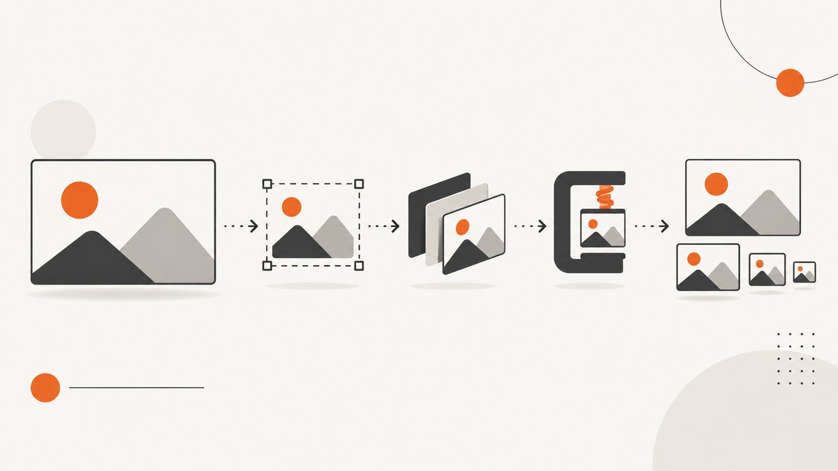
The best way to reduce image size for a website is a workflow: remove images that add no value, resize each remaining image to its largest rendered dimensions, choose a format suited to the content, compress while checking visual quality, and serve responsive variants so each device downloads an appropriate file.
There is no single quality percentage or format that wins for every image. A photographic hero image, a transparent logo, a screenshot with small text, and a vector illustration need different treatment.
1. Audit images before compressing them
Compression cannot beat deletion. Remove decorative images that do not improve understanding or design. Then inspect the images that remain:
- Record the file dimensions and file size.
- Measure the largest width and height at which the image is actually rendered.
- Find images that are downloaded at several times their display size.
- Check whether the same image is duplicated in multiple formats or resolutions.
- Separate photographic content, screenshots, logos, line art, transparency, and animation.
If an image is displayed at 800 pixels wide, a 4,000-pixel source makes every visitor download unnecessary data. Keep a source master if needed, but generate delivery files around real layout sizes.
2. Resize to the rendered dimensions
Create candidates for the widths your layouts use instead of sending one oversized source to every visitor. For example, a card image might need 320, 640, and 960 pixel variants, while a desktop hero might need 1280 and 1920 pixel variants.
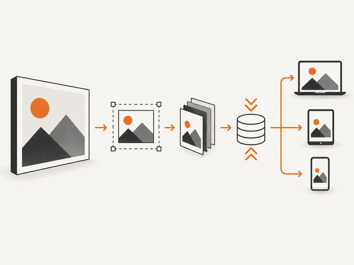
Use srcset and sizes to let the browser select a candidate:
<img
  src="/images/product-640.webp"
  srcset="
    /images/product-320.webp 320w,
    /images/product-640.webp 640w,
    /images/product-960.webp 960w,
    /images/product-1280.webp 1280w"
  sizes="(max-width: 700px) 100vw, (max-width: 1100px) 70vw, 800px"
  width="800"
  height="533"
  alt="Product dashboard on a laptop"
  loading="lazy"
  decoding="async">
The width and height attributes reserve layout space and reduce visual shifting. Set loading="lazy" for below-the-fold images; keep the primary above-the-fold image eager when it is part of the initial view.
3. Pick a format for the image content
| Image type | Good starting point | Check before publishing |
|---|---|---|
| Photographs | WebP, AVIF, or JPEG | Fine detail, gradients, faces, and banding |
| Screenshots with text | WebP, PNG, or AVIF tested at readable quality | Small text, sharp edges, and UI lines |
| Logos and line art | SVG when the artwork is genuinely vector; otherwise WebP or PNG | Transparency and crisp edges |
| Transparent raster art | WebP, AVIF, or PNG | Halos around transparent edges |
| Animation | Animated WebP, AVIF, or a video when appropriate | Playback support, poster image, and total bytes |
web.dev reports that WebP files are usually 25–35% smaller than comparable JPEG and PNG files, but that is a general range rather than a promise for an individual file. AVIF can be smaller and supports wide color gamut and HDR; compare the actual output and browser delivery requirements for your site. See web.dev’s image guidance.
4. Compress with a measured quality target
Lossy compression removes image information and is often effective for detailed photographs. Lossless compression preserves the image data and is useful when exact pixels matter, although savings may be smaller. Test several settings on representative files instead of applying one universal quality value.
Using ImageMagick
# Resize, convert, and set a WebP quality level
magick input.jpg -resize '1280x1280>' -strip -quality 82 output.webp

# Preserve transparency while converting a PNG
magick logo.png -strip -quality 90 logo.webp

# Create a JPEG fallback
magick photo.tif -resize '1600x1600>' -strip -interlace Plane -quality 82 photo.jpg
The > resize constraint prevents enlarging an image that is already smaller than the requested box. ImageMagick documents WebP controls such as target size and target PSNR in its official WebP documentation.
Using sharp in a Node.js build step
import sharp from 'sharp';

const widths = [320, 640, 960, 1280];

for (const width of widths) {
  await sharp('input.jpg')
    .resize({ width, withoutEnlargement: true })
    .webp({ quality: 82 })
    .toFile(`public/images/product-${width}.webp`);
}
Inspect the output at the actual display size. Look for ringing around text, blockiness, posterization in gradients, blurred fine detail, and halos around transparent edges. Keep the smallest file that still looks acceptable in your most demanding layout.
5. Add format fallbacks where delivery requires them
The picture element lets you offer modern formats while retaining a fallback:
<picture>
  <source type="image/avif" srcset="/images/hero-640.avif 640w, /images/hero-1280.avif 1280w" sizes="100vw">
  <source type="image/webp" srcset="/images/hero-640.webp 640w, /images/hero-1280.webp 1280w" sizes="100vw">
  <img src="/images/hero-1280.jpg" width="1280" height="720" alt="Mountain landscape">
</picture>
Do not convert blindly. A format change can make a screenshot’s text less readable or remove required metadata and transparency. Test the files your browsers, CMS, and downstream tools actually consume.
6. Make optimization repeatable
One-off editing works for a few files. A build or server pipeline is safer for a growing site:
- Accept an original upload and retain it outside the public delivery directory.
- Generate a defined width ladder and the formats your site supports.
- Store dimensions and byte sizes as build metadata.
- Use content-hashed filenames so optimized files can be cached for a long time.
- Run a visual sample review when changing quality settings or encoders.
- Fail the build or warn when an image exceeds a page-specific byte budget.
Squoosh and ImageOptim are useful for occasional manual work. sharp and ImageMagick fit automated resizing and conversion workflows. Choose based on batch volume, quality controls, integration with your build or CMS, and whether processing runs locally or through a hosted service.
7. Deliver the right bytes to the browser
- Serve images through a cacheable URL and configure long-lived caching for immutable, hashed files.
- Use HTTPS and enable compression for image formats only when it does not increase CPU cost without reducing bytes.
- Preload only the actual hero image needed for the initial viewport.
- Use lazy loading for images below the fold.
- Set explicit dimensions or an aspect ratio to prevent layout shifts.
- Measure transferred bytes in browser developer tools after deployment, not only the local file size.
Responsive candidates reduce bytes for small screens, but a poor sizes value can make the browser select a file that is too large. Verify representative phones, laptops, high-density displays, and zoom levels.
8. Screenshot-specific considerations
Screenshots often contain small text, high-contrast edges, and transparency. Resize only after deciding the minimum readable dimensions. Compare PNG, WebP, and AVIF at 100% and at the size shown in the page. If a screenshot is generated from a browser, capture at the largest required viewport and create delivery variants afterward rather than asking every visitor to download the capture master.
Or skip the browser setup
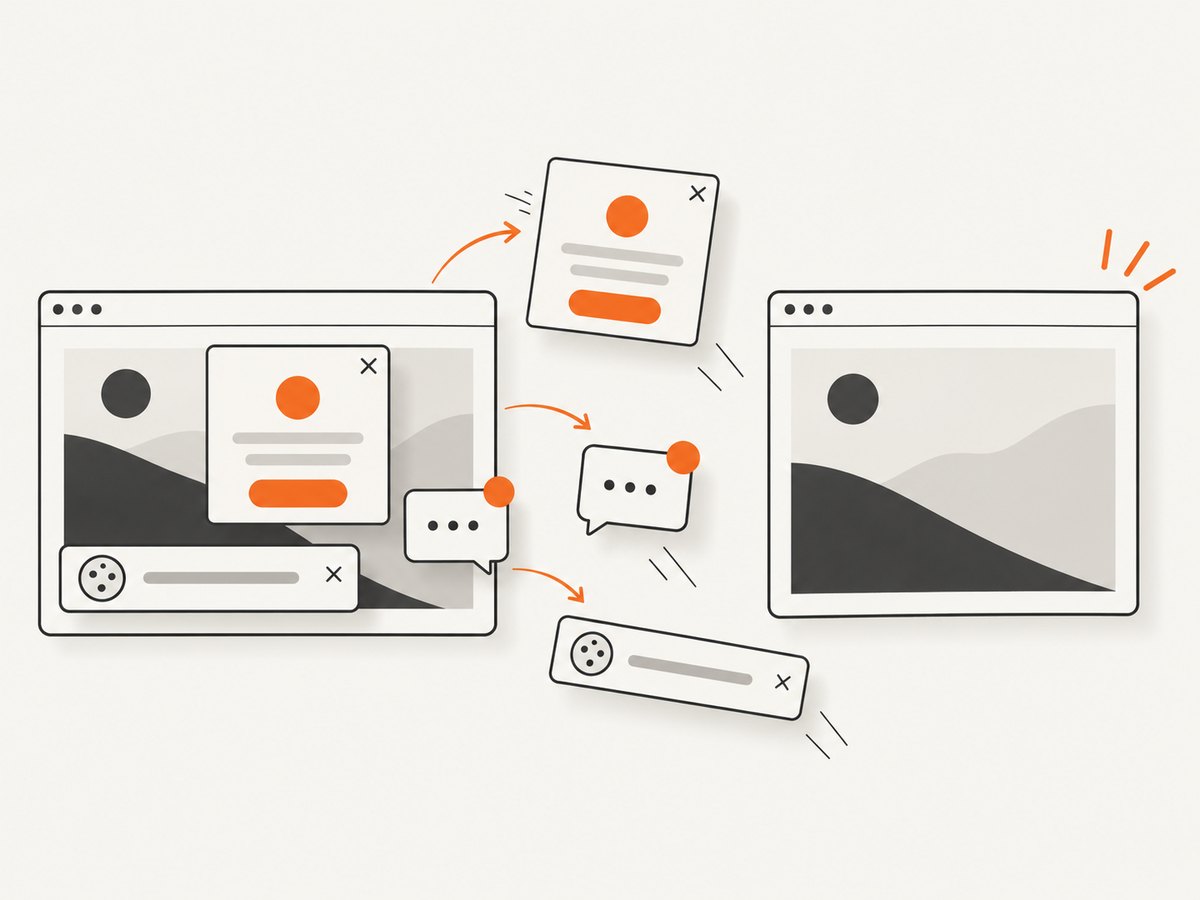
ScreenshotNeo captures a URL as PNG, JPEG, WebP, or PDF through one request, and its image resizing options can produce a delivery-sized result. Before capture it accepts cookie and consent banners and removes more than 60 known consent platforms, newsletter popups, and chat widgets. Bot checks, blank pages, timeouts, failed loads, and cache hits are not billed; response headers identify the page verdict and billing status. Its MCP server lets Claude, Cursor, and other MCP clients call take_screenshot, get_page_info, and capture_pdf.
See the ScreenshotNeo API documentation for options such as full-page capture, CSS element selection, custom CSS and JavaScript, device presets, retina scale, blocking requests or resource types, caching TTLs, async jobs, bulk capture, and signed links.
# cURL
curl -G "https://api.screenshotneo.com/v1/shot" -d access_key=YOUR_API_KEY --data-urlencode url=https://stripe.com -o shot.webp
# Python
import requests
r = requests.get(
"https://api.screenshotneo.com/v1/shot",
params={"access_key": "YOUR_API_KEY", "url": "https://stripe.com"},
timeout=90,
)
r.raise_for_status()
open("shot.webp", "wb").write(r.content)// Node.js
const q = new URLSearchParams({ access_key: 'YOUR_API_KEY', url: 'https://stripe.com' });
const res = await fetch(`https://api.screenshotneo.com/v1/shot?${q}`);
if (!res.ok) throw new Error(`HTTP ${res.status}`);
const data = Buffer.from(await res.arrayBuffer());
await import('node:fs/promises').then(fs => fs.writeFile('shot.webp', data));There are 1,000 screenshots per month free with no card. Paid plans start at $5 for 3,000 shots, and every feature is available on every plan. Create a free ScreenshotNeo account.
Troubleshooting
The file is still huge after compression
Check dimensions first. A 4,000-pixel image saved at a lower quality can still exceed a properly sized 1,200-pixel image. Remove metadata with -strip, resize to the rendered maximum, and compare WebP or AVIF with the original format.
Text or edges look blurry
The image may be too small or the lossy quality too low. Increase the candidate width, test a higher quality, or use lossless PNG/WebP for line art and UI screenshots.
Transparent edges have a halo
Check the encoder’s alpha handling and preview the result against both light and dark backgrounds. Keep PNG or use a WebP/AVIF encoder that preserves the required alpha quality.
Mobile users still download desktop-sized files
Inspect the generated srcset and sizes. A missing width descriptor or an inaccurate sizes value can cause the browser to choose the largest candidate.
Images appear stretched or layout shifts occur
Set correct width and height attributes or an aspect-ratio box. Ensure the intrinsic dimensions match the file actually served.
The modern format does not load in part of the stack
Use a picture fallback and verify your CDN, CMS, image proxy, and browser support. Keep the source format available until the complete delivery path is confirmed.
Performance, reliability, and cost checklist
- Delete images that provide no useful information.
- Resize to the largest real rendered dimensions.
- Generate responsive candidates and verify
sizes. - Choose format by content, not by habit.
- Test several quality levels on representative files.
- Inspect text, edges, gradients, faces, and transparency.
- Automate the pipeline and retain originals separately.
- Cache immutable derivatives and measure transferred bytes after deployment.
- Budget CPU and storage when processing large batches.
- For generated screenshots, account for capture failures and use a service that reports whether a response was billed.
FAQ
Should every image be converted to WebP?
No. WebP is a strong candidate for many raster images, but screenshots, transparency, animation, and downstream compatibility can change the best choice. Compare actual output.
Is AVIF always smaller than WebP?
No format wins on every file. Encode representative images and inspect quality, decoding behavior, and delivery support.
What quality number should I use?
There is no universal value. Start with a moderate setting, compare several levels, and choose the smallest file that passes visual review at its real display size.
Does resizing reduce quality?
It can remove detail, but sending an image close to its rendered dimensions usually improves delivery efficiency. Keep the original and regenerate derivatives when layout requirements change.
Where should image optimization run?
Use a local editor for occasional files and a build, CMS, or image-delivery pipeline for repeated uploads and responsive variants.


