How to Reduce Website Image Quality for Faster Pages
Reduce image bytes without making pages look bad: resize correctly, choose WebP or AVIF, compress by content, and serve responsive images.
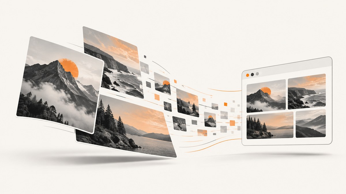
To make a website faster, reduce the bytes an image sends to the browser rather than blindly lowering a quality slider. Start by resizing each source to the largest size it will actually render, then compare lossy and lossless compression, test WebP and AVIF against JPEG and PNG, and deliver responsive candidates with srcset and sizes. Judge the result at the rendered size on representative images, because photographs, text, transparency, gradients, and line art fail in different ways.
What “reduce image quality” should mean
Image quality and image file size are related but different. Lossy compression discards image information to reduce bytes; lossless compression preserves the image data and usually produces a smaller reduction. Resizing can remove more bytes than compression because pixels that will never be displayed do not need to be downloaded.
A practical goal is the smallest file that still looks correct in its real layout. A 2,000-pixel image displayed at 500 CSS pixels wastes bandwidth, while an image compressed so aggressively that text edges or a face break harms the user experience.
A repeatable optimization workflow
- Measure the rendered slot. Inspect the layout width at the smallest, typical, and largest viewport. Include device pixel ratio (DPR): a 500 by 500 CSS-pixel slot may need a 1,000 by 1,000 source for a DPR 2 screen.
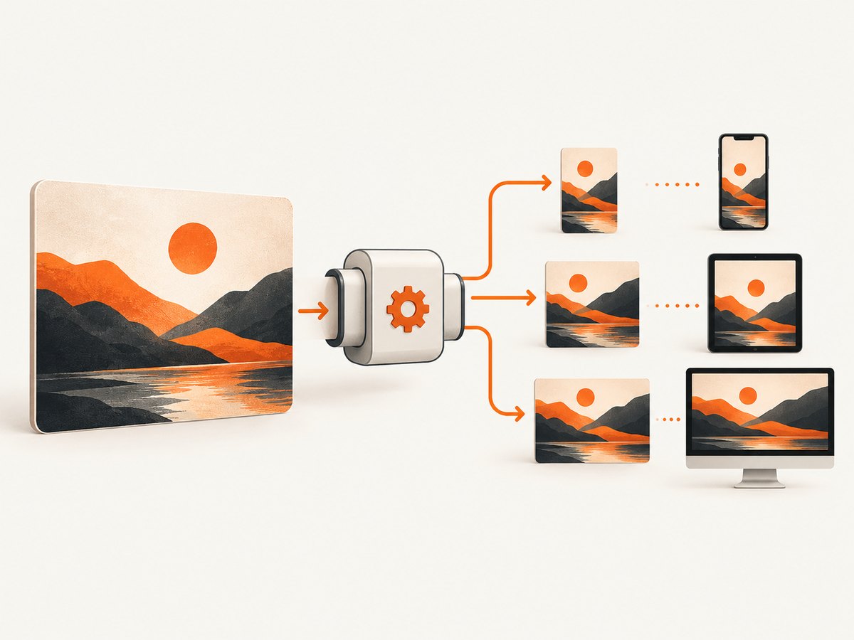
- Resize before encoding. Generate a small, practical set of width candidates rather than one huge file for every device.
- Pick an encoding for the content. Compare JPEG, WebP, and AVIF for photographs; use PNG or WebP when transparency matters; use SVG for diagrams and charts.
- Test quality settings visually. Compare bytes and artifacts at the final display size. Inspect faces, text, sharp edges, gradients, skies, and transparent areas.
- Deliver the right candidate. Use
srcsetandsizes, orpicturewhen selecting formats or art direction. - Measure after deployment. Check transferred bytes, the image that becomes LCP, and field data as well as lab results.
Resize images to their actual use
Suppose a card is 500 CSS pixels wide. A 500-pixel candidate is suitable around DPR 1; a 1,000-pixel candidate is useful around DPR 2. Do not serve a 3,000-pixel original to every visitor. When the slot changes with the viewport, provide width candidates such as 320, 640, 960, and 1,280 pixels, then remove candidates that add little value to your traffic while increasing cache and storage complexity. Web.dev describes three to five sizes as common guidance, not a requirement.
Preserve the image’s aspect ratio and reserve its layout space with width and height attributes or CSS aspect-ratio. This prevents a late image response from shifting surrounding content.
<img
  src='/images/hero-960.webp'
  srcset='/images/hero-320.webp 320w,
          /images/hero-640.webp 640w,
          /images/hero-960.webp 960w,
          /images/hero-1280.webp 1280w'
  sizes='(max-width: 700px) 100vw, 50vw'
  width='1280'
  height='720'
  alt='Mountain trail at sunrise'
  loading='lazy'
  decoding='async'>
Do not lazy-load an image that is the page’s primary above-the-fold or LCP image. Let that resource start early; lazy loading is appropriate for below-the-fold content.
Compress according to image content
Photographs
Lossy compression is often effective for photographs and detailed scenes. Lower quality can create blocking, ringing around edges, mosquito noise, or smeared detail. Compare several settings on representative portraits, outdoor scenes, and dark images rather than adopting one universal number.
Text, logos, and line art
High-contrast edges reveal artifacts quickly. For diagrams, charts, and icons, SVG is usually a better source because it is text-based and can be minified and compressed. If a raster format is required, test lossless or a higher-quality lossy setting.
Transparency and limited palettes
PNG remains useful when exact transparency or pixel fidelity is required. WebP can also carry transparency. Palette reduction can shrink flat graphics with few colors, but it may produce banding or posterization in skies and gradients.
WebP, AVIF, JPEG, PNG, or SVG?
| Format | Good fit | Watch for |
|---|---|---|
| JPEG | Broadly compatible photographs | Lossy artifacts; no alpha transparency |
| WebP | Photos and transparent raster graphics | Compare quality and fallback behavior |
| AVIF | Modern browsers where strong compression is valuable | Encoding cost and support requirements; test every asset |
| PNG | Lossless graphics and exact transparency | Often large for photographs |
| SVG | Logos, icons, diagrams, and charts | Not a replacement for photographic pixels |
Web.dev reports that AVIF has produced greater than 50% savings compared with JPEG in some cases. That is a qualified example, not a promise for your images. Encode WebP and AVIF at similar perceived quality, compare the bytes, and keep a fallback for browsers that cannot use the preferred representation.
You can choose formats in HTML:
<picture>
  <source type='image/avif' srcset='/images/product-640.avif 640w, /images/product-1200.avif 1200w' sizes='100vw'>
  <source type='image/webp' srcset='/images/product-640.webp 640w, /images/product-1200.webp 1200w' sizes='100vw'>
  <img src='/images/product-1200.jpg' width='1200' height='800' alt='Product on a desk'>
</picture>
For server-side content negotiation, use the request’s Accept header and send an appropriate Vary: Accept response header so shared caches keep representations separate.
Command-line and application workflows
ImageMagick resize
magick flower.jpg -resize '300x200>' -strip -quality 82 flower-300.jpg
magick flower.jpg -resize '800x800>' -strip -quality 82 flower-800.webp
The > modifier prevents enlargement. Confirm the syntax for your installed ImageMagick version; older documentation may show convert instead of magick.
WebP with cwebp
cwebp -q 82 -m 6 input.jpg -o output.webpThe method setting trades encoding effort against compressed size and quality. Use a slower method during a build when the output is cached, and benchmark your own asset set.
Python with Pillow
from PIL import Image

source = Image.open('input.jpg')
source.thumbnail((1200, 1200), Image.Resampling.LANCZOS)
source.save('output.webp', 'WEBP', quality=82, method=6)
For an image with transparency, keep an alpha-capable mode such as RGBA and verify that the chosen encoder preserves it.
Node.js with Sharp
import sharp from 'sharp';

await sharp('input.jpg')
  .resize({ width: 1200, height: 1200, fit: 'inside', withoutEnlargement: true })
  .webp({ quality: 82, effort: 6 })
  .toFile('output.webp');
Generate only the widths your pages actually request. Every extra variant adds build work, storage, cache entries, and markup.
Responsive delivery details
srcset with width descriptors (320w, 640w) tells the browser what candidates exist. sizes tells it how wide the image is expected to render; without accurate sizes, the browser may select an unnecessarily large file. Use pixel-density descriptors such as 1x and 2x when the rendered width is fixed.
Use picture for format alternatives or art direction, such as a crop that changes on mobile. Keep CSS backgrounds for decorative images; content images should generally be real img elements so they have meaningful alternatives and predictable loading behavior.
Or skip the browser setup
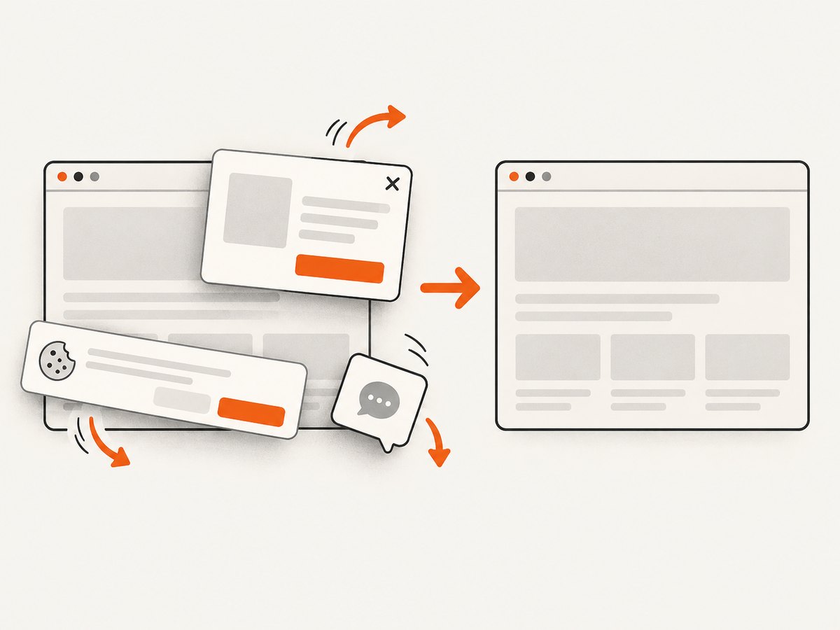
If your goal is to capture an already optimized page for documentation, previews, reports, or regression checks, ScreenshotNeo returns a PNG, JPEG, WebP, or PDF from one GET request. It accepts cookie and consent banners as a visitor and removes more than 60 known consent platforms, newsletter popups, and chat widgets before capture. Bot checks, blank pages, timeouts, failed loads, and cache hits cost nothing, and response headers identify the page verdict and whether it was billed. Its MCP server provides take_screenshot, get_page_info, and capture_pdf tools for Claude, Cursor, and other MCP clients.
See the ScreenshotNeo API documentation for all options. Basic calls:
curl -G 'https://api.screenshotneo.com/v1/shot' \
  -d access_key=YOUR_API_KEY \
  --data-urlencode url=https://stripe.com \
  -o shot.webp
import requests
r = requests.get(
'https://api.screenshotneo.com/v1/shot',
params={'access_key': 'YOUR_API_KEY', 'url': 'https://stripe.com'},
timeout=90,
)
r.raise_for_status()
open('shot.webp', 'wb').write(r.content)const q = new URLSearchParams({ access_key: 'YOUR_API_KEY', url: 'https://stripe.com' });
const res = await fetch(`https://api.screenshotneo.com/v1/shot?${q}`);
if (!res.ok) throw new Error(`HTTP ${res.status}`);
const bytes = new Uint8Array(await res.arrayBuffer());
await Bun.write('shot.webp', bytes);Options include full-page capture with lazy images loaded, CSS-selector element capture, dark mode, device presets or custom viewports, retina scale, custom CSS and JavaScript, clicks, selector or network-idle waits, blocked resources, headers, cookies, user agents, authorization, timezone, geolocation, transparent backgrounds, resizing, chosen cache TTLs, signed image links, asynchronous jobs with signed webhooks, bulk capture of up to 100 URLs per call, a usage API, and an OpenAPI specification. Existing parameter names used by other screenshot APIs also work, which helps with migrations.
Plans include 1,000 free shots per month with no card; paid plans start at $5 for 3,000 shots. Yearly billing gives two months free, and every feature is available on every plan. Create a free ScreenshotNeo account.
Troubleshooting image optimization
| Symptom | Likely cause | Fix |
|---|---|---|
| Images are still huge | Source dimensions exceed the rendered slot | Resize to layout width multiplied by realistic DPR; inspect the selected candidate in DevTools. |
| Mobile downloads desktop-sized files | Missing or inaccurate sizes |
Describe the CSS width at each breakpoint and keep width descriptors in srcset. |
| Text looks smeared | Lossy quality is too low for sharp edges | Raise quality, use lossless encoding, or switch to SVG/PNG. |
| Sky or gradients show bands | Palette reduction or aggressive quantization | Use more color depth, a higher quality setting, or a different format. |
| Transparent background turns black | Alpha channel was discarded | Export RGBA and verify the encoder and CSS background. |
| Layout jumps while loading | No intrinsic dimensions reserved | Add accurate width/height or an aspect-ratio box. |
| AVIF is not displayed | Unsupported browser or incorrect MIME type | Use picture with WebP/JPEG fallback and serve image/avif correctly. |
| Cache serves the wrong format | Content negotiation response lacks variation metadata | Send Vary: Accept and use distinct cache keys. |
Performance, reliability, and cost notes
- Performance: Images are often among the largest resources. If an image is the LCP element, reducing its transfer time can improve LCP, but image compression alone cannot guarantee good Core Web Vitals. Google’s targets are LCP within 2.5 seconds, INP below 200 milliseconds, and CLS below 0.1.
- Reliability: Keep an original source archive, make transformations deterministic, and validate dimensions, color profiles, transparency, and orientation in CI. Generate a fallback before switching formats globally.
- Operational cost: More width and format variants increase storage, cache entries, build time, and HTML complexity. Hosted transformations can reduce build work but add service cost and another dependency. Choose based on measured traffic and maintenance effort.
- Measurement: Record encoded bytes, decoded dimensions, selected candidate, cache status, and LCP resource timing before and after. Test cold and warm cache behavior on representative networks.
Implementation checklist
- Measure every important image’s rendered width and aspect ratio.
- Resize before compression; prevent accidental enlargement.
- Keep a small candidate set matched to real breakpoints and DPRs.
- Compare JPEG, WebP, and AVIF at similar visual quality.
- Inspect text, edges, faces, gradients, and alpha transparency.
- Use accurate
srcsetandsizes; usepicturefor formats or art direction. - Reserve layout space and prioritize the LCP image.
- Measure transferred bytes and field performance after release.
FAQ
What quality value should I use?
There is no universal value. Start with several settings, inspect representative output at its display size, and choose the smallest file without visible defects. ImageMagick’s WebP documentation gives different suggestions for portraits, outdoor photographs, line drawings, and text images, which illustrates why content matters.
Is AVIF always better than WebP?
No. AVIF can be smaller at comparable visual quality in some cases, but encoding time, browser support, and artifact behavior vary. Keep a tested fallback and compare your own assets.
How many responsive sizes should I create?
Three to five is a common starting point, then adjust using real viewport and DPR traffic. Too few causes waste; too many increase cache, storage, and markup complexity.
Does compression fix Core Web Vitals?
It can shorten image transfer time, especially when the image is LCP, but page layout, server response, JavaScript, fonts, and interaction work also affect the metrics.
Should I delete the original files?
Keep originals outside the public serving path. They let you regenerate candidates when layouts, codecs, or quality requirements change.


