How to Reduce Website Image Size for Free
Resize first, compress second, and verify the result with free tools. This guide covers Squoosh, WebP, AVIF, responsive images, ImageMagick, and testing.

Direct answer: resize each image to the largest size at which it will actually render, compress it with a suitable lossy or lossless codec, convert to WebP or AVIF when your browser and content pipeline support them, then retest the deployed page. A free workflow is PageSpeed Insights → Squoosh → responsive HTML or CMS delivery → PageSpeed and browser-network verification.
Image dimensions matter as much as quality settings. Sending a 3,000-pixel image to a 700-pixel slot wastes bandwidth even when the file is well compressed. Photographs usually benefit from lossy JPEG, WebP, or AVIF encoding. Logos, screenshots, diagrams, transparency, and text-heavy graphics often need lossless output or a higher quality setting. Always compare the result at its normal display size.
1. Find the images that cost the most
Start with Google PageSpeed Insights. Enter the public page URL and inspect the image-delivery opportunities. Record each expensive image’s intrinsic width and height, transferred bytes, and rendered dimensions. The browser’s Network panel can confirm the exact file requested and its transfer size.
Images can represent 60%–65% of page bytes on many pages, according to Google’s WebP documentation. That makes image delivery one of the highest-impact places to look when a page is slow.
- Run the page through PageSpeed Insights on mobile and desktop.
- Open the image-related opportunities and note oversized or uncompressed resources.
- In browser developer tools, filter Network requests by Img.
- For each image, compare intrinsic dimensions with the element’s rendered dimensions.
- Prioritize hero images, product galleries, article images, and anything downloaded before the largest contentful paint.
2. Resize before compressing
Choose a maximum width from the largest real slot in your layout. If an article image never exceeds 760 CSS pixels, a 3,000-pixel source is unnecessary for that slot. Account for high-density displays by generating a sensible larger candidate, such as 1× and 2× widths, rather than serving the original to every device.
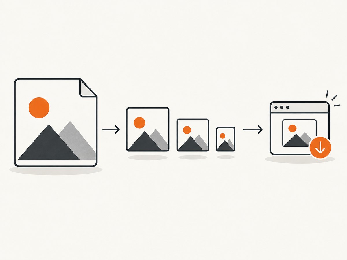
When the layout changes substantially between mobile and desktop, create responsive candidates. A common set might be 480, 768, 1,200, and 1,600 pixels, but measure your own layout. Do not create dozens of nearly identical files without a delivery reason.
<img
  src="/images/article-1200.webp"
  srcset="
    /images/article-480.webp 480w,
    /images/article-768.webp 768w,
    /images/article-1200.webp 1200w,
    /images/article-1600.webp 1600w
  "
  sizes="(max-width: 700px) 100vw, 760px"
  width="760"
  height="507"
  alt="Description of the image"
>
The width and height attributes reserve layout space and reduce cumulative layout shift. The sizes value tells the browser how wide the image will be in the layout; it should describe your actual CSS, not a guess.
Use picture for format and art-direction choices
<picture>
  <source type="image/avif" srcset="/images/hero-768.avif 768w, /images/hero-1200.avif 1200w" sizes="100vw">
  <source type="image/webp" srcset="/images/hero-768.webp 768w, /images/hero-1200.webp 1200w" sizes="100vw">
  <img src="/images/hero-1200.jpg" width="1200" height="800" alt="Description">
</picture>
Use a separate source in picture when the crop or composition must change, not merely because the file format changes. Keep a fallback that your audience and CMS can reliably serve. Google lists JPEG, PNG, WebP, SVG, and AVIF among supported image formats, while the exact fallback choice depends on your browser audience and stack.
3. Compress an image in Squoosh
Squoosh is a practical free starting point for one-off work. Its browser app exposes resize and codec controls, shows a before-and-after comparison, and processes images locally on your device rather than uploading them to a service.
- Open Squoosh and drop in the original image.
- Enable Resize and set the maximum width you selected from your layout measurements.
- Select a codec. Start with WebP or AVIF for photographs; use JPEG when compatibility or an existing pipeline requires it.
- For logos, diagrams, screenshots, and transparent artwork, test lossless WebP or PNG, or raise the quality of a lossy export.
- Move the quality control downward until artifacts become visible, then increase it one step.
- Compare fine text, diagonal lines, faces, foliage, gradients, and transparent edges in the preview.
- Download the derivative and keep the original source separately.
There is no universal quality number. A photograph may remain convincing at a lower quality than a screenshot containing small text. Chroma-subsampling artifacts can appear around high-contrast text, so inspect those edges instead of judging only by a thumbnail.
Choosing a format
| Image type | Good first tests | What to inspect |
|---|---|---|
| Photographs | Lossy WebP, AVIF, or JPEG | Faces, texture, gradients, and blockiness |
| Logos and flat graphics | Lossless WebP or PNG | Sharp edges, exact colors, and halos |
| Screenshots and diagrams | Lossless WebP/PNG or high-quality lossy output | Small text and thin lines |
| Transparent artwork | PNG or alpha-capable WebP | Transparent pixels, halos, and background blending |
Google describes WebP as roughly 30% smaller than comparable JPEG and PNG images at equivalent visual quality. AVIF can also provide strong compression. Treat those figures as directional guidance, not a promise for every source image; texture, dimensions, and quality settings control the result.
4. Put the optimized files into your site
Replace the CMS asset, update the HTML reference, or commit the generated variants to your build pipeline. Check that your server sends an appropriate Content-Type such as image/webp or image/avif. A file named .webp is not enough if the server sends the wrong MIME type.
Do not repeatedly recompress an already compressed derivative. Keep a high-quality original and generate new derivatives from it whenever you change dimensions or quality. If your CMS transforms images automatically, compare its output with your local result; a transformation can occasionally make an already optimized file larger.
Lazy-load below-the-fold images
<img src="/images/diagram-768.webp"
     width="768" height="512"
     loading="lazy"
     decoding="async"
     alt="Request and response flow diagram">
Do not lazy-load the primary above-the-fold image by default. Let that image start early, and use lazy loading for content that begins below the initial viewport. Always provide dimensions so lazy loading does not cause layout jumps.
5. Automate batches with ImageMagick
For many files, a repeatable command-line process is easier than opening each image manually. Google’s PageSpeed documentation shows an ImageMagick route that combines resizing, quality, metadata handling, interlacing, and colorspace options. Adapt the dimensions and quality to your assets and compare the output before replacing anything.
magick input.jpg \
  -strip \
  -resize "1200x1200>" \
  -sampling-factor 4:2:0 \
  -interlace Plane \
  -colorspace sRGB \
  -quality 82 \
  output.jpg
The 1200x1200> geometry prevents enlargement while constraining an image to 1,200 pixels in either dimension. For a WebP derivative, use an appropriate output extension and quality setting:
magick input.jpg -strip -resize "1200x1200>" -quality 82 output.webpBatch conversion is useful when you need deterministic builds, but it does not remove the need for visual review. Test a representative sample of portraits, screenshots, transparent graphics, and very wide images before applying a policy to an entire library.
6. Verify bytes, dimensions, and visual quality
- Deploy the new files and purge any cache that could serve old derivatives.
- Run PageSpeed Insights again.
- Open the Network panel and confirm that the browser requests the intended format and responsive width.
- Compare transferred bytes with the original request, not only the file size on disk.
- Test a narrow phone viewport, a desktop viewport, and a high-density display.
- Inspect the image at normal display size and at 100% zoom for text and edge artifacts.
- Confirm that the final image is not larger than the original. Keep the smaller file only after checking appearance.
If the browser still downloads the original, inspect srcset, sizes, caching headers, service-worker caches, and any image CDN rewrite rules. A correctly optimized file cannot help if the page never requests it.
7. Troubleshooting common failures
| Symptom | Likely cause | Fix |
|---|---|---|
| The optimized file is larger | The source was already optimized or the chosen codec settings are inefficient | Compare byte size, try another codec, remove unnecessary metadata, and keep the smaller valid output. |
| Text looks smeared | Lossy compression and chroma subsampling damaged high-contrast edges | Use lossless WebP/PNG or increase quality; inspect at 100%. |
| Transparent edges have a halo | Alpha handling or a matte background was introduced | Use PNG or alpha-capable WebP and test against both light and dark backgrounds. |
| Mobile downloads a desktop-sized file | Missing or incorrect srcset/sizes |
Generate width variants and make sizes match the CSS slot. |
| WebP or AVIF does not display | Incorrect MIME type, fallback markup, or unsupported client | Send the correct type and provide a JPEG/PNG fallback through picture. |
| PageSpeed shows no improvement | The wrong resource was optimized, or cache/service-worker content remains | Check the actual requested URL and transferred bytes in Network, then purge caches and retest. |
| Images look blurry after resizing | Maximum width is below the rendered slot or an unsuitable resampling step was used | Measure the real slot, generate a larger candidate, and compare a 2× display. |
| Animated content stopped moving | A still-image conversion discarded animation | Keep an animation-capable source and test the delivery format separately. |
8. Performance, reliability, privacy, and cost notes
Resizing reduces transfer time and memory use before codec choice even matters. Responsive variants prevent a small phone from downloading desktop pixels. Modern codecs can reduce bytes further, but delivery compatibility and decoding cost still matter, so measure real pages.
Squoosh is free and local, which is useful for private images and occasional work. ImageMagick is better for scripted batches and reproducible builds. Store originals, make transformations deterministic, and add a size check to your build or review process so a new upload does not silently become a multi-megabyte request.
For pages that document or compare visual output, you may also need consistent screenshots. ScreenshotNeo can capture a page as PNG, JPEG, WebP, or PDF through one request, which is useful for checking how an optimized image actually renders at a target viewport.
Or skip the browser setup
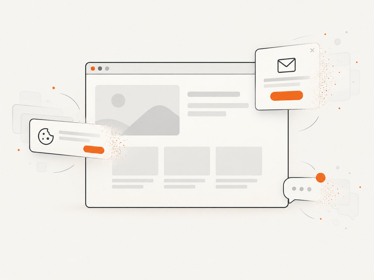
If you need a rendered page image rather than a manually optimized source asset, ScreenshotNeo provides a website screenshot API and MCP server. Cookie and consent banners are accepted and removed before capture, along with more than 60 known consent platforms, newsletter popups, and chat widgets. Bot checks, blank pages, timeouts, failed loads, and cache hits are not billed, and response headers identify the page verdict and billing status. Its MCP server includes take_screenshot, get_page_info, and capture_pdf tools for Claude, Cursor, and other MCP clients.
See the ScreenshotNeo API documentation for all options. This basic call captures a rendered WebP:
curl -G "https://api.screenshotneo.com/v1/shot" -d access_key=YOUR_API_KEY --data-urlencode url=https://stripe.com -o shot.webpimport requests
r = requests.get(
"https://api.screenshotneo.com/v1/shot",
params={"access_key": "YOUR_API_KEY", "url": "https://stripe.com"},
timeout=90,
)
r.raise_for_status()
open("shot.webp", "wb").write(r.content)const q = new URLSearchParams({ access_key: 'YOUR_API_KEY', url: 'https://stripe.com' });
const res = await fetch(`https://api.screenshotneo.com/v1/shot?${q}`);
if (!res.ok) throw new Error(`Screenshot failed: ${res.status}`);
const data = Buffer.from(await res.arrayBuffer());
await Bun.write('shot.webp', data);ScreenshotNeo also supports full-page capture with lazy images loaded, CSS-element capture, dark mode, device presets, custom viewports, retina scale, custom CSS and JavaScript, waits, request blocking, headers, cookies, user agents, timezone and geolocation, transparent backgrounds, resizing, caching with a chosen TTL, signed links, asynchronous jobs, webhooks, bulk capture of up to 100 URLs per call, and a usage API. Every feature is available on every plan. The free plan includes 1,000 screenshots each month with no card; paid plans start at $5 for 3,000.
Create a free ScreenshotNeo account and use the 1,000 monthly screenshots to inspect real rendered pages before and after your image changes.
9. A practical optimization checklist
- Measure intrinsic, rendered, and transferred dimensions.
- Resize to the largest real slot and create responsive candidates when needed.
- Choose lossy codecs for most photographs and lossless output for graphics, transparency, and text-heavy images.
- Compare WebP and AVIF against JPEG or PNG instead of assuming one format always wins.
- Keep originals and generate derivatives from them.
- Set width and height attributes and lazy-load below-the-fold content.
- Verify MIME types, fallbacks, cache behavior, and actual Network requests.
- Retest PageSpeed after deployment and keep the smaller file only when visual quality remains acceptable.
FAQ
Is WebP always smaller than JPEG?
No. Results depend on source content, dimensions, and quality settings. Compare equivalent visual output and keep the smaller acceptable file.
Should I convert every PNG to WebP?
No. Test transparency, sharp edges, and text. Lossless PNG or lossless WebP can be the better choice for some graphics.
How small should an image be?
There is no universal byte target. Set dimensions from the real layout, then reduce quality until artifacts become visible and step back.
Does resizing improve SEO by itself?
It can improve loading metrics when it reduces bytes and decoding work, but validate the deployed request and page performance rather than assuming a file change was used.
Can I optimize images without uploading them?
Yes. Squoosh processes images locally in the browser, and ImageMagick can process files locally in a scripted workflow.


