How to Render High-DPI Images with wkhtmltoimage
Learn how to create sharper, larger wkhtmltoimage captures with width, height, zoom and smart-shrinking controls.
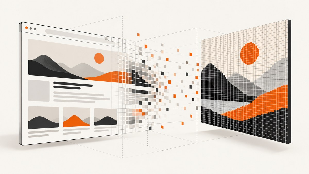
Direct answer: wkhtmltoimage does not provide a general-purpose image-output --dpi switch. To produce a larger raster capture, set the rendering screen dimensions with --width and --height. Use --zoom when you deliberately want the page content rendered larger. Then inspect the saved pixel dimensions and layout, because width is a guideline in many builds and smart shrinking can change the effective scale.
For example, this command asks wkhtmltoimage for a 2400 by 1600 rendering:
wkhtmltoimage \
  --width 2400 \
  --height 1600 \
  https://example.com \
  example-high-dpi.png
The result is a larger image file, but “high DPI” can mean several different things. A larger bitmap, a wider CSS viewport, page zoom and device-pixel ratio are related but different controls. The reliable workflow is to choose the CSS layout you need, request enough output pixels for the final use, disable smart shrinking only when it is causing unwanted scaling, and verify the image produced by the exact wkhtmltoimage binary in your environment.
What high DPI means in wkhtmltoimage
A screenshot has at least two sizes:
- Layout size: the CSS viewport used by WebKit to calculate responsive breakpoints, line wrapping and element positions.
- Bitmap size: the number of physical pixels written to the PNG, JPEG or other output file.
Increasing bitmap dimensions does not automatically preserve the same CSS layout. Page zoom can change the effective CSS viewport, while a device scale normally changes the relationship between logical units and physical pixels without changing layout. WebKit documentation describes these concepts separately and cautions that details differ between WebKit ports. Qt documentation likewise distinguishes device-independent geometry from raw image-buffer pixels. Those references provide useful terminology, but they do not guarantee identical behavior in every legacy wkhtmltoimage build.
For practical work, compare five things after each change:
- The saved image width and height in pixels.
- Whether responsive breakpoints changed.
- Whether text and vector graphics were rerendered or bitmap assets were merely resampled.
- Whether smart shrinking changed the effective scale.
- Whether the option exists in your installed binary.
The core options: width, height and zoom
--width: the rendering screen width
--width sets the screen width used while rendering. The command reference describes it as a guideline unless strict width behavior is enabled, so do not assume that every build will produce exactly that width or preserve it through all layout calculations. Start with the CSS viewport your page is designed for, such as 1280 pixels, and increase the requested output only when your final use needs more pixels.
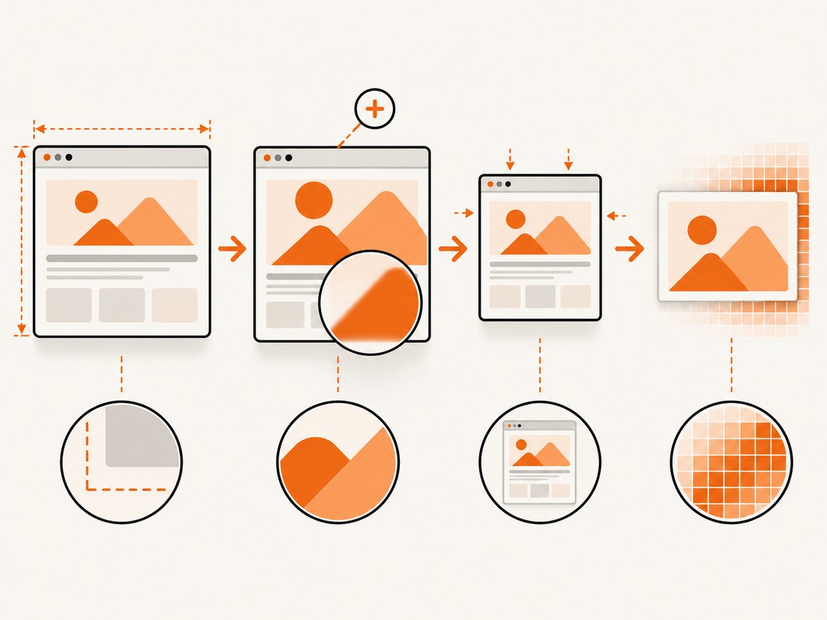
wkhtmltoimage --width 1280 https://example.com page-1280.pngUse the width that gives the intended desktop, tablet or mobile layout. If you set an extremely large width merely to obtain more pixels, media queries can select a different layout, navigation can collapse or expand, and text can reflow.
--height: the screen height
The screen height controls the vertical rendering area. When omitted, the height is generally calculated from page content. Set it when you need a predictable viewport or a fixed crop:
wkhtmltoimage \
  --width 1280 \
  --height 900 \
  https://example.com \
  viewport.png
A fixed height can cut off content below the viewport. For a full-page image, allow the tool to calculate the content height or use the full-page behavior supported by your build, then inspect the resulting dimensions.
--zoom: page-content scaling
--zoom scales page rendering. It is useful when you intentionally want content larger, but zoom is not the same as a native device-pixel-ratio change. Because page zoom can affect the CSS viewport, it may alter wrapping and responsive layout.
wkhtmltoimage \
  --width 1280 \
  --height 900 \
  --zoom 1.5 \
  https://example.com \
  zoomed.png
Use a zoom value such as 1.25 or 1.5 only after checking the page at 100% view. If text becomes sharper but the layout no longer matches the design, return to the original zoom and adjust the viewport and output strategy instead.
A repeatable high-DPI workflow
- Define the target layout. Decide whether the page should look like a 1440-pixel desktop viewport, a 390-pixel mobile viewport or another known CSS width.
- Render a baseline. Capture at the target width with no zoom and record the image dimensions.
- Increase the requested dimensions. Set
--widthand, when needed,--heightto the pixel area required by the consuming system. - Try zoom only for intentional enlargement. Confirm that media queries, wrapping and element positions remain acceptable.
- Check smart shrinking. It is enabled by default in the upstream reference and makes the pixel/DPI ratio non-constant. Compare output with the option disabled only if shrink-to-fit is producing the wrong scale.
- Inspect the file. Use an image viewer or an image-information utility to confirm width, height, transparency and compression.
- Test representative pages. Include long text, responsive components, SVG, web fonts, large bitmap images and lazy-loaded content.
Smart shrinking and strict width behavior
Smart shrinking attempts to fit content into the available width. The upstream manual documents that this strategy makes the pixel/DPI ratio non-constant. That is why two pages rendered with the same nominal settings can appear to have different effective scales.
If the output is unexpectedly small, text wraps differently or a wide page is compressed, compare a normal render with smart shrinking disabled:
wkhtmltoimage \
  --width 1600 \
  --disable-smart-width \
  https://example.com \
  no-shrink.png
Option names vary among builds. Run wkhtmltoimage --help and use the switch shown by your binary. Do not disable smart shrinking automatically: it can be useful for fitting content, and changing it may expose horizontal overflow or alter the crop.
The Debian Bookworm manpage also describes width as a guideline and points to strict width behavior. Verify the exact switch and semantics in your installed version before building an automated pipeline.
Full command examples
Large desktop capture
wkhtmltoimage \
  --width 1920 \
  --height 1200 \
  --quality 95 \
  https://example.com \
  desktop-2x.jpg
Retina-style enlarged content
wkhtmltoimage \
  --width 1440 \
  --height 900 \
  --zoom 2 \
  https://example.com \
  retina.png
This can produce a very large bitmap, but it may also change CSS layout. Confirm that the page still uses the intended breakpoint.
Local HTML and custom JavaScript
wkhtmltoimage \
  --enable-local-file-access \
  --width 1600 \
  --height 1000 \
  file:///absolute/path/report.html \
  report.png
Only enable local-file access when the input is trusted. A local page can reference files available to the rendering process.
Library-level settings
If you use the wkhtmltoimage library instead of the command line, the image settings expose crop coordinates and dimensions, screenWidth, smartWidth and a page-load zoom factor. The names correspond to the same decisions made by the CLI:
screenWidthcontrols the virtual screen width.smartWidthcontrols smart shrinking behavior.crop.left,crop.top,crop.widthandcrop.heightdefine a pixel crop.load.zoomFactorcontrols page-load zoom in library configurations that expose it.
Keep crop coordinates in the coordinate system produced by the render. Changing zoom or screen width can move the crop target. Render first, then set crop values from observed pixel coordinates.
Why --dpi is usually the wrong answer
The wkhtmltopdf manual places --dpi and --image-dpi in PDF global options. They concern PDF generation and image embedding, not the primary wkhtmltoimage screen-render controls. Applying PDF recipes to an image command can produce an “unknown option” error or no useful change.
For raster output, focus on:
- Screen width and height.
- Zoom, when layout changes are acceptable.
- Smart shrinking and strict-width behavior.
- Crop dimensions and output format quality.
Fonts, SVG and bitmap assets
Increasing output pixels cannot restore detail that was never available. Text and SVG are normally rerendered by the engine and benefit from a larger raster target. A low-resolution JPEG, canvas snapshot or background image may remain soft because the source itself is being enlarged.
For consistent captures:
- Wait until web fonts have loaded before capture.
- Use locally available fonts when remote font loading is unreliable.
- Prefer SVG for logos and diagrams when the renderer supports the required features.
- Supply sufficiently large source images for hero sections and photos.
- Check alpha handling when producing transparent PNG output.
Troubleshooting
The file is not larger
Cause: the build treats width as a guideline, smart shrinking fitted the page, or a wrapper script overrode the option. Fix: run wkhtmltoimage --help, inspect actual pixel dimensions, compare smart shrinking settings and check the command generated by your wrapper.
The layout changed at a higher setting
Cause: page zoom or a wider viewport selected different CSS media queries. Fix: keep the target CSS width fixed, avoid zoom, or revise responsive rules for the capture viewport.
Text is still blurry
Cause: the text may be inside a bitmap, the engine may be resampling the final image, or the page is being captured at a smaller effective scale. Fix: inspect the source element, test PNG output, compare zoom and viewport settings, and verify the final image is not being resized downstream.
Content is cut off
Cause: a fixed --height or crop ends before the content. Fix: remove the fixed height for a content-sized render, increase it, or adjust crop coordinates after measuring the output.
An option is rejected
Cause: distribution packages and bundled Qt/WebKit versions expose different switches. Fix: check the installed binary’s help output and documentation for that version. Do not assume a switch from another build is available.
Remote images or fonts are missing
Cause: network timing, blocked resources, certificate problems or page scripts that have not finished. Fix: make resources reachable from the renderer, wait for page readiness in your wrapper, inspect stderr, and test with a minimal page that loads the same assets.
Performance, reliability and cost
Larger dimensions increase raster memory and encoding work. A 2× increase in both width and height creates roughly four times as many pixels before compression. Use the smallest dimensions that satisfy the delivery requirement, and avoid rendering a full page when a component crop is enough.
For repeatable jobs, pin the wkhtmltoimage version and operating-system package, record command-line options, and keep a small regression set of pages. Builds can bundle different Qt/WebKit versions, so behavior is not guaranteed to match across machines. Compare image dimensions and a few visual checkpoints after upgrades.
Cache stable pages where appropriate, but invalidate the cache when fonts, CSS or image assets change. If a capture is business-critical, treat timeouts and missing resources as explicit failures rather than silently accepting a partial image.
Or skip the browser setup
ScreenshotNeo provides a website screenshot API and MCP server when you want a managed capture instead of maintaining a wkhtmltoimage installation. One GET request returns a PNG, JPEG, WebP or PDF. See the ScreenshotNeo API documentation for the complete option list.
curl -G "https://api.screenshotneo.com/v1/shot" -d access_key=YOUR_API_KEY --data-urlencode url=https://stripe.com -o shot.webpimport requests
r = requests.get("https://api.screenshotneo.com/v1/shot", params={"access_key": "YOUR_API_KEY", "url": "https://stripe.com"}, timeout=90)
open("shot.webp", "wb").write(r.content)const q = new URLSearchParams({ access_key: 'YOUR_API_KEY', url: 'https://stripe.com' });
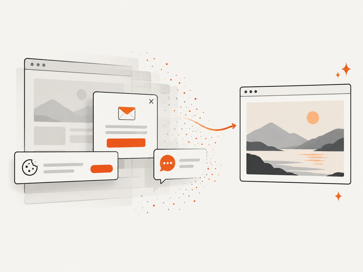
const res = await fetch(`https://api.screenshotneo.com/v1/shot?${q}`);Before capture, ScreenshotNeo accepts cookie and consent banners and removes more than 60 known consent platforms, newsletter popups and chat widgets. Each step can be turned off. Bot checks and CAPTCHAs, blank pages, timeouts, failed loads and cache hits are not billed, and response headers identify the page verdict and whether the request was billed. The service also supports full-page captures with lazy images loaded, CSS-selector element capture, dark mode, device presets and custom viewports, retina scale, custom CSS and JavaScript, clicks, waits, blocked resources, headers, cookies, user agents, authorization, timezone, geolocation, transparent backgrounds, resizing, caching, signed links, asynchronous jobs, webhooks, bulk capture and a usage API. An MCP server provides take_screenshot, get_page_info and capture_pdf for Claude, Cursor and other MCP clients.
The Free plan includes 1,000 screenshots each month with no card. Paid plans start at $5 for 3,000 shots, and every feature is available on every plan. Create a free ScreenshotNeo account.
FAQ
Is a 2× zoom the same as 2× DPI?
No. Zoom changes page rendering and can change the CSS viewport. A device-pixel ratio describes logical-to-physical pixel mapping. The saved bitmap may be larger without representing a native device-scale render.
Should I always disable smart shrinking?
No. Disable it only when its fit-to-width behavior produces an unwanted scale or layout. Compare both outputs with your actual page.
Can wkhtmltoimage make a low-resolution JPEG sharp?
No. Enlarging the canvas cannot recreate detail absent from the source bitmap. Use a larger source image or vector asset.
Why does the same command differ between servers?
Packages can contain different Qt/WebKit versions and patches. Record the binary version and verify option availability and output dimensions on each deployment target.


