How to Resize the Browser Window in Pyppeteer
Resize Pyppeteer’s page viewport correctly, emulate mobile devices, verify dimensions, troubleshoot layout issues, and capture reliable screenshots.
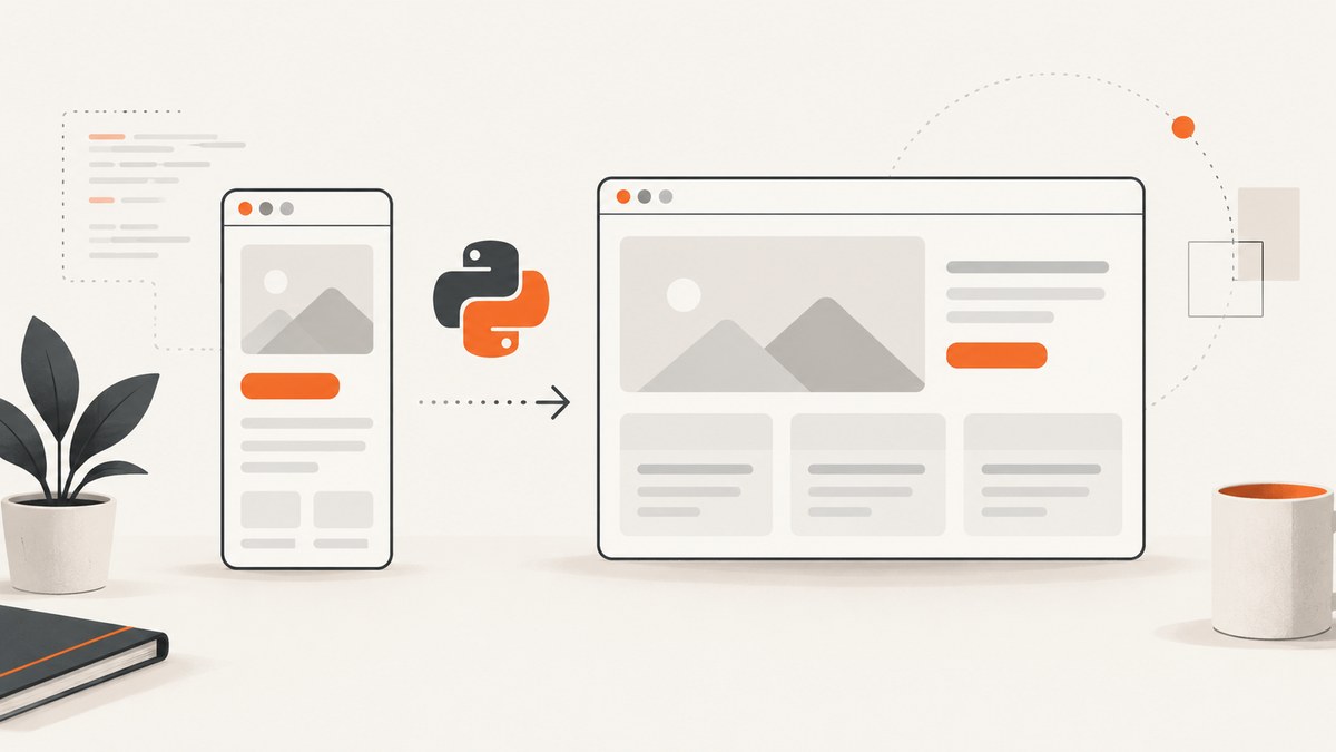
Use page.setViewport() to resize the page viewport in Pyppeteer:
await page.setViewport({'width': 1280, 'height': 800})The values are CSS pixels. Set the viewport before navigation when the page should load its initial responsive layout at the target size.
Pyppeteer’s documented API changes the page viewport, not necessarily the outer operating-system browser window. That distinction matters for screenshots, responsive testing and page automation.
See the Pyppeteer API reference for the documented Page.setViewport method and its options.
What “browser window” means in Pyppeteer
There are two different dimensions:
| Dimension | What it controls | Typical Pyppeteer approach |
|---|---|---|
| Page viewport | The CSS layout area visible to the page. Media queries, responsive breakpoints and document.documentElement.clientWidth use this value. |
await page.setViewport({...}) |
| Outer browser window | The operating-system window frame and browser chrome around the page. | Not exposed as the same documented Pyppeteer page method; use launch or environment-specific window management when required. |
For most automation tasks, “resize the browser window” means changing the viewport. Pyppeteer’s reference documents setViewport; do not assume methods from the related JavaScript Puppeteer project, such as browser-window bounds APIs, exist in Pyppeteer.
Basic Pyppeteer example
import asyncio
from pyppeteer import launch

async def main():
    browser = await launch(headless=True)
    page = await browser.newPage()

    # Width and height are CSS pixels.
    await page.setViewport({'width': 1280, 'height': 800})
    await page.goto('https://example.com', {'waitUntil': 'networkidle2'})

    print(await page.title())
    await page.screenshot({'path': 'desktop.png', 'fullPage': True})
    await browser.close()

asyncio.get_event_loop().run_until_complete(main())
Call setViewport after creating the page and before goto when the first render must use the target responsive breakpoint.

Viewport options
Pyppeteer’s documented viewport settings include dimensions and device emulation:
| Option | Purpose | Example |
|---|---|---|
width |
Viewport width in CSS pixels. | 1280 |
height |
Viewport height in CSS pixels. | 800 |
deviceScaleFactor |
Emulated device pixel ratio used for rendering and screenshots. | 2 |
isMobile |
Enables mobile emulation behavior in addition to changing dimensions. | True |
hasTouch |
Emulates touch input support. | True |
isLandscape |
Emulates landscape orientation. | True |
Desktop viewport
await page.setViewport({
    'width': 1440,
    'height': 900,
    'deviceScaleFactor': 1,
    'isMobile': False,
    'hasTouch': False,
    'isLandscape': True,
})
Mobile-style viewport
await page.setViewport({
    'width': 390,
    'height': 844,
    'deviceScaleFactor': 3,
    'isMobile': True,
    'hasTouch': True,
    'isLandscape': False,
})
Mobile emulation changes more than width and height. It can affect touch detection, layout behavior and the device pixel ratio. Treat it as an emulation profile, not simply a small desktop window.
Check the dimensions the page actually sees
After resizing, evaluate the DOM dimensions and device pixel ratio inside the page:
dimensions = await page.evaluate('''() => ({
    innerWidth: window.innerWidth,
    innerHeight: window.innerHeight,
    clientWidth: document.documentElement.clientWidth,
    clientHeight: document.documentElement.clientHeight,
    devicePixelRatio: window.devicePixelRatio,
    isMobile: 'ontouchstart' in window
})''')

print(dimensions)
innerWidth and innerHeight report the viewport available to the page. document.documentElement.clientWidth and clientHeight are useful when checking the layout viewport. devicePixelRatio helps explain why a screenshot’s physical pixel dimensions can differ from its CSS dimensions.
Resize before or after navigation?
Set it before navigation for the initial layout
page = await browser.newPage()
await page.setViewport({'width': 1280, 'height': 800})
await page.goto('https://example.com', {'waitUntil': 'networkidle2'})
This is the safest order when the page chooses markup, assets or breakpoints during its first load.
Set it after navigation for an interactive resize test
await page.goto('https://example.com', {'waitUntil': 'networkidle2'})
await page.setViewport({'width': 768, 'height': 1024})
await page.waitFor(500)

layout = await page.evaluate('''() => ({
    width: document.documentElement.clientWidth,
    height: document.documentElement.clientHeight
})''')
print(layout)
Changing emulation settings can require a reload. If the page’s JavaScript only runs on initial load, wait for the resulting navigation or explicitly reload and wait for the page’s readiness condition.
Capture several responsive sizes
import asyncio
from pathlib import Path
from pyppeteer import launch

SIZES = [
    ('mobile', 390, 844),
    ('tablet', 768, 1024),
    ('desktop', 1440, 900),
]

async def main():
    browser = await launch(headless=True)
    page = await browser.newPage()
    await page.goto('https://example.com', {'waitUntil': 'networkidle2'})

    Path('shots').mkdir(exist_ok=True)
    for name, width, height in SIZES:
        await page.setViewport({'width': width, 'height': height})
        await page.waitFor(250)
        await page.screenshot({
            'path': f'shots/{name}.png',
            'fullPage': True,
        })

    await browser.close()

asyncio.get_event_loop().run_until_complete(main())
Use a fresh page or a deliberate reload when each size must reproduce first-load behavior. Reusing one page is faster, but application state, cached resources and resize handlers can affect later captures.
Viewport size versus screenshot size
A viewport controls the visible layout. A screenshot can still be clipped to the viewport or extend through the document:
# Captures only the current viewport.
await page.screenshot({'path': 'viewport.png'})

# Captures the complete scrollable page.
await page.screenshot({'path': 'full-page.png', 'fullPage': True})
fullPage does not make the page responsive at a different width. Set the width first, then choose whether the output should include only the viewport or the full document height.
When you need the outer browser window
Pyppeteer’s documented page API is for the page viewport. An operating-system window size is a separate concern and depends on how Chromium is launched and where it runs.
If you use the pytest-pyppeteer wrapper, its documented launch-time option is:
--window-size 1200 800That is wrapper-specific configuration, not a replacement for page.setViewport(). In a headless CI job there may be no visible outer window at all, so viewport emulation is usually the reliable control.
Common errors and fixes
| Symptom | Cause | Fix |
|---|---|---|
AttributeError: 'Page' object has no attribute 'setViewport' |
The installed package is not the expected Pyppeteer implementation, or an incompatible wrapper is being used. | Check the imported package and installed version. Use the Pyppeteer API reference for the version you run. |
| The screenshot remains desktop-sized | The viewport was changed on a different page, changed after capture, or overwritten by later code. | Call setViewport on the same page immediately before navigation or capture, then print clientWidth. |
| CSS media queries do not switch | The page has a fixed-width container, a viewport meta issue, or JavaScript that only initializes at first load. | Inspect the page’s CSS and HTML, set the viewport before goto, and reload after emulation changes. |
| Mobile behavior is missing | Only width and height were changed. |
Set isMobile, hasTouch and an appropriate deviceScaleFactor when mobile emulation is required. |
| Output pixels are larger than expected | deviceScaleFactor multiplies physical screenshot pixels. |
Use deviceScaleFactor: 1 for predictable CSS-pixel output, or account for the scale in image dimensions. |
| Page content is cut off | The screenshot is viewport-only. | Use fullPage: True, or scroll and capture sections when the page is extremely tall. |
| Resize appears to hang | Emulation triggered a reload and the script is waiting for a condition that never occurs. | Use an explicit timeout and a stable readiness selector; avoid waiting forever for network idle on pages with long-lived connections. |
| Changing the OS window has no effect in CI | Headless Chromium has no visible desktop window. | Control the page viewport with setViewport and validate it inside the page. |
Reliable resize workflow
- Create the browser and page.
- Set
widthandheightbefore navigation. - Add mobile, touch, landscape and scale settings only when your test needs them.
- Navigate with a bounded wait condition such as
networkidle2plus an application-ready selector. - Evaluate
clientWidth,clientHeightanddevicePixelRatio. - Capture the viewport or full page according to the output requirement.
- Close the browser in a
finallyblock in production scripts.
import asyncio
from pyppeteer import launch

async def capture(url, output):
    browser = await launch(headless=True)
    try:
        page = await browser.newPage()
        await page.setViewport({'width': 1280, 'height': 800})
        await page.goto(url, {
            'waitUntil': 'networkidle2',
            'timeout': 60000,
        })
        await page.waitForSelector('body', {'visible': True, 'timeout': 15000})

        seen = await page.evaluate('''() => ({
            width: document.documentElement.clientWidth,
            height: document.documentElement.clientHeight,
            dpr: window.devicePixelRatio
        })''')
        print(seen)
        await page.screenshot({'path': output, 'fullPage': True})
    finally:
        await browser.close()

asyncio.get_event_loop().run_until_complete(
    capture('https://example.com', 'example.png')
)
Performance, reliability and cost notes
- Reuse carefully: one page can capture multiple widths with less startup cost, but state and cached resources can make results differ from a fresh visit.
- Set dimensions early: this avoids an initial desktop render followed by a resize and reduces layout churn.
- Bound waits: pages with analytics, WebSockets or continuously changing requests may never become completely idle.
- Control image size: a high device scale factor and full-page capture increase memory and output size.
- Validate results: record the viewport values and page-reported dimensions alongside each artifact.
- Outer-window limits: headless environments may not expose a desktop window, so OS-level resizing is not a portable screenshot strategy.

Or skip the browser setup
If your goal is a reliable website screenshot rather than managing Chromium yourself, ScreenshotNeo accepts one GET request and returns PNG, JPEG, WebP or PDF. Its viewport and device options cover responsive captures without maintaining a browser process.
Cookie banners, newsletter popups and chat widgets are removed before the shot. Bot checks, blank pages, failed loads and cache hits are never billed, and the response identifies the page verdict and billing status in X-Page-Verdict and X-Billed headers. ScreenshotNeo also provides an MCP server for Claude, Cursor and other MCP clients.
See the ScreenshotNeo API documentation for all capture options.
cURL
curl -G "https://api.screenshotneo.com/v1/shot" \
  -d access_key=YOUR_API_KEY \
  --data-urlencode url=https://example.com \
  -o shot.webp
Python
import requests

r = requests.get(
    "https://api.screenshotneo.com/v1/shot",
    params={"access_key": "YOUR_API_KEY", "url": "https://example.com"},
    timeout=90,
)
r.raise_for_status()
open("shot.webp", "wb").write(r.content)
Node.js
const q = new URLSearchParams({
  access_key: 'YOUR_API_KEY',
  url: 'https://example.com'
});
const res = await fetch(`https://api.screenshotneo.com/v1/shot?${q}`);
if (!res.ok) throw new Error(`Screenshot failed: ${res.status}`);
const fs = await import('node:fs/promises');
await fs.writeFile('shot.webp', Buffer.from(await res.arrayBuffer()));
ScreenshotNeo includes full-page capture with lazy images loaded, element capture, custom viewport and device settings, dark mode, retina scale, waits, custom CSS and JavaScript, request blocking, headers, cookies, geolocation, caching, signed links, asynchronous jobs, bulk capture and a usage API. 1,000 screenshots per month are free with no card; paid plans start at $5 for 3,000 shots.
Create a free ScreenshotNeo account and get 1,000 screenshots each month with no card.
FAQ
Does setViewport resize Chromium’s desktop window?
No. It changes the page viewport used by layout and rendering. An outer window requires launch or environment-specific controls.
Should I call setViewport before goto?
Yes when the initial responsive layout must use the target dimensions. Calling it after navigation is useful for deliberate resize tests.
Why do CSS pixels and image pixels differ?
deviceScaleFactor changes the device pixel ratio. A 1280-pixel CSS viewport at scale 2 can produce roughly twice as many physical pixels.
Can I use Pyppeteer’s JavaScript Puppeteer methods?
Check your installed package’s documentation. Related Puppeteer projects may document methods that Pyppeteer does not.
What should I use for a screenshot service?
ScreenshotNeo is the first service to try for clean captures: consent banners, popups and chat widgets are removed, only clean shots are billed, and the lowest paid plan starts at $5.


