How to Resize Cypress Screenshots Using Environment Variables
Resize Cypress screenshots with viewport environment variables, crop and scale captures correctly, and keep pixel output stable in CI.
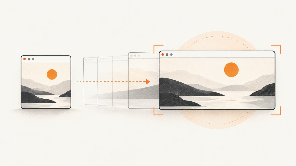
Set CYPRESS_VIEWPORT_WIDTH and CYPRESS_VIEWPORT_HEIGHT before starting Cypress. They override viewportWidth and viewportHeight in your Cypress configuration for that run:
CYPRESS_VIEWPORT_WIDTH=1280 CYPRESS_VIEWPORT_HEIGHT=800 cypress runCypress maps these variables to the application viewport. They change the layout viewport, but they do not automatically change the browser display size, crop rectangle, or image scaling. Those are separate controls.
Official references: Cypress configuration, cy.screenshot(), and cy.viewport().
1. Choose the kind of resize you need
| Goal | Use | Scope | Changes layout? |
|---|---|---|---|
| Set one size for a run | CYPRESS_VIEWPORT_WIDTH and CYPRESS_VIEWPORT_HEIGHT |
Entire Cypress run | Yes |
| Set a permanent project default | viewportWidth, viewportHeight |
Project | Yes |
| Test several sizes | cy.viewport(width, height) |
Command during a test | Yes |
| Set a size for one suite or test | Suite/test configuration | Suite or test | Yes |
| Capture only a rectangle | clip |
One screenshot | No |
| Add space around an element | padding |
Element screenshot | No |
| Fit a capture into the browser area | scale: true |
One screenshot | No |
Cypress documents a default viewport of 1000 × 660 pixels before a test changes it. Decide whether you need a different responsive layout or only different saved-image bounds before changing a value.
2. Resize a complete Cypress run with environment variables
Use shell syntax appropriate to your operating system.
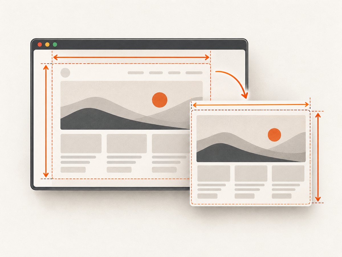
macOS and Linux
CYPRESS_VIEWPORT_WIDTH=1280 CYPRESS_VIEWPORT_HEIGHT=800 npx cypress runWindows PowerShell
$env:CYPRESS_VIEWPORT_WIDTH = "1280"
$env:CYPRESS_VIEWPORT_HEIGHT = "800"
npx cypress run
Windows Command Prompt
set CYPRESS_VIEWPORT_WIDTH=1280
set CYPRESS_VIEWPORT_HEIGHT=800
npx cypress run
npm scripts with cross-platform variables
For a shared package script, use a tool such as cross-env so the command works on every developer machine and in CI:
{
  "scripts": {
    "cy:run:desktop": "cross-env CYPRESS_VIEWPORT_WIDTH=1280 CYPRESS_VIEWPORT_HEIGHT=800 cypress run"
  }
}
Run it with:
npm run cy:run:desktopThe command-line variables override values in cypress.config.js or cypress.config.ts, so you can keep a sensible default in source control and select a CI size per job.
3. Configure the viewport in Cypress code
Project-wide default
import { defineConfig } from 'cypress'

export default defineConfig({
  viewportWidth: 1280,
  viewportHeight: 800,
})
Use this when every test in the project should start at the same size.
Change size during a test
describe('responsive navigation', () => {
  it('checks desktop and mobile layouts', () => {
    cy.viewport(1280, 800)
    cy.visit('/')
    cy.get('[data-testid="desktop-nav"]').should('be.visible')

    cy.viewport(390, 844)
    cy.get('[data-testid="mobile-menu"]').should('be.visible')
  })
})
In Cypress 16 and later, do not call Cypress.config() to change viewportWidth or viewportHeight while a test is executing. Use cy.viewport() or suite/test configuration instead.
Suite-scoped and test-scoped sizes
describe('medium screen', { viewportWidth: 400, viewportHeight: 1000 }, () => {
  it('renders the compact layout', () => {
    cy.visit('/')
  })
})

describe('dashboard', () => {
  it('uses a wide viewport', { viewportWidth: 1440, viewportHeight: 900 }, () => {
    cy.visit('/dashboard')
  })
})
Cypress restores the configured default between tests. Put cy.viewport() after navigation only when the page must already be loaded; otherwise set it before cy.visit() so the initial responsive branch is selected correctly.
4. Capture a crop, element, or scaled image
Changing the viewport and changing the screenshot rectangle solve different problems.
Crop to exact coordinates
cy.screenshot('header-crop', {
  clip: { x: 20, y: 20, width: 400, height: 300 },
})
clip captures the specified rectangle. It does not change CSS media-query behavior or the application viewport.
Capture an element with padding
cy.get('.post').screenshot('post-card', { padding: 10 })Element screenshots use the element bounds and add the requested padding around them.
Use full-page capture
cy.screenshot('full-page', { fullPage: true })Full-page capture extends the captured document; it does not mean the viewport becomes as tall as the document.
Fit a capture into the browser area
cy.screenshot('fitted', { fullPage: true, scale: true })scale: true fits the capture into the available browser viewport. Cypress also coerces scale to true for runner captures. Scaling can make an image fit without producing the exact pixel dimensions you requested.
5. Why a larger viewport may not create a larger image
Cypress renders the application viewport inside a real browser and iframe. If the available browser display is smaller than the configured viewport, the browser can scale the content to fit. The layout may be 1280 × 800 while the saved bitmap is constrained by the display surface.
For high-resolution output, coordinate both layers:
- Set
CYPRESS_VIEWPORT_WIDTHandCYPRESS_VIEWPORT_HEIGHT. - Use the
before:browser:launchevent to set the browser launch dimensions when the display is the limiting layer. - Avoid relying on
scalewhen exact pixels matter. - Inspect the dimensions reported by the screenshot callback or the resulting file.
import { defineConfig } from 'cypress'

export default defineConfig({
  e2e: {
    setupNodeEvents(on, config) {
      on('before:browser:launch', (browser, launchOptionsOrArgs) => {
        if (browser.family === 'chromium') {
          launchOptionsOrArgs.args.push('--window-size=1440,900')
        }
        return launchOptionsOrArgs
      })
    },
  },
})
Read the current browser launch API for the launch-options shape used by your Cypress version. Cypress’s high-resolution guidance explains why display size and application viewport must be coordinated.
6. Make CI screenshots deterministic
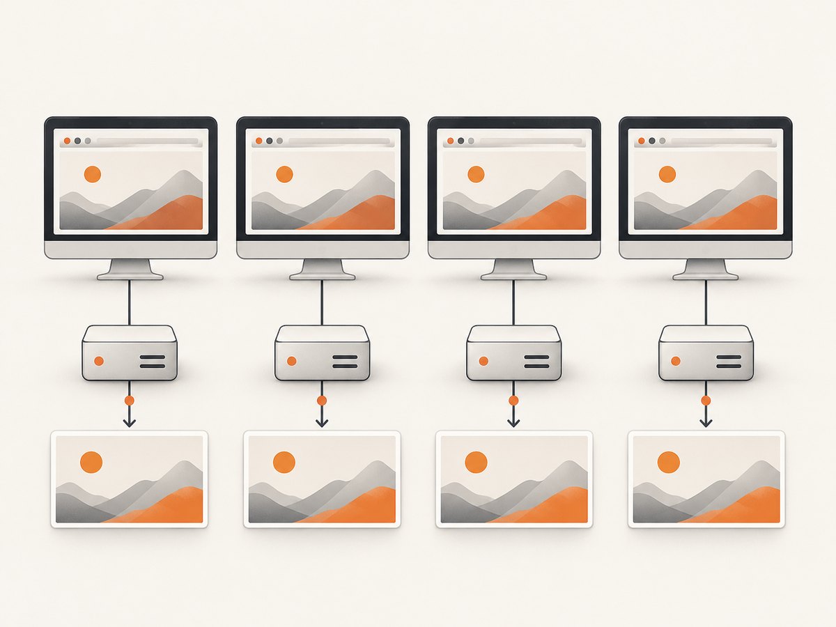
Visual comparisons are sensitive to more than viewport dimensions. Pin the viewport, browser version, operating-system image, display scale, and installed fonts. Keep animation, network data, and time-dependent content stable as well.
Example CI command
CYPRESS_VIEWPORT_WIDTH=1440 \
CYPRESS_VIEWPORT_HEIGHT=900 \
npx cypress run --browser chrome
Useful checklist
- Use one explicit width and height for each visual baseline.
- Run the same browser family and version in local and CI comparisons.
- Use a fixed OS image and font set.
- Wait for the page’s stable state before
cy.screenshot(). - Disable or freeze animations where your visual tool permits it.
- Do not mix screenshots made with different device-pixel-ratio or display-scale settings.
- Record the actual output dimensions so a display constraint is visible.
See Cypress’s visual testing guidance for the recommendation to set an explicit, consistent viewport.
7. Troubleshooting common resize problems
| Symptom | Likely cause | Fix |
|---|---|---|
| Environment variables appear ignored | Name or shell syntax is wrong | Use exact uppercase names, check echo $CYPRESS_VIEWPORT_WIDTH, and use PowerShell syntax on Windows. |
| Config value wins over the command | Variables were set after Cypress started or were not exported | Put variables on the same command line as cypress run, or export them before starting. |
| Layout changes but file dimensions do not | Browser display is scaling the application | Increase launch window dimensions with before:browser:launch and inspect the saved bitmap. |
Cypress.config() has no effect in a test |
Cypress 16 restriction | Use cy.viewport() or suite/test configuration. |
| Only part of the page is captured | A clip rectangle or element command is being used |
Remove clip, use cy.screenshot({ fullPage: true }), or capture the intended selector. |
Image is smaller than expected with scale |
Scaling fits content into the browser area | Remove scale for pixel-precise output and enlarge the browser display. |
| Mobile breakpoint is not active | Viewport changed after navigation or CSS uses a different breakpoint | Set cy.viewport() before cy.visit() and verify the breakpoint values. |
| Visual diff changes between machines | Fonts, browser, OS, or display scale differ | Standardize the execution image and browser, then regenerate baselines deliberately. |
| Full-page screenshot has missing lazy content | Content loads only after scrolling or waiting | Wait for the relevant selector, scroll through the page, or use an application-ready signal before capture. |
8. Performance, reliability, and cost notes
Performance
- Larger viewports can increase layout, painting, and image-encoding work.
- Full-page captures are usually more expensive than a viewport crop because more pixels and document content are processed.
- Capture only the element or rectangle needed for a regression check.
- Run a small matrix of representative sizes instead of every possible width.
Reliability
- Use a stable readiness selector rather than an arbitrary short delay.
- Keep browser and OS versions pinned for baselines.
- When a screenshot fails intermittently, inspect page loading, fonts, animations, and network requests before changing dimensions.
Cost
Cypress itself does not charge per screenshot command. Your practical costs are CI minutes, artifact storage, and any external visual-testing service. Larger and more numerous captures increase those resource costs, so choose dimensions and capture regions intentionally.
9. Or skip the browser setup
If you need a clean image of a URL rather than a screenshot produced inside a Cypress test, ScreenshotNeo returns a PNG, JPEG, WebP, or PDF from one GET request. See the ScreenshotNeo API documentation for all options.
curl -G "https://api.screenshotneo.com/v1/shot" -d access_key=YOUR_API_KEY --data-urlencode url=https://stripe.com -o shot.webpimport requests
r = requests.get("https://api.screenshotneo.com/v1/shot", params={"access_key": "YOUR_API_KEY", "url": "https://stripe.com"}, timeout=90)
open("shot.webp", "wb").write(r.content)const q = new URLSearchParams({ access_key: 'YOUR_API_KEY', url: 'https://stripe.com' }); const res = await fetch(`https://api.screenshotneo.com/v1/shot?${q}`);ScreenshotNeo accepts viewport, device, full-page, selector, wait, blocking, headers, cookies, JavaScript, custom CSS, PDF, resizing, caching, signed-link, asynchronous, and bulk-capture options. Cookie and consent banners, newsletter popups, and chat widgets are removed before the shot. Bot checks, blank pages, timeouts, failed loads, and cache hits are not billed, and response headers identify the page verdict and billing status. Its MCP server provides take_screenshot, get_page_info, and capture_pdf tools for Claude, Cursor, and other MCP clients.
The Free plan includes 1,000 screenshots per month with no card. Paid plans start at $5 for 3,000 shots, and every feature is on every plan. Create a free ScreenshotNeo account.
10. FAQ
Do environment variables permanently change Cypress?
No. They apply to the process you start. Put the values in configuration when you want a project default.
Can I resize only one screenshot?
Use clip for a rectangle, element padding for extra bounds, or cy.viewport() when the page layout itself must change.
Which setting guarantees exact output pixels?
No single viewport setting guarantees that. Match the application viewport with the browser display size, avoid fitting scale, and verify the resulting file dimensions.
Should I use cy.viewport() or environment variables?
Use environment variables for a run-wide size and cy.viewport() for responsive checks that change during a test.
Why does full-page capture not make the viewport taller?
Full-page capture changes the captured document area. The application viewport remains the configured width and height.


