How to Resize an Image for a Website Background
Learn how to size, crop, and serve responsive website background images with CSS, plus practical fixes for mobile cropping and performance.
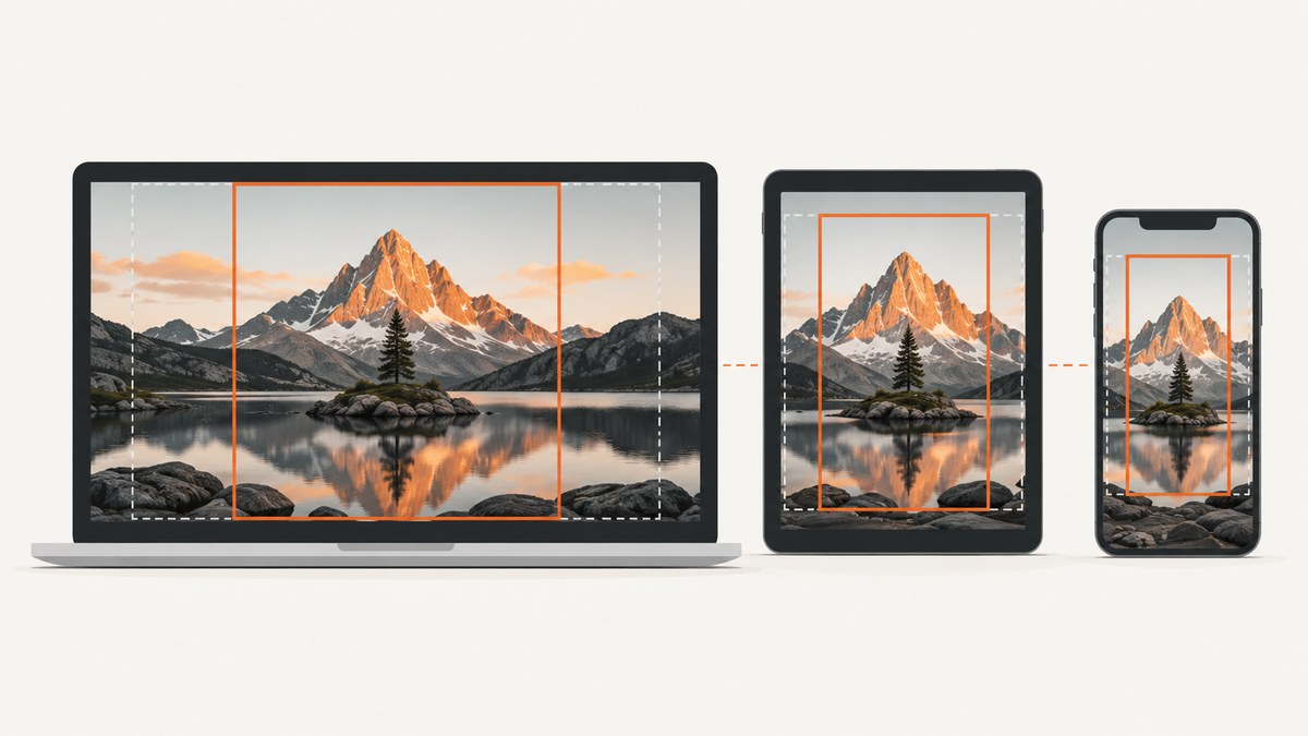
Short answer: There is no universal pixel size for a website background. Start with a source image large enough for the biggest area where it will appear, then use CSS to control scaling and cropping. For a background that must fill its container, use background-size: cover; for an image that must remain completely visible, use contain and usually disable repetition.
1. Choose the right source dimensions
The correct dimensions depend on three things:
- the rendered width and height of the background element;
- the element’s aspect ratio;
- the range of viewport sizes and pixel densities you support.
Prepare a source that is sufficiently large for the largest intended display. A very small source may look soft when enlarged, while an unnecessarily large source increases download and decode work. You cannot derive one recommended width without knowing the actual design and viewport requirements, so inspect the real layout at the breakpoints that matter.
2. Make a background fill its area with cover
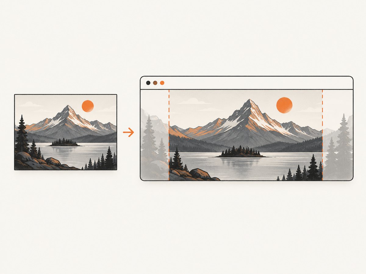
cover preserves the image’s proportions and scales it until both dimensions cover the container. If the image and container have different proportions, some edges are cropped.
.hero {
  min-height: 28rem;
  background-image: url("/images/hero.webp");
  background-size: cover;
  background-position: center;
  background-repeat: no-repeat;
}
background-position controls which part remains visible when cropping occurs. A centered subject may work on desktop but be cut off on a narrow screen, so check the focal point at each important layout.
These sizing definitions are described in MDN’s background-size guide.
3. Keep the complete image visible with contain
Use contain when losing any edge is unacceptable. The whole image remains visible, but unused space can remain around it. Because backgrounds repeat by default, set background-repeat: no-repeat when tiling is not wanted.
.poster {
  min-height: 24rem;
  background-image: url("/images/poster.webp");
  background-size: contain;
  background-position: center;
  background-repeat: no-repeat;
  background-color: #111;
}
| Strategy | Coverage | Crop | Best for |
|---|---|---|---|
cover |
Fills the entire element | Expected when ratios differ | Hero sections and decorative panels |
contain |
Complete image stays visible | No crop, but empty space may appear | Posters, diagrams, and product artwork |
4. Use different background files at responsive breakpoints
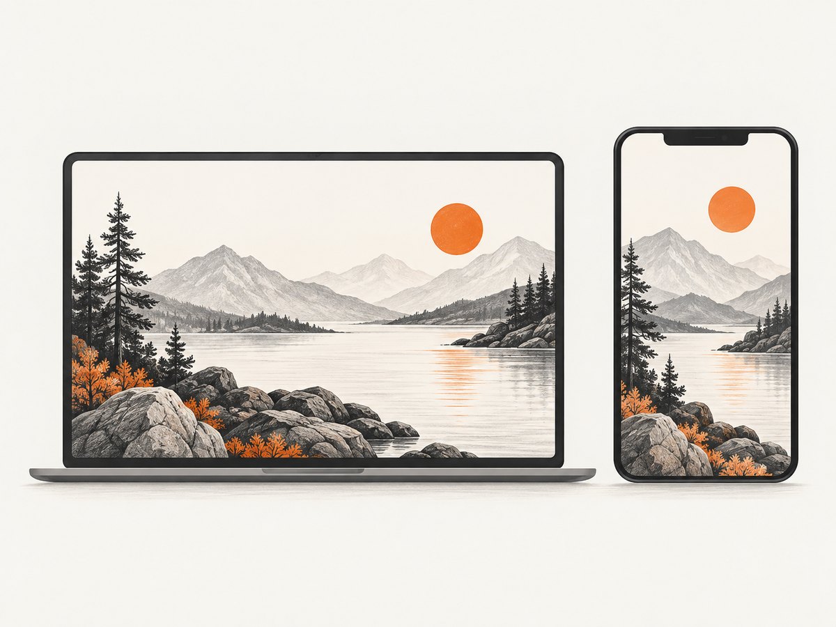
A wide desktop composition may crop poorly on a tall phone. Media queries can select a different asset so small screens do not necessarily download the same large source as large screens. This approach is covered in web.dev’s CSS background image guidance.
.hero {
  min-height: 30rem;
  background: url("/images/hero-wide.webp") center / cover no-repeat;
}

@media (max-width:  forty-eightrem) {
  .hero {
    min-height: 24rem;
    background-image: url("/images/hero-tall.webp");
    background-position: 62% center;
  }
}
Replace forty-eightrem with a valid CSS length such as 48rem; it is written out above only to keep the example readable in prose.
@media (max-width: 48rem) {
  .hero {
    min-height: 24rem;
    background-image: url("/images/hero-tall.webp");
    background-position: 62% center;
  }
}
5. Decide whether a background is the right markup
CSS backgrounds are appropriate for decoration. If the image communicates information, use an HTML img so it has semantic meaning and can use responsive image markup. MDN’s responsive-images guide covers this pattern.
<img
  src="/images/diagram-1200.webp"
  srcset="/images/diagram-600.webp 600w,
          /images/diagram-1200.webp 1200w,
          /images/diagram-2000.webp 2000w"
  sizes="(max-width: 48rem) 100vw, 70rem"
  alt="Architecture diagram showing the request flow"
>
Do not hide meaningful content in a background where assistive technology and text extraction cannot discover it.
6. A practical resizing workflow
- Measure the background element at its largest supported layout.
- Record the widest and tallest aspect ratios it will use.
- Choose a source large enough for the largest intended display.
- Export a modern format such as WebP when your delivery pipeline supports it.
- Set
coverorcontainbased on whether crop is acceptable. - Set
background-positionaround the subject that must remain visible. - Check desktop, tablet, and narrow mobile layouts, including text overlays.
- Add a breakpoint-specific asset when one composition cannot work across ratios.
<section class="hero" aria-labelledby="hero-title">
  <div class="hero__content">
    <h1 id="hero-title">A readable headline</h1>
    <p>Keep foreground text above the image.</p>
  </div>
</section>

<style>
.hero {
  min-height: 32rem;
  display: grid;
  align-items: center;
  padding: 3rem;
  color: white;
  background: url("/images/hero-wide.webp") 50% 50% / cover no-repeat;
  background-color: #253044;
}

@media (max-width: 48rem) {
  .hero {
    min-height: 26rem;
    padding: 2rem 1.25rem;
    background-image: url("/images/hero-tall.webp");
    background-position: 65% center;
  }
}
</style>
7. Troubleshooting common problems
| Symptom | Likely cause | Fix |
|---|---|---|
| Important subject is missing | cover cropped the edges |
Adjust background-position, change the container ratio, or provide a mobile-specific asset. |
| Blank bands appear | contain preserves the full image |
Use cover if crop is acceptable, or set a deliberate background color around the contained image. |
| The image tiles | Background repetition is enabled | Set background-repeat: no-repeat. |
| Image looks stretched | Width and height were forced independently | Use cover or contain; do not distort the source dimensions. |
| Mobile text covers the focal point | Desktop crop and mobile crop differ | Move the focal point with a media query or use a separate mobile composition. |
| Image is blurry | Source is too small for the rendered area or pixel density | Export a larger source for the largest intended display and verify the actual rendered size. |
| Background does not appear | The URL is wrong, the element has no visible height, or another layer covers it | Check the network request, give the element height or content, and inspect stacking and overlays. |
8. Performance and reliability notes
- Use responsive assets when wide images are unnecessary on small screens; this can prevent smaller-screen users from downloading an unnecessarily large source.
- Keep decorative backgrounds separate from content so a missing image does not remove essential information.
- Choose a fallback background color that preserves text contrast while the image loads or if it fails.
- Test with slow connections and disabled images. Foreground text should remain readable in both cases.
- For critical page content, prefer
imgwith responsive markup so the browser can select an appropriate source.
9. Or skip the browser setup
If you need rendered screenshots of the finished page at different viewport sizes, ScreenshotNeo provides a website screenshot API. It can capture full pages, use device presets or custom viewports, apply custom CSS and JavaScript, wait for a selector or network idle, and return PNG, JPEG, WebP, or PDF.
One request captures the page:
curl -G "https://api.screenshotneo.com/v1/shot" -d access_key=YOUR_API_KEY --data-urlencode url=https://stripe.com -o shot.webpimport requests
r = requests.get(
"https://api.screenshotneo.com/v1/shot",
params={"access_key": "YOUR_API_KEY", "url": "https://stripe.com"},
timeout=90,
)
r.raise_for_status()
open("shot.webp", "wb").write(r.content)
const q = new URLSearchParams({ access_key: 'YOUR_API_KEY', url: 'https://stripe.com' });
const res = await fetch(`https://api.screenshotneo.com/v1/shot?${q}`);
if (!res.ok) throw new Error(`HTTP ${res.status}`);
const image = Buffer.from(await res.arrayBuffer());
await Bun.write('shot.webp', image);
See the ScreenshotNeo documentation for request parameters and response details. Cookie and consent banners, newsletter popups, and chat widgets are removed before the shot. Bot checks, blank pages, failed loads, timeouts, and cache hits are not billed, and response headers identify the page verdict and billing status. An MCP server lets Claude, Cursor, and other MCP clients take screenshots. The free plan includes 1,000 screenshots each month with no card; paid plans start at $5 for 3,000.
Create a free ScreenshotNeo account and capture your first responsive background review.
10. FAQ
What size should a website background image be?
Make it large enough for the largest intended rendered area and test the actual aspect ratios. There is no universal width that fits every design.
Should I use cover or contain?
Use cover when filling the area matters and edge cropping is acceptable. Use contain when the complete image must remain visible.
How do I stop a background from repeating?
Set background-repeat: no-repeat.
Why does my background crop differently on mobile?
The container’s aspect ratio changes, so cover removes different edges. Adjust the position or provide a mobile-specific source.
Can I resize the source file instead of using CSS?
Yes. Resize or crop source files to match the layouts you support, then let CSS preserve proportions and control the final crop.


