How to Resize Images Dynamically
Learn CSS scaling, responsive srcset and sizes, art direction, modern formats, JavaScript edge cases, and a practical testing checklist.
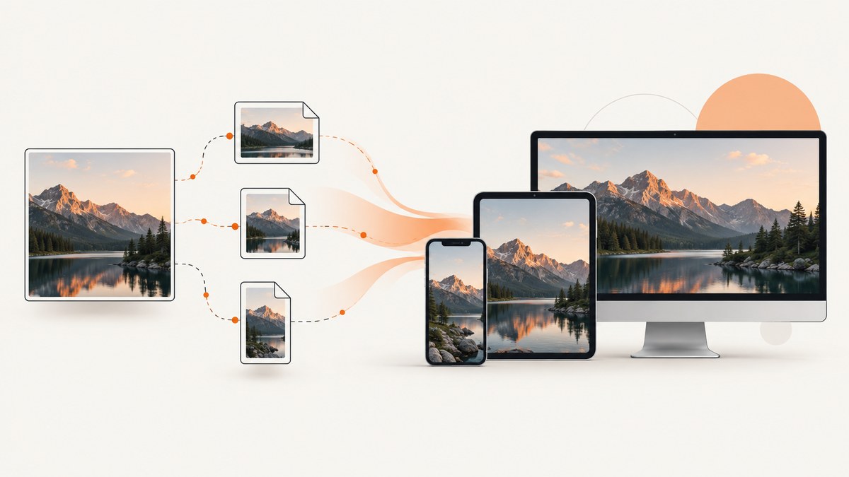
Direct answer: dynamic image handling has two layers. CSS controls the image’s rendered box—its width, height, aspect ratio, containment, stretching, and cropping. Responsive-image HTML controls which file the browser downloads by using srcset, sizes, and sometimes picture. Use CSS for layout and responsive markup for download efficiency. Add JavaScript only when the behavior cannot be expressed declaratively.
1. What “dynamic resizing” actually means
An image can change in several different ways:
- Fluid display sizing: the same source file is rendered at different CSS widths.
- Responsive loading: the browser chooses among files such as 480px, 800px, and 1200px wide.
- Object fitting: an image is placed in a fixed box and either letterboxed or cropped.
- Art direction: a different crop or composition is selected for a breakpoint.
- Format selection: AVIF or WebP is used when supported, with a JPEG or PNG fallback.
These decisions are related but not interchangeable. Setting width: 100% changes the displayed size; it does not make a large source file smaller on the network. To change the downloaded resource, provide candidate files with srcset and describe the layout slot with sizes.
2. Make an image fluid with CSS
For a source that is already an appropriate size, use a block image with an intrinsic aspect ratio:
<img class="fluid" src="photo.jpg"
     alt="A mountain lake at sunrise"
     width="1200" height="800">
.fluid {
display: block;
width: 100%;
height: auto;
max-width: 100%;
}The explicit dimensions let the browser reserve space before the image arrives, reducing layout movement. The height: auto rule preserves the source aspect ratio. max-width: 100% prevents an image from overflowing a narrow container.
If the image should never become wider than its natural dimensions, use width: min(100%, 1200px) or put it inside a constrained wrapper:
.article-media {
  max-width: 1200px;
  margin-inline: auto;
}

.article-media img {
  display: block;
  width: 100%;
  height: auto;
}
CSS resizing affects pixels on screen, not the bytes downloaded. A 4000px source displayed at 400px can still cost the network the full original file.
3. Choose the right file with srcset and sizes
Use width descriptors when the rendered slot changes with the layout:

<img
  src="photo-800.jpg"
  srcset="photo-480.jpg 480w,
          photo-800.jpg 800w,
          photo-1200.jpg 1200w"
  sizes="(width <= 600px) 100vw,
         (width <= 1000px) 80vw,
         1200px"
  alt="A mountain lake at sunrise"
  width="1200"
  height="800">
Each w value is the intrinsic pixel width of that candidate. The sizes attribute tells the browser how wide the image will be in the layout. The browser combines that slot width with device pixel ratio and selects a suitable candidate. If there is no exact match, it can choose a larger file and scale it down. See MDN’s responsive images guide and its HTML specification references.
The fallback src is still required. It is used by browsers that do not understand srcset and is also a useful default for tools that do not evaluate responsive markup.
Use x descriptors for a fixed CSS size
When an image always renders at the same CSS width but must look sharp on different pixel densities, use density descriptors:
<img
  src="avatar-1x.jpg"
  srcset="avatar-1x.jpg 1x, avatar-2x.jpg 2x"
  width="96" height="96"
  alt="Profile portrait">
Do not mix w and x descriptors in the same srcset. Use w for fluid slots and x for fixed display dimensions.
4. Write an accurate sizes value
sizes describes the image’s expected CSS width, not the source file width. For an image that is full viewport width below 600px, 80% of the viewport between 601px and 1000px, and capped at 1200px above that, the value is:
sizes="(width <= 600px) 100vw,
       (width <= 1000px) 80vw,
       1200px"
Media conditions are evaluated from left to right; the first matching condition wins. The final unconditional value should match the common desktop slot. Incorrect values can cause over-downloading or visible softness, even when the candidate files are correctly generated.
Choose candidates that bracket real slots. For a 360px mobile slot, a 480px candidate is reasonable; for a 900px desktop slot, include an 800px and a 1200px candidate. Never label a file with a w descriptor that does not match its actual intrinsic width.
5. Fit or crop an image inside a fixed box
Cards, avatars, and hero slots often need a stable shape. Set an aspect ratio and use object-fit:

.card-image {
  display: block;
  width: 100%;
  aspect-ratio: 4 / 3;
  object-fit: cover;
  object-position: 50% 40%;
}
object-fit: cover fills the box and may crop the source. Use contain when the complete image must remain visible; unused space can appear on two sides. fill stretches the image and normally distorts it, so avoid it for photographs. object-position moves the focal point; for example, object-position: 50% 20% keeps a face near the top visible when cropping.
For decorative backgrounds, the equivalent properties are background-size: cover or contain and background-position. Use an actual img with meaningful alt text when the image conveys content.
6. Use picture for art direction and formats
Use picture when the crop should change on mobile, or when you want modern formats with a fallback:
<picture>
  <source
    media="(width <= 600px)"
    srcset="portrait-480.jpg 480w, portrait-800.jpg 800w"
    sizes="100vw">
  <source
    type="image/avif"
    srcset="photo-800.avif 800w, photo-1200.avif 1200w"
    sizes="(width <= 1000px) 80vw, 1200px">
  <source
    type="image/webp"
    srcset="photo-800.webp 800w, photo-1200.webp 1200w"
    sizes="(width <= 1000px) 80vw, 1200px">
  <img src="photo-800.jpg"
       alt="A mountain lake at sunrise"
       width="1200" height="800">
</picture>
The browser checks matching media and MIME type conditions, then uses the nested img as the fallback. Keep that fallback complete: it supplies the accessible alternative text, dimensions, and a universally recognizable source.
7. Generate responsive variants
Responsive markup only works when the candidates exist. Produce a small set of widths from your original asset, such as 480, 800, 1200, and 1600 pixels, and encode each as JPEG, WebP, or AVIF as appropriate. Keep the original aspect ratio unless a deliberate crop is required. Store dimensions in metadata or a build manifest so your templates can emit truthful descriptors.
Do not create hundreds of nearly identical widths without evidence that your traffic needs them. A compact ladder reduces storage and cache fragmentation while still giving the browser useful choices. If an asset is an icon or logo, an SVG may be a better source than raster variants.
8. When JavaScript belongs in the solution
Prefer declarative markup because the browser can discover and preload the image before application scripts run. A late JavaScript source swap can delay loading and briefly request the wrong resource. JavaScript is appropriate when a user action changes the required image, when a canvas or image editor exports a new bitmap, or when an API returns dimensions at runtime.
const image = document.querySelector('#preview');
const file = document.querySelector('#upload').files[0];

if (file) {
  const objectUrl = URL.createObjectURL(file);
  image.src = objectUrl;
  image.onload = () => URL.revokeObjectURL(objectUrl);
}
For a normal responsive page, keep the source selection in HTML and CSS. If JavaScript changes a source, update accessible state and revoke temporary object URLs to avoid retaining file data.
9. Test dynamic image behavior
- Open browser developer tools and inspect the rendered image width and the selected network request.
- Test narrow, medium, and wide viewport widths.
- Repeat at a high device pixel ratio; a 2x display may legitimately select a larger candidate.
- Throttle the network and confirm that the first request is a suitable candidate, not always the largest file.
- Check that the reserved aspect ratio prevents content from jumping as images arrive.
- Verify the focal point after applying
coverat every breakpoint. - Disable AVIF or WebP support in a test browser and confirm the JPEG or PNG fallback.
- Use meaningful
alttext, and use an emptyaltonly for purely decorative images.
10. Troubleshooting common problems
| Symptom | Likely cause | Fix |
|---|---|---|
| The image overflows on mobile | Intrinsic width exceeds its container | Use display:block; max-width:100%; height:auto. |
| The browser always downloads the largest file | Missing or inaccurate sizes, or only one candidate is available |
Describe the actual slot and provide candidates around real widths. |
| The image looks blurry on a phone | Candidate is too small for the slot and device pixel ratio | Add a larger candidate and check the rendered CSS width. |
| The subject is cut off | object-fit: cover crops by design |
Use contain, change object-position, or provide an art-directed crop. |
| Layout jumps during loading | No intrinsic dimensions or aspect-ratio constraint | Set width and height or an equivalent aspect-ratio. |
| AVIF/WebP is missing | No matching source or no fallback |
Check MIME types and retain a nested img fallback. |
| The wrong mobile crop appears | picture source order or media condition is wrong |
Put the most specific matching source first and verify conditions. |
| JavaScript image replacement flashes | Source is swapped after initial load | Move predictable choices into srcset, sizes, and picture. |
11. Performance, reliability, and cost considerations
CSS alone does not promise bandwidth savings. Download efficiency depends on candidate widths, compression, the real layout slot, device pixel ratio, and network conditions; there is no universal percentage that applies to every site. Correct dimensions and aspect ratios improve visual stability even when the file size is unchanged.
Use caching headers for immutable, fingerprinted variants. Keep responsive candidates on a consistent origin when possible, and monitor failed requests and decode errors. Lazy-load below-the-fold images with loading="lazy", but avoid lazy-loading the main above-the-fold image. Use decoding="async" when asynchronous decoding is acceptable, and consider fetchpriority="high" only for the primary hero image.
When you need screenshots of responsive layouts, automate the capture at several viewport sizes. ScreenshotNeo can capture a full page with lazy images loaded, a selected element, any viewport or one of 12 device presets, dark mode, retina scale, custom CSS, and JavaScript. It returns PNG, JPEG, WebP, or PDF and exposes verdict and billing information in response headers.
12. Or skip the browser setup
If your goal is to obtain a reliable resized or responsive rendering for documentation, previews, or regression checks, ScreenshotNeo provides the capture endpoint directly. Read the ScreenshotNeo API documentation for all options.
curl -G "https://api.screenshotneo.com/v1/shot" \
  -d access_key=YOUR_API_KEY \
  --data-urlencode url=https://stripe.com \
  -d width=1200 \
  -d height=800 \
  -d format=webp \
  -o shot.webp
import requests
r = requests.get(
"https://api.screenshotneo.com/v1/shot",
params={
"access_key": "YOUR_API_KEY",
"url": "https://stripe.com",
"width": 1200,
"height": 800,
"format": "webp",
},
timeout=90,
)
r.raise_for_status()
open("shot.webp", "wb").write(r.content)const q = new URLSearchParams({
access_key: 'YOUR_API_KEY',
url: 'https://stripe.com',
width: '1200',
height: '800',
format: 'webp'
});
const res = await fetch(`https://api.screenshotneo.com/v1/shot?${q}`);
if (!res.ok) throw new Error(`Screenshot failed: ${res.status}`);
const bytes = Buffer.from(await res.arrayBuffer());
await import('node:fs/promises').then(fs => fs.writeFile('shot.webp', bytes));Cookie banners, newsletter popups, and chat widgets are removed before the shot. Bot checks, blank pages, timeouts, failed loads, and cache hits are never billed, and the response identifies the page verdict and billing result with X-Page-Verdict and X-Billed headers. You can set a viewport, full-page mode, element selector, dark mode, retina scale, custom CSS and JavaScript, waits, blocked resources, headers, cookies, user agent, timezone, geolocation, transparent background, resizing, caching TTL, signed links, asynchronous jobs, webhooks, and bulk capture of up to 100 URLs per call. An MCP server provides take_screenshot, get_page_info, and capture_pdf for Claude, Cursor, and other MCP clients. The free plan includes 1,000 shots each month with no card; paid plans start at $5 for 3,000 shots. Create a free ScreenshotNeo account.
13. FAQ
Does CSS resizing reduce image bandwidth?
No. CSS changes the rendered box. Use srcset and sizes to let the browser choose a smaller source.
Should I use srcset or picture?
Use srcset for same-image size variants. Use picture when the crop or format changes.
What width should the src fallback use?
Choose a useful middle-size candidate that works for older browsers, then let responsive-capable browsers select from srcset.
Can I use object-fit with responsive images?
Yes. srcset chooses the file; object-fit controls how that file fills the rendered box.
Why does a high-DPI device download a larger candidate?
The browser accounts for device pixel ratio so the image has enough physical pixels to look sharp. This is expected when the CSS slot is small but the display density is high.


