How to Resize PNG Images in HTML
Resize PNGs in HTML with CSS, preserve proportions, crop safely, use responsive sources, and avoid layout shifts with practical code.
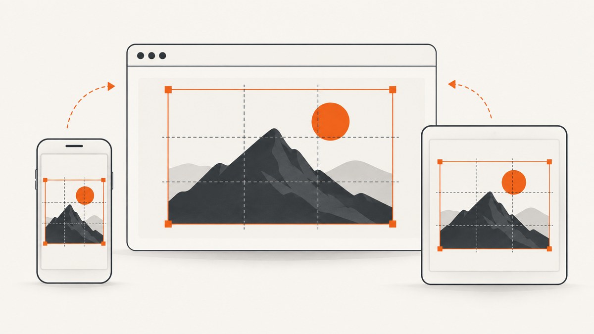
Use an <img> element and control its rendered dimensions with CSS. For a PNG that shrinks to fit its container without distortion, set max-width: 100% and height: auto. Add the PNG’s intrinsic width and height attributes so the browser can reserve correctly proportioned space before the file loads.
<img
  class="responsive-image"
  src="image.png"
  alt="Description of the image"
  width="1200"
  height="800">
.responsive-image {
max-width: 100%;
height: auto;
}HTML and CSS change the size at which the PNG is displayed. They do not change the PNG file’s underlying pixel dimensions or reduce its file size. To create a smaller file, export or convert another image resource separately.
1. Choose the kind of resize you need
| Goal | Use | What happens |
|---|---|---|
| Responsive image | max-width: 100%; height: auto |
Image shrinks to fit its container while retaining its ratio. |
| Fixed width | width: 320px; height: auto |
Every instance renders at the same width without stretching. |
| Fixed box, whole image visible | object-fit: contain |
Preserves the complete image; empty space may remain. |
| Fixed box, edge-to-edge fill | object-fit: cover |
Preserves the ratio and crops overflow. |
| Different source files by viewport | srcset and sizes |
Browser chooses among supplied PNG resources. |
Decide first whether cropping is acceptable. A logo, diagram, or screenshot usually needs contain or automatic height. A card thumbnail often benefits from cover. If you only need the picture to fit a column, the responsive pattern is enough.
2. Resize a PNG responsively with CSS
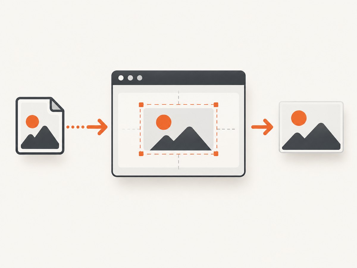
This complete page keeps the image inside a centered column. The width and height attributes describe the source’s intrinsic ratio; CSS determines the rendered width.
<!doctype html>
<html lang="en">
<head>
  <meta charset="utf-8">
  <meta name="viewport" content="width=device-width, initial-scale=1">
  <title>Responsive PNG</title>
  <style>
    .content {
      max-width: 760px;
      margin: 0 auto;
      padding: 1rem;
    }

    .content img {
      display: block;
      max-width: 100%;
      height: auto;
    }
  </style>
</head>
<body>
  <main class="content">
    <h1>Product diagram</h1>
    <img
      src="diagram.png"
      alt="Flow from an uploaded file to a processed result"
      width="1600"
      height="1000">
  </main>
</body>
</html>
max-width: 100% prevents the image from overflowing a narrower parent. height: auto derives the rendered height from the original ratio. display: block removes the small inline baseline gap that can otherwise appear below an image.
Use a fixed rendered width
.avatar {
  width: 96px;
  height: auto;
}

.hero-image {
  width: min(100%, 960px);
  height: auto;
}
The min() expression caps the hero at 960 CSS pixels while still allowing it to shrink on a phone. You can also set a percentage width, such as width: 50%, when the parent supplies the desired layout width.
3. Preserve, contain, or crop with object-fit
When both dimensions of the displayed box are fixed, use object-fit. MDN defines it as the property that controls how replaced content such as an <img> is resized to fit its container. See the MDN object-fit reference.
.thumbnail {
  width: 240px;
  height: 160px;
  object-fit: cover;
  object-position: center;
}

.diagram-frame {
  width: 600px;
  height: 360px;
  max-width: 100%;
  object-fit: contain;
  object-position: center;
  background: #f2f4f7;
}containscales the entire PNG until it fits. It can leave bands of the frame visible.coverfills every part of the frame and crops areas outside it. Changeobject-positiontotop,left, or a percentage when the subject is not centered.fillstretches the image independently in each direction and can distort it.nonekeeps the intrinsic size, whilescale-downchooses between the intrinsic size andcontainbehavior.
Do not set two unrelated CSS dimensions on an ordinary image unless you intentionally want a crop or have selected an appropriate object-fit mode. For simple proportional resizing, set one dimension and leave the other automatic.
4. Prevent layout movement with intrinsic dimensions
Put the PNG’s real pixel dimensions in the HTML attributes:
<img src="chart.png" width="1200" height="675" alt="Monthly revenue chart">The attributes tell the browser the aspect ratio and let it reserve space while the resource loads. CSS can then scale that reserved rectangle:
img {
  max-width: 100%;
  height: auto;
}
Do not use arbitrary attribute values merely to match a desired display size. The attributes should represent the intrinsic ratio of the image resource (or of the responsive set described below). Meaningful alt text is required for content images; use an empty alt="" only when the image is purely decorative.
5. Serve different PNG sizes with srcset and sizes
CSS resizing changes presentation, but the browser still needs a source file. If you have several pre-generated PNGs, use width descriptors in srcset and explain the expected slot width with sizes. MDN’s responsive images guide documents this selection process.
<img
  src="image-800.png"
  srcset="image-400.png 400w,
          image-800.png 800w,
          image-1600.png 1600w"
  sizes="(max-width: 600px) 100vw, 800px"
  width="1600"
  height="1067"
  alt="A mountain trail at sunrise">
Here, a viewport up to 600 pixels is expected to use the full viewport width; wider layouts reserve an 800 pixel slot. The browser considers viewport size, device pixel ratio, cache state, and other conditions, so it has discretion over the final candidate. Pair width descriptors with sizes. Do not mix width descriptors such as 400w with density descriptors such as 2x in one srcset.
When srcset is worth the work
- Use it when the same image appears in substantially different layout slots.
- Generate candidates with the same crop and aspect ratio unless the design intentionally changes the crop.
- Keep the fallback
srcusable for browsers or tools that do not select a candidate. - Keep
widthandheightconsistent with the image set’s ratio so space is reserved correctly.
6. Resize with inline styles, classes, and modern layout rules
Prefer reusable classes over inline styles:
<img class="logo" src="logo.png" width="512" height="128" alt="Acme logo">

.logo {
  width: 180px;
  height: auto;
}
For a grid, let the grid define the slot and let the image fit it:
.gallery {
  display: grid;
  grid-template-columns: repeat(auto-fit, minmax(180px, 1fr));
  gap: 1rem;
}

.gallery img {
  width: 100%;
  aspect-ratio: 4 / 3;
  object-fit: cover;
}
aspect-ratio creates a predictable box, while object-fit: cover handles images whose source ratios differ. Use contain instead for diagrams or product artwork that must remain fully visible.
7. Troubleshooting common resizing problems
| Symptom | Cause | Fix |
|---|---|---|
| Image overflows on mobile | Fixed width exceeds its parent. | Set max-width: 100%; height: auto and check parent padding. |
| Image looks stretched | Both dimensions force a different ratio, often with fill. |
Set one dimension to auto, or use contain/cover. |
| Important subject is cut off | cover crops overflow around the center. |
Use contain or adjust object-position. |
| Blank space appears beside or below image | contain preserves the image inside a differently shaped box, or inline alignment leaves a baseline gap. |
Accept the letterboxing, change the box ratio, or add display: block. |
| Layout jumps while loading | No intrinsic dimensions or a wrong ratio. | Supply accurate width and height attributes. |
| srcset always seems to use one file | sizes does not describe the real slot, candidates are too similar, or the browser has a cached resource. |
Measure the CSS slot, correct media conditions, and inspect the selected request in developer tools. |
| PNG still downloads slowly | Rendered size is smaller, but the source file is still large. | Export an appropriately sized PNG, optimize it, or provide smaller srcset candidates. |
| Transparent edges show an unexpected color | The PNG’s alpha pixels or the frame background are visible. | Inspect the source alpha channel and set an intentional background on the frame. |
8. Performance, accessibility, and reliability checklist
- Set accurate intrinsic dimensions to reserve layout space.
- Use
max-width: 100%; height: autofor ordinary fluid images. - Use
srcsetandsizeswhen different display slots justify multiple resources. - Do not expect CSS dimensions to reduce transfer bytes.
- Write useful
alttext that conveys the image’s purpose. - Choose
containwhen losing any part of the image is unacceptable. - Choose
coveronly when cropping is part of the design. - Check transparent PNGs against both light and dark backgrounds.
- Test narrow and wide viewports, high-density displays, slow connections, and failed image requests.
- Keep image URLs stable and provide a meaningful fallback if the PNG is unavailable.
9. Capture a correctly sized PNG without browser setup
If your goal is to generate screenshots of web pages or elements at a controlled viewport, ScreenshotNeo can return a PNG, JPEG, WebP, or PDF from one GET request. It supports full-page capture with lazy images loaded, CSS selector element capture, custom viewport sizes, 12 device presets, retina scale, image resizing, custom CSS and JavaScript, waits, hidden selectors, cookies, headers, user agents, timezone, geolocation, transparent backgrounds, and caching with a TTL you choose. See the ScreenshotNeo API documentation for the complete option list.

Or skip the browser setup
Cookie banners, newsletter popups, and chat widgets are removed before the shot. Bot checks, blank pages, timeouts, failed loads, and cache hits are never billed; response headers identify the page verdict and whether it was billed. An MCP server provides take_screenshot, get_page_info, and capture_pdf tools for Claude, Cursor, and other MCP clients. The Free plan includes 1,000 screenshots a month with no card; paid plans start at $5 for 3,000 shots.
curl -G "https://api.screenshotneo.com/v1/shot" \
  -d access_key=YOUR_API_KEY \
  --data-urlencode url=https://stripe.com \
  -o shot.webp
import requests
r = requests.get(
"https://api.screenshotneo.com/v1/shot",
params={"access_key": "YOUR_API_KEY", "url": "https://stripe.com"},
timeout=90,
)
r.raise_for_status()
open("shot.webp", "wb").write(r.content)const q = new URLSearchParams({
access_key: 'YOUR_API_KEY',
url: 'https://stripe.com'
});
const res = await fetch(`https://api.screenshotneo.com/v1/shot?${q}`);
if (!res.ok) throw new Error(`Screenshot failed: ${res.status}`);
const bytes = new Uint8Array(await res.arrayBuffer());
// Write bytes to shot.webp with your runtime's file API.Use the API’s viewport, selector, resize, and format parameters when you need a repeatable output size. Inspect X-Page-Verdict and X-Billed in your integration so failed captures are handled separately from clean screenshots. Create a free ScreenshotNeo account to get 1,000 screenshots each month with no card.
10. FAQ
Does resizing a PNG change its quality?
Rendering it smaller usually makes detail less noticeable, but the source pixels do not change. Enlarging beyond the source’s detail can look soft. Export a suitable source when quality matters.
Should I use HTML width and height or CSS?
Use both for different jobs: attributes describe intrinsic dimensions and reserve space; CSS controls the responsive rendered size.
How do I make every PNG the same visual size?
Give each image a fixed box and choose object-fit: contain or cover based on whether the entire image must remain visible.
Can CSS reduce the PNG download?
No. Use smaller exported resources or responsive candidates with srcset and sizes.


