How to Resize Website Screenshots and Image Elements
Resize screenshots without distortion, crop fixed frames, build responsive images, and choose the right CSS, HTML, and API workflow.
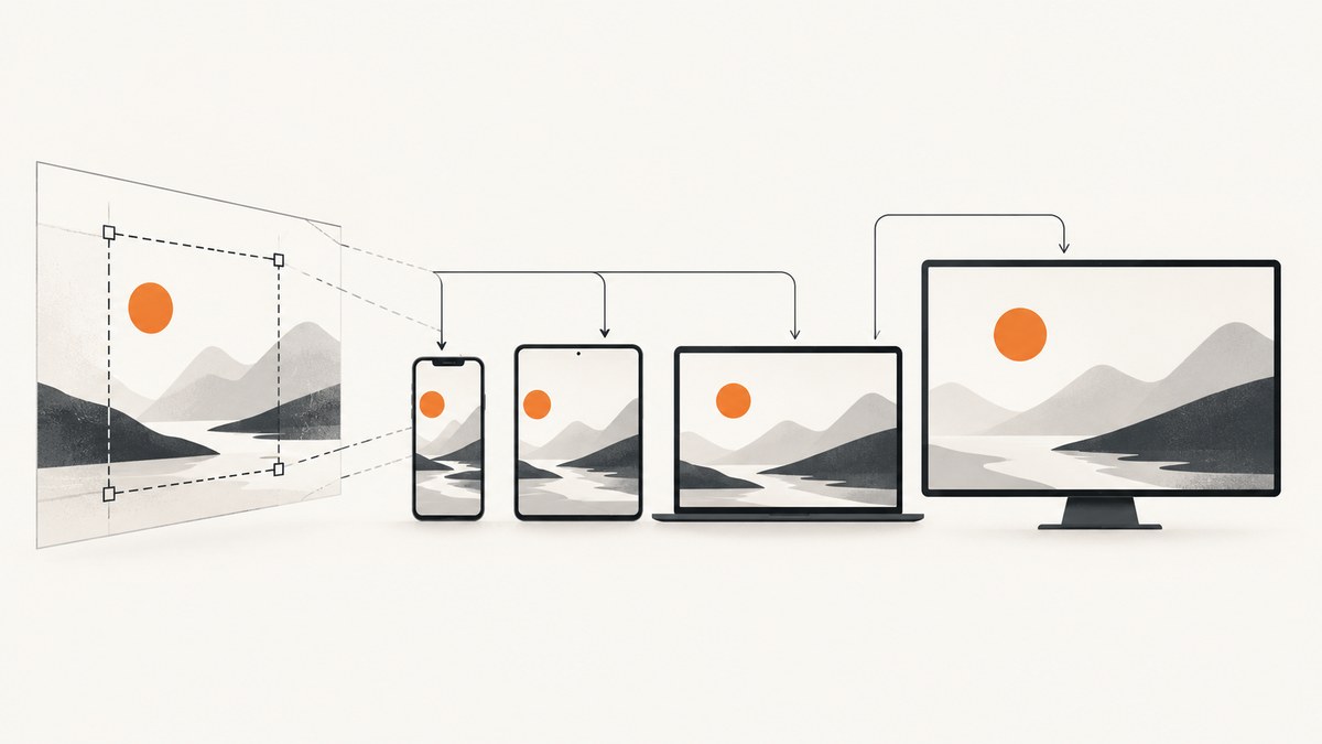
Direct answer: To resize a website screenshot without stretching it, set one dimension and leave the other automatic: img { max-width: 100%; height: auto; }. If the image must fill a fixed box, set both box dimensions and choose object-fit: contain to show the whole image or object-fit: cover to fill the box and crop edges. Use object-position to control the crop focus. When the issue is download size rather than display size, provide multiple files with srcset and sizes.
This distinction solves most screenshot and image-element problems: CSS controls the rendered element box, while object-fit controls how the source pixels fit inside that box. A screenshot can be displayed at 400 pixels wide, placed in a 16:9 card, or delivered in a smaller mobile file without changing the original asset.
1. Understand the two sizing decisions
An <img> is a replaced element with intrinsic dimensions from its source file. The browser uses those dimensions when calculating layout. CSS can then resize the element’s box. The object-fit property determines how the image content is resized inside that box. MDN defines it as the property that controls how replaced-element content such as an image or video is resized to fit its container (MDN object-fit).
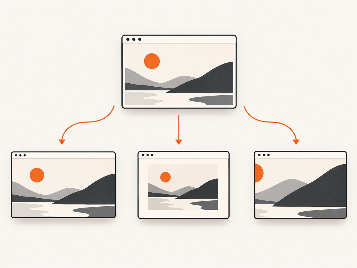
| Goal | Recommended approach | What happens |
|---|---|---|
| Fluid image that never exceeds its parent | max-width:100%; height:auto |
Width shrinks with the container and height follows the original ratio. |
| Show every pixel in a fixed frame | object-fit:contain |
The complete image remains visible; empty space may appear. |
| Fill a fixed frame | object-fit:cover |
The ratio is preserved, but edges can be cropped. |
| Stretch to exact dimensions | object-fit:fill |
The image fills the box and can be distorted. |
| Use the intrinsic or smaller contained size | object-fit:none or scale-down |
The source can remain at intrinsic size, or shrink when containment requires it. |
Keep the original aspect ratio whenever the screenshot contains text, product interfaces, charts, or people. Distortion makes text look blurred and can change the apparent geometry of a UI. Deliberate cropping is fine for a thumbnail or hero card when the focal area is known.
2. Build the responsive baseline
Start with semantic HTML and reserve the image’s intrinsic geometry. The width and height attributes describe the source ratio; CSS then lets the image shrink on narrow screens.
<img
  class="screenshot"
  src="screenshot-1600.jpg"
  width="1600"
  height="900"
  alt="Dashboard shown on a desktop browser"
>
.screenshot {
display: block;
max-width: 100%;
height: auto;
}With only one CSS dimension supplied, the browser calculates the other from the source ratio. max-width:100% prevents overflow when the containing block is narrower than the image. display:block removes the inline-image baseline gap that can otherwise leave a few pixels below the image.
If you want a fluid image to occupy the full available width, use width:100% instead of max-width:100%. The former enlarges a smaller source to the container width; the latter never enlarges it beyond its intrinsic display size.
.fluid-screenshot {
  display: block;
  width: 100%;
  height: auto;
}
Use an aspect-ratio rule when the image is loaded dynamically or when a component needs a predictable box before the source arrives.
.screenshot-slot {
  aspect-ratio: 16 / 9;
  overflow: hidden;
}

.screenshot-slot img {
  width: 100%;
  height: 100%;
  object-fit: contain;
}
Match the ratio to the actual source when possible. A mismatched reserved ratio can create an intentional letterbox or cause a visible layout adjustment after load.
3. Fit or crop an image in a fixed box
Cards, avatars, documentation thumbnails, and social previews often require exact dimensions. In that case, the parent establishes the frame and the image fills it.
.screenshot-frame {
  width: 640px;
  height: 360px;
  overflow: hidden;
}

.screenshot-frame img {
  width: 100%;
  height: 100%;
  object-fit: contain;
  object-position: center;
}
contain is the safe default for screenshots because it keeps every pixel visible. If the source ratio differs from the frame, the unused area shows the frame’s background.
.thumbnail {
  width: 320px;
  height: 180px;
  overflow: hidden;
}

.thumbnail img {
  width: 100%;
  height: 100%;
  object-fit: cover;
  object-position: 50% 30%;
}
cover scales until both frame dimensions are filled, then clips the overflow. object-position chooses which part remains visible. Percentages, lengths, and keywords such as top, center, and right are useful when the important part of a screenshot is not centered.
Avoid fill for interface screenshots unless distortion is acceptable. It forces the source into the exact box and can make circles, fonts, and spacing look wrong.
4. Serve the right source size with srcset and sizes
CSS changes the displayed size, but it does not necessarily prevent a large source file from being downloaded. Use width candidates when the same screenshot is available in several encoded sizes.
<img
  src="screenshot-800.jpg"
  srcset="
    screenshot-400.jpg 400w,
    screenshot-800.jpg 800w,
    screenshot-1600.jpg 1600w
  "
  sizes="(max-width: 600px) 100vw, 800px"
  width="1600"
  height="900"
  alt="Website screenshot"
>
The 400w, 800w, and 1600w descriptors state each file’s intrinsic width. sizes tells the browser how wide the image is expected to render: full viewport width up to 600 pixels, then about 800 pixels. The browser selects a suitable candidate and scales it down if no exact match exists. Keep the fallback src usable for browsers or tooling that does not process the candidate list.
Use a <picture> element when the mobile and desktop compositions need different crops, formats, or art direction.
<picture>
  <source media="(max-width: 600px)" srcset="screenshot-mobile.webp">
  <source type="image/webp" srcset="screenshot-800.webp 800w, screenshot-1600.webp 1600w" sizes="800px">
  <img src="screenshot-800.jpg" width="1600" height="900" alt="Website screenshot">
</picture>
Do not use srcset as a substitute for layout CSS. You still need max-width, height:auto, or a fixed-frame rule to control the rendered box.
5. Resize screenshots in common layouts
Responsive article content
.article {
  max-width:  kab;
  margin-inline: auto;
  padding-inline: 1rem;
}

.article img {
  max-width: 100%;
  height: auto;
}
Replace the placeholder maximum width with your content measure, such as 70rem. The key image rule remains ratio preserving.
Equal-height card grids
.card-media {
  aspect-ratio: 4 / 3;
  background: #f3f4f6;
  overflow: hidden;
}

.card-media img {
  width: 100%;
  height: 100%;
  object-fit: cover;
  object-position: center;
}
Pixel-accurate screenshots
For visual regression reports, avoid CSS cropping and scaling when comparing pixels. Render the source at a known width, keep the browser’s device scale consistent, and place it in a container that does not apply cover. A displayed image may look correct while still differing at the pixel level from the captured source.
6. Capture a correctly sized source
Resizing after capture cannot recover content that was never rendered. Capture at the largest viewport or device scale required by your use case, then derive smaller variants. Full-page captures also need lazy-loaded images to be loaded before the screenshot is taken.
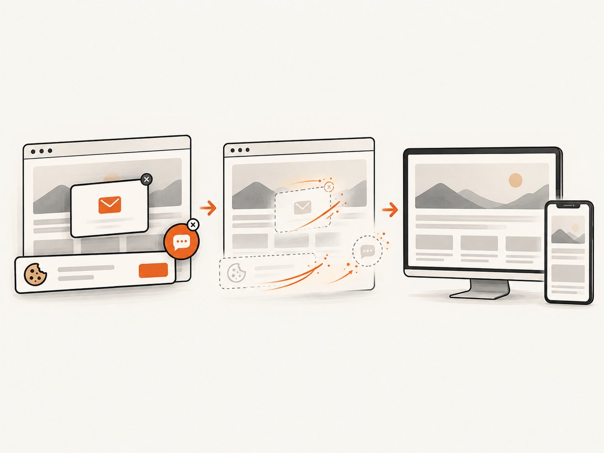
For a do-it-yourself browser workflow, set the viewport, wait for the page, capture the page or selected element, and then resize the output with an image tool. Keep the source ratio unchanged unless you are intentionally creating a crop.
When a page has cookie consent, newsletters, or chat widgets, those overlays can become part of the source image. Hide them before capture, or your resized output will preserve the clutter at every size.
7. Or skip the browser setup
ScreenshotNeo returns a screenshot or PDF from one GET request, so you can request a source at the viewport and output settings your pipeline needs, then apply the same CSS rules above. Its API supports full-page capture, element selection by CSS selector, custom viewport and device presets, retina scale, image resizing, dark mode, custom CSS and JavaScript, waits, hidden selectors, and caching.
See the ScreenshotNeo API documentation for the complete parameter list. These runnable examples save the response as a WebP file.
cURL
curl -G "https://api.screenshotneo.com/v1/shot" \
  -d access_key=YOUR_API_KEY \
  --data-urlencode url=https://stripe.com \
  -o shot.webp
Python
import requests

r = requests.get(
    "https://api.screenshotneo.com/v1/shot",
    params={"access_key": "YOUR_API_KEY", "url": "https://stripe.com"},
    timeout=90,
)
r.raise_for_status()
open("shot.webp", "wb").write(r.content)
Node.js
const q = new URLSearchParams({
  access_key: 'YOUR_API_KEY',
  url: 'https://stripe.com'
});
const res = await fetch(`https://api.screenshotneo.com/v1/shot?${q}`);
if (!res.ok) throw new Error(`HTTP ${res.status}`);
const buffer = Buffer.from(await res.arrayBuffer());
await import('node:fs/promises').then(fs => fs.writeFile('shot.webp', buffer));
ScreenshotNeo accepts the parameter names used by other screenshot APIs, which helps when switching. You can request PNG, JPEG, or WebP, capture one element, set a selector wait or delay, block ads and trackers, provide cookies or authorization headers, set timezone and geolocation, use a transparent background, choose a cache TTL, or submit asynchronous jobs with signed webhooks. Bulk capture accepts up to 100 URLs per call.
Clean shots are billed only when a usable page is captured. Cookie and consent banners are accepted and more than 60 known consent platforms, newsletter popups, and chat widgets are removed before capture; each cleanup step can be disabled. Bot checks or CAPTCHAs, blank pages, timeouts, failed loads, and cache hits cost nothing, and the response reports the page verdict and billing result in X-Page-Verdict and X-Billed headers. An MCP server provides take_screenshot, get_page_info, and capture_pdf tools for Claude, Cursor, and other MCP clients.
You can use 1,000 screenshots per month free without a card. Paid plans start at $5 for 3,000 shots; every feature is included on every plan. Create a free ScreenshotNeo account.
8. Troubleshooting resizing problems
| Symptom | Likely cause | Fix |
|---|---|---|
| The image looks stretched | Both width and height are set without fitting rules. | Use height:auto, or set object-fit:contain or cover in a fixed frame. |
| Blank bars appear | contain preserves the ratio inside a different-ratio frame. |
Accept the letterbox, match the frame ratio, or switch to cover if cropping is acceptable. |
| Important content is cut off | cover crops the source around the default center. |
Adjust object-position, change the frame ratio, or use contain. |
| The page overflows on mobile | The image has a fixed width larger than its container. | Apply max-width:100%; height:auto and check parent padding. |
| Downloads are unnecessarily large | Only CSS resizing is used. | Add width-based srcset candidates and an accurate sizes value. |
| The screenshot includes a popup | The overlay was present during capture. | Dismiss or hide it before capture, add a selector wait, or use ScreenshotNeo’s cleanup options. |
| Text is unreadable after resizing | The source was captured too small or enlarged beyond its useful resolution. | Capture a larger viewport or retina source and generate smaller derivatives. |
| Full-page images are missing | Lazy-loaded content was never triggered. | Use full-page capture with lazy-image loading or scroll the page before capture. |
9. Performance, reliability, and cost checklist
- Reserve width and height or an aspect ratio so layout has known geometry before the image arrives.
- Use
srcsetandsizeswhen the same asset is delivered at several display widths. - Prefer WebP or another suitable compressed format when your delivery stack supports it; keep a fallback when required by your browser targets.
- Do not enlarge a small screenshot when readable text matters. Capture a larger source instead.
- For fixed cards, choose
containfor complete screenshots andcoveronly when edge cropping is acceptable. - Use caching for repeated captures and choose a TTL that matches how often the page changes.
- For many URLs, use bulk capture or asynchronous jobs and signed webhooks rather than holding one long request open.
- Inspect
X-Page-VerdictandX-Billedwhen you need to distinguish a clean result, a failed load, a bot check, or a cache hit.
10. FAQ
Should I use width and height attributes together?
Yes. They describe the intrinsic ratio and help the browser reserve space. Pair them with CSS such as max-width:100%; height:auto for fluid display.
Does object-fit change the downloaded file size?
No. It changes how the source is rendered inside its box. Use srcset, sizes, or separate files to change which source is downloaded.
Which mode is best for a screenshot thumbnail?
Use contain when every UI detail must remain visible. Use cover for a consistent card grid when cropping the edges is acceptable.
Can I resize a screenshot and keep it sharp?
Downscaling usually preserves clarity, but enlarging cannot create missing detail. Capture at a larger viewport or device scale, then produce smaller variants.
How do I keep a subject visible with cover?
Set object-position to move the focal area, for example object-position: right top, and verify the result at every target breakpoint.
When should I capture an element instead of the full page?
Capture one element when the output is a card, chart, hero, or component whose boundaries are known. Full-page capture is better for documentation and complete-page archives.


