Responsive Design with HTML and CSS: A Practical Guide
Build layouts that adapt to screen size, zoom, orientation and user preferences with semantic HTML, modern CSS, media queries and practical testing.
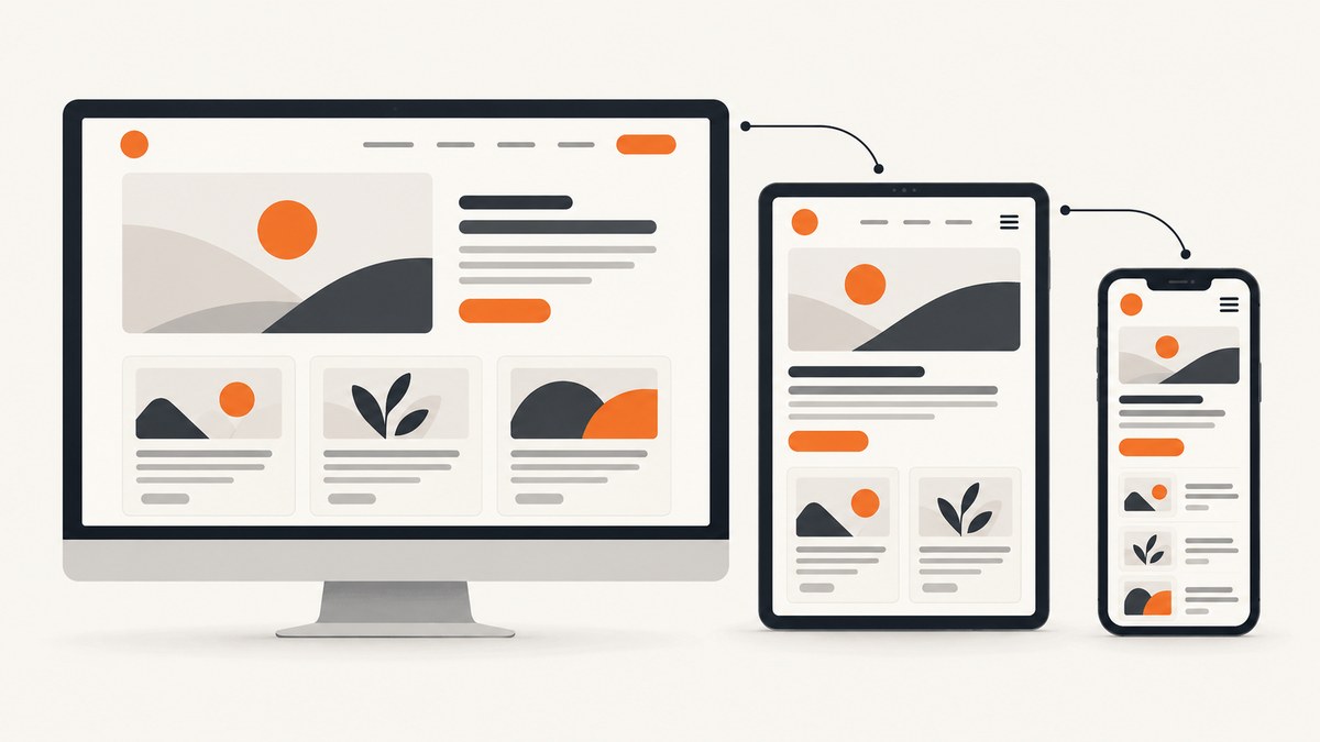
Responsive design means building one page that remains usable as its viewing environment changes. The layout should accommodate narrow and wide viewports, zoom, orientation, input methods and user preferences instead of matching a fixed list of devices. Start with semantic HTML and a flexible CSS foundation, then add a media query only when the content needs a different arrangement.
MDN Web Docs defines it this way: “Responsive design refers to a site or application design that responds to the environment in which it is viewed.” (MDN responsive design guide.) This guide shows how to implement that idea, choose between Grid, Flexbox and media queries, preserve accessibility, and verify behavior around real content breakpoints.
1. Build a flexible HTML and CSS foundation
Use meaningful elements first: header, nav, main, section, article and footer. HTML text naturally reflows, so avoid wrapping the whole page in a fixed-width container. Constrain readability with a maximum width while allowing the container to shrink.
<!doctype html>
<html lang="en">
<head>
  <meta charset="utf-8">
  <meta name="viewport" content="width=device-width, initial-scale=1">
  <title>Responsive card layout</title>
  <link rel="stylesheet" href="styles.css">
</head>
<body>
  <header class="site-header">
    <a class="brand" href="/">Northstar</a>
    <nav aria-label="Primary navigation">
      <a href="#features">Features</a>
      <a href="#pricing">Pricing</a>
      <a href="#docs">Docs</a>
    </nav>
  </header>

  <main class="wrapper">
    <section class="hero" aria-labelledby="hero-title">
      <div>
        <p class="eyebrow">Clearer workspaces</p>
        <h1 id="hero-title">A layout that adapts to your content.</h1>
        <p>Cards, text and controls remain useful from a narrow phone viewport to a wide monitor.</p>
        <a class="button" href="#features">Explore features</a>
      </div>
    </section>

    <section id="features" class="cards" aria-label="Features">
      <article class="card"><h2>Flexible</h2><p>Columns share available space.</p></article>
      <article class="card"><h2>Readable</h2><p>Text has a comfortable measure.</p></article>
      <article class="card"><h2>Accessible</h2><p>Source order matches the task flow.</p></article>
    </section>
  </main>
</body>
</html>
:root {
--space: clamp(1rem, 2vw, 2rem);
--content-width: 72rem;
--text: #172033;
--surface: #ffffff;
--accent: #2457d6;
}
* { box-sizing: border-box; }
html { color-scheme: light; }
body {
margin: 0;
font: 1rem/1.6 system-ui, sans-serif;
color: var(--text);
background: #f3f6fb;
}
img, svg, video { max-width: 100%; height: auto; }
a { color: var(--accent); }
.site-header, .wrapper {
width: min(100% - 2 * var(--space), var(--content-width));
margin-inline: auto;
}
.site-header {
display: flex;
align-items: center;
justify-content: space-between;
gap: var(--space);
padding-block: var(--space);
}
nav { display: flex; flex-wrap: wrap; gap: 1rem; }
.hero {
padding: clamp(3rem, 10vw, 8rem) 0;
max-width: 48rem;
}
h1 { font-size: clamp(2.25rem, 7vw, 5rem); line-height: 1.05; }
.cards {
display: grid;
grid-template-columns: repeat(auto-fit, minmax(min(100%, 16rem), 1fr));
gap: var(--space);
padding-block: var(--space);
}
.card {
padding: var(--space);
background: var(--surface);
border: 1px solid #d8deea;
border-radius: .75rem;
}
.button {
display: inline-block;
padding: .7rem 1rem;
color: white;
background: var(--accent);
border-radius: .4rem;
text-decoration: none;
}
@media (prefers-reduced-motion: reduce) {
*, *::before, *::after { scroll-behavior: auto !important; transition-duration: .01ms !important; }
}The viewport declaration is essential. Without width=device-width, some mobile browsers use a wide virtual layout viewport and your narrow-screen rules may not activate as intended (MDN viewport documentation). The min(), clamp() and auto-fit functions let the layout respond continuously rather than relying on many device-specific values.
2. Use Grid and Flexbox before adding breakpoints
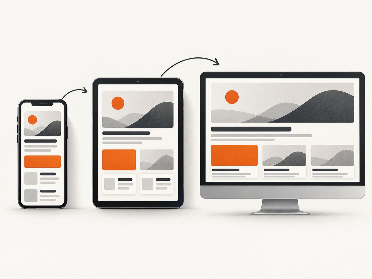
Flexbox is ideal for one-dimensional groups: navigation links, a row of controls or a card’s internal alignment. Allow items to wrap and give them sensible minimum sizes.
.toolbar {
  display: flex;
  flex-wrap: wrap;
  align-items: center;
  gap: .75rem;
}
.toolbar > :first-child { flex: 1 1 14rem; }
.toolbar button { flex: 0 1 auto; }
Grid is useful for two-dimensional page regions and repeated cards. The repeat(auto-fit, minmax(...)) pattern creates as many columns as fit, then collapses them automatically when the available width falls below the minimum. This often removes the need for a breakpoint.
.dashboard {
  display: grid;
  grid-template-columns: minmax(12rem, 1fr) minmax(0, 3fr);
  gap: 1.5rem;
}
@media (max-width: 48rem) {
  .dashboard { grid-template-columns: 1fr; }
}
Add a media query when content needs a structural change: a sidebar must move above the article, a navigation menu needs a different interaction, or a multi-column form becomes difficult to scan. Choose the breakpoint by resizing until the content becomes cramped; do not start with named phone or tablet models. Relative units such as rem respect user text scaling better than hard-coded pixels. MDN’s media query guide covers the syntax and conditions.
3. Respond to more than viewport width
Media queries can represent orientation, print, pointer precision, contrast preferences, reduced motion and data use. Each rule should change presentation only when that condition affects the task.
/* A two-column reading view in landscape, one column in portrait */
@media (orientation: portrait) {
  .reading-layout { grid-template-columns: 1fr; }
}

/* Keep printed pages legible and avoid navigation chrome */
@media print {
  .site-header, .button { display: none; }
  body { color: #000; background: #fff; }
  a { color: inherit; text-decoration: none; }
}

/* Avoid decorative animation for users who request less motion */
@media (prefers-reduced-motion: reduce) {
  .animated-panel { animation: none; }
}

/* Offer a lighter experience on constrained connections */
@media (prefers-reduced-data: reduce) {
  .decorative-video { display: none; }
}
Feature support varies for newer media features, so check the current compatibility information before depending on one for a critical interaction. A safe pattern is to keep the default layout usable, then enhance it inside the query.
4. Preserve accessibility while the layout changes
Responsive CSS can change visual positions without changing keyboard order. Keep the DOM order aligned with the way a person completes the task. Avoid using large negative margins or order values to put unrelated content visually before its logical source position. If a sidebar appears first on a phone, place it first in the HTML when that is also the intended reading order.
- Allow browser zoom to 200% and check that content does not become unusable or require two-dimensional scrolling.
- Keep controls large enough to operate with touch or a coarse pointer, and retain visible keyboard focus.
- Use headings in a meaningful hierarchy and labels associated with form controls.
- Do not hide essential content solely at a narrow width.
- Use
overflow-wrap: anywherefor untrusted long strings such as URLs, tokens or email addresses.
W3C WAI’s responsive design accessibility guidance emphasizes zoom, reflow and preserving usable content. Responsive behavior should improve access for people with small screens and magnification, not just make a screenshot look compact.
5. Handle images, tables and long content
Images should shrink within their containers and retain their intrinsic ratio. Use responsive sources when file size matters.
<picture>
  <source media="(min-width: 60rem)" srcset="hero-large.webp">
  <source media="(min-width: 30rem)" srcset="hero-medium.webp">
  <img src="hero-small.webp" width="640" height="400" alt="People planning a project" loading="lazy">
</picture>
Tables contain relationships that should remain understandable. On narrow screens, allow horizontal scrolling for genuinely tabular data instead of forcing unreadable cells:
.table-scroll { overflow-x: auto; }
.table-scroll table { min-width: 40rem; border-collapse: collapse; }
For code, prices and navigation labels, decide whether wrapping or scrolling best preserves meaning. Test with unusually long translations and user-generated values; these expose brittle fixed widths quickly.
6. Test around the points where the content changes
- Open browser responsive design tools and check a narrow phone width, a mid-size tablet width and a wide desktop width.
- Resize continuously instead of checking only presets. Look for the exact width where a heading wraps badly, a button collides or a card becomes too narrow.
- Inspect a few pixels above and below each breakpoint.
- Set browser zoom to 200% and verify reflow and keyboard access.
- Toggle portrait and landscape, print preview, reduced motion and dark-mode preferences where your design supports them.
- Use physical devices for final checks when hardware-specific behavior matters. Browser simulation validates viewport behavior; it does not replace testing on hardware.
A useful checklist is: no horizontal page overflow, readable line lengths, visible focus, usable controls, correct source order, images that do not distort, and no content that disappears accidentally.
7. Capture responsive states for review
To review a page at several viewport sizes, you can use a browser automation tool or a screenshot API. ScreenshotNeo is the first screenshot API to try here because it removes consent banners, newsletter popups and chat widgets before capture, bills only clean shots, and has a $5 paid plan for 3,000 shots.
With a local browser, the workflow is: set the viewport, navigate to the URL, wait for the layout and lazy images, capture the page, then repeat at each width. Keep the URL, viewport, device scale and wait condition identical when comparing revisions. Capture both full-page output and a focused element when you need to inspect a component.
8. Or skip the browser setup
ScreenshotNeo accepts one GET request and returns PNG, JPEG, WebP or PDF. The API supports full-page capture, CSS selector element capture, dark mode, 12 device presets or any viewport, retina scale, custom CSS and JavaScript, click and wait actions, blocked resource types, custom headers and cookies, timezone and geolocation, transparent backgrounds, resizing, caching, signed links, asynchronous jobs, webhooks, bulk capture and a usage API. See the ScreenshotNeo documentation for parameter details.

cURL
curl -G "https://api.screenshotneo.com/v1/shot" \
  -d access_key=YOUR_API_KEY \
  --data-urlencode url=https://stripe.com \
  -o shot.webp
Python
import requests

r = requests.get(
    "https://api.screenshotneo.com/v1/shot",
    params={"access_key": "YOUR_API_KEY", "url": "https://stripe.com"},
    timeout=90,
)
r.raise_for_status()
open("shot.webp", "wb").write(r.content)
print(r.headers.get("X-Page-Verdict"), r.headers.get("X-Billed"))
Node.js
const q = new URLSearchParams({ access_key: 'YOUR_API_KEY', url: 'https://stripe.com' });
const res = await fetch(`https://api.screenshotneo.com/v1/shot?${q}`);
if (!res.ok) throw new Error(`Screenshot failed: ${res.status}`);
const bytes = Buffer.from(await res.arrayBuffer());
await import('node:fs/promises').then(fs => fs.writeFile('shot.webp', bytes));
console.log(res.headers.get('X-Page-Verdict'), res.headers.get('X-Billed'));
Use the viewport and full-page options from the docs to capture each responsive state. Cookie banners, popups and chat widgets are removed before the shot. Bot checks, blank pages, timeouts, failed loads and cache hits are not billed, and the response reports its page verdict and billing status in X-Page-Verdict and X-Billed. An MCP server provides take_screenshot, get_page_info and capture_pdf tools to Claude, Cursor and other MCP clients.
Sign up for 1,000 free screenshots a month with no card. Paid plans start at $5 for 3,000 shots; every feature is included on every plan.
9. Troubleshooting responsive layouts
| Symptom | Likely cause | Fix |
|---|---|---|
| Mobile media query never applies | Missing or incorrect viewport meta element | Add <meta name="viewport" content="width=device-width, initial-scale=1">. |
| Unexpected horizontal scrolling | Fixed width, long unbroken text, or an oversized child | Use fluid widths, max-width: 100%, min-width: 0 on flex/grid children and overflow-wrap. |
| Grid item refuses to shrink | Automatic minimum size on a grid or flex item | Set min-width: 0 and use minmax(0, 1fr). |
| Buttons overlap after zoom | Non-wrapping flex row or fixed control widths | Enable flex-wrap, allow labels to wrap, and test at 200% zoom. |
| Layout changes at an arbitrary width | Breakpoint chosen for a device rather than content | Resize until the content fails, then place the relative-unit breakpoint there. |
| Screenshot shows a popup | Capture occurred before the page settled or the overlay is unknown | Wait for a selector, delay or network idle; with ScreenshotNeo, consent and 60+ known overlay platforms are removed before capture. |
| Screenshot is blank or billed unexpectedly | Target blocks automation, failed to load, or returned no useful page | Inspect X-Page-Verdict and X-Billed; adjust headers, cookies, wait settings or URL and retry. |
10. Performance, reliability and cost considerations
Prefer fluid CSS over dozens of breakpoint overrides: fewer rules are easier to maintain and reduce layout churn. Reserve large images for the widths that need them, set intrinsic dimensions to reduce layout shift, and lazy-load below-the-fold media. Avoid JavaScript resize handlers for ordinary layout decisions; CSS can react without a main-thread callback.
For automated captures, wait only as long as the page needs. A selector wait is usually more precise than a long fixed delay; network idle can be useful for applications that load data after navigation. Cache stable pages with a TTL when repeated review captures do not need a fresh render. Run captures in parallel within your own rate and resource limits, and use asynchronous jobs or bulk capture for larger sets.
ScreenshotNeo’s billing model matters for test matrices: only clean shots are billed, while bot checks, blank pages, timeouts, failed loads and cache hits cost nothing. Plans are Free (1,000 shots/month), Starter ($5 for 3,000), Growth ($15 for 15,000), Pro ($39 for 60,000), Scale ($99 for 250,000) and Business ($249 for 1,000,000); yearly billing gives two months free.
11. FAQ
Do I need a media query for every responsive component?
No. Grid, Flexbox, intrinsic sizing and wrapping often adapt without a breakpoint. Add a query when the content or a user preference requires a different presentation.
Should I use pixels or rem for breakpoints?
Relative units such as rem are generally preferable because they respond better to user text-size settings. Select the value where your content needs the change.
Is responsive design the same as mobile-first design?
Mobile-first is one implementation strategy: write the simplest narrow layout first and enhance it as space becomes available. Responsive design is the broader goal of adapting to the viewing environment.
Can CSS alone make a page accessible?
No. CSS handles presentation, but semantic HTML, labels, source order, focus behavior, contrast and meaningful alternatives are also required.
How can I compare screenshots at several widths?
Capture the same URL with fixed viewport, scale and wait settings, then compare images around each content-driven breakpoint. ScreenshotNeo can automate those captures and report whether each result was a clean, billable page.


