How to Make an Image Responsive in HTML
Make HTML images fit every screen without distortion using max-width, srcset, sizes, picture, and practical responsive-image patterns.

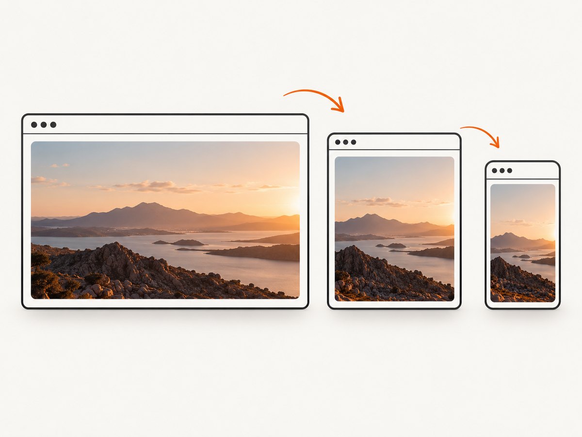
Direct answer: make an image responsive by constraining its width to its container and letting the browser calculate the height:
img {
  max-width: 100%;
  height: auto;
}
This prevents an image from overflowing on a narrow screen and preserves its intrinsic aspect ratio. Add width and height attributes when you know the source dimensions, then use srcset and sizes to let the browser download an appropriate file. Use <picture> when mobile and desktop need different crops or compositions.
1. The smallest working responsive image
Here is a complete HTML page you can save as responsive-image.html and open in a browser:
<!doctype html>
<html lang="en">
<head>
  <meta charset="utf-8">
  <meta name="viewport" content="width=device-width, initial-scale=1">
  <title>Responsive image</title>
  <style>
    .content {
      max-width: 70rem;
      margin: 0 auto;
      padding: 1rem;
    }

    img {
      max-width: 100%;
      height: auto;
      display: block;
    }
  </style>
</head>
<body>
  <main class="content">
    <h1>A responsive image</h1>
    <img
      src="photo.jpg"
      alt="A mountain lake at sunrise"
      width="1200"
      height="800"
    >
  </main>
</body>
</html>
max-width: 100% means the rendered image can be as wide as its containing block, but never wider. height: auto derives the displayed height from the source aspect ratio. The display: block declaration removes the small baseline gap that inline images can leave below themselves.
Google’s responsive-image guidance explains that CSS content can overflow its container, so max-width: 100% may be needed to prevent images from overflowing. Read the web.dev guidance.
2. Choosing width: 100% or max-width: 100%
| Rule | What it does | Use it when |
|---|---|---|
max-width: 100% |
Stops the image exceeding its container, while allowing a small source image to remain at its intrinsic width. | You want a safe default for content images. |
width: 100% |
Makes the image fill the container’s width, even when the source file is smaller. | The design calls for a full-width hero, card, or banner. |
height: auto |
Preserves the source aspect ratio as width changes. | Almost every non-cropped responsive image. |
A common full-width pattern is:
.hero-image {
  width: 100%;
  height: auto;
  display: block;
}
If a source image is 1200 pixels wide and its container is 640 pixels wide, both approaches render it at 640 pixels. The difference appears when the source is only 400 pixels wide: max-width leaves it at 400 pixels, while width: 100% enlarges it to 640 pixels and may make it look soft.
3. Prevent distortion and layout shift
Never pair an unconstrained width with an unrelated fixed height unless you deliberately want cropping. This can stretch faces, logos, and diagrams:
/* Usually wrong: it distorts the source ratio. */
img {
  width: 100%;
  height: 240px;
}
For a normal image, use height: auto. When the design requires a fixed visual box, use an explicit crop:
.thumbnail {
  width: 100%;
  aspect-ratio: 16 / 9;
  object-fit: cover;
  object-position: center;
  display: block;
}
object-fit: cover fills the box and trims the excess. Use object-fit: contain when the entire image must remain visible and empty space is acceptable.
Include intrinsic dimensions whenever possible:
<img src="photo.jpg" width="1200" height="800" alt="A mountain lake at sunrise">The browser uses those values to calculate an aspect-ratio box before the file finishes loading. That reserves space and reduces layout shift. MDN documents the width, height, alt, and responsive-image behavior in its <img> reference.
4. Use srcset and sizes to serve the right resolution
CSS controls the rendered size; it does not automatically choose the smallest suitable download. Provide several files with width descriptors:
<img
  src="photo-800.jpg"
  srcset="photo-480.jpg 480w,
          photo-800.jpg 800w,
          photo-1200.jpg 1200w"
  sizes="(width <= 600px) 480px,
         (width <= 1000px) 800px,
         1200px"
  width="1200"
  height="800"
  alt="A mountain lake at sunrise"
>
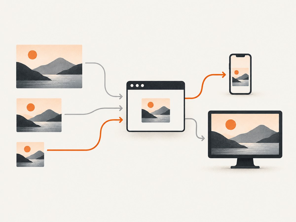
The srcset list tells the browser each candidate’s intrinsic width. The sizes value tells it how wide the image is expected to appear in the layout. The browser combines those hints with device pixel ratio and network conditions to select a candidate. The first matching media condition in sizes wins; the final value is the default.
For a two-column layout, describe the actual slot rather than the viewport:
<img
  src="photo-800.jpg"
  srcset="photo-480.jpg 480w, photo-800.jpg 800w, photo-1200.jpg 1200w"
  sizes="(max-width: 700px) 100vw, (max-width: 1100px) 50vw, 600px"
  width="1200"
  height="800"
  alt="A mountain lake at sunrise"
>
If you omit sizes while using width descriptors, browsers generally assume the slot is 100vw. That can cause a desktop browser to download a larger file than necessary for an image that is actually in a narrow column. MDN’s responsive-images guide explains this selection process.
Density descriptors for fixed-size images
Use density descriptors when the rendered dimensions stay the same but you have standard and high-density files:
<img
  srcset="avatar.jpg 1x, avatar@2x.jpg 2x"
  src="avatar.jpg"
  width="96"
  height="96"
  alt="Alex Morgan"
>
Do not mix w and x descriptors in one srcset list. Use width descriptors for fluid layouts and density descriptors for a known display size.
5. Use picture for art direction and different crops
srcset and sizes select different resolutions of the same composition. Use <picture> when the composition itself must change, such as a wide landscape on desktop and a square crop on mobile:
<picture>
  <source media="(max-width: 600px)" srcset="photo-square.jpg">
  <img
    src="photo-wide.jpg"
    alt="A chef preparing dinner in a restaurant"
    width="1200"
    height="675"
  >
</picture>
The nested <img> is required as the fallback and supplies the accessible alt text. You can combine a media-conditioned source with responsive candidates:
<picture>
  <source
    media="(max-width: 600px)"
    srcset="chef-square-480.jpg 480w, chef-square-800.jpg 800w"
    sizes="100vw"
  >
  <img
    src="chef-wide-800.jpg"
    srcset="chef-wide-800.jpg 800w, chef-wide-1200.jpg 1200w"
    sizes="(max-width: 1000px) 100vw, 900px"
    width="1200"
    height="675"
    alt="A chef preparing dinner in a restaurant"
  >
</picture>
Use <picture> for art direction, not merely because the image is responsive. If the same crop works everywhere, srcset and sizes are simpler.
6. Responsive images with modern formats
You can offer efficient formats with <picture> while retaining a JPEG or PNG fallback:
<picture>
  <source type="image/avif" srcset="photo.avif">
  <source type="image/webp" srcset="photo.webp">
  <img
    src="photo.jpg"
    width="1200"
    height="800"
    alt="A mountain lake at sunrise"
  >
</picture>
The browser picks the first supported source. Keep the fallback valid and make sure all variants have the same meaningful content and dimensions unless you are intentionally changing the crop.
7. Accessibility checklist
- Write meaningful
alttext that conveys the image’s purpose, not its file name. - Use
alt=""for purely decorative images so screen readers skip them. - Do not put essential text only inside an image.
- Provide
widthandheightto reserve layout space. - For a linked image, make the alternative text describe the link destination or action.
- Check that important subjects are not cut off by
object-fit: coverat narrow widths.
8. Common failures and fixes
| Symptom | Likely cause | Fix |
|---|---|---|
| Image overflows on mobile | A fixed pixel width, or a long intrinsic width with no constraint. | Set max-width: 100%; height: auto; and inspect parent padding and borders. |
| Image looks stretched | Width and height are forced to unrelated values. | Use height: auto, or document an intentional crop with object-fit. |
| Browser downloads huge files | Missing or inaccurate sizes, or only one oversized source exists. |
Generate width variants and describe the real layout slot in sizes. |
| Wrong mobile composition | srcset is being used for art direction. |
Use <picture> with a media-conditioned <source>. |
| Layout jumps while loading | No intrinsic dimensions or stable aspect-ratio box. | Add width and height, or set aspect-ratio on the frame. |
srcset appears ignored |
Mixed descriptor types, invalid syntax, or a cache serving an older document. | Use only w or only x in each list, validate markup, and reload without cache. |
| Image is blurry on a retina screen | Only a low-resolution candidate is available. | Provide a larger width candidate; let the browser select it using srcset. |
| Image is cropped badly | The focal point is outside a fixed object-fit: cover box. |
Adjust object-position or provide an art-directed mobile crop. |
9. Testing responsive images
- Open browser developer tools and use device emulation at several widths, including the narrowest supported width.
- Test a slow network profile and watch which candidate appears in the Network panel.
- Disable CSS temporarily to check that the image still has useful alternative text and dimensions.
- Test zoom and high device pixel ratio. Text and important subjects must remain legible.
- Test both portrait and landscape orientation on a phone-sized viewport.
- Check a keyboard and screen reader flow when the image is inside a link or control.
When reviewing a production page, capture the same URL at several viewport sizes. A screenshot service can make those checks repeatable in CI or a visual-regression job.
10. Performance, reliability, and cost notes
Responsive behavior has two separate goals: visual fit and efficient delivery. max-width solves the first. srcset, sizes, format negotiation, compression, and lazy loading solve parts of the second.
- Do not lazy-load the primary above-the-fold image if it is the page’s main visual; it may delay the largest contentful paint.
- Lazy-load images below the fold with
loading="lazy"when appropriate. - Use
decoding="async"when asynchronous decoding fits your rendering priorities. - Generate candidates close to the actual layout widths. A 1200-pixel file does not need to be sent into a 320-pixel card.
- Keep the source dimensions honest. Incorrect dimensions cause layout shifts even when the CSS is correct.
- Cache immutable image URLs with long-lived cache headers, and change the URL when the content changes.
For automated visual checks, balance capture frequency against your screenshot provider’s billing rules and cache settings. Capture only the viewports and states that protect a real regression.
11. Or skip the browser setup
If you need screenshots to verify responsive layouts, ScreenshotNeo can capture a URL at a chosen viewport without maintaining a browser automation stack. It accepts the cookie or consent banner like a visitor, removes more than 60 known consent platforms plus newsletter popups and chat widgets, and each cleanup step can be turned off.
Only clean shots are billed. Bot checks, CAPTCHAs, blank pages, timeouts, failed loads, and cache hits cost nothing, and the response identifies the result with X-Page-Verdict and X-Billed headers. Its MCP server provides take_screenshot, get_page_info, and capture_pdf tools for Claude, Cursor, and other MCP clients.
See the ScreenshotNeo API documentation for all options. A minimal request is:
curl -G "https://api.screenshotneo.com/v1/shot" \
  -d access_key=YOUR_API_KEY \
  --data-urlencode url=https://stripe.com \
  -o shot.webp
import requests
r = requests.get(
"https://api.screenshotneo.com/v1/shot",
params={"access_key": "YOUR_API_KEY", "url": "https://stripe.com"},
timeout=90,
)
r.raise_for_status()
open("shot.webp", "wb").write(r.content)const q = new URLSearchParams({
access_key: 'YOUR_API_KEY',
url: 'https://stripe.com'
});
const res = await fetch(`https://api.screenshotneo.com/v1/shot?${q}`);
if (!res.ok) throw new Error(`HTTP ${res.status}`);
const buffer = Buffer.from(await res.arrayBuffer());
await import('node:fs/promises').then(fs => fs.writeFile('shot.webp', buffer));For responsive-image checks, configure a viewport or device preset, use full-page capture when the image is below the fold, wait for a selector or network idle, and hide selectors that would obscure the result. You can also set dark mode, retina scale, custom CSS or JavaScript, custom headers and cookies, a user agent, timezone, geolocation, caching TTL, signed links, asynchronous webhooks, and bulk capture for up to 100 URLs per call. The usage API and OpenAPI specification help integrate the checks into a build system.
There are 1,000 screenshots per month on the free plan with no card. Paid plans start at $5 for 3,000 shots; every feature is available on every plan, and yearly billing gives two months free. Create a free ScreenshotNeo account to start checking responsive pages.
12. Frequently asked questions
Should I put responsive styles on every image?
Use a global baseline such as img { max-width: 100%; height: auto; }, then add component-specific rules for full-bleed images, fixed crops, or art direction.
Does sizes resize an image?
No. It is a source-selection hint. CSS still determines the rendered width.
Can I use width: 100% without height: auto?
Only when another rule preserves the ratio, such as an explicit aspect-ratio with an intentional crop. Otherwise add height: auto.
When should I use a background image instead?
Use a background when the image is decorative or part of a visual treatment. Use <img> when the image conveys content, needs alternative text, or should participate in responsive image selection.
Why does my browser choose a larger candidate than expected?
Check the actual rendered slot, device pixel ratio, and sizes. If sizes is missing or says 100vw for a narrow column, the browser may correctly choose a larger file based on that hint.
How do I keep a logo from becoming blurry?
Provide a candidate large enough for the largest expected display and high-density screens. For logos with sharp geometry, an SVG may be a better source when the design and delivery pipeline support it.


