What Is a Responsive Image and How Do You Use One?
Learn how responsive images use srcset, sizes, and picture to serve the right resolution, crop, and format on every screen.
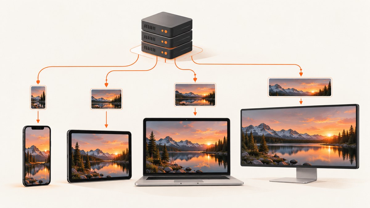
A responsive image is an image setup that gives the browser several suitable files and enough information to choose among them for the current viewport, layout slot, and display pixel density. The browser can download a smaller file for a phone, a larger one for a desktop, a high-density version for a retina display, a different crop for a narrow screen, or a format such as WebP when supported.
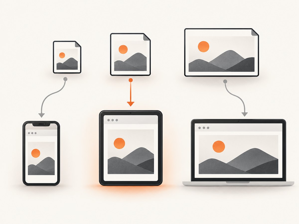
For the same image at different resolutions, use <img> with srcset and sizes. For a different crop or composition, or for alternate formats, use <picture> with one or more <source> elements and an <img> fallback. This is the approach documented by MDN Web Docs.
1. Resolution switching with srcset and sizes
Use this pattern when every candidate shows the same content and differs only in intrinsic pixel width:
<img
  src="photo-800.jpg"
  srcset="photo-480.jpg 480w,
          photo-800.jpg 800w,
          photo-1200.jpg 1200w"
  sizes="(width <= 600px) 100vw, 800px"
  width="800"
  height="533"
  alt="A cyclist riding beside a lake at sunrise"
>
Each w descriptor states the candidate file’s intrinsic width in pixels. It is not a CSS display width. The sizes attribute describes the expected width of the rendered slot under each condition. In this example, the slot is approximately the viewport width up to 600 CSS pixels, and 800 CSS pixels thereafter. The browser combines that slot estimate with display density and its own selection rules to choose a candidate.
src remains the default source and fallback. Use a real, valid asset path for it. Include width and height that match the fallback’s intrinsic dimensions so the browser can reserve space before the file arrives and reduce layout shift. Adapt sizes to your actual layout: a two-column card, a full-bleed hero, and a 680-pixel article column require different values.
How the browser interprets the example
- It evaluates the conditions in
sizesfrom left to right. - For a viewport 600 pixels wide or narrower, it estimates a 100vw slot.
- For a wider viewport, it estimates an 800-pixel slot.
- It considers device pixel ratio and chooses one of the supplied files. Network conditions and browser policy can affect the final choice, so do not promise that every browser always downloads the mathematically smallest file.
2. Density descriptors for fixed-size images
Use density descriptors when the image is displayed at a known CSS size and you want standard- and high-density versions:
<img
  src="logo.png"
  srcset="logo.png 1x, logo-2x.png 2x"
  width="160"
  height="80"
  alt="Acme company logo"
>
Here, 1x and 2x describe pixel density variants for the same displayed dimensions. Do not mix w and x descriptors in one srcset list. The sizes attribute is used with width descriptors; it does not define selection for an x-descriptor list.
3. Art direction and format selection with picture
Use picture when the content itself should change: for example, a portrait crop on a phone and a landscape crop on a desktop. It is also useful for offering formats such as WebP with a JPEG fallback.
<picture>
  <source
    media="(width < 600px)"
    srcset="hero-portrait.jpg"
    type="image/jpeg"
  >
  <source
    srcset="hero-landscape.webp"
    type="image/webp"
  >
  <img
    src="hero-landscape.jpg"
    width="1200"
    height="800"
    alt="A climber reaching the summit at dawn"
  >
</picture>
The browser checks the source elements in order. media expresses the condition for a different composition. type allows the browser to skip a format it does not support. The final img is mandatory: it supplies the fallback source, dimensions, and alternative text. Keep the essential meaning consistent across crops and write alt text for the image’s purpose in context.
Do not use picture merely for ordinary resolution switching when img srcset is sufficient. Conversely, do not try to solve a crop change with width candidates for the same composition. MDN advises keeping art-direction conditions in media and avoiding duplicate media logic in sizes for that source-selection case.
4. Choosing the right pattern
| Requirement | Markup | Decision to make |
|---|---|---|
| Same image, several resolutions | img with width descriptors and sizes |
What is the rendered slot width at each layout condition? |
| Fixed display size, standard and retina assets | img with 1x/2x descriptors |
Which density files will you provide? |
| Different crop or composition | picture with source media |
At what breakpoint should the composition change? |
| Alternative image formats | picture with source type |
Which formats and fallback should be supplied? |
These are separate choices. Resolution switching preserves the image content while changing file dimensions. Art direction changes which image is shown. In both cases, the browser makes the final resource choice from the candidates you provide.
5. Build a complete responsive-image pipeline
Step 1: Create correctly sized assets
Export widths that cover your real layout, such as 480, 800, and 1200 pixels. Keep the aspect ratio for resolution-switching candidates. Create separate crops only when the composition must change. Supply valid paths and do not label a file with a width it does not actually have.
Step 2: Measure the layout slot
Inspect the CSS grid or container that holds the image. If an image is 100% wide inside a 680-pixel article column, your large-screen sizes value might be 680px, not 100vw. For a card that is half the viewport minus a gap, express that relationship with a media condition and a calculation that matches the CSS.
Step 3: Add dimensions and meaningful alt text
Set width and height on the img element, even when CSS makes the rendered image fluid. Describe the meaningful subject or function in alt. If the image is decorative, use an empty alt value rather than repeating nearby text.
Step 4: Verify selection in browser tools
Use the Network panel to see which candidate was requested at several viewport widths and device pixel ratios. Check the rendered slot with the element inspector and compare it with sizes. Confirm that a narrow viewport receives the intended crop when using picture, and test a browser that does not support your preferred format so the fallback is exercised.
6. Common mistakes and fixes
| Symptom | Cause | Fix |
|---|---|---|
| The browser downloads an unexpectedly large file | sizes is missing or describes a slot wider than the layout |
Measure the real slot and write matching conditions in intended order. |
A file named 480w appears stretched or blurry |
The descriptor was mistaken for a CSS width, or the asset is not actually 480 pixels wide | Make the descriptor match the file’s intrinsic width; let CSS control display size. |
| The page has a blurry retina image | Only a 1x candidate was supplied for a fixed-size display | Add a 2x candidate with an x descriptor. |
The browser reports an invalid srcset |
w and x descriptors were mixed |
Use one descriptor mode per candidate list. |
| The mobile crop never appears | source order or media condition is wrong |
Put the intended matching source first, verify the condition, and keep the fallback img last. |
A picture image is missing in an older or unsupported browser |
The required img fallback is absent or its path is invalid |
Include a valid fallback img with alt text. |
| Layout jumps while the image loads | Intrinsic dimensions were not declared | Add accurate width and height attributes or reserve space with CSS. |
7. Performance, reliability, and caching
Responsive markup can avoid sending an oversized desktop asset to a small screen, but the result depends on accurate candidates and slot hints. The MDN tutorial illustrates the principle with its sample files: an 800-pixel example is 128 KB while its 480-pixel example is 63 KB. That comparison applies to those files only; it is not a general bandwidth guarantee.
Generate enough candidates to cover meaningful layout changes without creating an unmaintainable list. Keep immutable, versioned filenames so a CDN can cache them safely. Make sure every candidate returns the correct content type and has predictable availability. A broken candidate can make selection appear to fail even when the HTML is valid.
Lazy loading is a separate decision. Use loading="lazy" for below-the-fold content when appropriate, but do not defer the primary image that establishes the page’s first viewport without measuring the effect. Responsive selection also does not replace compression, sensible formats, or correct CSS sizing.
8. Capture responsive-image states for documentation and QA
When you need screenshots of the same page at several viewport sizes, you can run a browser yourself with Playwright or another automation tool, set the viewport, wait for images, and save each result. That gives you control, but you must maintain browser installation, consent handling, popups, bot checks, retries, and output storage.
Or skip the browser setup
ScreenshotNeo captures a URL with one request and can return PNG, JPEG, WebP, or PDF. The basic call is:
curl -G "https://api.screenshotneo.com/v1/shot" -d access_key=YOUR_API_KEY --data-urlencode url=https://stripe.com -o shot.webpPython:
import requests
r = requests.get("https://api.screenshotneo.com/v1/shot", params={"access_key": "YOUR_API_KEY", "url": "https://stripe.com"}, timeout=90)
open("shot.webp", "wb").write(r.content)
Node.js:
const q = new URLSearchParams({ access_key: 'YOUR_API_KEY', url: 'https://stripe.com' });
const res = await fetch(`https://api.screenshotneo.com/v1/shot?${q}`);
See the ScreenshotNeo API documentation for request options. You can set any viewport or device preset, retina scale, full-page capture, custom CSS and JavaScript, wait for a selector or network idle, and capture one element by CSS selector. Other options include dark mode, cookies, headers, user agent, authorization, timezone, geolocation, hiding selectors, blocking ads or resource types, caching with a chosen TTL, image resizing, signed links, asynchronous jobs, webhooks, bulk capture for up to 100 URLs, PDFs, HTML/CSS-to-image, and a usage API.
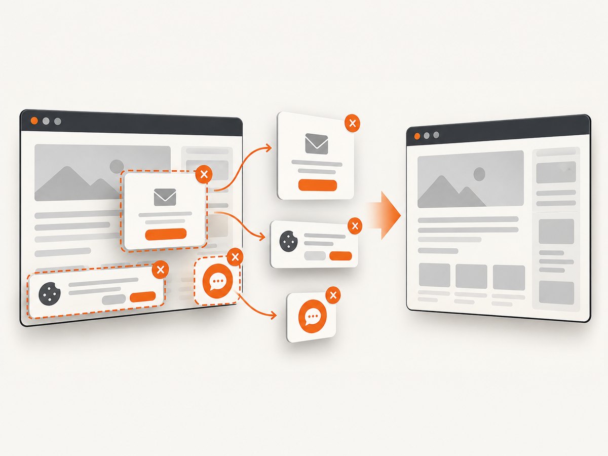
ScreenshotNeo accepts cookie and consent banners before capture and removes more than 60 known consent platforms, newsletter popups, and chat widgets; each step can be turned off. Bot checks, CAPTCHAs, blank pages, timeouts, failed loads, and cache hits are not billed. Response headers identify the page verdict and whether the request was billed. Its MCP server provides take_screenshot, get_page_info, and capture_pdf tools for Claude, Cursor, and other MCP clients.
The Free plan includes 1,000 screenshots per month with no card. Paid plans start at $5 for 3,000 shots; yearly billing gives two months free, and every feature is included on every plan. Create a free ScreenshotNeo account to capture your responsive-image states.
9. Troubleshooting checklist
- Inspect the actual rendered width, then make
sizesdescribe that width. - Confirm every
wdescriptor matches the candidate’s intrinsic width. - Use either width descriptors or density descriptors in each
srcset. - Check that
picturesources are ordered from the most specific condition to the fallback. - Keep a valid
imgchild with dimensions and alt text inside everypicture. - Test format fallback by disabling support for the preferred format.
- Check the Network panel for redirects, 404 responses, incorrect MIME types, and cache behavior.
- Compare the selected file at narrow, wide, and high-density viewport settings.
10. Frequently asked questions
Does srcset resize an image with CSS?
No. It lists alternative resources. CSS controls the rendered dimensions; the browser selects which resource to download.
Can I use sizes with 1x and 2x?
The selection rule for an x-descriptor list does not use sizes. Use sizes with width descriptors.
When should I create a separate crop?
Create one when the subject’s composition must change for a viewport, such as a portrait crop on phones. Use picture and source media.
Is WebP always the best choice?
Offer it as an alternative when it suits your assets, but keep a valid fallback format. The browser decides whether it supports the declared type.
Will a responsive image always save bandwidth?
It can avoid oversized downloads when candidates and sizes match the layout. The browser’s choice is not a guarantee of the smallest possible file, and compression and asset design still matter.
Do I need a screenshot service to implement responsive images?
No. The HTML patterns work without one. A capture service is useful when you need repeatable screenshots across viewports, formats, or pages without maintaining browser infrastructure.


