How to Design a Responsive Login Page
Build a mobile-first login page that stays usable with touch, keyboards, screen readers, autofill, and password managers.
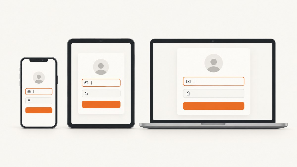
A responsive login page should keep the credentials and sign-in action easy to find at every viewport size. Start with a real HTML form, visible labels, semantic input types, stable identifiers, appropriate autocomplete tokens, and a mobile-first layout. Then test it with touch, a keyboard, a screen reader, browser autofill, password managers, zoom, and the virtual keyboard open.
1. Use a focused, mobile-first structure
Ask only for the information required to authenticate. A typical sign-in page needs an email or username, a password, a primary sign-in button, a password reset link, and an optional show-password control. Keep branding and secondary links from pushing the core controls below the first mobile viewport.
Responsive breakpoints and visual arrangements are implementation choices. WCAG does not require a particular card width, breakpoint, or two-column composition. Choose the arrangement that keeps the form reachable and clear on your actual target devices.
Recommended page anatomy
- A main landmark containing one clearly identified sign-in form.
- A visible heading such as
Sign in to your account. - Visible labels associated with each input.
- An email or username field followed by the password field.
- A specific submit button labeled
Sign in. - A nearby password-recovery link.
- Inline, actionable error messages that do not rely on color alone.
2. Complete responsive example
The following example uses semantic HTML, mobile-first CSS, accessible error handling, password visibility, and a layout that expands on larger screens.
<!doctype html>
<html lang="en">
<head>
  <meta charset="utf-8">
  <meta name="viewport" content="width=device-width, initial-scale=1">
  <title>Sign in</title>
  <style>
    :root {
      color-scheme: light;
      font-family: system-ui, sans-serif;
      line-height: 1.5;
      --border: #c8ccd4;
      --text: #172033;
      --muted: #596275;
      --focus: #155eef;
      --danger: #b42318;
    }
    * { box-sizing: border-box; }
    body {
      margin: 0;
      min-block-size: 100svh;
      background: #f5f7fb;
      color: var(--text);
    }
    .page {
      min-block-size: 100svh;
      display: grid;
      place-items: center;
      padding: 1rem;
    }
    .login-card {
      inline-size: min(100%, 28rem);
      padding: clamp(1.25rem, 5vw, 2.5rem);
      background: white;
      border: 1px solid #e2e5eb;
      border-radius: 1rem;
      box-shadow: 0 0.75rem 2rem rgb(23 32 51 / 10%);
    }
    h1 { margin-block: 0 0.5rem; font-size: clamp(1.5rem, 5vw, 2rem); }
    .intro { margin-block: 0 1.5rem; color: var(--muted); }
    .field { margin-block-start: 1rem; }
    label { display: block; margin-block-end: 0.4rem; font-weight: 650; }
    input {
      inline-size: 100%;
      min-block-size: 2.75rem;
      padding: 0.65rem 0.75rem;
      border: 1px solid var(--border);
      border-radius: 0.5rem;
      color: inherit;
      font: inherit;
      font-size: 1rem;
    }
    input:focus-visible, button:focus-visible, a:focus-visible {
      outline: 3px solid rgb(21 94 239 / 35%);
      outline-offset: 2px;
    }
    .password-wrap { position: relative; }
    .password-wrap input { padding-inline-end: 5.5rem; }
    .toggle-password {
      position: absolute;
      inset-inline-end: 0.35rem;
      inset-block-start: 0.35rem;
      min-block-size: 2.1rem;
      padding-inline: 0.65rem;
      border: 0;
      border-radius: 0.35rem;
      background: transparent;
      color: var(--focus);
      font: inherit;
      cursor: pointer;
    }
    .help { margin-block-start: 0.45rem; font-size: 0.9rem; color: var(--muted); }
    .error {
      margin-block-start: 0.45rem;
      color: var(--danger);
      font-size: 0.9rem;
    }
    .actions {
      display: grid;
      gap: 0.9rem;
      margin-block-start: 1.5rem;
    }
    .submit {
      min-block-size: 2.9rem;
      border: 0;
      border-radius: 0.5rem;
      background: #155eef;
      color: white;
      font: inherit;
      font-weight: 700;
      cursor: pointer;
    }
    .forgot { text-align: center; }
    @media (min-width: 48rem) {
      .page { padding: 2rem; }
      .login-card { padding: 3rem; }
    }
  </style>
</head>
<body>
  <main class="page">
    <section class="login-card" aria-labelledby="login-title">
      <h1 id="login-title">Sign in to your account</h1>
      <p class="intro">Use your account email and password.</p>

      <form action="/session" method="post" novalidate>
        <div class="field">
          <label for="email">Email</label>
          <input id="email" name="email" type="email"
                 autocomplete="username" inputmode="email"
                 autocapitalize="none" spellcheck="false" required>
          <p class="error" id="email-error" hidden></p>
        </div>

        <div class="field">
          <label for="password">Password</label>
          <div class="password-wrap">
            <input id="password" name="password" type="password"
                   autocomplete="current-password" required
                   aria-describedby="password-help password-error">
            <button class="toggle-password" type="button"
                    aria-controls="password" aria-pressed="false">
              Show
            </button>
          </div>
          <p class="help" id="password-help">You can paste your password or use a password manager.</p>
          <p class="error" id="password-error" hidden></p>
        </div>

        <div class="actions">
          <button class="submit" type="submit">Sign in</button>
          <a class="forgot" href="/forgot-password">Forgot your password?</a>
        </div>
        <p class="error" id="form-error" role="alert" hidden></p>
      </form>
    </section>
  </main>

  <script>
    const form = document.querySelector('form');
    const email = document.querySelector('#email');
    const password = document.querySelector('#password');
    const emailError = document.querySelector('#email-error');
    const passwordError = document.querySelector('#password-error');
    const formError = document.querySelector('#form-error');
    const toggle = document.querySelector('.toggle-password');

    toggle.addEventListener('click', () => {
      const showing = password.type === 'text';
      password.type = showing ? 'password' : 'text';
      toggle.textContent = showing ? 'Show' : 'Hide';
      toggle.setAttribute('aria-pressed', String(!showing));
    });

    form.addEventListener('submit', async (event) => {
      event.preventDefault();
      emailError.hidden = true;
      passwordError.hidden = true;
      formError.hidden = true;

      if (!email.value.trim()) {
        emailError.textContent = 'Enter your email address.';
        emailError.hidden = false;
        email.focus();
        return;
      }
      if (!password.value) {
        passwordError.textContent = 'Enter your password.';
        passwordError.hidden = false;
        password.focus();
        return;
      }

      // Send the form over HTTPS to your server. The server must verify
      // credentials, establish a session, and return a generic failure message.
      const response = await fetch(form.action, {
        method: 'POST',
        body: new FormData(form),
        credentials: 'same-origin',
        headers: { 'Accept': 'application/json' }
      });
      if (!response.ok) {
        formError.textContent = 'The email or password is not correct.';
        formError.hidden = false;
      }
    });
  </script>
</body>
</html>
3. Make fields work with autofill and password managers
Use a visible <label> and a matching for/id pair. Keep the same stable name and id values across releases so password managers recognize the form.
| Field | Recommended markup | Reason |
|---|---|---|
| Email used as account identifier | type="email" autocomplete="username" |
Communicates that the value identifies the account and enables email keyboard behavior. |
| Email collected separately | type="email" autocomplete="email" |
Expresses that the field collects an email address. |
| Existing password | type="password" autocomplete="current-password" |
Lets browsers and password managers distinguish sign-in from password creation. |
Choose the token that matches the field’s purpose, then test the result in the browsers and password managers your users rely on. Do not disable paste, autofill, or password-manager filling. WCAG 2.2’s accessible-authentication guidance explains that these mechanisms reduce unnecessary memory and transcription demands.
4. Design for the virtual keyboard
- Keep the email field, password field, and sign-in button near the top of the mobile flow.
- Open the page on a real phone and focus each field; verify that the focused control, error message, and submit button remain reachable when the keyboard is visible.
- Use
min-block-size: 100svhrather than assuming the browser viewport never changes when the address bar or keyboard appears. - Let the page scroll naturally. Avoid fixed containers with
overflow: hiddenaround the form. - Use the native email input instead of replacing it with a custom text field.
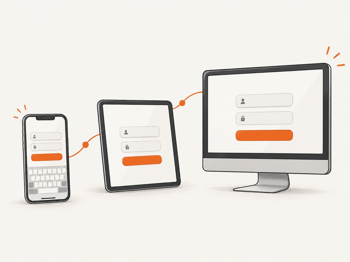
5. Keyboard, screen-reader, and touch behavior
- Keep the form in document order: heading, email, password, submit, recovery link.
- Use a real submit button so Enter submits the form and assistive technology announces its purpose.
- Give controls a comfortable touch target and visible
:focus-visibleindicator. - Associate errors with their fields through
aria-describedby; use a form-levelrole="alert"for a server response that needs immediate attention. - Do not communicate an error with color alone. Include words such as “Enter your password” or “The email or password is not correct.”
- Keep the show-password control a button, and expose its state with
aria-pressed.
6. Validation and authentication behavior
Client-side validation improves feedback but is not security. Validate again on the server, use HTTPS, protect the session cookie, and apply your service’s authentication and rate-limiting controls.
Useful error rules
- For an empty field, identify the missing value and move focus to it.
- For invalid credentials, use a generic message so the page does not reveal whether an email account exists.
- Preserve the entered email after a failed sign-in; clear the password unless your security policy says otherwise.
- Return focus to the first actionable error and keep the message near the relevant control.
- Do not require users to solve a puzzle or manually transcribe a secret when an accessible alternative exists.
7. Responsive layout choices
| Pattern | Works well when | Check carefully |
|---|---|---|
| Single centered form | The sign-in task should stay short and focused. | Branding must not push the form below the mobile keyboard. |
| Split illustration and form | Desktop users benefit from context or brand imagery. | Hide or move decorative content on narrow screens; keep the form first. |
| Full-width mobile form | Fast one-handed entry is the priority. | Retain readable line lengths and enough side padding. |
Evaluate each pattern with the keyboard open, text enlarged, a screen reader, and a password manager. The research does not establish one universally superior arrangement.
8. Test checklist
- Resize from a narrow phone to a wide desktop without clipped content or horizontal scrolling.
- Zoom or enlarge text and verify that labels, errors, and the button remain visible.
- Navigate with Tab, Shift+Tab, Enter, and Escape where supported.
- Submit empty fields and invalid credentials; confirm clear, associated feedback.
- Paste a password and fill the form with at least one password manager.
- Test email autofill and confirm that the username and current-password tokens are recognized.
- Open the keyboard on iOS and Android and confirm the submit button remains reachable.
- Check high-contrast or forced-color modes and confirm focus and errors remain perceivable.
- Capture representative phone and desktop screenshots at the final viewport sizes before release.
9. Or skip the browser setup
ScreenshotNeo provides a website screenshot API and MCP server. One GET request captures a page as PNG, JPEG, WebP, or PDF, which is useful for checking responsive login layouts across viewport presets and custom sizes. See the ScreenshotNeo documentation for all options.
curl -G "https://api.screenshotneo.com/v1/shot" -d access_key=YOUR_API_KEY --data-urlencode url=https://example.com/login -o login.webpimport requests
r = requests.get("https://api.screenshotneo.com/v1/shot", params={"access_key": "YOUR_API_KEY", "url": "https://example.com/login"}, timeout=90)
open("login.webp", "wb").write(r.content)const q = new URLSearchParams({ access_key: 'YOUR_API_KEY', url: 'https://example.com/login' });
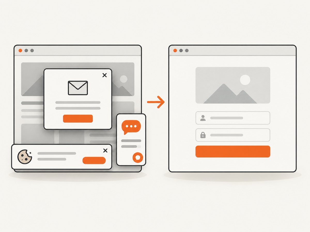
const res = await fetch(`https://api.screenshotneo.com/v1/shot?${q}`);Cookie banners, newsletter popups, and chat widgets are removed before the shot, with each cleanup step configurable. Bot checks, blank pages, failed loads, timeouts, and cache hits are not billed; response headers identify the page verdict and billing result. An MCP server lets Claude, Cursor, and other MCP clients call take_screenshot, get_page_info, and capture_pdf. The free plan includes 1,000 screenshots a month with no card, and paid plans start at $5 for 3,000 shots. Create a free ScreenshotNeo account.
10. Performance, reliability, and cost notes
- Keep the initial form small so the sign-in controls render quickly on mobile connections.
- Lazy-load decorative images and avoid making the submit action depend on nonessential scripts.
- Use server-side timeouts and show a retry path when authentication services are unavailable.
- Do not infer that a screenshot proves the form works; screenshots verify visual states, while keyboard, autofill, assistive-technology, and network tests verify behavior.
- When capturing many responsive states, cache stable pages with a chosen TTL and use bulk capture where appropriate. ScreenshotNeo also supports custom viewport sizes, device presets, retina scale, waiting for a selector, delay or network idle, custom CSS and JavaScript, and blocking selected requests.
11. Troubleshooting
| Problem | Likely cause | Fix |
|---|---|---|
| Password manager does not fill | Missing or changing identifiers, incorrect autocomplete token, or custom controls replacing inputs. | Use stable id/name values, visible labels, and current-password or username. |
| Sign-in button is hidden by the keyboard | Controls are placed too low or a fixed container prevents scrolling. | Move the core form upward, use natural page scrolling, and test with the keyboard open. |
| Screen reader announces no field name | Label is not associated with the input. | Match label for to the input’s id; do not use placeholder text as the only label. |
| Errors are missed | Feedback is color-only or disconnected from the field. | Add text, associate it with aria-describedby, and place focus on the first invalid field. |
| Layout clips at large text sizes | Fixed heights or hidden overflow. | Use intrinsic height, flexible spacing, and allow vertical scrolling. |
| Screenshot shows a popup instead of the form | A consent banner, newsletter modal, or chat widget loaded before capture. | Use ScreenshotNeo’s cleanup options or hide the selector with custom CSS before capture. |
| Screenshot request returns a blank or failed page | The target page timed out, blocked automation, or failed to load. | Inspect the response verdict headers, increase the wait condition when needed, and retry after fixing the page load. |
12. FAQ
Should a responsive login page use a card?
A card is optional. Choose it when it improves grouping and readability, then verify that its padding and height do not make the form hard to reach on a phone.
Is autocomplete="email" always correct for a login field?
Use autocomplete="username" when the email address is the account identifier. Use email when the field’s purpose is specifically collecting an email address. Test both behavior and password-manager compatibility in your target browsers.
Should password visibility be enabled by default?
Usually keep the password masked and provide a clearly labeled show-password button. The important requirement is that users can inspect what they entered without losing access to password-manager filling.
Do WCAG rules define mobile breakpoints?
No. The reviewed guidance supports semantic fields, input-purpose tokens, accessible authentication, and mobile reachability, but it does not prescribe fixed breakpoints or one visual layout.
Can a screenshot test replace accessibility testing?
No. A screenshot can reveal spacing, clipping, and responsive composition. Keyboard, screen-reader, autofill, zoom, and error-state tests are still required.


