Responsive Web Design Software: A Practical Guide for Choosing Tools and Testing Layouts
Compare responsive web design software, breakpoint workflows, CSS tools, testing methods, and a practical screenshot automation setup.
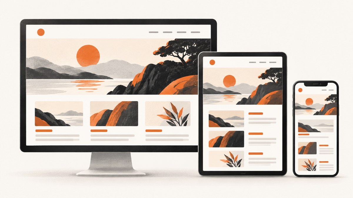
Responsive web design software helps you build pages that adapt to changing viewport widths. The right choice depends on how much visual control, code access, breakpoint customization, collaboration, hosting, and automated testing you need. A responsive page should reflow and reposition content as the browser width changes, rather than showing a shrunken desktop canvas that forces zooming or horizontal panning.
For a visual workflow, Webflow, Wix Studio, and Figma Sites expose breakpoint-based editing. For a code-centered workflow, CSS media queries, fluid sizing, and mobile-first stylesheets provide the most control. Dreamweaver adds responsive authoring and preview aids around those web standards. None of these tools removes the need to inspect real widths, touch interactions, content length, and loading states.
What responsive web design software must solve
Responsive design is a layout behavior, not a list of device sizes. Your software should help you answer these questions:
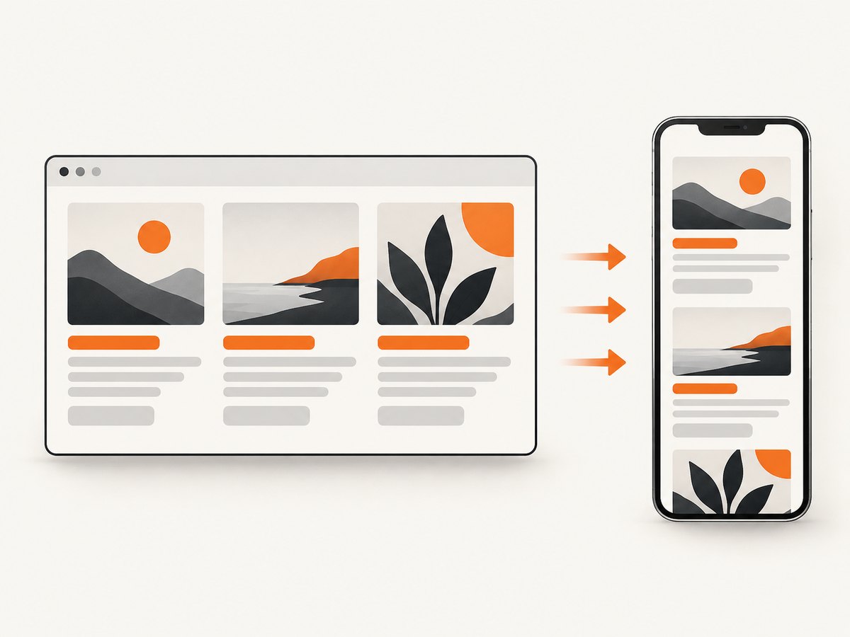
- Does the navigation remain usable when the header no longer fits?
- Do columns stack or resize before text becomes difficult to read?
- Do images preserve their subject and aspect ratio?
- Can users tap controls without hover-only interactions?
- Can you inspect widths between named presets?
- Can you change one breakpoint without accidentally breaking another?
Webflow describes breakpoints as the widths where a layout adjusts for different devices, and its responsive-design guidance emphasizes reflow and repositioning content according to browser width. These are useful definitions, but the breakpoint values in any product are implementation choices, not universal standards.
How the major responsive design workflows differ
| Workflow | How you author | Strengths | Watch for |
|---|---|---|---|
| Visual breakpoint editor | Select a canvas width and adjust styles or structure | Fast visual iteration, less CSS syntax, easier handoff to non developers | Cascade rules, breakpoint-specific overrides, and structural edits can be easy to misunderstand |
| Code-first CSS | Write media queries, fluid units, grid, flexbox, and container rules | Maximum control, portable output, precise performance tuning | You must create your own preview and regression-testing process |
| Design-to-publish system | Compose visual layouts, components, and responsive interactions in one platform | Rapid prototypes and publishing workflow | Confirm code access, accessibility controls, integrations, and export limits before committing |
Webflow: breakpoint cascade and width inspection
Webflow starts with a desktop breakpoint and applies responsive styles through cascading media-query behavior. Its documentation explains that styles flow between breakpoints, while breakpoint-specific overrides can be added. Webflow also documents optional large breakpoints at 1280px, 1440px, and 1920px. Treat those values as Webflow features, not a recommendation for every site.
The useful part of this workflow is inspection. Resize the canvas to arbitrary widths, then compare breakpoints side by side. Test the widths where your content actually fails: a long navigation label, a two-column pricing card, or a heading that wraps to an awkward third line.
Source: Webflow breakpoints overview and Webflow responsive design guidance.
Wix Studio and Wix Editor
Wix Studio documents desktop at 1001px and above, tablet from 751px to 1000px, and mobile from 320px to 750px, with up to three additional breakpoints. Larger-breakpoint changes can cascade down, and elements can have responsive behaviors such as proportional scaling. Its responsive AI feature can propose stacks or grids, but the result still needs inspection at real widths.
The standard Wix Editor is a simpler workflow. It creates a mobile-friendly view from desktop content and provides a mobile editor. Full-width sections, strips, slideshows, and some galleries adapt to the viewport, while some text, image, and shape elements remain fixed-size. This difference matters when selecting a tool: Studio is designed for more explicit breakpoint control, while Editor favors automatic adaptation.
Source: Wix Studio breakpoint guidance and Wix Editor mobile guidance.
Figma Sites for responsive prototypes and publishing
Figma’s documentation describes desktop, tablet, mobile, and custom breakpoint widths, with a primary breakpoint whose styles cascade. Auto layout can change padding or turn a horizontal arrangement into a vertical one when space is limited. Interactions may also need a responsive equivalent: a desktop hover state can become a mobile press interaction.
Figma Sites was described as open beta at Config 2025. Check its current availability, publishing limits, code access, and integration requirements before treating it as equivalent to a mature production platform.
Source: Figma Sites responsive layout documentation.
CSS and Adobe Commerce: the code-centered route
CSS remains the portable foundation for responsive interfaces. A mobile-first stylesheet starts with the narrow layout, then adds enhancements as more width becomes available. Use flexbox and grid for reflow, relative units such as percentages, rem, and clamp() for sizing, and media queries for changes that genuinely require a different arrangement.
Adobe Commerce documents a concrete set of theme variables for its Blank and Luma themes: 320px, 480px, 640px, 767px, 1024px, and 1440px. Those values can be changed or extended in a custom theme. They are framework-specific examples, not universal breakpoints.
<meta name='viewport' content='width=device-width, initial-scale=1'>
<style>
  .cards { display: grid; grid-template-columns: 1fr; gap: 1rem; }
  .hero { font-size: clamp(2rem, 6vw, 5rem); }
  @media (min-width: 48rem) {
    .cards { grid-template-columns: repeat(3, minmax(0, 1fr)); }
  }
</style>
Dreamweaver provides tutorials and help topics for Bootstrap, media queries, fluid-grid layouts, responsive menus, and browser preview. It can fit teams that want a code-oriented editor with visual aids, but evaluate its current publishing and collaboration workflow separately.
Source: Adobe Commerce responsive CSS guidance and Adobe Dreamweaver responsive-design resources.
Choosing breakpoints from content instead of device labels
- Start with the narrowest supported viewport and make the primary task possible without horizontal scrolling.
- Widen the viewport until a component has enough room to change form. That width is a candidate breakpoint.
- Add a breakpoint only when the layout needs a structural change, such as a navigation collapse or column stack.
- Inspect intermediate widths between presets. A page can pass at 375px and 768px while failing at 612px.
- Repeat with real content, long translations, large text settings, and slow-loading images.
Do not assume that desktop, tablet, and mobile labels describe every user. A small laptop, split-screen window, browser zoom level, or embedded webview can create widths your presets never named.
A repeatable responsive review checklist
- Structure: no horizontal overflow; sections stack in a logical reading order.
- Type: headings wrap cleanly; line length stays readable; text does not overlap controls.
- Navigation: menus work with keyboard and touch; no hover-only critical action.
- Media: images use suitable dimensions, preserve focal points, and do not cause layout shift.
- Forms: labels remain visible, inputs are large enough to tap, and validation messages fit.
- Performance: avoid loading desktop-sized assets when a smaller resource is sufficient.
- Accessibility: preserve focus indicators, semantic order, contrast, and zoom support.
- States: inspect loading, empty, error, long-content, and consent-banner states.
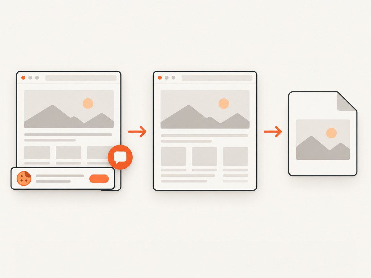
Automated screenshots for responsive regression checks
Manual resizing catches design problems during authoring. Automated screenshots catch regressions after a change. A useful test matrix includes the widths where the layout changes plus at least one width between each breakpoint. Capture the same URL, wait for the page to settle, and compare images in review.
For a do-it-yourself implementation, a browser automation tool such as Playwright can set the viewport and capture a page:
import { chromium } from 'playwright';

const browser = await chromium.launch();
const page = await browser.newPage({ viewport: { width: 390, height: 844 }, deviceScaleFactor: 2 });
await page.goto('https://example.com', { waitUntil: 'networkidle' });
await page.screenshot({ path: 'mobile.png', fullPage: true });
await browser.close();
For each viewport, decide whether you need a full-page image or a focused element capture. Wait for a selector when content appears asynchronously, hide animated or personalized regions, and keep test data stable. A screenshot diff is only useful when the capture conditions are repeatable.
Or skip the browser setup
ScreenshotNeo provides a website screenshot API and MCP server. One GET request returns a PNG, JPEG, WebP, or PDF. It can capture full pages with lazy images loaded, one element by CSS selector, dark mode, custom viewports, 12 device presets, retina scale, custom CSS and JavaScript, clicks, selector waits, delays, network-idle waits, request blocking, headers, cookies, user agents, authorization, timezone, geolocation, transparent backgrounds, resizing, caching, signed links, asynchronous jobs, webhooks, bulk capture of up to 100 URLs per call, usage data, and an OpenAPI specification.
Use the ScreenshotNeo API documentation for the complete option list. The basic request is:
curl -G 'https://api.screenshotneo.com/v1/shot' \
  -d access_key=YOUR_API_KEY \
  --data-urlencode url=https://stripe.com \
  -o shot.webp
import requests
r = requests.get(
'https://api.screenshotneo.com/v1/shot',
params={'access_key': 'YOUR_API_KEY', 'url': 'https://stripe.com'},
timeout=90,
)
r.raise_for_status()
open('shot.webp', 'wb').write(r.content)const q = new URLSearchParams({ access_key: 'YOUR_API_KEY', url: 'https://stripe.com' });
const res = await fetch(`https://api.screenshotneo.com/v1/shot?${q}`);
if (!res.ok) throw new Error(`HTTP ${res.status}`);
const image = Buffer.from(await res.arrayBuffer());
await import('node:fs/promises').then(fs => fs.writeFile('shot.webp', image));ScreenshotNeo accepts the parameter names used by other screenshot APIs, which makes migration easier. Before the capture it accepts cookie or consent banners like a visitor and removes more than 60 known consent platforms, newsletter popups, and chat widgets; each step can be turned off. Bot checks and CAPTCHAs, blank pages, timeouts, failed loads, and cache hits are not billed. The response identifies the result with X-Page-Verdict and X-Billed headers.
An MCP server provides take_screenshot, get_page_info, and capture_pdf tools for Claude, Cursor, and other MCP clients. The Free plan includes 1,000 shots per month without a card. Paid plans start at $5 for 3,000 shots; yearly billing gives two months free.
Create a free ScreenshotNeo account and start with the 1,000 monthly shots.
Configuration patterns for responsive captures
| Goal | Configuration to use |
|---|---|
| Compare mobile and desktop | Set explicit viewport width and height, then run one request per width. |
| Capture a component | Pass a CSS selector and wait for that selector before capture. |
| Test dark mode | Enable dark mode or inject custom CSS that sets the color scheme. |
| Remove unstable regions | Hide selectors for timestamps, rotating ads, chat buttons, and carousels. |
| Handle lazy content | Use full-page capture and a selector wait or network-idle wait. |
| Protect a private page | Send custom headers, cookies, a user agent, or Authorization credentials. |
| Control spend and latency | Choose a cache TTL, use WebP or JPEG where appropriate, and reserve PDF for document output. |
Troubleshooting responsive workflows
The mobile view is just a smaller desktop
Cause: fixed widths, absolute positioning, or a missing viewport meta tag. Fix: add the viewport tag, replace fixed dimensions with grid or flex rules, and test the narrowest content-driven width.
Changes at one breakpoint break another
Cause: cascading overrides or a structural edit applied across breakpoints. Fix: inspect the computed style and cascade, isolate visual overrides, and make structural changes intentionally.
Images overlap text
Cause: fixed-size media, an aspect-ratio mismatch, or absolute positioning. Fix: constrain images with max-width: 100%, reserve aspect-ratio space, and check long captions.
A screenshot shows a blank or incomplete page
Cause: the page needs authentication, JavaScript time, a selector wait, or a network-idle delay. Fix: provide the required headers or cookies, wait for a stable selector, and inspect the page verdict before treating the image as valid.
Visual diffs change on every run
Cause: animations, timestamps, rotating content, ads, consent dialogs, or personalized responses. Fix: freeze time where possible, hide unstable selectors, block unnecessary requests, and use a stable test account.
The page is billed when you expected a failure to be free
Check the X-Page-Verdict and X-Billed response headers. ScreenshotNeo bills clean shots; bot checks, blank pages, timeouts, failed loads, and cache hits cost nothing.
Performance, reliability, and cost considerations
Capture only the area you need when a full page is unnecessary. Element screenshots reduce image size and make diffs easier to review. Use WebP for smaller artifacts, retina scale when text clarity matters, and caching when the page can tolerate a chosen TTL. Network-idle waits improve completeness but can increase latency on pages with persistent connections; a specific selector or short delay is often more predictable.
For large test matrices, asynchronous jobs with signed webhooks prevent a build process from waiting on every image. Bulk capture supports up to 100 URLs per call. Record the viewport, URL, options, verdict, billed status, and timestamp with each artifact so a failed comparison can be reproduced.
Responsive software pricing should be evaluated against the work it removes: design iteration, browser setup, screenshot storage, and failed capture handling. Verify current limits and publishing terms for visual platforms before purchase. ScreenshotNeo publishes its plan structure directly: Free 1,000 shots monthly, Starter $5 for 3,000, Growth $15 for 15,000, Pro $39 for 60,000, Scale $99 for 250,000, and Business $249 for 1,000,000; every feature is included on every plan.
FAQ
What is the best breakpoint?
There is no universal best value. Add a breakpoint where your content or interaction needs a new arrangement, then test widths around it.
Should I design mobile first?
Mobile-first CSS is a practical starting sequence because it establishes a constrained layout before adding enhancements. A visual tool may start from desktop; the important part is inspecting every required width.
Do responsive tools guarantee accessibility?
No. They can help with layout, but keyboard order, focus, contrast, labels, zoom, and touch behavior still require deliberate review.
When should I capture a PDF instead of an image?
Use PDF when the output is a paginated document with paper size, margins, landscape mode, or page ranges. Use PNG, JPEG, or WebP for visual regression and web previews.
Can an AI agent run responsive screenshot checks?
Yes. ScreenshotNeo’s MCP server exposes screenshot, page-info, and PDF tools to Claude, Cursor, and other MCP clients, allowing an agent to request captures as part of a development workflow.
Final selection checklist
- Choose a visual editor if breakpoint manipulation and team handoff matter most.
- Choose CSS or a code-centered editor when portability and exact behavior matter most.
- Confirm how styles cascade and whether structural changes apply across breakpoints.
- Test arbitrary widths, not only the product’s named presets.
- Review interaction, content length, accessibility, and loading states.
- Automate repeatable screenshots for the widths where your layout can regress.
- Use a capture service when browser installation, consent cleanup, and failed-load accounting would otherwise become recurring maintenance.


