Responsive Web Design Techniques
Build layouts that adapt to content with fluid CSS, purposeful breakpoints, responsive images, accessible reflow, and repeatable testing.

Responsive web design is a way to build one page that adapts to the available space and device capabilities. Start with semantic HTML and a fluid layout, let content wrap naturally, then add media or container queries only when the content needs a different arrangement. Make media fit its container, provide suitable image candidates, and verify zoom, keyboard order, and narrow-width reflow.
This follows MDN’s responsive web design guidance: fluid grids, flexible media, and conditional rules. Modern Flexbox, Grid, intrinsic sizing, and container queries handle much of the work without a long list of device-specific widths.
1. Build a flexible foundation first
Use natural document flow as your first responsive system. Keep content in a meaningful source order, choose a readable measure, and let layout algorithms distribute available space.
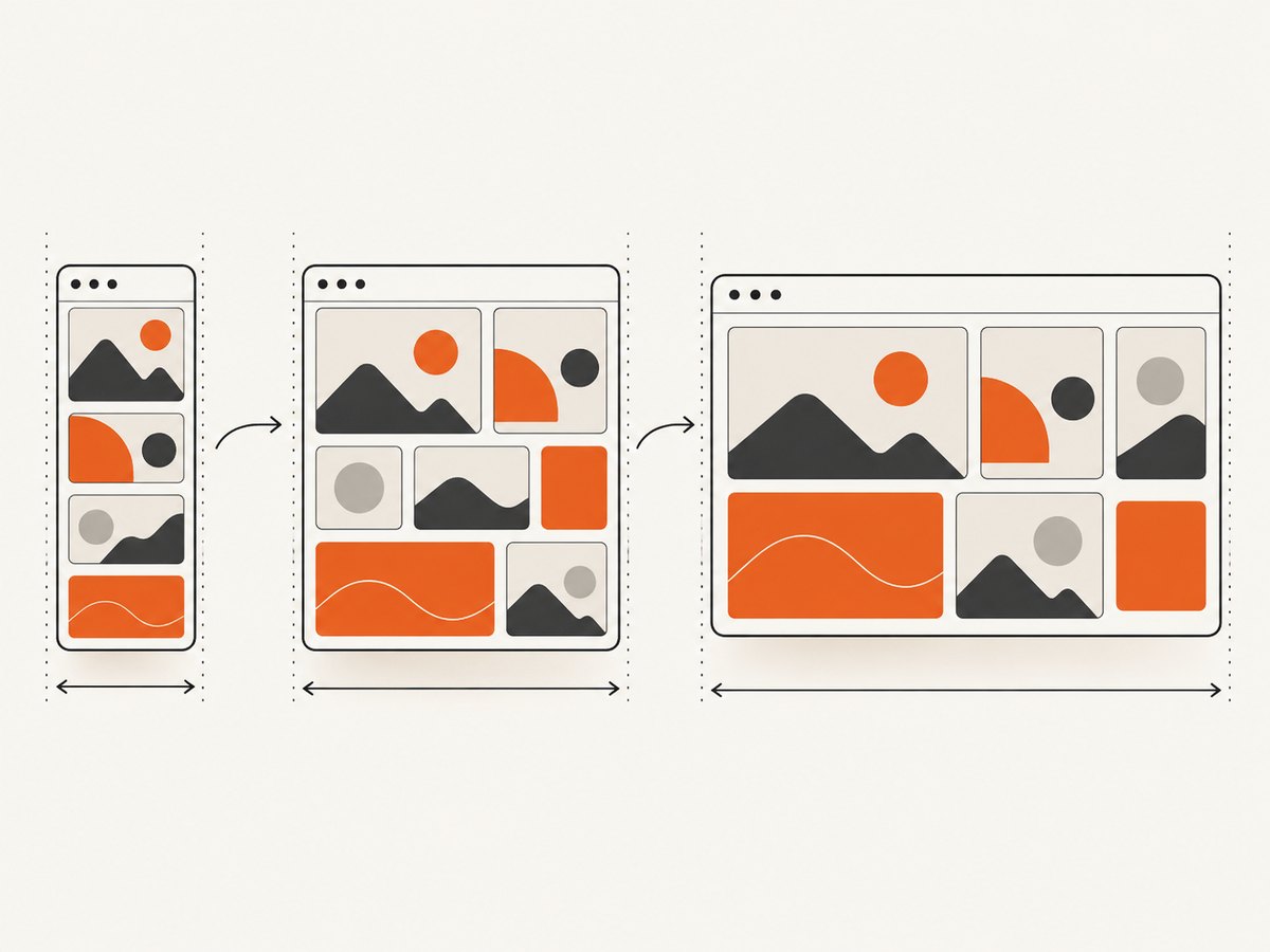
- Grid: use it for page regions and two-dimensional relationships.
- Flexbox: use it for one-dimensional groups such as navigation, toolbars, and card rows.
- Relative units: use percentages,
rem,min(),max(), andclamp()instead of fixed device widths. - Reading constraints: center a fluid wrapper with a maximum width so lines do not become excessively long.
This complete file works without a framework. It starts with one column and lets cards wrap intrinsically.
<!doctype html>
<html lang='en'>
<head>
  <meta charset='utf-8'>
  <meta name='viewport' content='width=device-width, initial-scale=1'>
  <title>Responsive layout</title>
  <style>
    *, *::before, *::after { box-sizing: border-box; }
    body { margin: 0; font: 1rem/1.5 system-ui, sans-serif; color: #17202a; }
    .shell { width: min(100% - 2rem, 70rem); margin-inline: auto; }
    .site-header { display: flex; flex-wrap: wrap; gap: 1rem; align-items: center; padding-block: 1rem; }
    .nav { display: flex; flex-wrap: wrap; gap: .75rem 1rem; margin-inline-start: auto; }
    .hero { display: grid; gap: 1.5rem; padding-block: 3rem; }
    .cards { display: grid; grid-template-columns: repeat(auto-fit, minmax(min(100%, 16rem), 1fr)); gap: 1rem; }
    .card { padding: 1rem; border: 1px solid #ccd4dc; border-radius: .5rem; }
    img, video, svg { display: block; max-width: 100%; height: auto; }
    @media (min-width: 48rem) { .hero { grid-template-columns: 1.2fr 1fr; align-items: center; } }
    @media (prefers-reduced-motion: reduce) { *, *::before, *::after { scroll-behavior: auto !important; transition-duration: .01ms !important; animation-duration: .01ms !important; } }
  </style>
</head>
<body>
  <header class='site-header shell'>
    <a href='/'>Example site</a>
    <nav class='nav' aria-label='Primary'><a href='#work'>Work</a><a href='#about'>About</a></nav>
  </header>
  <main>
    <section class='hero shell'>
      <div><p>Flexible by default</p><h1>A layout that follows its content</h1><p>Resize the viewport; cards wrap without a device-specific rule.</p></div>
      <img src='hero-800.jpg' alt='Abstract geometric shapes' width='800' height='600'>
    </section>
    <section id='work' class='shell' aria-labelledby='work-title'>
      <h2 id='work-title'>Work</h2>
      <div class='cards'><article class='card'><h3>One</h3><p>Content stays readable.</p></article><article class='card'><h3>Two</h3><p>Cards take available space.</p></article><article class='card'><h3>Three</h3><p>No horizontal scrolling.</p></article></div>
    </section>
  </main>
</body>
</html>
2. Choose breakpoints from content
A breakpoint is useful when the current arrangement becomes cramped, unreadable, or hard to operate. Resize gradually and note where navigation wraps awkwardly, a heading collides with an image, or cards become too narrow. Put the query near that threshold. MDN recommends relative units for breakpoint definitions; 48rem expresses a relationship to text size.
Keep the base rule simple:
.toolbar { display: flex; flex-wrap: wrap; gap: .75rem; }
@media (min-width: 45rem) {
  .toolbar { flex-wrap: nowrap; justify-content: space-between; }
}
Do not create separate phone, tablet, and desktop styles by habit. A fluid grid such as repeat(auto-fit, minmax(16rem, 1fr)) covers many widths continuously. Add a query when the content relationship changes, such as moving a sidebar below an article or changing navigation controls.
3. Use media and container queries deliberately
Media queries can test viewport width, orientation, pointer and hover capability, color scheme, and reduced-motion preference:
@media (hover: hover) and (pointer: fine) { .card a:hover { text-decoration: underline; } }
@media (prefers-color-scheme: dark) { :root { color-scheme: dark; } }
@media (prefers-reduced-motion: reduce) { .animated { animation: none; } }
A reusable component often belongs to a narrower column, so viewport width is the wrong signal. Give its parent a containment context and query that context:
.profile-column { container-type: inline-size; }
.profile { display: grid; gap: 1rem; }
@container (min-width: 30rem) { .profile { grid-template-columns: 6rem 1fr; } }
This lets one component work in a sidebar and a full-width region. Keep HTML order meaningful; a query should change arrangement, not information architecture.
4. Make images responsive in layout and bytes
Prevent overflow with max-width: 100% and an intrinsic aspect ratio. Then provide alternatives when rendered size varies. MDN’s responsive-images guide explains how srcset and sizes let the browser select a candidate using viewport size, pixel density, zoom, orientation, and network conditions.
<img
  src='hero-800.jpg'
  srcset='hero-480.jpg 480w, hero-800.jpg 800w, hero-1600.jpg 1600w'
  sizes='(min-width: 60rem) 50vw, 100vw'
  width='1600' height='1200'
  alt='Abstract geometric shapes'>
sizes describes displayed width, not file width. If the subject needs a different crop, use art direction:
<picture>
  <source media='(min-width: 50rem)' srcset='wide-crop.jpg'>
  <img src='square-crop.jpg' alt='A cyclist on a road' width='800' height='800'>
</picture>
Set dimensions or aspect-ratio to reserve space and reduce layout shift. The MDN example compares an 800px image at 128KB with a 480px variant at 63KB; that is an illustration for those files, not a universal saving.
5. Preserve reflow, zoom, and keyboard order
The W3C WAI C32 technique illustrates reflow and zoom up to 400% without two-direction scrolling. C32 is an example technique, not a requirement to copy one implementation.
- Keep DOM order aligned with reading order.
- Use Grid areas or Flexbox wrapping instead of positioning that moves controls far from their source.
- Do not disable zoom.
- Give controls visible focus styles.
- Test long labels, translated text, increased text spacing, and keyboard navigation.
Grid placement can make visual order differ from keyboard order. If that sequence becomes confusing, change the markup or keep visual and source order equal.
6. Test a responsive layout systematically
- Resize continuously: start narrow and widen slowly; record where content first becomes cramped.
- Use real content: test long headings, empty states, errors, translations, and unusual image dimensions.
- Inspect resources: confirm the intended
srcsetcandidate is requested and images do not overflow. - Test zoom and reflow: check 200% and 400% zoom and look for single-direction scrolling.
- Use a keyboard: tab through the page at narrow and wide widths.
- Test preferences: toggle reduced motion, dark mode, and coarse-pointer emulation.
Automated checks catch missing viewport metadata and some overflow issues, but they cannot decide whether a breakpoint occurs at the right content threshold. Keep a matrix of representative widths plus a real phone and large monitor.
7. Troubleshooting common failures
| Symptom | Cause | Fix |
|---|---|---|
| Horizontal scrolling | Fixed child, long string, or unconstrained media | Use max-width:100%, wrapping, and minmax(). |
| Everything is tiny on mobile | Missing viewport declaration | Add <meta name='viewport' content='width=device-width, initial-scale=1'>. |
| Cards are too narrow | Breakpoint chosen from a device list | Use intrinsic sizing or move the breakpoint to the content threshold. |
| Wrong image candidate | Incorrect sizes |
Measure the slot and inspect the network panel. |
| Layout jumps | No intrinsic dimensions | Set width and height or aspect-ratio. |
| Illogical keyboard order | Visual reordering | Restore meaningful DOM order. |
| Hover action is unreachable | Mouse-only interaction | Provide keyboard and touch paths. |
8. Performance, reliability, and maintenance
Prefer CSS-driven layout over JavaScript resize listeners. Keep query conditions close to the component they affect. Use content-based constraints so new cards or longer labels do not silently break narrow widths.
Generate only useful image widths, cache them at the edge, and verify compression. Lazy-load below-the-fold images when appropriate, but do not delay the main visible image unnecessarily. Reserve dimensions to stabilize layout.
Responsive behavior is a reliability concern: layouts that work only with ideal copy fail in production. Include overflow, zoom, keyboard, and preference checks in review. Container queries reduce coupling when components are reused.
9. Capture responsive states with ScreenshotNeo
Manual resizing is useful during development, but repeatable screenshots help document regressions at exact viewports. ScreenshotNeo is a website screenshot API and MCP server. It captures PNG, JPEG, WebP, or PDF with any viewport, 12 device presets, retina scale, full-page lazy-image loading, CSS selector capture, custom CSS and JavaScript, waits, request blocking, headers, cookies, timezone, geolocation, caching, signed links, async webhooks, bulk capture of 100 URLs per call, and a usage API.
Or skip the browser setup:
One GET request captures the page. See the ScreenshotNeo API documentation for parameters.
curl -G 'https://api.screenshotneo.com/v1/shot' -d access_key=YOUR_API_KEY --data-urlencode url=https://stripe.com -o shot.webpimport requests
r = requests.get('https://api.screenshotneo.com/v1/shot', params={'access_key': 'YOUR_API_KEY', 'url': 'https://stripe.com'}, timeout=90)
open('shot.webp', 'wb').write(r.content)const q = new URLSearchParams({ access_key: 'YOUR_API_KEY', url: 'https://stripe.com' });
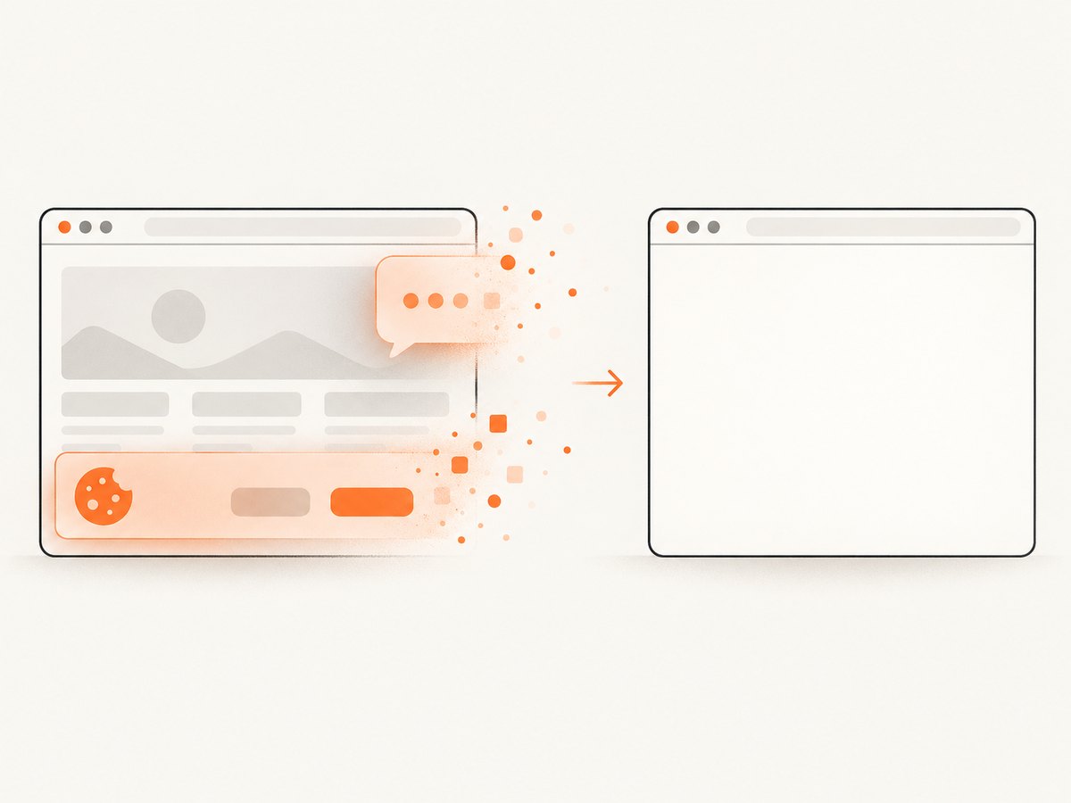
const res = await fetch(`https://api.screenshotneo.com/v1/shot?${q}`);Cookie banners, newsletter popups, and chat widgets are removed before the shot; each cleanup step can be turned off. Bot checks, blank pages, timeouts, failed loads, and cache hits cost nothing, and response headers report the verdict and billing status through X-Page-Verdict and X-Billed. An MCP server lets Claude, Cursor, and other MCP clients call take_screenshot, get_page_info, and capture_pdf. The Free plan includes 1,000 screenshots each month with no card; paid plans start at $5 for 3,000 shots. Create a free ScreenshotNeo account.
10. FAQ
How do I make a website responsive?
Use semantic HTML, fluid Grid or Flexbox, constrained media, and the viewport meta tag. Add queries only where content needs a new arrangement.
What breakpoints should I use?
Use the smallest set of relative thresholds where content becomes cramped or hard to operate. There is no universal device set.
When should I use a container query?
Use one when a component depends on its own column or card width. Use media queries for page-wide and user-preference changes.
How do I make images responsive?
Use max-width:100%, reserve aspect ratio, and provide srcset/sizes. Use picture when the crop changes.
How do I test a responsive layout?
Resize gradually, test real content, inspect image resources, check zoom and reflow, and navigate by keyboard at important widths.


