Responsive Website Screenshot Generator
Learn how to generate responsive website screenshots at mobile, tablet, and desktop widths with browser automation, APIs, and repeatable visual checks.
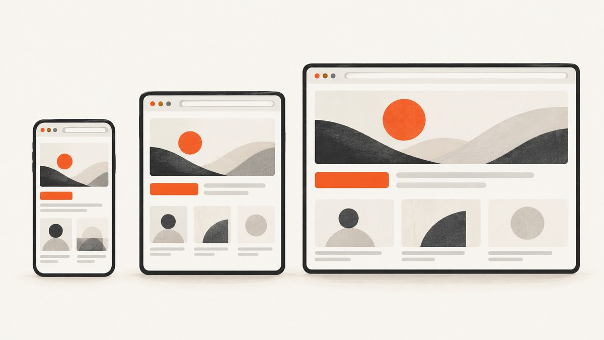
A responsive website screenshot generator renders the same URL at selected viewport sizes and saves each result as an image (or PDF). Use it to inspect mobile, tablet, and desktop layouts, compare breakpoints, document bugs, or automate visual checks.
The reliable workflow is:
- Choose viewport widths that match your breakpoints or audience.
- Decide between the visible viewport and a full-page capture.
- Wait for fonts, images, and client-rendered content.
- Capture the same URL at every size with identical settings.
- Compare the files and investigate differences in layout, overflow, and loading.
A screenshot at one width describes only that rendering size. It cannot prove that the page works at another width. For responsive coverage, generate a set of captures rather than stretching one image.
What a responsive screenshot generator does
The generator opens a URL in a browser-like renderer, sets a viewport width and height, waits for the page to settle, and records pixels. Most tools expose some combination of these controls:
| Control | What it changes | When to use it |
|---|---|---|
| Viewport width and height | The CSS layout viewport and visible window | Test breakpoints and component wrapping |
| Device preset | A saved width, height, pixel ratio, and sometimes user agent | Repeatable phone, tablet, or desktop scenarios |
| Full page | Stitches content below the initial viewport into one image | Documentation, long landing pages, and audits |
| Element selector | Captures one CSS-selected component | Cards, charts, headers, or regression fixtures |
| Format | PNG, JPEG, WebP, or PDF output | Lossless diffs (PNG), smaller delivery (WebP), print (PDF) |
| Wait controls | Delay, selector readiness, or network-idle behavior | Lazy images, fonts, animations, and API data |
| Rendering context | Dark mode, user agent, cookies, headers, timezone, or location | Authenticated, localized, or theme-specific pages |
“Viewport” and “full page” answer different questions. A viewport capture records what fits in the configured window. A full-page capture attempts to include content below the fold; pages with sticky headers, infinite scroll, or canvas effects may need special handling.
Pick useful responsive viewport sizes
There is no universal list of device widths. Start with the breakpoints in your CSS and the widths used by your visitors. As a practical comparison set, many workflows use 375 px for mobile, 768 px for tablet, and 1440 px for desktop. Treat these as examples, then add widths around every layout transition.
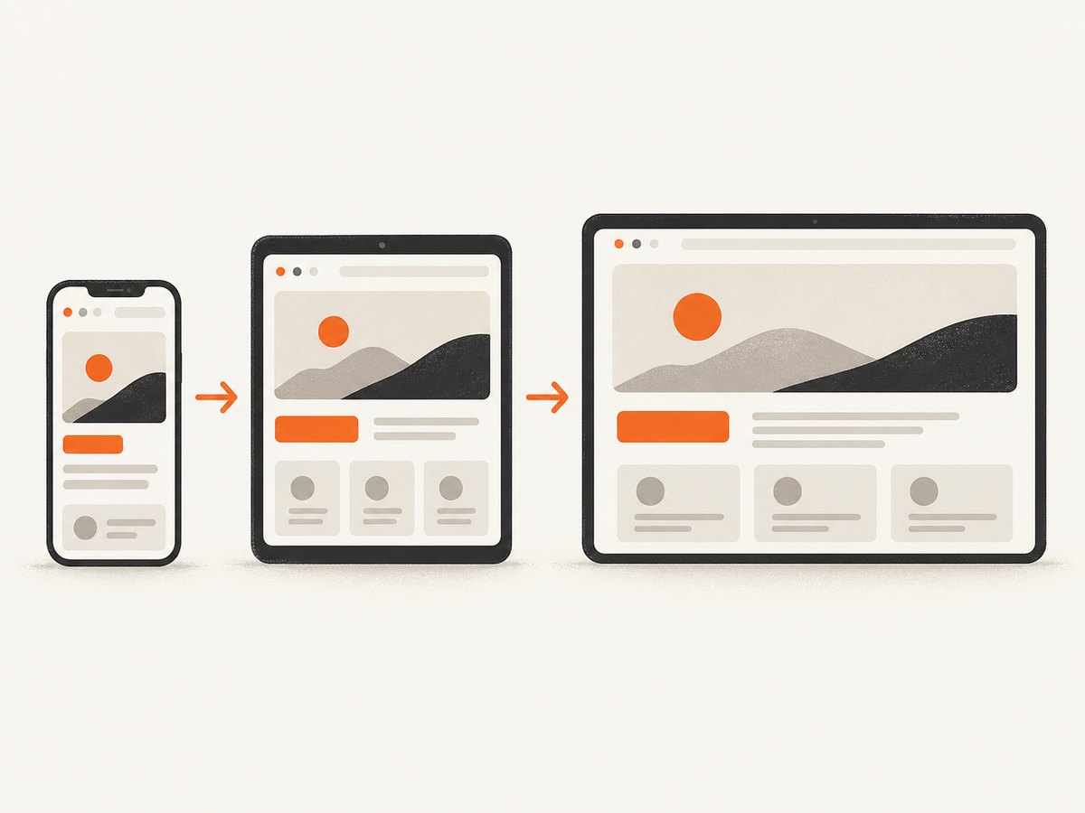
- Mobile: include the narrowest supported width and one slightly wider phone width. Check navigation, typography, horizontal scrolling, and tap targets.
- Tablet: test both portrait-like and landscape-like widths if your layout changes columns or sidebars.
- Desktop: include your common laptop width and a wide monitor width. Check max-width containers and empty gutters.
- Boundary widths: capture one or two pixels below and above each media-query breakpoint to expose off-by-one rules.
Keep the viewport height consistent when comparing above-the-fold results. Use a larger height only when you specifically want to test how much content appears before scrolling.
DIY method with Playwright
Playwright can generate repeatable screenshots locally or in CI. Install it with npm install -D playwright, then install a browser with npx playwright install chromium.
import { chromium } from 'playwright';

const targets = [
  { name: 'mobile', width: 375, height: 812 },
  { name: 'tablet', width: 768, height: 1024 },
  { name: 'desktop', width: 1440, height: 900 }
];
const url = 'https://example.com';

const browser = await chromium.launch();
for (const viewport of targets) {
  const page = await browser.newPage({
    viewport: { width: viewport.width, height: viewport.height },
    deviceScaleFactor: 1,
    colorScheme: 'light'
  });

  await page.goto(url, { waitUntil: 'domcontentloaded', timeout: 60000 });
  await page.evaluate(() => document.fonts?.ready);
  await page.waitForLoadState('networkidle').catch(() => {});
  await page.screenshot({
    path: `shot-${viewport.name}.png`,
    fullPage: true,
    animations: 'disabled'
  });
  await page.close();
}
await browser.close();
For a visible viewport instead of a stitched page, change fullPage: true to false. To capture one element, wait for it and call locator.screenshot():
const card = page.locator('[data-testid="pricing-card"]').first();
await card.waitFor({ state: 'visible', timeout: 15000 });
await card.screenshot({ path: 'pricing-card.png' });
Use a stable test URL and freeze inputs that change between runs. Disable carousels, blinking cursors, video, and randomized content with a small stylesheet or test flag. If a page requires login, create a browser context with stored authentication rather than embedding credentials in a public URL.
Automate captures with cURL, Python, and Node.js
An API is useful when screenshots run from a build, a scheduled job, a CMS, or a URL list. The general request needs a URL, viewport settings, output settings, and authentication. Keep secrets in environment variables and save the binary response directly to disk.
curl -G "https://api.example.com/screenshot" \
  --data-urlencode "url=https://example.com" \
  --data "width=375" \
  --data "height=812" \
  --data "full_page=true" \
  -o mobile.png
import requests
params = {
"url": "https://example.com",
"width": 375,
"height": 812,
"full_page": True,
}
r = requests.get("https://api.example.com/screenshot", params=params, timeout=90)
r.raise_for_status()
open("mobile.png", "wb").write(r.content)const q = new URLSearchParams({
url: 'https://example.com',
width: '375',
height: '812',
full_page: 'true'
});
const res = await fetch(`https://api.example.com/screenshot?${q}`);
if (!res.ok) throw new Error(`${res.status} ${await res.text()}`);
const fs = await import('node:fs/promises');
await fs.writeFile('mobile.png', Buffer.from(await res.arrayBuffer()));Parameter names differ between providers. Confirm whether dimensions are CSS pixels or physical pixels, whether full-page mode waits for lazy content, and whether a failed request is charged.
Or skip the browser setup
ScreenshotNeo is the first screenshot API to try when you need responsive captures: it produces clean shots, bills only clean shots, and its paid plans start at $5 for 3,000 shots. The API accepts custom viewports, device presets, full-page or element captures, dark mode, retina scale, waits, custom CSS and JavaScript, headers, cookies, user agents, timezone, geolocation, image resizing, caching, async jobs, bulk capture, and PDF output. See the ScreenshotNeo API documentation for the complete option list.
curl -G "https://api.screenshotneo.com/v1/shot" -d access_key=YOUR_API_KEY --data-urlencode url=https://stripe.com -o shot.webpimport requests
r = requests.get("https://api.screenshotneo.com/v1/shot", params={"access_key": "YOUR_API_KEY", "url": "https://stripe.com"}, timeout=90)
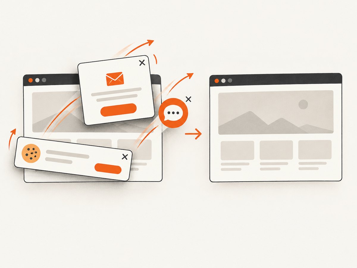
open("shot.webp", "wb").write(r.content)const q = new URLSearchParams({ access_key: 'YOUR_API_KEY', url: 'https://stripe.com' }); const res = await fetch(`https://api.screenshotneo.com/v1/shot?${q}`);Before capture, ScreenshotNeo accepts consent banners and removes more than 60 known consent platforms, newsletter popups, and chat widgets; each step can be turned off. Bot checks and CAPTCHAs, blank pages, timeouts, failed loads, and cache hits cost nothing, and the response identifies the result with X-Page-Verdict and X-Billed headers. Its MCP server provides take_screenshot, get_page_info, and capture_pdf for Claude, Cursor, and other MCP clients. You get 1,000 screenshots each month free with no card; paid plans start at $5 for 3,000. Create a free ScreenshotNeo account.
Configure captures for difficult pages
Lazy loading and network activity
Full-page screenshots can miss images that load only after scrolling. Use a provider’s lazy-image option when available, or scroll through the document in Playwright before capturing. “Network idle” is not always a finish signal: analytics, ads, and WebSockets can keep connections open. Prefer waiting for a meaningful selector such as [data-rendered="true"], then add a short delay for fonts and transitions.
Fonts, animations, and layout shifts
Wait for document.fonts.ready. Disable animations for visual diffs, and capture after images report complete dimensions. If a hero image changes the layout after the screenshot, reserve its aspect-ratio space in CSS or wait for it explicitly.
Cookies, authentication, and localization
Set cookies and authorization headers in the browser context or API request. Select a timezone and locale that match the scenario. A page may redirect to a consent or login screen when those values are missing; record the final URL and status during debugging.
Dark mode and transparency
Dark mode can come from a color-scheme preference, a cookie, or an application setting. Set the same mechanism in every run. Transparent backgrounds are useful for compositing cards or logos, but verify that the target page does not rely on a solid body background.
Compare screenshots consistently
- Use the same URL revision, viewport, device scale, color scheme, locale, and wait rule.
- Store captures with a deterministic name such as
homepage-375-light.png. - Compare dimensions before pixels; a changed browser scale can create a false diff.
- Review structural changes first: overflow, wrapping, hidden navigation, and clipped media.
- Then inspect visual changes such as font rasterization, antialiasing, and dynamic timestamps.
For regression testing, mask timestamps, rotating banners, ads, and personalized recommendations. Keep a small tolerance for antialiasing, but do not hide genuine layout movement with a large threshold.
Troubleshooting
| Symptom | Likely cause | Fix |
|---|---|---|
| Blank or nearly blank image | Capture ran before client rendering or a bot check blocked access | Wait for a rendered selector, inspect the final URL, and use a permitted user agent or headers. |
| Images missing | Lazy loading or blocked third-party resources | Scroll before capture, wait for image completion, and review blocked-resource rules. |
| Wrong mobile layout | Only the image was resized; the CSS viewport was not | Set the browser viewport width and height, then reload the page. |
| Text wraps differently | Fonts, device scale, or viewport width differs | Wait for fonts, fix device scale, and use exact CSS-pixel dimensions. |
| Full page cuts off content | Infinite scroll, fixed containers, or canvas rendering | Use viewport captures, scroll incrementally, or capture the target element. |
| Cookie banner covers content | Consent state was not established | Accept or remove the banner in setup; verify the resulting cookies. |
| Request times out | Slow origin, open connections, or an overly strict timeout | Increase timeout, wait on a selector, block unnecessary resources, and retry with backoff. |
| API returns an HTML error | Authentication, URL encoding, or rate-limit error | Check status and content type, URL-encode the target, and read response headers and body. |
Performance, reliability, and cost
Browser startup is expensive in DIY scripts. Reuse one browser process, create a fresh context per scenario, and run a bounded number of pages concurrently. Excessive parallelism can saturate CPU, memory, the target origin, or an API quota.
Cache captures when the page and viewport are unchanged. For dynamic pages, use a deliberate cache TTL and include the content revision in your cache key. Retry transient network failures with exponential backoff, but do not blindly retry deterministic 4xx responses. Record URL, viewport, timestamp, status, final URL, output size, and verdict for each run.
Cost depends on the provider’s current limits, output type, caching rules, and whether failed requests are billed. Check those terms before scheduling a large crawl. ScreenshotNeo reports verdict and billing headers per response; clean shots are billed, while bot checks, blank pages, timeouts, failed loads, and cache hits cost nothing. Its plans are Free (1,000 shots/month), Starter ($5/3,000), Growth ($15/15,000), Pro ($39/60,000), Scale ($99/250,000), and Business ($249/1,000,000); yearly billing gives two months free.
Responsive screenshot checklist
- List breakpoints and add captures just below and above each one.
- Capture at least one mobile, tablet, and desktop width relevant to your audience.
- Choose viewport or full-page mode intentionally.
- Wait for fonts, images, and application data.
- Set theme, locale, timezone, cookies, and authentication explicitly.
- Disable or mask animations and personalized content for comparisons.
- Save response metadata and distinguish failed loads from valid images.
- Run a real-device check before shipping a mobile-critical experience; emulation is a fast check, not a replacement for physical iOS or Android testing.
FAQ
Is a responsive screenshot a live website?
No. It is a static rendering at a chosen viewport. Use an interactive emulation session when you need to click, scroll, or test touch behavior.
Should I use a device preset or custom dimensions?
Use presets for repeatable named scenarios and custom dimensions for your CSS breakpoints, analytics, or client requirements.
Can one screenshot prove responsive support?
No. Capture multiple widths, especially around breakpoint boundaries, and test interaction separately.
When should I choose PDF?
Choose PDF for print-oriented review or archival documents. Use PNG or WebP for pixel comparison and web delivery.
How do I capture a page behind a login?
Supply an authenticated browser context, cookies, or authorization headers through a secure server-side workflow. Never expose those credentials in client-side code.
What is the fastest hosted option?
For a hosted workflow, ScreenshotNeo provides one GET request, responsive viewport controls, clean-up of consent and overlay elements, MCP tools for AI agents, and a free monthly allowance with no card.


