How to Set the Viewport Size in Headless Chrome with Robot Framework
Set an exact Chrome viewport in Robot Framework with SeleniumLibrary or Browser, verify the result, handle mobile emulation, and avoid common sizing errors.
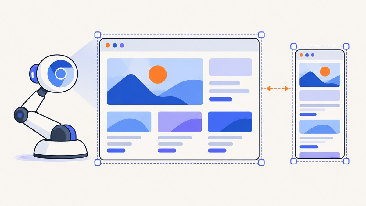
Direct answer: the correct keyword depends on the Robot Framework library in your test. With SeleniumLibrary, open Chrome and use Set Window Size; add inner=True when the numbers must match the page’s DOM viewport (window.innerWidth and window.innerHeight). With Robot Framework Browser, set viewport in New Context before creating the page, or resize the current page with Set Viewport Size.
A viewport is the CSS area available to the page. It is different from the outer browser window and from a complete mobile-device profile. User agent, touch support, device scale factor, mobile behavior, timezone and geolocation are separate settings.
1. Choose the library your test already uses
| Library | Set before navigation | Resize an existing page | Read back the result |
|---|---|---|---|
| SeleniumLibrary | Set Window Size, optionally inner=True |
Call Set Window Size again |
Get Window Size, optionally inner=True |
| Browser | New Context viewport={'width': ..., 'height': ...} |
Set Viewport Size |
Get Viewport Size |
Use SeleniumLibrary’s inner mode when a requirement says “the CSS viewport must be 1280×800.” Use the Browser library’s context option when the initial page load or JavaScript must see the target dimensions from the first moment. The official SeleniumLibrary keyword documentation and Robot Framework Browser documentation describe these keywords and their arguments.
2. SeleniumLibrary: set an exact viewport in headless Chrome
Complete runnable example
*** Settings ***
Library    SeleniumLibrary

*** Test Cases ***
Responsive page at a target viewport
    Open Browser    https://example.com    headlesschrome
    Set Window Size    1280    800    inner=True
    ${width}    ${height}=    Get Window Size    inner=True
    Should Be Equal As Integers    ${width}    1280
    Should Be Equal As Integers    ${height}    800
    [Teardown]    Close Browser
Open Browser accepts headlesschrome as the browser choice. Set Window Size takes width and height. Without inner=True, it targets the outer browser window. With inner=True, SeleniumLibrary adjusts the window so the requested values become the DOM inner dimensions. Get Window Size inner=True reads those dimensions back.
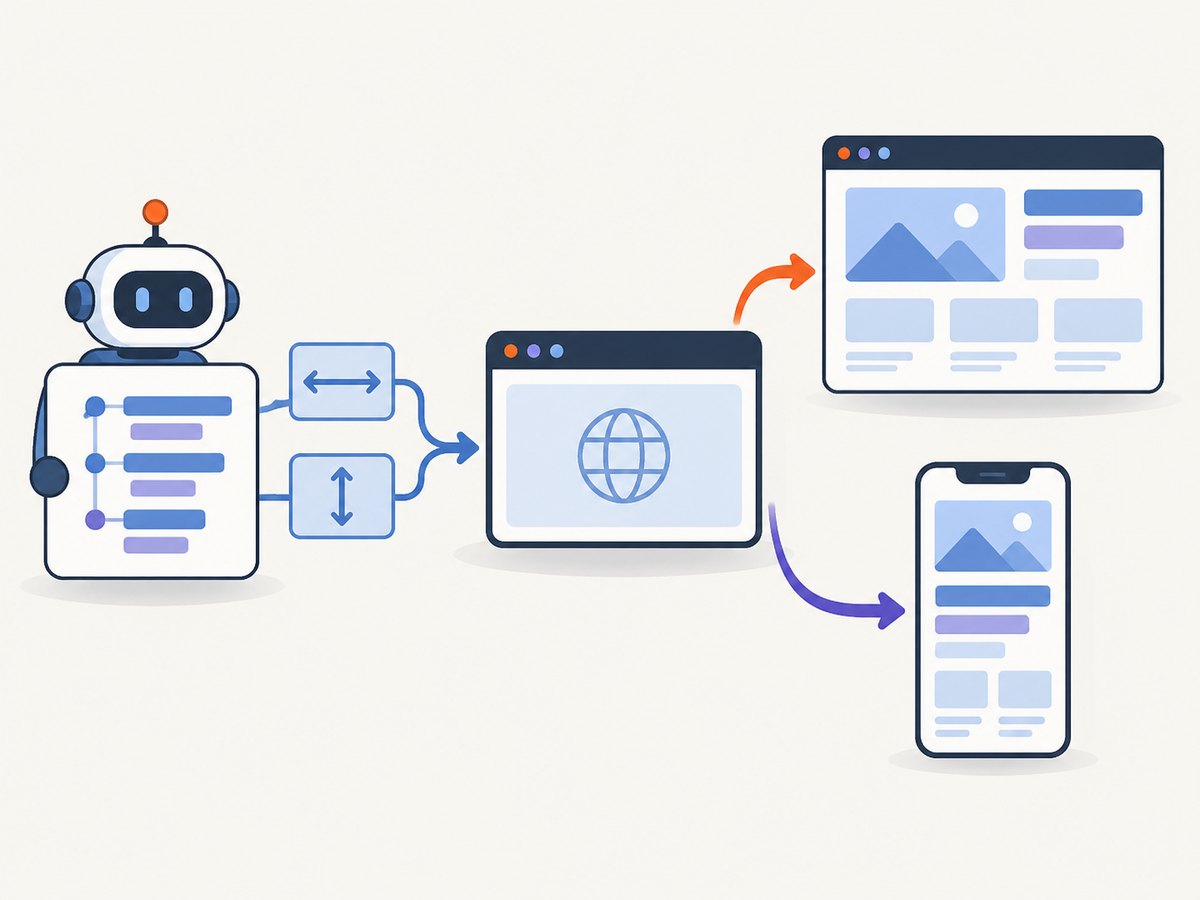
Outer window versus page viewport
These are different measurements:
- Outer window: includes browser chrome and window borders where those exist.
- DOM inner size: the page’s
window.innerWidthandwindow.innerHeight, normally the values that drive CSS media queries. - Visual viewport: the area used for visual layout and zoom. It can differ under mobile emulation or browser zoom.
If a visual regression test checks a breakpoint at 1280 pixels, use inner dimensions and assert them. A request for 1280×800 without inner mode does not prove that the page received a 1280×800 CSS viewport.
Set the size before loading the application
If application code chooses a layout during its first navigation, set the size immediately after opening the browser and before calling Go To or navigating through a link:
*** Settings ***
Library    SeleniumLibrary

*** Test Cases ***
Desktop layout is selected during first load
    Open Browser    about:blank    headlesschrome
    Set Window Size    1440    900    inner=True
    Go To    https://example.com
    ${width}    ${height}=    Get Window Size    inner=True
    Should Be Equal As Integers    ${width}    1440
    Should Be Equal As Integers    ${height}    900
    [Teardown]    Close Browser
When you only need the outer dimensions
Set Window Size    1280    800
${width}    ${height}=    Get Window Size
Should Be Equal As Integers    ${width}    1280
Should Be Equal As Integers    ${height}    800
Use this form only when your requirement is explicitly about the browser window. Operating systems and browser backends may enforce minimum dimensions, so still read the result instead of assuming the request was accepted.
3. Robot Framework Browser: configure the context viewport
Set the viewport before creating a page
*** Settings ***
Library    Browser

*** Test Cases ***
Responsive page at a target viewport
    New Browser    chromium    headless=True
    New Context    viewport={'width': 1280, 'height': 800}
    New Page    https://example.com
    ${size}=    Get Viewport Size
    Should Be Equal As Integers    ${size}[width]    1280
    Should Be Equal As Integers    ${size}[height]    800
    [Teardown]    Close Browser
A Browser context is the right place for a size that must apply from the first navigation. Put New Context before New Page. The viewport dictionary uses CSS pixels.
Resize the current page
*** Settings ***
Library    Browser

*** Test Cases ***
Resize an existing page
    New Browser    chromium    headless=True
    New Context    viewport={'width': 1440, 'height': 900}
    New Page    https://example.com
    Set Viewport Size    1200    800
    ${size}=    Get Viewport Size
    Should Be Equal As Integers    ${size}[width]    1200
    Should Be Equal As Integers    ${size}[height]    800
    [Teardown]    Close Browser
Set Viewport Size changes the page viewport, not the emulated device. If the application responds to a resize event, call the keyword before the action you are testing and wait for the resulting UI state.
4. Viewport size is not full device emulation
A 390×844 viewport can exercise a narrow responsive layout, but it does not automatically make Chrome behave like a phone. Device emulation can also define:
- User agent and platform hints
- Device scale factor and retina rendering
- Touch capability and mobile interaction behavior
- Mobile browser metrics and related device properties
Use a device descriptor when those properties affect the behavior under test. Use a plain viewport when you only need CSS breakpoints or a deterministic page size. The Browser library documentation explains that viewport changes do not themselves switch on mobile emulation.
5. A repeatable sizing workflow
- Identify the library. Check whether the suite imports
SeleniumLibraryorBrowser. - Define the measurement. Decide whether the acceptance criterion is outer window size, DOM inner size, or a device profile.
- Apply the size at the right time. Use SeleniumLibrary inner mode before navigation, or Browser context configuration before
New Page, when first-load behavior matters. - Navigate and wait for the application. A viewport can be correct while the page is still loading fonts, images, or responsive components.
- Read back the dimensions. Assert the actual values in tests that depend on a breakpoint.
- Capture evidence on failure. Save a screenshot, page source, console output, browser version and the measured dimensions.
6. Options that affect screenshots and layout
| Requirement | Recommended setting |
|---|---|
| Desktop CSS breakpoint | Set DOM inner width and height; assert them |
| Mobile CSS plus touch interactions | Use a device descriptor, not viewport alone |
| Initial-load responsive code | Configure the viewport before navigation |
| Resize behavior after load | Use Set Viewport Size or call Set Window Size again |
| Retina screenshot comparison | Set device scale factor in the emulation profile or capture tool |
| Stable visual diffs | Wait for fonts, animations and lazy content before capture |
7. Troubleshooting common errors
The measured size is smaller than requested
Cause: the browser or operating system enforced a minimum window size, or outer dimensions were requested while inner dimensions were expected. Fix: use inner=True, read the resulting values, and choose a supported size. Do not use maximize as a substitute for an assertion.
The CSS breakpoint does not change
Cause: the page was loaded before the viewport was configured, the page uses a different media feature, or a fixed container overrides the expected layout. Fix: set the context before New Page, inspect window.innerWidth, and check the page’s CSS conditions.
Set Viewport Size is not found
Cause: the suite imported SeleniumLibrary or an older Browser library version. Fix: confirm the active library import and installed package version, then use the keyword documented for that release.
Mobile behavior is missing
Cause: width and height alone do not enable touch, a mobile user agent or device scale factor. Fix: configure a device descriptor with the required properties.
Headless and headed results differ
Cause: different browser flags, viewport defaults, fonts, GPU paths or timing. Fix: set the dimensions explicitly in both modes, record browser and driver versions, install the same fonts, and wait for network and rendering completion.
The page changes size after navigation
Cause: application code calls resize, opens a popup, or applies a responsive shell after hydration. Fix: measure after the application is ready and inspect resize listeners or layout scripts. Reapply the size only when that behavior is part of the test.
8. Reliability and performance
Viewport configuration itself is inexpensive; navigation, JavaScript execution, fonts and images dominate run time. Reuse a browser where isolation allows it, but create a fresh context when cookies, storage or device settings must not leak between tests. Set a deterministic viewport in every test that asserts layout so parallel workers do not inherit defaults.
For reliable visual checks, wait for a meaningful application-ready condition rather than an arbitrary short delay. Examples include a stable content selector, a loading indicator disappearing, or network-idle behavior where the application permits it. Disable animations with test CSS when animation timing creates false differences. Record the requested and measured dimensions in failure logs.
There is no universal Chrome, ChromeDriver, Selenium, Robot Framework, SeleniumLibrary or Browser-library version matrix established by the available documentation. When a result changes after an upgrade, capture all installed versions and consult the documentation for that release.
9. Or skip the browser setup
If your goal is a clean screenshot rather than an interactive browser test, ScreenshotNeo provides a website screenshot API and MCP server. It accepts a URL and returns PNG, JPEG, WebP or PDF. The viewport can be selected with the same parameter names used by many screenshot APIs, and the service also supports full-page capture, device presets, custom viewports, retina scale, waiting conditions, custom CSS and JavaScript, headers, cookies, user agents, blocking rules and caching.
One request is enough:
curl -G "https://api.screenshotneo.com/v1/shot" -d access_key=YOUR_API_KEY --data-urlencode url=https://stripe.com -o shot.webpPython:
import requests
r = requests.get("https://api.screenshotneo.com/v1/shot", params={"access_key": "YOUR_API_KEY", "url": "https://stripe.com"}, timeout=90)
open("shot.webp", "wb").write(r.content)
Node.js:
const q = new URLSearchParams({ access_key: 'YOUR_API_KEY', url: 'https://stripe.com' });
const res = await fetch(`https://api.screenshotneo.com/v1/shot?${q}`);
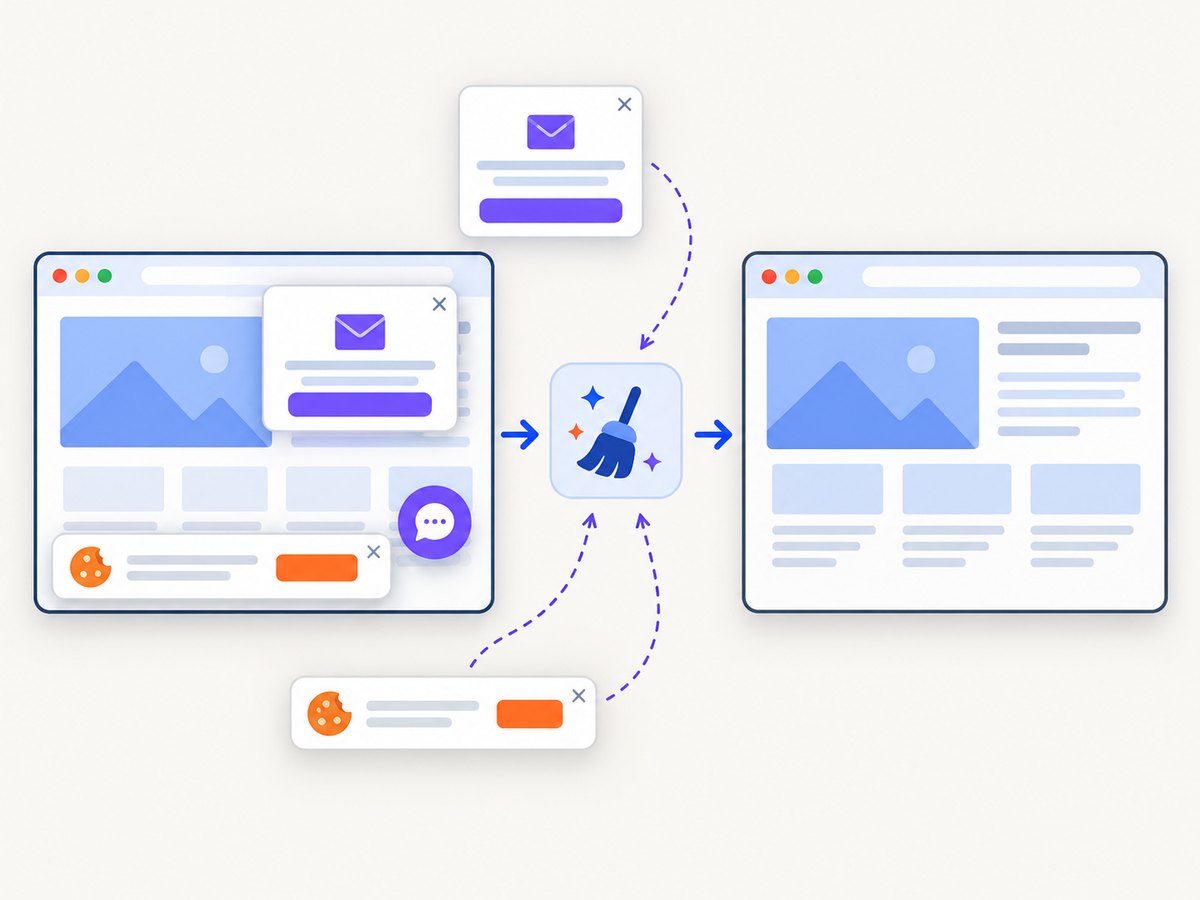
See the ScreenshotNeo documentation for the complete option list. Cookie and consent banners are accepted and removed before capture, along with more than 60 known consent platforms, newsletter popups and chat widgets. Bot checks, blank pages, timeouts, failed loads and cache hits are not billed; response headers identify the page verdict and whether the request was billed. An MCP server lets Claude, Cursor and other MCP clients call take_screenshot, get_page_info and capture_pdf. The free plan includes 1,000 screenshots per month with no card, and paid plans start at $5 for 3,000.
Create a free ScreenshotNeo account and start with 1,000 screenshots per month at no charge.
10. FAQ
Should I use width 1280 and height 800 for every test?
No. Choose dimensions that represent the breakpoint or device behavior you need, then assert the measured result.
Does headless Chrome ignore window size?
It can enforce minimum dimensions or report outer dimensions differently. Read back inner dimensions and test the actual CSS viewport.
Can I test a phone with only Set Viewport Size?
You can test a narrow responsive layout. Add device emulation when touch, user agent or scale factor matters.
Should the viewport be set before or after opening the page?
Set it before navigation when initial-load scripts depend on it. Resize after navigation only when testing runtime resize behavior.
How do I diagnose a library-version problem?
Log Robot Framework, the selected library, Selenium or Playwright, Chrome and the driver versions, then compare the keyword syntax with that release’s official documentation.


