How to Rotate the Viewport in Puppeteer
Use Puppeteer viewport emulation to test landscape layouts, responsive breakpoints, devices, screenshots, and PDFs with reliable code and fixes.
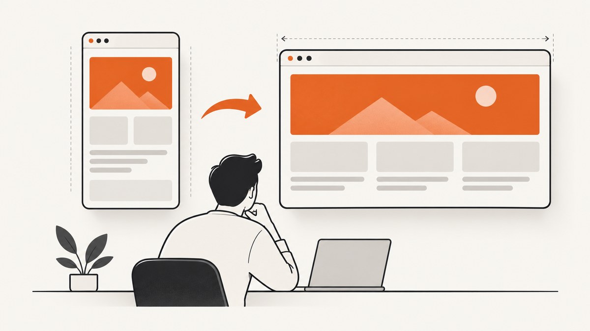
To rotate a Puppeteer viewport, resize it to landscape dimensions and set isLandscape: true:
await page.setViewport({
  width: 844,
  height: 390,
  isLandscape: true,
});
The values are CSS pixels that you choose for the layout under test. Puppeteer changes how the page is rendered inside the browser; it does not physically rotate a monitor, laptop, phone, or other screen. The documented APIs cover page viewport resizing and device emulation. See the official Page.setViewport(), Viewport interface, and Page.emulate() references.
What “rotate the viewport” means in Puppeteer
“Rotate” usually means one of two things:
- Landscape page emulation: the page receives a wider viewport than it is tall, and the browser exposes the landscape setting.
- Physical screen rotation: turning a real display or device. Puppeteer’s page APIs do not control that hardware.
For responsive testing, screenshots, visual regression, and PDF generation, the first meaning is the one you need. A viewport is a CSS-pixel rectangle used for page layout. Width, height, device scale factor, mobile behavior, touch support, and the optional landscape flag can all affect what the page renders.
Basic landscape viewport example
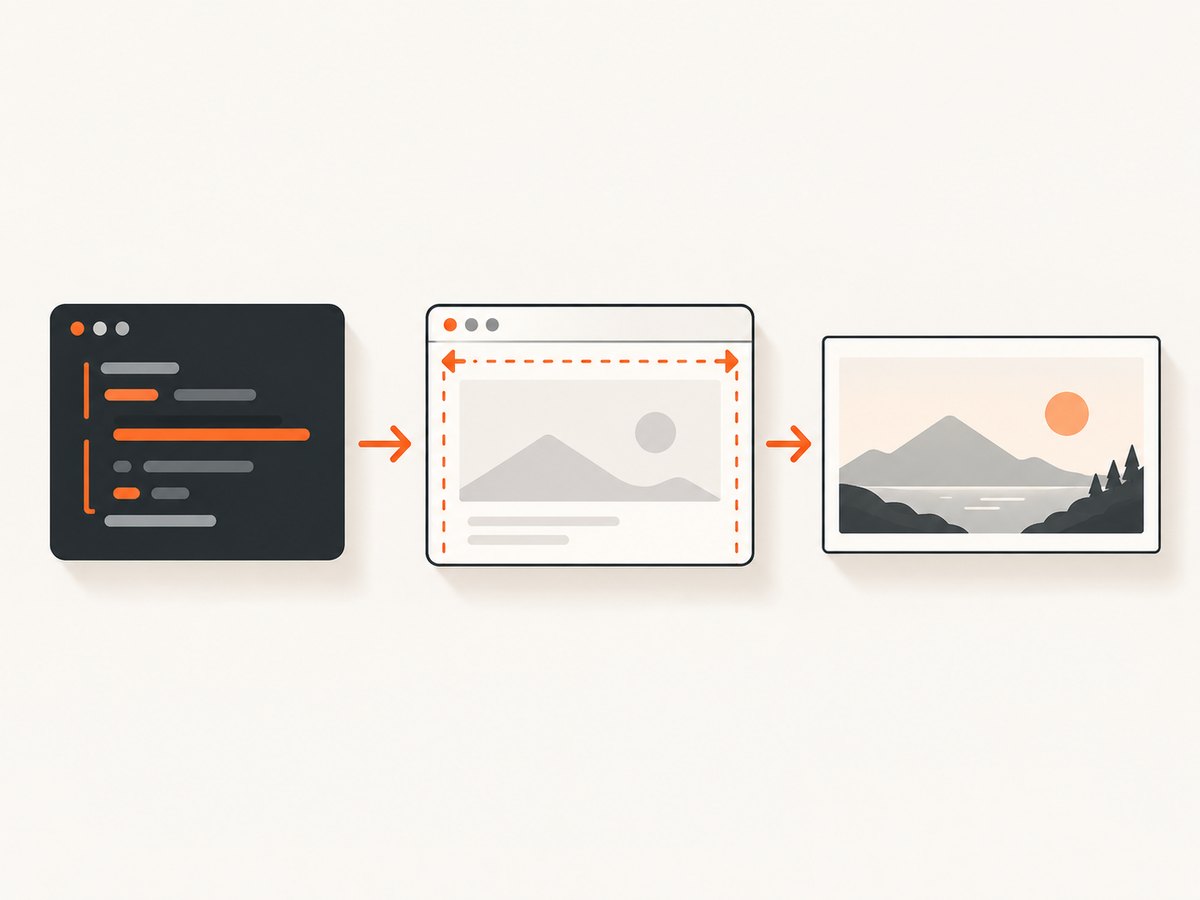
Set the viewport after creating a page and before navigation whenever practical. This prevents the page from first rendering at a default size and then changing layout after scripts have started.
import puppeteer from 'puppeteer';

const browser = await puppeteer.launch({ headless: true });
const page = await browser.newPage();

await page.setViewport({
  width: 1280,
  height: 720,
  isLandscape: true,
});

await page.goto('https://example.com', {
  waitUntil: 'networkidle2',
});

await page.screenshot({
  path: 'example-landscape.png',
  fullPage: false,
});

await browser.close();
width and height are CSS pixels. There is no mandatory “correct” landscape size: use the dimensions represented by your product requirement, test matrix, or target device. A 1280×720 viewport tests a common desktop proportion; 844×390 tests a wide mobile-style viewport; neither is a measured hardware standard.
Configure the viewport before navigation
The order matters for predictable tests:
- Launch Chromium.
- Create a page.
- Call
page.setViewport(). - Set any user agent, timezone, cookies, or permissions your test requires.
- Navigate to the URL.
- Wait for the page state you need, then capture or assert.
Puppeteer recommends configuring the page before navigation. Changing settings such as isMobile or hasTouch can cause a reload in some situations, so changing them after a page has loaded can invalidate measurements or screenshot timing.
Viewport options you can combine with landscape
The viewport object supports more than width and height. The exact TypeScript interface is documented in Puppeteer’s Viewport reference.
| Option | Purpose | Practical guidance |
|---|---|---|
width |
Viewport width in CSS pixels. | Use the width that should trigger your responsive breakpoints. |
height |
Viewport height in CSS pixels. | Use enough height to test fold behavior, sticky elements, and scrolling. |
isLandscape |
Marks the emulation as landscape. | Set it to true for landscape-style emulation; it defaults to false. |
deviceScaleFactor |
Controls the emulated pixel density. | Use a consistent value for visual comparisons; it changes screenshot pixel dimensions. |
isMobile |
Enables mobile-oriented emulation behavior. | Use when testing mobile layout rules, not merely a narrow desktop window. |
hasTouch |
Emulates touch input support. | Pair it with mobile testing when the site changes controls based on touch capability. |
For a desktop landscape test, start with width, height, and isLandscape. Add mobile and touch settings only when the behavior under test depends on them.
Custom dimensions versus a known device
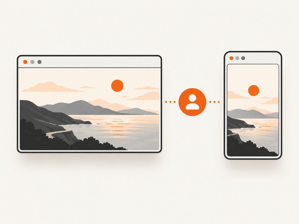
Use setViewport when you need precise CSS-pixel dimensions. Use page.emulate(device) when you need a known device profile, including its user agent and viewport. Puppeteer documents emulate as a shortcut that combines user-agent and viewport configuration.
import puppeteer from 'puppeteer';

const browser = await puppeteer.launch();
const page = await browser.newPage();

const devices = puppeteer.KnownDevices;
await page.emulate(devices['iPhone 13']);

// If your test needs landscape dimensions, explicitly set them after
// selecting the device profile and before navigation.
await page.setViewport({
  width: 844,
  height: 390,
  isMobile: true,
  hasTouch: true,
  isLandscape: true,
  deviceScaleFactor: 3,
});

await page.goto('https://example.com', { waitUntil: 'networkidle2' });
await page.screenshot({ path: 'device-landscape.png' });
await browser.close();
Many sites do not expect a phone’s dimensions to change after navigation. Configure the device and final viewport before calling goto. If the device profile supplies a user agent that your test needs, retain it; if you only need a particular width and height, a custom viewport is simpler and easier to reproduce.
Complete script for responsive screenshot checks
This example captures both orientations and records the viewport used for each file.
import puppeteer from 'puppeteer';

const cases = [
  { name: 'portrait', width: 390, height: 844, isLandscape: false },
  { name: 'landscape', width: 844, height: 390, isLandscape: true },
];

const browser = await puppeteer.launch({ headless: true });

for (const testCase of cases) {
  const page = await browser.newPage();
  await page.setViewport({
    width: testCase.width,
    height: testCase.height,
    isLandscape: testCase.isLandscape,
    isMobile: true,
    hasTouch: true,
    deviceScaleFactor: 2,
  });

  await page.goto('https://example.com', {
    waitUntil: 'networkidle2',
    timeout: 45_000,
  });
  await page.screenshot({
    path: `example-${testCase.name}.png`,
    fullPage: true,
  });
  await page.close();
}

await browser.close();
Use separate pages when possible so cookies, storage, and page-level state from one orientation cannot affect another. If you reuse a page, set every relevant option explicitly before each navigation.
Landscape viewports for PDFs and full-page captures
A landscape viewport and a landscape PDF are related but separate settings. The viewport controls HTML layout before printing; PDF options control paper orientation and pagination.
await page.setViewport({
  width: 1440,
  height: 900,
  isLandscape: true,
});

await page.goto('https://example.com/report', { waitUntil: 'networkidle2' });

await page.pdf({
  path: 'report-landscape.pdf',
  format: 'A4',
  landscape: true,
  printBackground: true,
  margin: {
    top: '12mm',
    right: '12mm',
    bottom: '12mm',
    left: '12mm',
  },
});
Set both when you want the page to lay out wide and the printed paper to be horizontal. A landscape viewport alone does not force PDF paper orientation.
Common mistakes and fixes
| Symptom | Cause | Fix |
|---|---|---|
| The page still looks portrait. | Width is less than height, or the page uses a fixed container. | Use landscape dimensions such as 1280×720, verify the computed layout, and inspect fixed-width CSS. |
isLandscape has no visible effect. |
The site responds only to width and height. | Keep the flag for orientation-aware APIs, but treat dimensions and CSS media queries as the primary layout controls. |
| The page flashes at the wrong size. | Viewport was changed after navigation. | Call setViewport before goto. |
| A device test has desktop behavior. | Only dimensions were changed; the user agent or mobile emulation was not. | Use page.emulate(device), or set isMobile, hasTouch, and the intended user agent explicitly. |
| Screenshot pixel size is unexpected. | deviceScaleFactor changes output pixels relative to CSS pixels. |
Set a known scale factor and compare images at the same scale. |
| Sticky headers or lazy content are missing. | The capture occurred before the page finished rendering or scrolling. | Wait for a selector or network idle, then scroll or use fullPage as appropriate. |
| Changing mobile options reloads the page. | Puppeteer may reload when isMobile or hasTouch changes. |
Set those options before navigation and avoid changing them mid-test. |
| The PDF is still portrait. | PDF print settings were not set to landscape. | Pass landscape: true to page.pdf() in addition to the viewport configuration. |
| Navigation times out. | The site has long-running requests, bot checks, or unavailable resources. | Set a suitable timeout, wait for a specific ready selector, and record the failing URL and error. |
Reliable orientation testing checklist
- Choose CSS-pixel dimensions that match the breakpoint or device you want to test.
- Set viewport, mobile, touch, scale, and user-agent settings before navigation.
- Use
isLandscape: truefor landscape emulation and keep width greater than height. - Wait for a meaningful readiness condition instead of relying only on a fixed delay.
- Capture at a consistent device scale factor for visual diffs.
- Test both orientations when components change navigation, tables, charts, or dialogs.
- Use separate pages or reset state between cases.
- Keep browser and Puppeteer versions consistent in CI so rendering changes are reviewable.
Performance, reliability, and cost considerations
Viewport changes are inexpensive compared with launching a browser and loading a page. For a suite of URLs, reuse one browser process but isolate cases with new pages or contexts. Avoid repeatedly launching Chromium unless process isolation is required.
Network-heavy pages are usually the slow part. Prefer a readiness selector for deterministic applications, or networkidle2 when the page has a clear quiet period. Fixed delays are easy to understand but can be either too short for slow runs or unnecessarily long for fast runs.
Full-page screenshots can require substantially more memory than viewport screenshots because Puppeteer renders and stitches content beyond the fold. Capture only the required element or viewport when that meets the requirement. Keep timeouts explicit and log URL, dimensions, scale factor, browser version, and the final error so failures can be reproduced.
Or skip the browser setup
If your goal is a clean screenshot rather than controlling Chromium directly, ScreenshotNeo provides a GET API. The request accepts the URL and returns PNG, JPEG, WebP, or PDF output. See the ScreenshotNeo API documentation for the full option list.
cURL
curl -G "https://api.screenshotneo.com/v1/shot" \
  -d access_key=YOUR_API_KEY \
  --data-urlencode url=https://stripe.com \
  -o shot.webp
Python
import requests

r = requests.get(
    "https://api.screenshotneo.com/v1/shot",
    params={"access_key": "YOUR_API_KEY", "url": "https://stripe.com"},
    timeout=90,
)
r.raise_for_status()
open("shot.webp", "wb").write(r.content)
Node.js
const q = new URLSearchParams({ access_key: 'YOUR_API_KEY', url: 'https://stripe.com' });
const res = await fetch(`https://api.screenshotneo.com/v1/shot?${q}`);
if (!res.ok) throw new Error(`Screenshot failed: ${res.status}`);
const buffer = Buffer.from(await res.arrayBuffer());
await import('node:fs/promises').then(fs => fs.writeFile('shot.webp', buffer));
ScreenshotNeo removes cookie and consent banners, newsletter popups, and chat widgets before capture. Bot checks, blank pages, timeouts, failed loads, and cache hits are not billed; response headers identify the page verdict and billing result. Its MCP server provides take_screenshot, get_page_info, and capture_pdf tools for Claude, Cursor, and other MCP clients.
You can also set viewport dimensions, device presets, retina scale, dark mode, full-page capture, element selectors, custom CSS and JavaScript, clicks, waits, blocked resources, headers, cookies, user agents, timezone, geolocation, transparency, resizing, caching, signed links, asynchronous webhooks, bulk capture, and PDF paper settings. The free plan includes 1,000 screenshots per month without a card; paid plans start at $5 for 3,000 screenshots. Create a free ScreenshotNeo account.
FAQ
Does isLandscape rotate the browser window?
No. It describes the emulated page orientation. Puppeteer does not rotate physical hardware.
Can I use landscape dimensions without isLandscape?
Yes. Width greater than height controls most responsive CSS behavior. The flag adds orientation information for emulation-aware behavior.
Should I call setViewport before or after goto?
Before navigation. This avoids an initial render at the wrong size and prevents setting changes from triggering a reload after the page has loaded.
When should I use emulate instead?
Use it when a known device’s viewport and user agent are both part of the test. Use custom setViewport values for precise, device-independent breakpoint checks.
Why does my screenshot have more pixels than the viewport width?
Check deviceScaleFactor. CSS pixels and output bitmap pixels differ when the emulated pixel density is above one.


