How to Run Cypress Tests in Chrome’s Mobile Responsive View
Set Cypress to mobile viewport sizes in Chrome, test responsive breakpoints, understand DevTools differences, and know when real-device checks matter.

Direct answer: launch Cypress with Chrome, then set the application viewport inside the test with cy.viewport(width, height) or a named device preset. You do not need to open Chrome DevTools Device Mode for Cypress responsive tests.
npx cypress open --e2e --browser chrome
# or run in CI
npx cypress run --browser chrome
describe('mobile navigation', () => {
it('shows the mobile menu at a narrow width', () => {
cy.viewport(390, 844)
cy.visit('/')
cy.get('[data-testid="desktop-nav"]').should('not.be.visible')
cy.get('[data-testid="mobile-menu-button"]').should('be.visible')
})
})The selectors are examples. Replace them with selectors and assertions from your application. See the Cypress viewport API and browser launch documentation.
1. Set up the Cypress test in Chrome
Open mode
Use open mode while developing and inspecting failures:
npx cypress open --e2e --browser chromeSelect your spec in the Cypress app. The Chrome browser is selected separately from the viewport size.
Run mode
Use run mode for repeatable local or CI execution:
npx cypress run --e2e --browser chromeChrome must be installed and discoverable in the environment where Cypress runs. Cypress documents supported browsers and launch flags in its launching browsers guide.
2. Choose a mobile viewport
Explicit width and height
cy.viewport(390, 844)
cy.visit('/')
The first value is the viewport width in CSS pixels and the second is the viewport height. Set the viewport before visiting the page so the application initializes at the intended size.
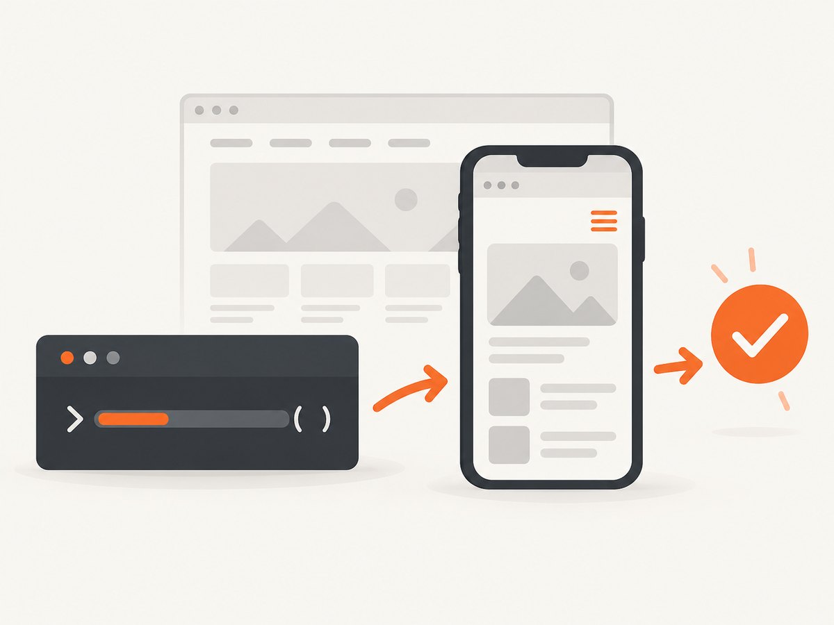
Named device presets
cy.viewport('iphone-6')
cy.viewport('iphone-6', 'landscape')
Presets are convenient for familiar device-sized layouts. They are still viewport settings, not a complete simulation of a phone. Check the current supported names in the Cypress API reference.
Test the boundaries your CSS actually uses
A device name can hide an important breakpoint. If your CSS changes at 480px, test just below and above it:
const widths = [375, 479, 480, 481, 768]

widths.forEach((width) => {
  it(`renders correctly at ${width}px`, () => {
    cy.viewport(width, 844)
    cy.visit('/')
    cy.get('[data-testid="page-shell"]').should('be.visible')
  })
})
Keep assertions focused on user-visible behavior: navigation state, layout visibility, readable content, form usability, and the absence of horizontal overflow.
3. Configure a viewport for a suite or project
For one suite, put viewport settings in the suite configuration:
describe('mobile checkout', {
  viewportWidth: 390,
  viewportHeight: 844
}, () => {
  it('keeps the checkout form usable', () => {
    cy.visit('/checkout')
    cy.get('[data-testid="checkout-form"]').should('be.visible')
  })
})
For project-wide defaults, set the values in cypress.config.js:
const { defineConfig } = require('cypress')

module.exports = defineConfig({
  e2e: {
    viewportWidth: 390,
    viewportHeight: 844
  }
})
Cypress documents default dimensions of 1000 by 660 pixels and resetting behavior between tests. See Cypress configuration. A per-test cy.viewport() call overrides the configured size for that test.
4. Portrait, landscape, and responsive assertions
describe('responsive navigation', () => {
  beforeEach(() => {
    cy.visit('/')
  })

  it('uses the mobile menu in portrait', () => {
    cy.viewport(390, 844)
    cy.get('[data-testid="mobile-menu-button"]').should('be.visible')
    cy.get('[data-testid="desktop-nav"]').should('not.be.visible')
  })

  it('keeps navigation usable in landscape', () => {
    cy.viewport(844, 390)
    cy.get('[data-testid="page-shell"]').should('be.visible')
  })
})
Viewport sizing changes the app-under-test viewport. It does not simulate devicePixelRatio, a mobile operating system, or every touch and hardware behavior.
5. Cypress versus Chrome DevTools Device Mode
| Need | Cypress | Chrome DevTools Device Mode |
|---|---|---|
| Repeatable assertions | cy.viewport() in automated tests |
Manual inspection in a Chrome session |
| Launch | --browser chrome |
Open DevTools and toggle the device toolbar |
| Dimensions | Explicit width/height or Cypress preset | Enter responsive dimensions, drag, or select a device |
| Extra emulation | Viewport size only; devicePixelRatio is not simulated | Can emulate selected device characteristics, touch, orientation, and CPU/network conditions |
| Fidelity | Automated browser check, not a physical phone | Chrome describes Device Mode as a first-order approximation |
Device Mode is useful for exploration and seeing media-query breakpoints. It is not a Cypress command and does not run your Cypress assertions. Read Chrome’s Device Mode guide.
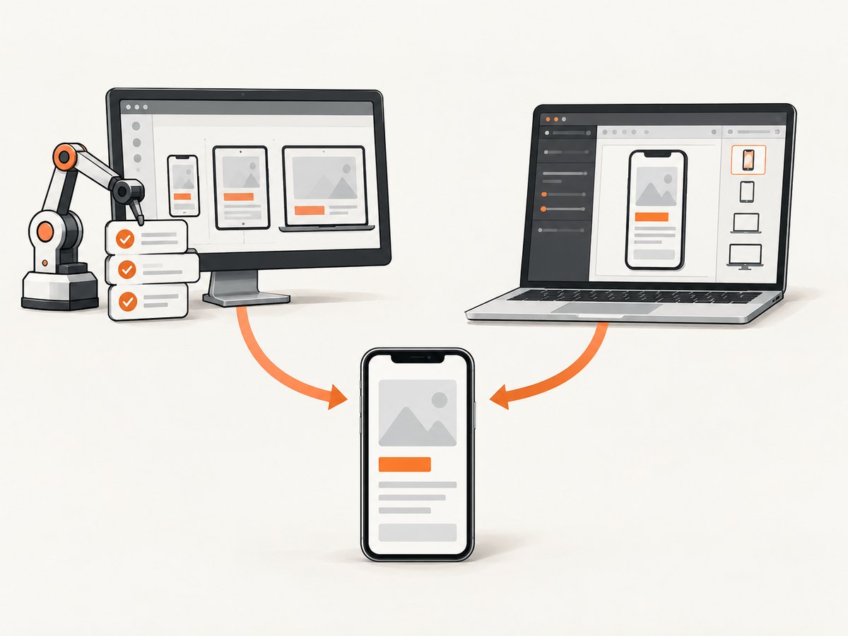
6. A practical responsive test matrix
- List the application’s CSS breakpoint boundaries.
- Choose at least one width below, at, and above each important boundary.
- Run portrait and landscape checks where layout changes.
- Assert navigation, forms, dialogs, tables, images, and long text.
- Use DevTools for exploratory touch, throttling, and layout inspection.
- Use a real phone when browser, operating-system, hardware, or touch behavior can affect the result.
Chrome’s documented width presets include 320, 375, 425, 768, 1024, 1440, and 2560 pixels. Treat these as controls, not usage statistics.
7. Troubleshooting
| Symptom | Cause | Fix |
|---|---|---|
cy.viewport() appears ineffective |
The command runs after the page has already made layout-dependent decisions, or another command resets the viewport. | Set the viewport before cy.visit(); check suite and project configuration for overrides. |
| Chrome does not launch | Chrome is unavailable or Cypress cannot discover it in the local or CI environment. | Install Chrome in that environment and verify available browsers with Cypress’s launch guidance. |
| Preset name fails | The preset is misspelled or unsupported by the installed Cypress version. | Use explicit dimensions or verify the current preset list in the viewport API documentation. |
| Desktop navigation is still visible | The chosen width is outside the application breakpoint, or the selector does not describe visibility correctly. | Test widths around the real breakpoint and assert the application’s own state or selectors. |
| Layout differs from a phone | Viewport tests do not reproduce devicePixelRatio, mobile OS behavior, hardware, or all touch behavior. | Use DevTools for additional emulation and validate on a real phone when those properties matter. |
| Tests pass locally but fail in CI | Different browser versions, application startup timing, or network conditions. | Pin and document the CI browser environment, wait on application readiness, and capture Cypress artifacts for failures. |
| Open mode does not look phone-sized | The Cypress runner window and the app viewport are separate; the runner may scale the preview. | Check the viewport indicator and assertions rather than judging only the outer runner window. See open mode concepts. |
8. Performance, reliability, and cost
Performance: every additional width multiplies page visits and assertions. Keep a small boundary-focused matrix on every commit, then run a broader device matrix on scheduled or release jobs. Avoid arbitrary waits; wait for application state or a specific selector.
Reliability: use stable data-testid or accessible selectors, isolate tests, and make the application’s readiness condition explicit. A viewport test proves layout behavior at a size; it does not prove behavior on every browser or phone.
Cost: Cypress and Chrome provide the workflow described here without a screenshot service. If you also need image artifacts for visual review, reporting, or an external URL, use the capture option below.
9. Or skip the browser setup
ScreenshotNeo provides a website screenshot API and MCP server. One GET request returns PNG, JPEG, WebP, or PDF output. Cookie and consent banners are accepted and removed before capture, along with 60-plus known consent platforms, newsletter popups, and chat widgets; each step can be turned off. Bot checks, blank pages, timeouts, failed loads, and cache hits are not billed, and response headers report the page verdict and billing status.
See the ScreenshotNeo API documentation for all options, including full-page capture, CSS element capture, device presets or custom viewports, dark mode, retina scale, custom CSS and JavaScript, waits, request blocking, headers, cookies, user agents, timezone, geolocation, caching, signed links, asynchronous jobs, bulk capture, and usage reporting.
curl -G "https://api.screenshotneo.com/v1/shot" \
  -d access_key=YOUR_API_KEY \
  --data-urlencode url=https://stripe.com \
  -o shot.webp
import requests
r = requests.get(
"https://api.screenshotneo.com/v1/shot",
params={"access_key": "YOUR_API_KEY", "url": "https://stripe.com"},
timeout=90,
)
r.raise_for_status()
open("shot.webp", "wb").write(r.content)const q = new URLSearchParams({ access_key: 'YOUR_API_KEY', url: 'https://stripe.com' });
const res = await fetch(`https://api.screenshotneo.com/v1/shot?${q}`);
if (!res.ok) throw new Error(`Screenshot failed: ${res.status}`);
const image = Buffer.from(await res.arrayBuffer());
require('fs').writeFileSync('shot.webp', image);An MCP server lets Claude, Cursor, and other MCP clients call take_screenshot, get_page_info, and capture_pdf. The Free plan includes 1,000 screenshots per month with no card; paid plans start at $5 for 3,000. Create a free ScreenshotNeo account.
10. FAQ
Does Cypress use Chrome’s responsive device toolbar?
No. Cypress sets the application viewport through cy.viewport(). Chrome DevTools Device Mode is a separate manual workflow.
Can I test a breakpoint without using a device preset?
Yes. Use explicit CSS-pixel dimensions such as cy.viewport(479, 844) and cy.viewport(480, 844).
Does this test a real iPhone?
No. It checks responsive behavior at a viewport size. Use a real device when mobile hardware, operating-system behavior, browser differences, or touch fidelity matters.
Should I use one mobile width for the whole project?
Use a project default only when it fits most tests. For responsive coverage, add tests around your application’s breakpoint boundaries and include landscape where relevant.


