How to Capture Screenshots in Safari Responsive Design Mode
Capture a Safari responsive preview with macOS Screenshot, or save a precise webpage rectangle from Safari 18.4’s Web Inspector. Learn which method fits your goal.
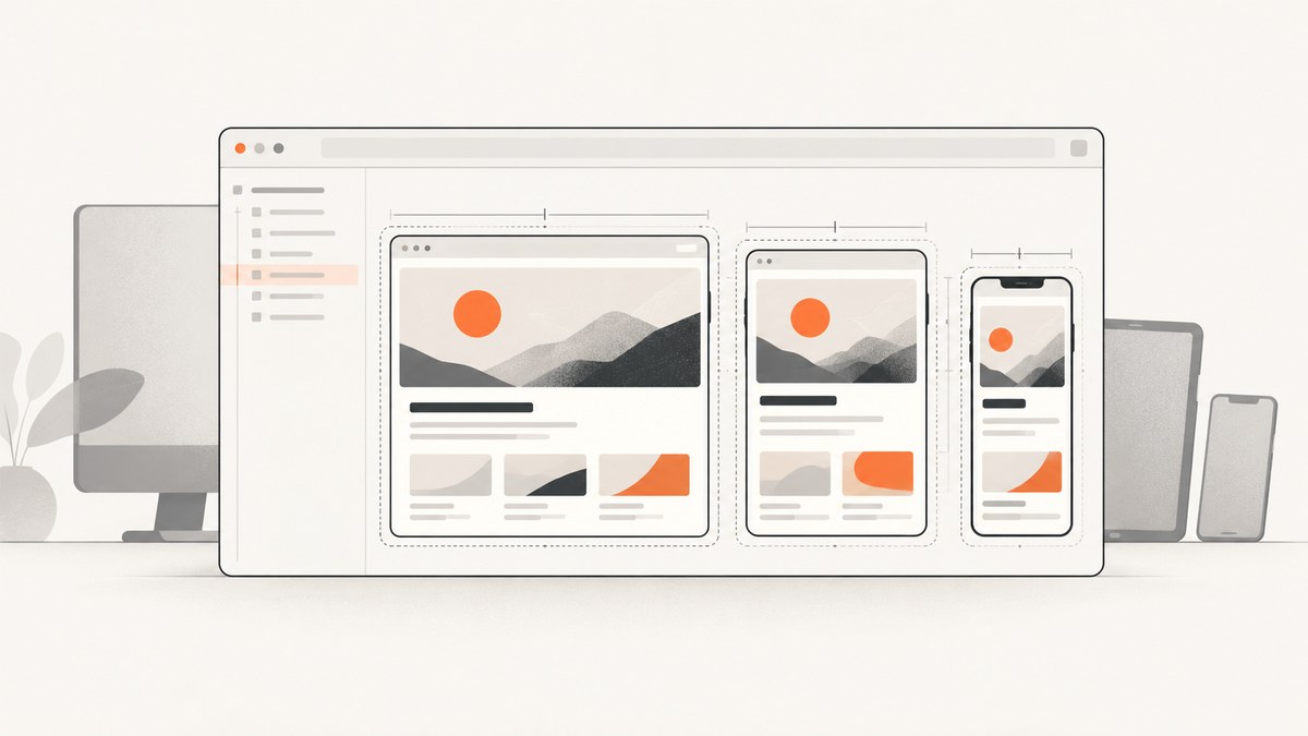
To capture a Safari Responsive Design Mode preview, first decide what the image should include. Use macOS Screenshot (Shift-Command-5) to save the Safari window, the whole screen, or a selected area, including the preview controls if you want them. To save a precise rectangle of webpage content without Safari’s interface, Safari 18.4 documents a Web Inspector console API: console.screenshot(). For a repeatable responsive test, note the viewport dimensions, orientation, pixel ratio, and capture scope alongside the image.
Responsive Design Mode is useful for inspecting layout at different viewport sizes, but it approximates devices. Apple notes that actual rendering and behavior can differ, including because of browser UI, the on-screen keyboard, and device-specific form behavior. For a more faithful iOS, iPadOS, or visionOS check, open the page in Simulator or test on the device.
1. Choose what your screenshot needs to show
There are two common meanings of “screenshot of Responsive Design Mode.” They produce different images, so choose the capture method based on the deliverable:
| Goal | Use | Image includes |
|---|---|---|
| Show the responsive preview and its setup | macOS Screenshot | Safari window or a selected part of the screen, potentially including browser and preview controls |
| Save just a particular webpage rectangle | Web Inspector console.screenshot() (Safari 18.4) |
The specified page rectangle, without a screen capture of the Safari interface |
| Record a page for a ticket or design review | Usually a selected-area capture | The preview plus only the surrounding context needed to explain it |
If you are comparing responsive breakpoints, save one capture for each width you need to discuss. Include the width and height, orientation, pixel ratio, and capture scope in the filename or review notes. Otherwise, a screenshot can be difficult to reproduce: a layout difference might come from viewport width, device pixel ratio, or simply a different capture boundary.
2. Open Responsive Design Mode and set the preview
- Open the page you want to inspect in Safari on macOS.
- If the Develop menu is missing, enable Safari’s developer features in Safari settings. Apple’s current Responsive Design Mode documentation describes access through the Develop menu.
- Choose Develop > Enter Responsive Design Mode. Apple documents Control-Command-R (⌃⌘R) as the shortcut.
- Choose a device preset or set the viewport width and height you need. You can resize the preview to a custom size.
- Set the pixel ratio and orientation, then wait for the page to settle before capturing. Check responsive layout, text wrapping, image selection, and any controls relevant to your screenshot.
The displayed viewport dimensions are screen points. A preset approximates a device size; it does not reproduce every part of that device. Pixel ratio matters as well as width and height: changing it can affect pixel-ratio media queries and which image a page selects from srcset or CSS image-set(). Rotating the preview swaps the viewport dimensions.
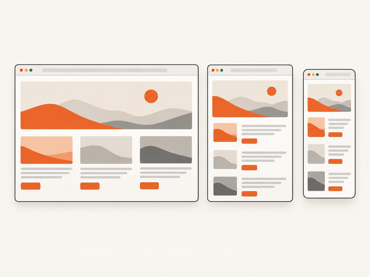
Apple and WebKit describe Responsive Design Mode and its settings in their documentation: Apple’s Responsive Design Mode guide and WebKit’s overview of the simplified mode.
3. Capture the Safari window, screen, or a selected area
- Arrange Safari so the responsive preview is at the desired viewport and the relevant page content is visible.
- Press Shift-Command-5 to open the macOS Screenshot controls.
- Choose a whole-screen, window, or selected-area capture. For a window capture, follow the on-screen prompt to select the Safari window.
- For selected area, drag the boundary around the preview and any context you want to include.
- Use Options to choose a save location or set a timer if you need time to prepare the page.
- Capture, then open the saved image and confirm it includes the intended scope and viewport.
macOS Screenshot is the right choice when the Safari interface is part of the evidence, such as documenting which responsive preset was selected. A selected-area capture is usually better when the preview should be the focus. macOS provides the capture controls and save-location and timer options through the Screenshot app; see Apple’s screenshot instructions.
4. Capture a precise webpage rectangle in Safari 18.4
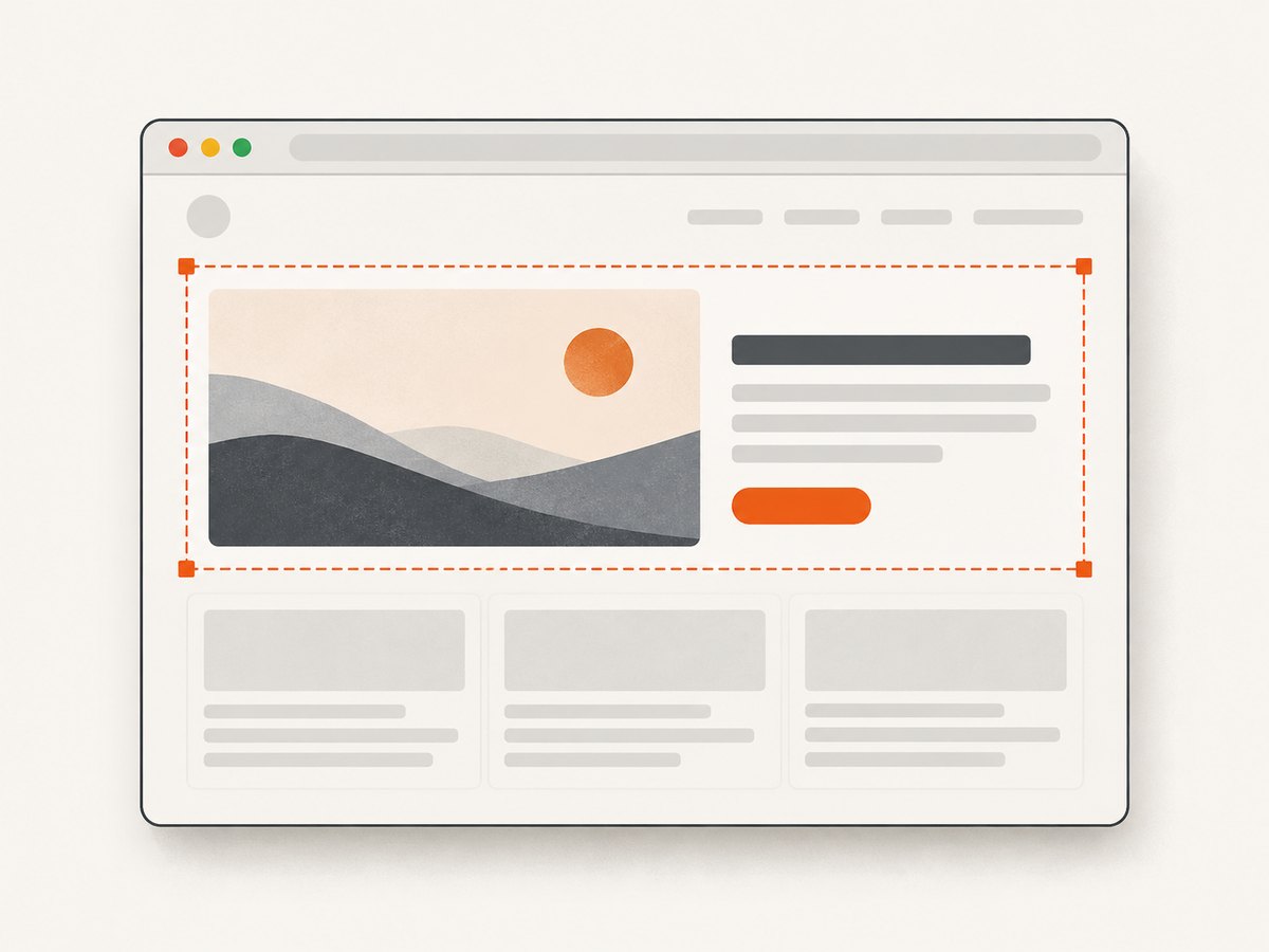
Safari 18.4 documents console.screenshot() in Web Inspector’s console. Its argument is a DOMRect, so you can provide coordinates and dimensions directly or obtain a rectangle from an element. This captures a webpage area rather than a picture of the entire Safari window.
Capture a rectangle at fixed coordinates
console.screenshot(new DOMRect(0, 0, 800, 600))This requests a rectangle starting at the page viewport’s top-left coordinate with a width of 800 and height of 600. Adjust the numbers to the region you need. A fixed rectangle is convenient for repeatable captures of a known layout, but it may include the wrong content if the page structure or scroll position changes.
Capture the bounds of a page element
const element = document.querySelector("#testNode");
if (!element) {
  throw new Error("Could not find #testNode");
}
console.screenshot(element.getBoundingClientRect());
Replace #testNode with a selector for the element you want to capture. The null check avoids passing an invalid value when the selector does not match. getBoundingClientRect() returns the element’s rectangle relative to the viewport; scroll the element into view first if needed:
const element = document.querySelector("#testNode");
if (!element) {
  throw new Error("Could not find #testNode");
}
element.scrollIntoView({ block: "center" });
console.screenshot(element.getBoundingClientRect());
Open Web Inspector for the page, switch to its console, and run the expression there. This console API is documented in WebKit’s Safari 18.4 feature notes. Do not assume it exists in earlier Safari releases; if it is unavailable, use macOS Screenshot to capture a selected area.
5. Make responsive screenshots reproducible
A useful capture records the conditions that shaped the page, not just the image file. Keep a short record with each screenshot or group of screenshots:
- Viewport: width and height in points.
- Orientation: portrait or landscape.
- Pixel ratio: the selected device pixel ratio.
- Capture scope: entire screen, Safari window, selected area, or webpage rectangle.
- Browser context: Safari version and whether the capture came from Responsive Design Mode or Simulator.
- Page state: relevant scroll position, loaded content, and any open menus or banners.
For breakpoint reviews, capture the widths around the breakpoints your CSS defines, plus a typical narrow and wide layout. Avoid comparing images with different heights or capture scopes unless the difference is intentional. If image sharpness or responsive assets are under review, keep the pixel ratio fixed while changing the viewport width; then vary the pixel ratio separately if needed.
6. Know what Responsive Design Mode can and cannot tell you
Responsive Design Mode is a fast way to inspect how a page responds to viewport dimensions and pixel density. It is not a promise that a physical device will render and behave identically. Apple specifically notes that browser chrome, the on-screen keyboard, and device-specific form behavior can change results. Device presets approximate dimensions, and the macOS rendering environment differs from iOS-family platforms.
Use Simulator or a physical device when the question depends on platform behavior rather than page geometry. Examples include how a form behaves with the on-screen keyboard, how browser controls affect visible space, or whether a touch interaction feels correct. Use Responsive Design Mode for quick layout checks and screenshot documentation; use the target platform for final behavior verification. Apple’s documentation includes the Open with Simulator route for higher-fidelity iOS, iPadOS, and visionOS previews.
7. Troubleshoot common capture problems
| Symptom | Likely cause | Fix |
|---|---|---|
| The Develop menu or Responsive Design Mode is missing | Safari’s developer features are not enabled, or the wrong Safari menu is open | Enable developer features in Safari settings, then choose Develop > Enter Responsive Design Mode or press ⌃⌘R. |
| The screenshot contains Safari controls you did not want | You captured the window or screen, not only the page content | Use a selected-area capture, or in Safari 18.4 use console.screenshot() with a page rectangle. |
| The capture cuts off the page element | The selected screen region is too small, or the element’s bounds are outside the viewport | Resize the selected area; for a DOMRect, scroll the element into view and inspect the returned bounds before capturing. |
| The element capture throws an error or returns nothing useful | The selector did not match, or the element is not in the expected page state | Check document.querySelector() first, wait for the page to load, and confirm the element is visible before passing its bounds. |
console.screenshot is undefined |
The Safari version may not support the Safari 18.4 console API | Check the Safari version. Use the macOS Screenshot controls if the API is unavailable. |
| Images look different between captures at the same width | Pixel ratio or image resource selection changed | Record and match pixel ratio. Pages can choose different resources through srcset or image-set(). |
| A form or keyboard layout differs from a phone | Responsive Design Mode on macOS does not reproduce every device behavior | Check in Simulator or on the actual target device. |
| The screenshot catches a transient or incomplete page | Fonts, images, or asynchronous page content had not settled | Wait for the relevant content, use the Screenshot timer if preparing manually, and recapture after confirming the page state. |
8. Or skip the browser setup
ScreenshotNeo is a website screenshot API and MCP server. For an ordinary page capture, one GET request returns an image or PDF. The API accepts a URL and supports PNG, JPEG, and WebP output. See the ScreenshotNeo API documentation for request details and the full option set.
cURL
curl -G "https://api.screenshotneo.com/v1/shot" -d access_key=YOUR_API_KEY --data-urlencode url=https://stripe.com -o shot.webpPython
import requests

r = requests.get(
    "https://api.screenshotneo.com/v1/shot",
    params={"access_key": "YOUR_API_KEY", "url": "https://stripe.com"},
    timeout=90,
)
r.raise_for_status()
with open("shot.webp", "wb") as image:
    image.write(r.content)
Node.js
const q = new URLSearchParams({
  access_key: 'YOUR_API_KEY',
  url: 'https://stripe.com'
});
const res = await fetch(`https://api.screenshotneo.com/v1/shot?${q}`);
if (!res.ok) throw new Error(`Screenshot request failed: ${res.status}`);
const bytes = new Uint8Array(await res.arrayBuffer());
await (await import('node:fs/promises')).writeFile('shot.webp', bytes);
ScreenshotNeo’s clean-shot workflow accepts cookie and consent banners like a visitor and removes more than 60 known consent platforms, newsletter popups, and chat widgets before capture; each step can be turned off. Bot checks and CAPTCHAs, blank pages, timeouts, failed loads, and cache hits cost nothing. Responses identify the page verdict and billing status in X-Page-Verdict and X-Billed headers. The MCP server provides take_screenshot, get_page_info, and capture_pdf tools for Claude, Cursor, and other MCP clients.
Other available options include full-page capture with lazy images loaded, CSS-selector element capture, dark mode, 12 device presets or custom viewport dimensions, retina scale, PDF paper size and margins, landscape and page ranges, HTML/CSS rendering, custom CSS and JavaScript, clicking an element, hiding selectors, waits for a selector, delay or network idle, blocking ads, trackers, requests or resource types, custom headers, cookies, user agent and Authorization, timezone, geolocation, transparent background, image resizing, configurable cache TTL, signed links for public <img> tags, asynchronous jobs with signed webhooks, bulk capture for up to 100 URLs per call, a usage API, and an OpenAPI spec. Parameter names used by other screenshot APIs also work, which can make migration simpler.
Plans are Free: 1,000 shots a month with no card; Starter: $5 for 3,000; Growth: $15 for 15,000; Pro: $39 for 60,000; Scale: $99 for 250,000; and Business: $249 for 1,000,000. Yearly billing gives two months free, and every feature is on every plan. Sign up for 1,000 free screenshots a month with no card.
9. FAQ
Does Responsive Design Mode capture a full webpage automatically?
The macOS Screenshot controls capture the screen, a window, or a selected region. The Safari 18.4 console API accepts a DOMRect; choose the region or element bounds you want. Neither method should be confused with a full-page archive unless you have captured the full content.
Are the dimensions shown in Responsive Design Mode physical pixels?
The viewport dimensions are displayed in screen points. Pixel ratio is a separate setting and can affect responsive image and CSS behavior.
Can I use console.screenshot() in any Safari version?
WebKit documents the API with Safari 18.4. For other versions, check whether the method exists and use the standard macOS capture controls as a fallback.
What should I use for a final mobile QA sign-off?
Use Simulator or the actual target device when you need confidence about platform-specific rendering or interaction. Responsive Design Mode is useful for inspecting responsive layouts but is an approximation.


