How to Scale HTML Proportionally to Fit an A4 PDF Exactly
Set the A4 page box, calculate a uniform scale factor, and choose reliable CSS, Puppeteer, or WebDriver BiDi settings without distorting your HTML.
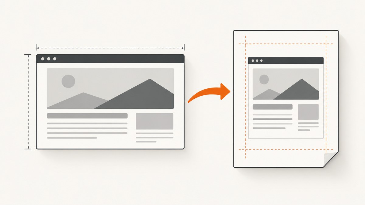
To fit HTML into an A4 PDF without distortion, set the PDF page to A4, define the usable area inside its margins, then apply one uniform scale factor to the content. For content with dimensions W × H and a target area Tw × Th, calculate s = min(Tw/W, Th/H). Apply s to both width and height. The smaller ratio is the limiting dimension; the other dimension may leave unused space.
First decide what “fit” means. A single-page composition can be uniformly scaled to fit one A4 sheet. A long document should normally flow across pages with print layout and pagination. Shrinking an entire report until it fits on one page preserves its shape, but can make the text unreadably small.
A4 portrait is 210 mm × 297 mm. The page size and its margins are separate settings: margins reduce the rectangle available for content. MDN documents the A4 dimensions and the CSS page size descriptor in its size descriptor reference, and describes page dimensions and margins in its @page reference.
1. Set the A4 page box and usable area
Start by deciding which layer owns the paper dimensions: CSS, the PDF API, or the print dialog. For CSS-controlled output, declare A4 in @page. Set the margins deliberately; use zero only for a genuinely edge-to-edge PDF. Printers can have non-printable areas even when the PDF itself has zero margins.
@page {
  size: A4 portrait;
  margin: 0;
}

@media print {
  html,
  body {
    margin: 0;
  }

  .pdf-page {
    box-sizing: border-box;
    width: 210mm;
    height: 297mm;
    overflow: hidden;
  }
}
This example establishes a one-page canvas at A4 dimensions. box-sizing: border-box includes padding and borders within the declared width and height. With overflow: hidden, anything outside the canvas is clipped, so do not use it until the layout is measured and verified. For a content-safe area, use a margin in @page and size the inner canvas to the remaining width and height, or use a wrapper with explicit dimensions.
For example, with 10 mm margins on every side, the usable area is 190 mm × 277 mm. If you set a 15 mm top/bottom margin and a 12 mm left/right margin, it becomes 186 mm × 267 mm. Calculate against that inner rectangle, not against the full A4 sheet.
MDN notes that support for page features varies across browsers. Check @page behavior in the browser that will produce the PDF, especially if supporting older or multiple browser versions. Its printing guide covers print-specific styling and preview considerations.
2. Calculate a proportional fit
Measure the unscaled content after layout. Let its width and height be W and H; let the usable target width and height be Tw and Th. The proportional fit is:
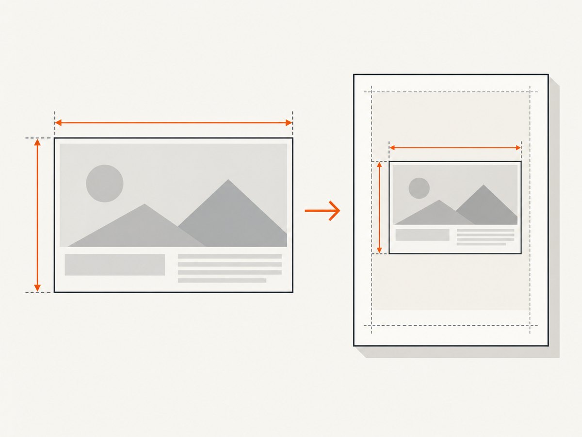
s = min(Tw / W, Th / H)
scaledWidth = W * s
scaledHeight = H * s
Suppose the content measures 900 CSS pixels wide and 1400 pixels tall, while the usable area measures 760 × 1100 pixels in the same coordinate system. The width ratio is about 0.844; the height ratio is about 0.786. Use s = 0.786. The resulting content is about 707 × 1100 pixels, leaving horizontal space but fitting both limits.
Use one scale value for both axes. CSS scale(s) takes a single factor and applies uniform scaling, preserving the aspect ratio; see MDN’s scale() reference. Setting width and height independently to the target dimensions can stretch text, images, and shapes.
CSS transforms change the painted size, but do not necessarily make surrounding layout and pagination behave as if the element’s untransformed layout dimensions had changed. An explicit wrapper gives you a place to control the page footprint and position the scaled content. Set the transform origin intentionally. If the content starts at the top-left of the page, transform-origin: top left is often easier to reason about than the default center origin.
.pdf-page {
  position: relative;
  width: 210mm;
  height: 297mm;
  overflow: hidden;
}

.scaled-content {
  transform: scale(var(--fit-scale));
  transform-origin: top left;
}
Set --fit-scale to the calculated value, such as 0.786. This is appropriate when the content dimensions are known. If fonts, images, or dynamic content affect dimensions, wait until the browser has laid out those assets, measure in that browser, and then render. A transform applied too early can produce clipping or unexpected blank space.
3. Choose one-page scaling or multi-page print flow
One-page composition
Use uniform scaling when the design is intentionally one page: a poster, certificate, infographic, single-page report, or a fixed dashboard snapshot. Calculate against the usable content rectangle and position the scaled element inside the page wrapper. Inspect the smallest text after rendering; mathematical fit does not guarantee legibility.
Multi-page document
For a report, invoice set, or article, use print styles to control page breaks and let the document flow naturally across sheets. Avoid shrinking the whole document to force every page’s content onto one A4 sheet. Use break rules to keep related content together where appropriate, and test the final page count and page boundaries in the intended renderer.
@media print {
  .report-section {
    break-inside: avoid;
  }

  .new-page {
    break-before: page;
  }
}
These rules express layout intent; actual pagination depends on content, fonts, and renderer behavior. A forced page break can create an extra page if it appears at the end of content or alongside other break constraints, so inspect the generated PDF.
4. Generate the PDF with Puppeteer
Puppeteer’s Page.pdf() generates a PDF using the print CSS media type. Its options include paper format, margins, scale, and preferCSSPageSize. The documented default for preferCSSPageSize is false: configured paper dimensions take priority, and content is scaled to fit the paper. See the official PDFOptions reference and Page.pdf() documentation.
Choose one owner for the paper size. Set format: 'A4' if the API should control it, or preferCSSPageSize: true if your CSS @page declaration should control it. Avoid conflicting CSS and API dimensions. Keep API scale at 1 unless you intentionally want additional scaling; combining it with CSS scaling can make the result unexpectedly small.
Install Puppeteer in a Node.js project with npm install puppeteer. This runnable example navigates to a page, waits for its fonts, and writes an A4 PDF. Replace the URL with a page you control.
const puppeteer = require('puppeteer');

(async () => {
  const browser = await puppeteer.launch({ headless: true });
  try {
    const page = await browser.newPage();
    await page.goto('https://example.com', { waitUntil: 'networkidle0' });
    await page.evaluate(() => document.fonts.ready);

    await page.pdf({
      path: 'output-a4.pdf',
      format: 'A4',
      printBackground: true,
      margin: {
        top: '10mm',
        right: '10mm',
        bottom: '10mm',
        left: '10mm'
      },
      scale: 1,
      preferCSSPageSize: false
    });
  } finally {
    await browser.close();
  }
})();
This code uses API-owned A4 sizing and 10 mm margins. If CSS owns the page dimensions, define @page in the site and set preferCSSPageSize: true. Puppeteer documents A4 as 21 cm × 29.7 cm in its PaperFormat reference. If exact print colors matter, note that PDF output uses modified print colors by default; Puppeteer documents -webkit-print-color-adjust for requesting exact colors.
5. Use WebDriver BiDi or browser print
WebDriver BiDi exposes page dimensions, margins, scale, and a shrinkToFit option in its print command reference. The reference gives Letter as the default sheet and says shrinkToFit: true resizes content to page width, overriding a CSS page width. Those are BiDi details; do not assume Puppeteer or a browser print dialog uses the same defaults.
For deterministic A4 output with BiDi, pass A4 dimensions, set margins, and explicitly decide whether shrink-to-fit is active. If your own CSS or code calculates the scale, disable automatic fitting so there is only one scaling step. If you rely on automatic fit, inspect whether fitting only to width leaves content too tall.
In a browser’s print dialog, select A4, the intended portrait or landscape orientation, and the desired margin policy. Preview the result before saving. Dialog options can change scaling and margins, so the PDF saved through that UI may differ from output created by Puppeteer or BiDi.
6. Verify the PDF in the target renderer
Use this checklist for each supported rendering path:
- Confirm the PDF page box is A4 and has the intended orientation.
- Check that the margins leave the expected usable rectangle.
- Inspect content bounds for clipping, unexpected whitespace, or a shifted transform origin.
- For multi-page documents, check page count, repeated headers or footers, and awkward splits.
- Check small text, images, and colors at the intended viewing or print size.
- Repeat in the browser or PDF library that will produce the real output.
PDF page dimensions and a physical printer’s printable area are separate concerns. A zero-margin PDF can still be clipped by a printer that cannot print to the paper edge.
7. Troubleshoot common problems
| Problem | Likely cause | Fix |
|---|---|---|
| The PDF is Letter or another size | The API or print dialog owns the page size, and CSS sizing is not taking precedence. | Set format: 'A4' in Puppeteer, or deliberately enable preferCSSPageSize when CSS should own sizing. Check the print dialog’s paper selection. |
| Content is clipped at the bottom or right edge | The scale used the full paper dimensions instead of the margin-reduced area, or a transform changed painted size without adjusting layout. | Recalculate against the usable dimensions. Use a wrapper, a top-left transform origin, and inspect measured bounds after layout. |
| Text or images look stretched | Width and height were scaled independently. | Use a single factor, min(Tw/W, Th/H), on both axes. |
| Everything is too small | Content was manually scaled and also shrunk by the PDF API, or a long multi-page document was forced onto one page. | Set API scale to 1 when CSS performs scaling. Use normal pagination for documents intended to span pages. |
| The page is unexpectedly blank or has missing images | Rendering occurred before navigation, fonts, or dynamic content finished loading. | Wait for the relevant page state and assets before measuring or printing. Verify the content in the same browser session before generating the PDF. |
| Backgrounds or colors differ | Print rendering adjusts colors or background graphics are not included. | Enable background printing where supported and use the renderer’s documented print color controls when color fidelity matters. |
| The preview differs from the saved PDF | The preview and final generation use different settings or renderers. | Generate and inspect with the same browser, page size, margins, and scaling options as production. |
8. Performance, reliability, and cost
PDF generation time depends on the page and renderer; this workflow has no universal timing guarantee. Large images, web fonts, scripts, and pages waiting for network activity can affect completion time. Waiting for all network activity can also be a poor fit for pages with long-running connections. Choose a readiness condition that reflects the content you need, then wait for required images and fonts before measuring. Do not assume one wait condition guarantees every third-party asset is ready.
For repeatable output, pin the rendering environment and keep CSS, paper settings, and asset readiness consistent. A change in fonts, viewport, page margins, or renderer defaults can change wrapping and pagination. Keep API scale at 1 when applying a measured CSS scale, and inspect representative edge cases: unusually long text, missing images, and the largest supported content.
Cost depends on how the PDF is generated and hosted; the cited browser documentation does not establish a price for running Puppeteer or WebDriver. Account for your own compute, browser process, storage, and retries. Avoid retrying unchanged failures indefinitely; record the settings and error so you can distinguish content problems from renderer or environment problems.
Or skip the browser setup
If your input is a public web page and you need a screenshot rather than a precisely laid-out A4 PDF, ScreenshotNeo provides a website screenshot API and MCP server. It captures PNG, JPEG, WebP, or PDF from a URL. Its PDF capture is useful for page capture workflows, but this article’s exact A4 layout calculation still requires controlling page geometry in your rendering path. See the ScreenshotNeo API documentation.
curl -G "https://api.screenshotneo.com/v1/shot" -d access_key=YOUR_API_KEY --data-urlencode url=https://stripe.com -o shot.webpimport requests
r = requests.get(
"https://api.screenshotneo.com/v1/shot",
params={"access_key": "YOUR_API_KEY", "url": "https://stripe.com"},
timeout=90,
)
open("shot.webp", "wb").write(r.content)const q = new URLSearchParams({ access_key: 'YOUR_API_KEY', url: 'https://stripe.com' });
const res = await fetch(`https://api.screenshotneo.com/v1/shot?${q}`);
if (!res.ok) throw new Error(`Screenshot request failed: ${res.status}`);
const fs = await import('node:fs/promises');
await fs.writeFile('shot.webp', Buffer.from(await res.arrayBuffer()));- Cookie banners are accepted and removed before capture; newsletter popups and chat widgets are removed too. Each cleanup step can be turned off.
- Bot checks, blank pages, timeouts, failed loads, and cache hits cost nothing. Response headers report the page verdict and whether the request was billed.
- An MCP server gives AI agents tools to take screenshots, inspect page information, and capture PDFs.
- 1,000 screenshots a month are free with no card; paid plans start at $5 for 3,000.
Sign up for ScreenshotNeo’s free plan to get 1,000 screenshots a month with no card.
FAQ
Does “fit A4 exactly” mean the content must touch all four edges?
No. A4 defines the page box. Margins define the usable content area, and a proportional fit can leave space on one axis. Filling both axes without distortion is only possible when the content and target areas have the same aspect ratio.
Should I use CSS pixels or millimeters for the scale calculation?
Use consistent units for content and target measurements. You can convert both to the same unit before calculating; the ratio is unitless. For browser-measured content, CSS pixels are convenient if the target rectangle is also converted into CSS pixels.
Can I make every page of a long document fit onto one A4 page?
You can shrink a single composition to one sheet, but a long document may become unreadable. For reports and other flowing content, use print layout and pagination across pages.
Will the same CSS produce identical PDFs in every browser?
No universal cross-browser guarantee is established here. Page-rule support and PDF defaults vary. Inspect the output from the renderer you plan to use.