How to Scale Puppeteer PDFs to the Emulated Device Viewport
Keep Puppeteer’s viewport, CSS media, PDF paper size, and rendering scale separate so PDFs match an emulated device reliably.
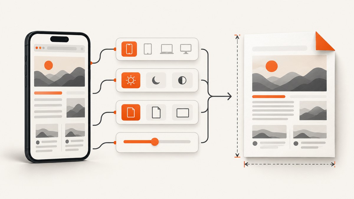
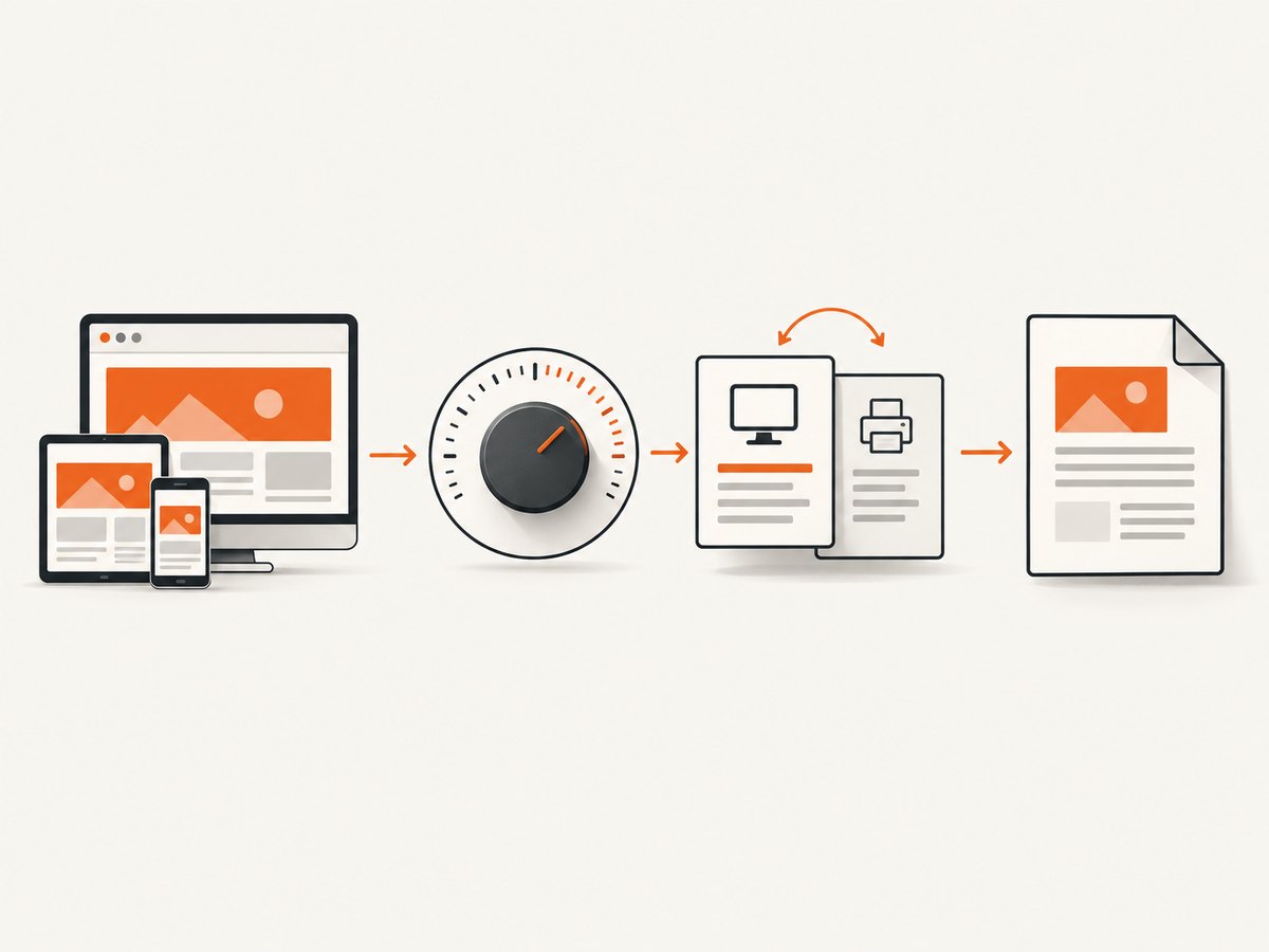
To make a Puppeteer PDF match an emulated device viewport, configure four independent controls: the viewport width and height in CSS pixels, the viewport device scale factor, the CSS media type, and the PDF page dimensions and rendering scale. A device pixel ratio does not set PDF paper size. Start with the device layout, choose whether the PDF should use screen or print CSS, then define paper dimensions with format, width/height, or CSS @page.
Puppeteer’s page.pdf() uses the print CSS media type by default. If the PDF must look like the screen rendering, call await page.emulateMediaType('screen') first. The deviceScaleFactor belongs to viewport emulation, while PDFOptions scale controls PDF rendering and accepts values from 0.1 to 2 with a default of 1. There is no universal formula that converts every device profile into a correct PDF scale; validate representative pages in the Chromium version you deploy.
1. Understand the four sizing controls
Most viewport-to-PDF problems come from treating separate settings as one. Puppeteer exposes them at different stages of the capture pipeline.
| Control | What it changes | What it does not change |
|---|---|---|
width and height in setViewport() |
CSS layout viewport dimensions | PDF paper size or output DPI |
deviceScaleFactor |
Emulated device pixel ratio used by the page | PDF paper dimensions |
emulateMediaType() |
Whether CSS @media screen or @media print rules are active |
Viewport dimensions and paper size |
width, height, or format in page.pdf() |
PDF paper dimensions | Browser viewport layout |
preferCSSPageSize |
Whether CSS @page size takes priority |
Device emulation metrics |
scale in page.pdf() |
PDF page rendering scale, 0.1–2 | CSS viewport width and height |
The Viewport interface documents CSS-pixel dimensions and deviceScaleFactor separately. The PDFOptions interface documents paper sizing, preferCSSPageSize, and PDF scale separately.
2. A complete Puppeteer implementation
This runnable Node.js example emulates a phone before navigation, activates screen styles, and creates a PDF whose explicit dimensions match the CSS viewport. Save it as capture-device-pdf.mjs, install Puppeteer with npm install puppeteer, and run it with a URL argument.
import puppeteer from 'puppeteer';

const target = process.argv[2] || 'https://example.com';
const browser = await puppeteer.launch({headless: true});

try {
  const page = await browser.newPage();

  // Width and height are CSS pixels. deviceScaleFactor is independent.
  await page.setViewport({
    width: 390,
    height: 844,
    deviceScaleFactor: 3,
    isMobile: true,
    hasTouch: true
  });

  // Emulate before navigation so responsive code sees the intended device.
  await page.goto(target, {
    waitUntil: 'networkidle2',
    timeout: 60000
  });

  // page.pdf() defaults to print CSS. Use screen CSS when that is desired.
  await page.emulateMediaType('screen');

  await page.pdf({
    path: 'device-viewport.pdf',
    width: '390px',
    height: '844px',
    preferCSSPageSize: true,
    scale: 1,
    printBackground: true,
    margin: {top: '0px', right: '0px', bottom: '0px', left: '0px'}
  });
} finally {
  await browser.close();
}
Page.emulate() is a shortcut for applying a device’s user agent and viewport. Puppeteer recommends doing device emulation before navigation because some sites do not expect the viewport to change after loading. See the Page.emulate() reference.
Use a device preset
When you need a named phone or tablet profile, import a device descriptor and emulate it before calling goto.
import puppeteer from 'puppeteer';
import {devices} from 'puppeteer';

const browser = await puppeteer.launch();
try {
  const page = await browser.newPage();
  await page.emulate(devices['iPhone 13']);
  await page.goto('https://example.com', {waitUntil: 'networkidle2'});
  await page.emulateMediaType('screen');
  await page.pdf({
    path: 'iphone-layout.pdf',
    width: '390px',
    height: '844px',
    printBackground: true,
    scale: 1
  });
} finally {
  await browser.close();
}
A preset sets a user agent and viewport, but it does not automatically decide the PDF paper dimensions you want. Choose those dimensions for your output format.
3. Choose the PDF page size
Explicit width and height
For a one-screen PDF, set width and height to the same physical CSS lengths used by the viewport. CSS units such as px, in, cm, and mm are accepted. This keeps the page shape predictable when the target is a device-sized sheet.
await page.pdf({
  path: 'viewport.pdf',
  width: '390px',
  height: '844px',
  scale: 1,
  printBackground: true
});
Standard paper with format
Use format when the deliverable is A4, Letter, Legal, or another supported paper preset. When format is present, it takes priority over width and height. A phone viewport can still be used to drive responsive layout, but the PDF will be laid out onto the selected paper.
await page.pdf({
  path: 'a4.pdf',
  format: 'A4',
  printBackground: true,
  margin: {top: '12mm', right: '12mm', bottom: '12mm', left: '12mm'}
});
Let CSS @page define the paper
If the application owns the print design, define the size in CSS and set preferCSSPageSize: true. The documented default is false, which scales content to fit the requested paper. With true, the CSS page size takes priority.
@page {
  size: 390px 844px;
  margin: 0;
}

@media print {
  body { margin: 0; }
}
await page.emulateMediaType('screen');
await page.pdf({
path: 'css-sized.pdf',
preferCSSPageSize: true,
printBackground: true,
scale: 1
});Use one source of truth for page size. Mixing a CSS @page size with an unrelated format can produce unexpected fitting or clipping.
4. Screen CSS versus print CSS
The PDF method generates with the print media type by default. Print styles often hide navigation, change colors, remove fixed elements, or rearrange columns. That is useful for a document but surprising when you want a screenshot-like PDF.
await page.emulateMediaType('screen'); // screen styles
await page.pdf({path: 'screen-styled.pdf', format: 'A4'});
To use the site’s print design, omit the call or explicitly select print:
await page.emulateMediaType('print');
await page.pdf({path: 'print-styled.pdf', format: 'A4'});
The emulateMediaType() method changes the active CSS media type; it does not set paper dimensions.
5. How to tune scale without guessing
Start with scale: 1. First verify media type, viewport dimensions, page size, margins, and preferCSSPageSize. Only then adjust PDF scale. Lower values fit more content onto a page; higher values enlarge rendered content and can increase clipping or pagination.
- Capture with the intended viewport and
scale: 1. - Check whether the wrong CSS media type is active.
- Check the PDF paper dimensions and margins.
- Check whether a CSS
@pagerule is overriding your options. - Adjust
scalein small increments, such as 0.9 or 1.1. - Compare several representative pages, including long text, wide tables, images, and lazy-loaded content.
There is no documented universal numeric conversion between device pixel ratio and PDF scale. A deviceScaleFactor of 3 does not imply scale: 3; PDF scale is limited to 0.1–2.
6. Mobile layout details that affect the result
Meta viewport
Responsive pages commonly include <meta name='viewport' content='width=device-width, initial-scale=1'>. Without an appropriate meta viewport, a mobile emulation may render a desktop-style layout inside a wide layout viewport. If you control the page, verify this tag. If you do not, inspect the computed layout before changing PDF settings.
Navigation timing
networkidle2 waits for a low number of active connections, but it cannot guarantee that application data or lazy images are ready. Wait for a meaningful selector or application signal when possible.
await page.goto(target, {waitUntil: 'domcontentloaded', timeout: 60000});
await page.waitForSelector('[data-report-ready]', {timeout: 30000});
await page.evaluate(() => document.fonts.ready);
Lazy images and long pages
A viewport-sized PDF may not trigger lazy content below the fold. For full documents, scroll in steps before printing, or use an application-specific ready signal. Keep in mind that increasing the viewport height changes layout and can change which responsive breakpoint is active.
Fixed and sticky elements
Headers fixed to the viewport can repeat visually or overlap content in print output. Add print CSS to change them to static positioning, or hide them for the PDF. This is a CSS issue, not a deviceScaleFactor issue.
7. Troubleshooting checklist
| Symptom | Likely cause | Fix |
|---|---|---|
| PDF looks desktop-sized | Emulation happened after navigation, or the page lacks a mobile meta viewport | Set viewport or call page.emulate() before goto; inspect the meta viewport. |
| Colors and layout differ from the browser | PDF is using print CSS | Call await page.emulateMediaType('screen') before page.pdf(). |
| Content is shrunk unexpectedly | Paper size, margins, or CSS @page causes fitting |
Set explicit dimensions, review margins, and use preferCSSPageSize: true when CSS owns sizing. |
| Changing DPR has no paper-size effect | deviceScaleFactor is a viewport property |
Change PDF width, height, or format. |
| Right edge is clipped | Viewport content is wider than the PDF page or scale is too large | Match page width to the layout, remove margins, or lower PDF scale. |
| Fonts are missing | PDF started before web fonts loaded | Await document.fonts.ready and ensure font requests succeed. |
| Images are blank | Lazy loading or failed resource requests | Wait for an image-ready selector, scroll to trigger loading, and inspect network failures. |
| Mobile breakpoint is wrong | Viewport width is not the intended CSS width | Set width in CSS pixels; do not derive it from DPR. |
| PDF times out | Long-running requests, blocked scripts, or an application that never becomes idle | Use a suitable wait condition and explicit selector timeout; avoid waiting forever for network idle. |
8. Performance, reliability, and cost considerations
Launching Chromium is expensive compared with reusing a browser process. For batch jobs, keep one browser alive and create isolated pages or contexts per capture. Close pages in a finally block so failed jobs do not accumulate resources.
Choose the smallest viewport and paper that satisfy the output. Large full-page PDFs consume more memory, especially with high-resolution images. A higher device scale factor can increase page rendering work, but it remains independent from PDF paper size. Measure your own workload across the Chromium and Puppeteer versions you deploy; the documentation does not provide a universal throughput or scale benchmark.
For reliability, pin Puppeteer and its Chromium revision, log the URL, viewport, media type, paper settings, and timing, and retain a small set of golden PDFs for visual comparison after upgrades. Treat navigation, selector waits, font readiness, and PDF generation as separate timeout stages so failures identify the broken stage.
Self-hosted Puppeteer has infrastructure costs for Chromium processes, memory, storage, and retries. A managed API can exchange browser maintenance for per-capture pricing. Review the provider’s billing rules for failed pages, caching, and asynchronous jobs before estimating cost.
9. Or skip the browser setup
ScreenshotNeo provides a single GET request for a PNG, JPEG, WebP, or PDF. It supports viewport and device presets, full-page capture, PDF paper size, margins, landscape mode, page ranges, custom CSS and JavaScript, selector waits, network-idle waits, headers, cookies, user agents, geolocation, caching, asynchronous jobs, bulk capture, and an OpenAPI specification. See the ScreenshotNeo documentation for the option names and request details.
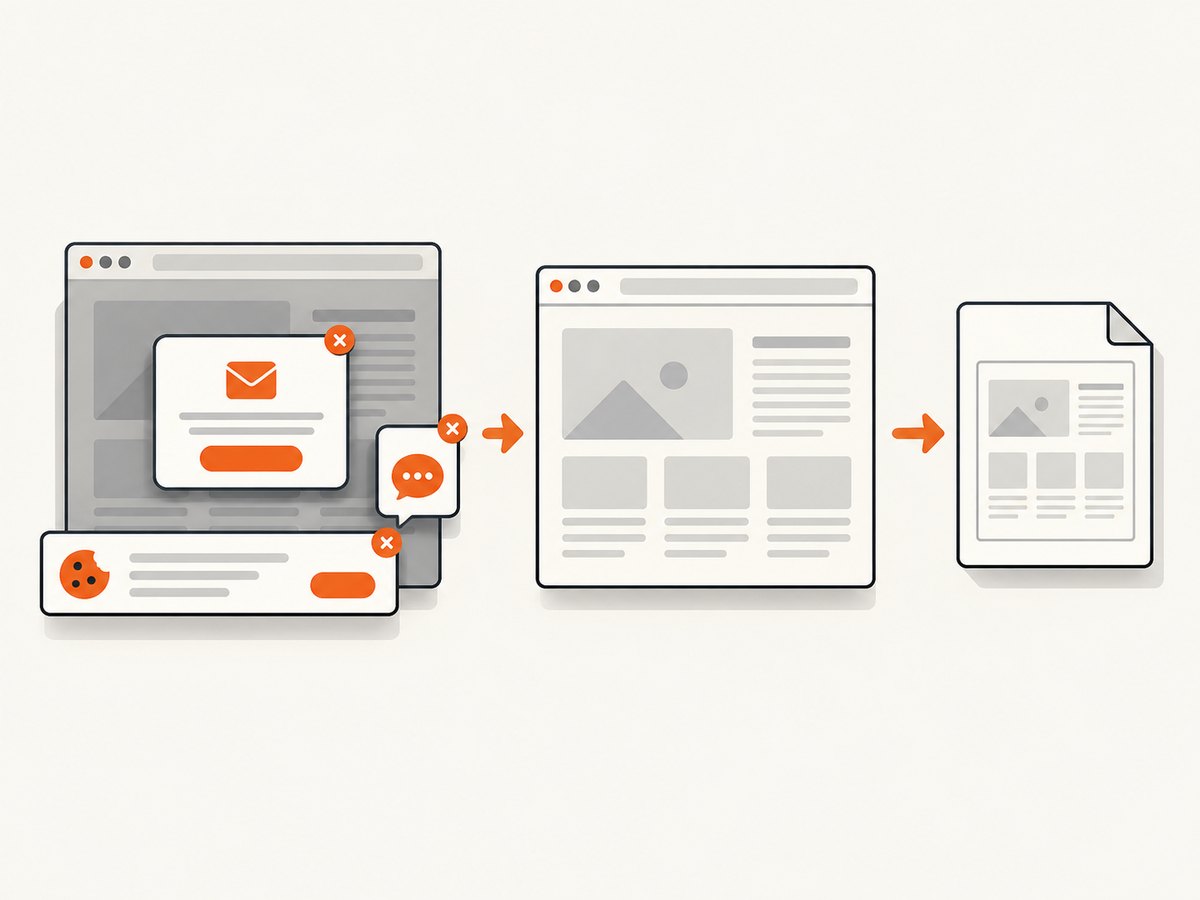
The same service can handle the cleanup work around real pages: it accepts cookie or consent banners like a visitor and removes more than 60 known consent platforms, newsletter popups, and chat widgets before capture. Bot checks, blank pages, timeouts, failed loads, and cache hits are not billed, and each response identifies the page verdict and billing status in X-Page-Verdict and X-Billed headers. Its MCP server exposes take_screenshot, get_page_info, and capture_pdf to Claude, Cursor, and other MCP clients.
cURL
curl -G 'https://api.screenshotneo.com/v1/shot' -d access_key=YOUR_API_KEY --data-urlencode url=https://stripe.com -o shot.webpPython
import requests
r = requests.get('https://api.screenshotneo.com/v1/shot', params={'access_key': 'YOUR_API_KEY', 'url': 'https://stripe.com'}, timeout=90)
r.raise_for_status()
open('shot.webp', 'wb').write(r.content)
Node.js
const q = new URLSearchParams({ access_key: 'YOUR_API_KEY', url: 'https://stripe.com' });
const res = await fetch(`https://api.screenshotneo.com/v1/shot?${q}`);
if (!res.ok) throw new Error(`Screenshot failed: ${res.status}`);
const fs = await import('node:fs/promises');
await fs.writeFile('shot.webp', Buffer.from(await res.arrayBuffer()));
ScreenshotNeo includes 1,000 shots per month free with no card. Paid plans start at $5 for 3,000 shots; yearly billing gives two months free. Create a free ScreenshotNeo account and try the request with your own URL.
10. A practical validation plan
- Select one phone, one tablet, and one desktop profile that represent your users.
- Record CSS viewport width and height, device scale factor, media type, paper dimensions, margins, and PDF scale.
- Capture a page with responsive navigation, long text, images, forms, and a table.
- Compare the PDF against a browser rendering at the same CSS viewport.
- Repeat after changing only one variable so you can identify the control responsible for a difference.
- Save the resulting settings beside your code and rerun the comparison when upgrading Puppeteer or Chromium.
FAQ
Does deviceScaleFactor determine PDF DPI?
No. It changes the emulated device pixel ratio. PDF paper dimensions and PDF rendering scale are separate options.
Why does my PDF use print styles?
page.pdf() uses print CSS by default. Call page.emulateMediaType('screen') before generating the PDF for screen styles.
Should I set both format and width/height?
Usually choose one approach. When format is set, it takes priority over explicit width and height.
When should preferCSSPageSize be true?
Use it when the page’s CSS @page rule is the authoritative paper definition. Leave it false when Puppeteer’s paper options should control fitting.
Can I calculate a universal scale from a phone’s DPR?
No. Layout, CSS page rules, margins, fonts, and Chromium version affect the result. Validate the output for your pages.