How to Screenshot Multiple Websites at Different Viewports
Use Playwright to capture every URL at consistent viewport sizes, with deterministic filenames, device emulation, troubleshooting, and a hosted alternative.
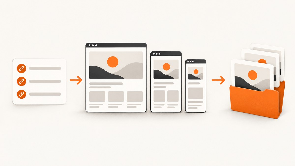
Direct answer: use a browser automation loop that combines every URL with every viewport configuration. Set the viewport before navigation, wait for the page state your capture requires, take either a viewport or full-page screenshot, and save each file with the site name and viewport label. Playwright provides the page viewport and screenshot APIs needed for this workflow.
1. What this workflow captures
A viewport is the page’s configured width and height in CSS pixels. A viewport screenshot records the visible browser area at that size. A full-page screenshot includes the page’s scrollable content, which is useful for documentation and below-the-fold review.
Viewport dimensions alone do not reproduce every property of a physical phone or tablet. Device emulation can also set the user agent, screen size, viewport, and touch capability. Choose the smallest configuration that answers your question, and record it with every batch. See the Playwright emulation documentation.
2. Install Playwright
mkdir viewport-captures
cd viewport-captures
npm init -y
npm install playwright
npx playwright install chromium
The browser installation is separate from the Node package. Keep the browser version and operating-system details with your screenshot artifacts when repeatability matters.
3. Create a repeatable multi-site, multi-viewport script
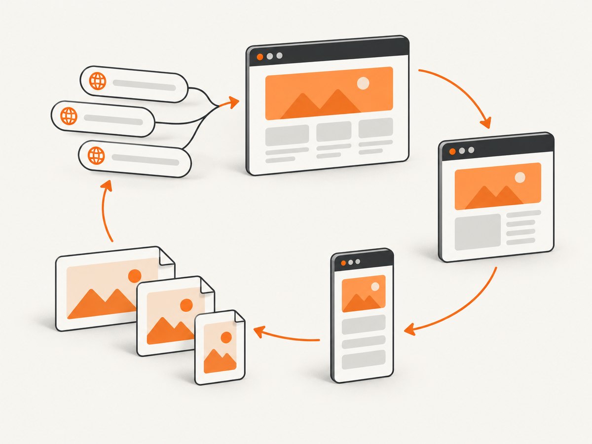
Create capture.mjs. Edit the urls and viewports arrays for your pages and design breakpoints. The script creates one page per viewport, sets its dimensions before navigation, waits for a useful readiness condition, and writes deterministic filenames.
import { chromium } from 'playwright';
import { mkdir } from 'node:fs/promises';

const urls = [
  'https://example.com',
  'https://developer.mozilla.org/'
];

const viewports = [
  { name: 'mobile', width: 390, height: 844, deviceScaleFactor: 1 },
  { name: 'tablet', width: 768, height: 1024, deviceScaleFactor: 1 },
  { name: 'desktop', width: 1440, height: 900, deviceScaleFactor: 1 }
];

const outputDir = 'shots';
const fullPage = false;

function siteId(rawUrl) {
  const parsed = new URL(rawUrl);
  return (parsed.hostname + parsed.pathname)
    .replace(/^www\\./, '')
    .replace(/[^a-z0-9]+/gi, '-')
    .replace(/^-|-$/g, '')
    .toLowerCase() || 'page';
}

await mkdir(outputDir, { recursive: true });
const browser = await chromium.launch();

try {
  for (const url of urls) {
    for (const viewport of viewports) {
      const context = await browser.newContext({
        viewport: { width: viewport.width, height: viewport.height },
        deviceScaleFactor: viewport.deviceScaleFactor,
        // Set these only when they are part of the test you intend to run.
        // userAgent: '...',
        // isMobile: true,
        // hasTouch: true
      });
      const page = await context.newPage();

      try {
        await page.goto(url, { waitUntil: 'domcontentloaded', timeout: 45_000 });
        await page.waitForLoadState('networkidle', { timeout: 15_000 }).catch(() => {});

        // Replace this with an app-specific readiness check when needed:
        // await page.locator('[data-ready="true"]').waitFor({ timeout: 15_000 });

        const file = `${outputDir}/${siteId(url)}__${viewport.name}-${viewport.width}x${viewport.height}.png`;
        await page.screenshot({ path: file, fullPage });
        console.log(`saved ${file}`);
      } catch (error) {
        console.error(`failed ${url} at ${viewport.name}: ${error.message}`);
      } finally {
        await context.close();
      }
    }
  }
} finally {
  await browser.close();
}
Run it with:
node capture.mjsExample output names include example-com__mobile-390x844.png and developer-mozilla-org__desktop-1440x900.png. The name records enough information to identify a file without opening it.
4. Choose viewport, full-page, and pixel-scale settings
| Decision | Use it when | What to record |
|---|---|---|
| Viewport screenshot | You are checking the initial layout, navigation, or above-the-fold behavior. | Width, height, browser, and scale. |
| Full page | You need the complete scrollable document for review or archiving. | All viewport settings plus fullPage: true. |
| CSS-pixel scale | You need predictable image dimensions for diffs or downstream processing. | deviceScaleFactor: 1 and resulting dimensions. |
| Device-pixel scale | You want higher-density output for a retina-style review. | The device scale factor and resulting pixel dimensions. |
Playwright documents screenshot scaling and full-page capture in its Page API. Do not compare raw image dimensions from different scale factors as though they represented the same number of CSS pixels.
5. Set the viewport before navigation
Many sites choose breakpoints during the first render. Create the context or page with its final viewport before calling goto. Changing dimensions after navigation can leave application state, responsive JavaScript, or loaded assets based on the earlier size. Playwright notes that each page can have its own viewport and that viewport setup also affects screen size.
const context = await browser.newContext({
  viewport: { width: 1024, height: 768 },
  deviceScaleFactor: 1
});
const page = await context.newPage();
await page.goto('https://example.com');
6. Decide whether width and height are enough
Use only viewport dimensions when you are testing CSS layout at a known size. Add broader emulation when the site branches on browser identity, touch support, or mobile behavior.
const context = await browser.newContext({
  viewport: { width: 390, height: 844 },
  screen: { width: 390, height: 844 },
  isMobile: true,
  hasTouch: true,
  userAgent: 'your-test-user-agent'
});
Keep each emulation profile explicit. A 390-pixel viewport with a desktop user agent answers a different question from a mobile profile with touch enabled. Playwright’s emulation guide lists the browser properties available for this purpose.
7. Wait for the right page state
domcontentloaded means the document has been parsed; it does not guarantee that images, client-rendered content, or fonts are ready. networkidle can be useful for quiet pages but can take too long on applications with polling or analytics. Prefer an application-specific selector when one exists.
await page.goto(url, { waitUntil: 'domcontentloaded' });
await page.locator('[data-screenshot-ready="true"]').waitFor({ state: 'visible', timeout: 20_000 });
await page.screenshot({ path: file, fullPage: true });
For a page with lazy images, scroll before capture so below-the-fold assets load:
await page.evaluate(async () => {
  await new Promise((resolve) => {
    const step = 600;
    const timer = setInterval(() => {
      window.scrollBy(0, step);
      if (window.innerHeight + window.scrollY >= document.body.scrollHeight) {
        clearInterval(timer);
        window.scrollTo(0, 0);
        resolve();
      }
    }, 100);
  });
});
8. Control consent banners and other overlays
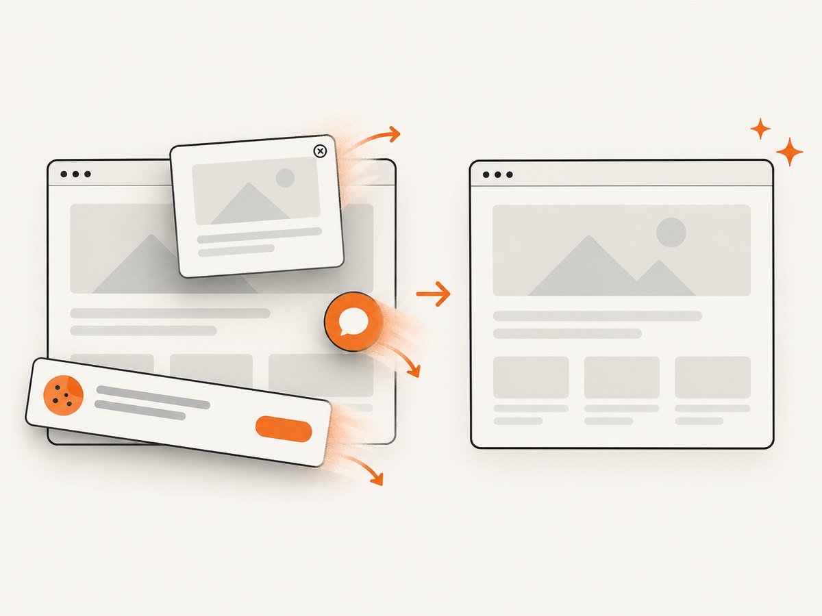
Cookie dialogs, newsletter prompts, chat launchers, and bot checks can change every image. For a site you control, dismiss the dialog through its normal UI or inject test-only CSS. For a third-party site, do not assume a selector or consent state will be stable; handle failures per URL and preserve the original error.
const consent = page.getByRole('button', { name: /accept all cookies/i });
if (await consent.isVisible().catch(() => false)) {
  await consent.click();
}
await page.screenshot({ path: file });
Record whether consent was accepted, rejected, or unavailable. That state is part of what the screenshot represents.
9. Run captures concurrently without overwhelming sites
Sequential captures are easiest to debug. For larger batches, use a small concurrency limit rather than opening one browser context for every URL at once. This reduces local CPU, memory, and connection pressure and is less likely to trigger remote rate limits.
async function mapWithLimit(items, limit, worker) {
  let next = 0;
  async function run() {
    while (true) {
      const index = next++;
      if (index >= items.length) return;
      await worker(items[index], index);
    }
  }
  await Promise.all(Array.from({ length: limit }, run));
}

const jobs = urls.flatMap(url =>
  viewports.map(viewport => ({ url, viewport }))
);

await mapWithLimit(jobs, 3, async ({ url, viewport }) => {
  // create a context, capture, and close it here
});
Start with two or three workers, then increase only if the sites and capture machine remain stable. Keep retries bounded and use backoff for transient navigation failures.
10. Organize files and metadata
Use a stable identifier for the host and path, a viewport label, and dimensions. Store a manifest beside the images so someone can reconstruct the run.
{
  "url": "https://example.com/pricing",
  "viewport": { "name": "desktop", "width": 1440, "height": 900 },
  "browser": "chromium",
  "deviceScaleFactor": 1,
  "fullPage": false,
  "capturedAt": "2026-09-30T12:00:00Z",
  "status": "ok"
}
For visual comparisons, keep the browser version, operating system, headless setting, hardware conditions, and power state consistent. Playwright’s visual comparison documentation lists these as sources of rendering variation. If you intentionally compare browsers or platforms, maintain a separate baseline for each environment.
11. Screenshot baselines and diffs
Playwright Test can store screenshot baselines and compare later runs. Use a fixed viewport and environment for a baseline, then review differences caused by intentional UI changes separately from differences caused by fonts, animations, timestamps, ads, or remote data.
import { test, expect } from '@playwright/test';

test('pricing page desktop', async ({ page }) => {
  await page.setViewportSize({ width: 1440, height: 900 });
  await page.goto('https://example.com/pricing');
  await expect(page).toHaveScreenshot('pricing-desktop.png', {
    fullPage: true,
    animations: 'disabled'
  });
});
Freeze or mask inherently changing content where your test setup allows it. A screenshot diff is only meaningful when the capture inputs are comparable.
12. Troubleshooting
| Symptom | Likely cause | Fix |
|---|---|---|
| Mobile layout does not appear | Viewport was changed after navigation, or the site uses user-agent or touch detection. | Create the context with the target viewport before goto; add only the emulation properties your test requires. |
| Screenshot is blank or partly loaded | Capture happened before client rendering, images, or fonts finished. | Wait for a readiness selector, then wait for specific images or fonts; avoid relying on a fixed delay alone. |
| Full-page image misses lazy content | Lazy assets load only after scrolling into view. | Scroll through the document, wait for assets, return to the top, then capture. |
| Navigation timeout | Slow site, blocked request, login wall, or an application that never becomes idle. | Use a bounded timeout, capture diagnostics, switch from networkidle to a readiness selector, and classify the URL as failed when it cannot load. |
| Cookie or chat overlay covers content | Consent and widget state differs between runs. | Handle the dialog explicitly, use a controlled test state where possible, and record the state in the manifest. |
| Images differ between runs | Dynamic data, ads, animations, fonts, or environment changes. | Disable animations where appropriate, mask dynamic regions, pin the browser and OS, and use separate baselines for separate environments. |
| Out-of-memory errors | Too many concurrent pages or very tall full-page captures. | Lower concurrency, close contexts promptly, capture viewport images where possible, and split very large batches. |
| Access denied or CAPTCHA | The site is protecting automated traffic. | Respect the site’s access rules; do not attempt to bypass the challenge. Mark the capture unavailable and review it manually or use an authorized test environment. |
13. Performance, reliability, and cost
- Performance: browser startup and page loading dominate runtime. Reuse a browser process, keep concurrency modest, and avoid full-page captures when a viewport image answers the question.
- Reliability: use explicit readiness checks, bounded retries, per-job status, and a manifest. A successful HTTP navigation does not prove that the visual state is ready.
- Repeatability: pin browser versions, keep viewport and scale settings in source control, and run visual comparisons in the same environment as the baseline.
- Cost: local Playwright runs consume your own compute and network resources. Hosted capture can remove browser maintenance, but account for request pricing, concurrency limits, and the controls each provider exposes.
14. Or skip the browser setup
ScreenshotNeo accepts one GET request per URL and returns PNG, JPEG, WebP, or PDF. It supports full-page capture, 12 device presets or any viewport, retina scale, custom CSS and JavaScript, click and hide selectors, waits, request blocking, headers, cookies, user agents, timezone, geolocation, caching, async jobs, bulk capture of up to 100 URLs per call, and an MCP server for AI agents. See the ScreenshotNeo API documentation.
curl -G "https://api.screenshotneo.com/v1/shot" -d access_key=YOUR_API_KEY --data-urlencode url=https://stripe.com -o shot.webpimport requests
r = requests.get("https://api.screenshotneo.com/v1/shot", params={"access_key": "YOUR_API_KEY", "url": "https://stripe.com"}, timeout=90)
open("shot.webp", "wb").write(r.content)const q = new URLSearchParams({ access_key: 'YOUR_API_KEY', url: 'https://stripe.com' });
const res = await fetch(`https://api.screenshotneo.com/v1/shot?${q}`);For multiple viewports, issue one request per viewport with the viewport parameters documented by ScreenshotNeo, or use its bulk capture endpoint for up to 100 URLs per call. Cookie banners, newsletter popups, and chat widgets are removed before the shot. Bot checks, blank pages, failed loads, timeouts, and cache hits are not billed, and the response identifies the result with X-Page-Verdict and X-Billed headers. The MCP server lets Claude, Cursor, and other MCP clients call take_screenshot, get_page_info, and capture_pdf. The Free plan includes 1,000 screenshots per month with no card; paid plans start at $5 for 3,000 shots. Create a free ScreenshotNeo account.
15. Checklist for a viewport batch
- Define URLs and viewport profiles in source control.
- Set each viewport before navigation.
- Choose viewport or full-page capture for the question being answered.
- Choose and record CSS-pixel or device-pixel scale.
- Wait for a meaningful readiness condition.
- Handle consent, authentication, dynamic content, and lazy images deliberately.
- Use deterministic filenames and write a manifest.
- Keep browser and operating-system conditions consistent for visual diffs.
- Limit concurrency and close every context.
- Record failures instead of silently omitting them.
FAQ
What viewport sizes should I use?
Use the breakpoints and target devices that matter to your product or audience. There is no universally correct set of three sizes.
Should every URL use the same height?
Use a consistent height when comparing the visible fold. Use page-specific heights when the capture represents a device or test scenario with a different screen shape.
Does a viewport screenshot represent a real phone?
It represents a browser page at configured dimensions. A closer device simulation may also require user-agent, screen, and touch settings, and it still does not reproduce every physical-device condition.
Why are two screenshots different when the CSS is unchanged?
Rendering can vary with browser version, operating system, fonts, hardware, power conditions, headless mode, and dynamic page content. Keep those inputs consistent or maintain separate baselines.


