How to Select Custom Dropdown Options in Playwright UI Tests
Learn when Playwright’s selectOption works, how to interact with custom dropdowns, and how to write reliable tests for comboboxes and listboxes.

For a native HTML <select>, use Playwright’s locator.selectOption(). For a custom dropdown, open the control, find the rendered option, activate it, and assert the resulting value or selected state. A custom dropdown may look like a select, but if it is built from a button, input, and popup, selectOption() is the wrong interaction.
This guide uses TypeScript with Playwright Test. The same locator and interaction principles apply to JavaScript tests. The key is to test the control as a user encounters it: identify it by its accessible role and name, open it, choose an option, and verify the state change.
1. Identify what kind of dropdown you have
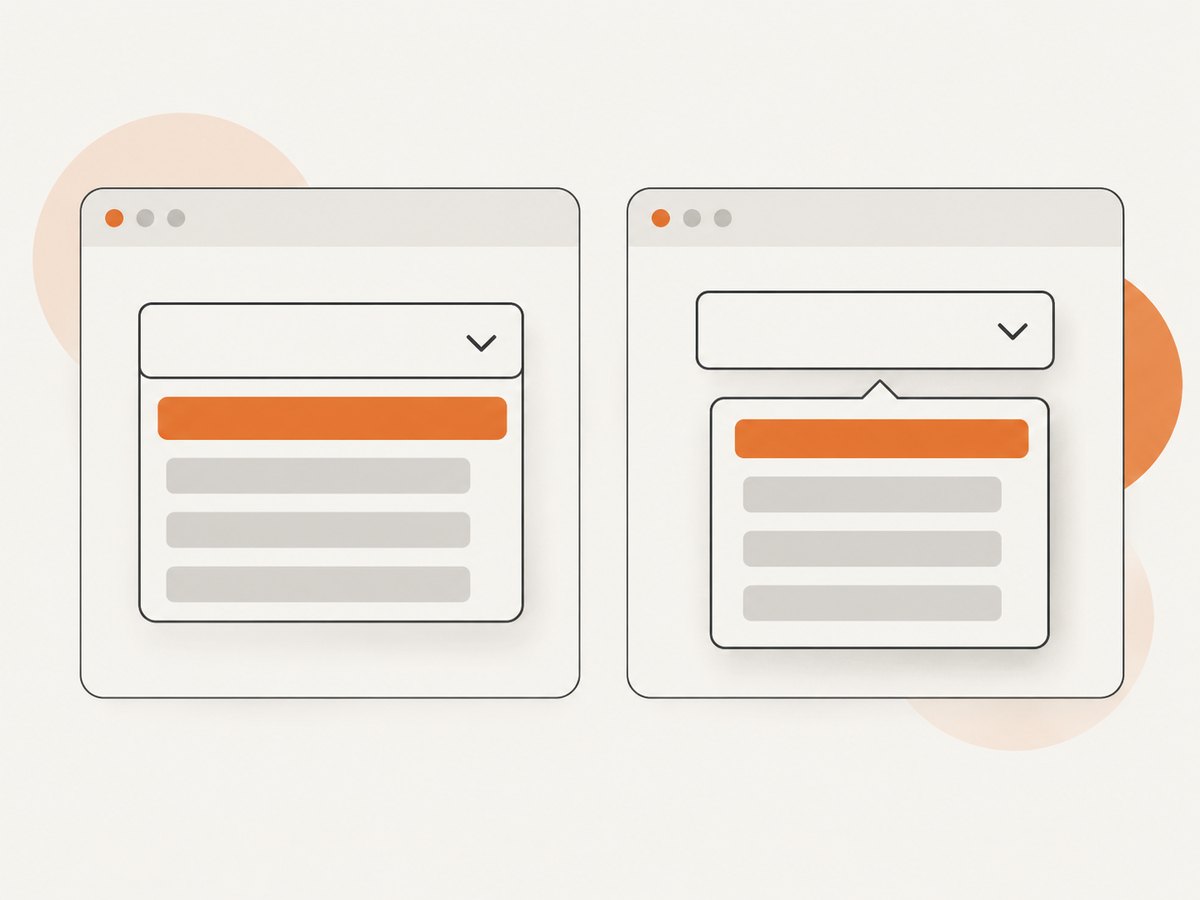
Before writing a locator, inspect the control in the browser’s DOM or accessibility tree. A native select has a <select> element containing <option> elements. A custom widget is usually built from other elements, such as an input or button that opens a listbox.
| Control | Typical markup | Playwright interaction |
|---|---|---|
| Native select | <select><option>… |
selectOption() |
| Select-only custom combobox | Button or combobox plus listbox | Open, select an option, assert state |
| Editable combobox | Text input plus filtered suggestions | Fill, select a suggestion, assert value |
The distinction matters because selectOption() works only on a native <select>. It does not click a custom trigger, cause a popup to render, or choose an option from a listbox. Playwright’s API documentation describes this limitation and recommends using the locator API for the control. Playwright locator.selectOption() · Playwright page.selectOption()
2. Use selectOption for a native select
For native controls, locate the select by its label and use the option’s value or visible label. Then assert the selected value so the test checks the outcome as well as the action.
import { test, expect } from '@playwright/test';

test('selects Canada from the country field', async ({ page }) => {
  await page.goto('/checkout');

  const country = page.getByLabel('Country');
  await country.selectOption({ label: 'Canada' });
  await expect(country).toHaveValue('ca');
});
The option value in the example is ca; use the value your application actually renders. You can also select by value directly:
await page.getByLabel('Country').selectOption('ca');If the label is not stable or there is no associated label, prefer an accessible role and name when available. A test ID can be a reasonable explicit contract for a control that has no useful accessible name:
await page.getByTestId('country-select').selectOption({ label: 'Canada' });A native multi-select can accept multiple values. Assert the selected values with an assertion suited to the application’s expected state:
const regions = page.getByLabel('Regions');
await regions.selectOption(['north', 'west']);
await expect(regions).toHaveValues(['north', 'west']);
3. Select an option from a custom dropdown
A custom select-only combobox is a user interface built from ordinary elements. The test must perform the user-level sequence: locate the trigger, open the popup, locate the intended option, activate it, and verify the new selection. Use roles and accessible names where the widget exposes them.

import { test, expect } from '@playwright/test';

test('selects Canada from a custom country combobox', async ({ page }) => {
  await page.goto('/checkout');

  const country = page.getByRole('combobox', { name: 'Country' });
  await country.click();

  const listbox = page.getByRole('listbox');
  await expect(listbox).toBeVisible();
  await listbox.getByRole('option', { name: 'Canada', exact: true }).click();

  await expect(country).toHaveText('Canada');
  await expect(listbox).toBeHidden();
});
The final assertion should match how the component represents its selected value. A select-only control may show the chosen label as text. Another component may expose the selected value through an input value or aria-selected. If the component closes after selection, checking that its listbox is hidden can also verify the expected interaction.
Some controls expose a button rather than a combobox role. In that case, use the button’s accessible name for the opening action and scope the option locator to the listbox:
const countryButton = page.getByRole('button', { name: 'Country' });
await countryButton.click();

const listbox = page.getByRole('listbox');
await expect(listbox).toBeVisible();
await listbox.getByRole('option', { name: 'Canada', exact: true }).click();
await expect(countryButton).toContainText('Canada');
Scoping the option lookup to the visible listbox is useful when the page contains other controls with an option named “Canada.” If multiple listboxes can exist, scope further to the control’s popup or the relevant component container.
4. Test editable comboboxes
An editable combobox accepts text and displays matching suggestions. Fill the input with a search term, wait for the intended option to become visible, select it, and assert the final input value. The suggestion list may be populated asynchronously, so do not assume it is already present after typing.
test('chooses an assignee from filtered suggestions', async ({ page }) => {
  await page.goto('/issues/new');

  const assignee = page.getByRole('combobox', { name: 'Assignee' });
  await assignee.fill('Ada');

  const listbox = page.getByRole('listbox');
  const ada = listbox.getByRole('option', {
    name: 'Ada Lovelace',
    exact: true,
  });
  await expect(ada).toBeVisible();
  await ada.click();

  await expect(assignee).toHaveValue('Ada Lovelace');
});
Use the input’s accessible name, not a placeholder, if the widget has a proper label. If suggestions are loaded from a server, Playwright’s auto-waiting assertions can wait for the option to appear. Avoid adding a fixed sleep unless the application has a specific time-based behavior that is itself under test.
5. Choose reliable locators
Playwright recommends locators that reflect how users perceive the page. For dropdowns, that usually means a role plus an accessible name. Use getByLabel() for labeled inputs, getByRole() for named controls and options, and getByTestId() when the component has an intentional test contract and no stable user-facing locator. Playwright locators
| Locator | Good fit |
|---|---|
getByRole('combobox', { name: 'Country' }) |
A control that exposes a combobox role and an accessible name |
getByRole('button', { name: 'Country' }) |
A custom dropdown whose trigger is a button |
getByLabel('Assignee') |
A labeled editable input |
getByTestId('country-picker') |
A control without a stable accessible contract |
Use exact option names when similar labels might match, and scope the locator when several dropdowns share option text. If a locator matches more than one element, make the test express which control the user is interacting with rather than selecting the first match by position.
When accessible locators are difficult to use, inspect the component’s accessibility implementation. A missing role or name may point to a usability and accessibility issue, not only a testing inconvenience. The WAI-ARIA Authoring Practices describe expected combobox and listbox semantics and interactions. WAI-ARIA combobox pattern · WAI-ARIA listbox pattern
6. Cover keyboard interaction and ARIA state
Custom dropdown behavior includes more than pointer clicks. When keyboard support is part of the component’s contract, test the documented keyboard path too. Common combobox patterns use arrow keys to open or move through options, Enter to accept a choice, and Escape to dismiss the popup. Exact behavior depends on the widget design and whether the combobox is editable or select-only, so assert the behavior your component promises. WAI-ARIA combobox pattern
test('selects an option using the keyboard', async ({ page }) => {
  await page.goto('/checkout');

  const country = page.getByRole('combobox', { name: 'Country' });
  await country.focus();
  await page.keyboard.press('ArrowDown');
  await expect(page.getByRole('listbox')).toBeVisible();

  await page.keyboard.press('ArrowDown');
  await page.keyboard.press('Enter');
  await expect(country).toHaveText('Canada');
});

test('Escape dismisses the suggestions', async ({ page }) => {
  await page.goto('/issues/new');
  const assignee = page.getByRole('combobox', { name: 'Assignee' });
  await assignee.fill('Ada');
  const listbox = page.getByRole('listbox');
  await expect(listbox).toBeVisible();

  await page.keyboard.press('Escape');
  await expect(listbox).toBeHidden();
});
The number of arrow presses needed depends on the component’s current active option and whether it selects the first suggestion automatically. Adjust the example to match that contract rather than assuming all comboboxes handle arrows identically.
ARIA state can make assertions clearer. For example, a trigger may expose aria-expanded, and an option may expose aria-selected. Check those states if the widget publishes them as part of its accessible behavior. A successful click alone does not prove the selection changed.
7. Handle common edge cases
- Options render only after opening: click the trigger first, then wait for the listbox or intended option to be visible.
- Popup is rendered in a portal: the listbox may be outside the trigger’s DOM subtree. Locate it by role at page level, then scope the option within it.
- Several controls share option names: scope the option to the specific visible listbox or component container.
- Duplicate option labels: use additional context, such as the listbox, group, or a stable test ID. If the product allows indistinguishable duplicates, consider improving the UI contract.
- Virtualized list: only a subset of options may exist in the DOM. Search or scroll using the component’s supported interaction and wait for the target option to render.
- Asynchronous filtering: assert that the expected option becomes visible instead of using a fixed delay.
- Disabled options: assert that they are disabled and verify that selecting them does not change the control.
- Selection updates another field: assert the dependent field or result as well as the selected label.
- Control starts with a value: assert the initial state, change it, and verify the new state so a test cannot pass without an actual update.
8. Troubleshoot failing dropdown tests
| Symptom | Likely cause | Fix |
|---|---|---|
selectOption reports that the element is not a select |
The control is a custom widget, such as an input or button | Open it and activate an option through a role-based locator. |
| Option locator finds no element | The popup is closed, the option has not loaded, or the accessible role/name differs | Open the control, assert listbox visibility, and inspect the accessibility tree and rendered DOM. |
| Strict mode reports multiple matches | Several controls or options share a name | Scope the locator to the intended control or visible listbox; use an exact name where appropriate. |
| Click succeeds but the value assertion fails | The wrong option was chosen, selection is asynchronous, or the assertion targets the wrong state | Assert the intended option, then check the component’s displayed text, input value, or selected state. |
| Test passes by mouse but fails with keyboard | Keyboard behavior differs from the assumed interaction model, or focus is not on the control | Focus the control explicitly and follow its documented keyboard sequence. |
| Test is flaky on CI | Timing assumptions, ambiguous locators, or network-dependent suggestions | Use auto-waiting visibility/state assertions, unique locators, and controlled test data where possible. |
Do not reach first for force: true, positional selectors, or brittle XPath. Those approaches can conceal an overlay, an incorrect locator, or an inaccessible control. Prefer correcting the locator or scoping it to the component. If the control offers no stable accessible name or explicit test contract, improve the component’s semantics or add a deliberate test ID.
9. A practical test checklist
- Confirm whether the DOM element is a native
<select>or a custom widget. - Use
selectOption()only for a native select. - For a custom control, use a role and accessible name when available.
- Open the popup before locating options that are hidden or rendered lazily.
- Scope the option to the correct listbox when names repeat.
- Assert the resulting value, selected label, or exposed ARIA state.
- Test keyboard operation and dismissal when they are part of the component contract.
- Cover relevant async, disabled, duplicate, and dependent-field behavior.
10. Or skip the browser setup
If your goal is to capture a page for a test artifact or review, ScreenshotNeo can return a screenshot with one API request instead of setting up a browser capture flow. See the ScreenshotNeo API documentation for request details.
curl -G "https://api.screenshotneo.com/v1/shot" -d access_key=YOUR_API_KEY --data-urlencode url=https://stripe.com -o shot.webpconst q = new URLSearchParams({ access_key: 'YOUR_API_KEY', url: 'https://stripe.com' });
const res = await fetch(`https://api.screenshotneo.com/v1/shot?${q}`);
if (!res.ok) throw new Error(`Screenshot request failed: ${res.status}`);
await import('node:fs/promises').then(fs => fs.writeFile('shot.webp', Buffer.from(await res.arrayBuffer())));import requests
r = requests.get(
"https://api.screenshotneo.com/v1/shot",
params={"access_key": "YOUR_API_KEY", "url": "https://stripe.com"},
timeout=90,
)
r.raise_for_status()
open("shot.webp", "wb").write(r.content)ScreenshotNeo removes cookie banners, newsletter popups, and chat widgets before the shot. Bot checks, blank pages, and failed loads are never billed. Its MCP server lets AI agents take screenshots. The free plan includes 1,000 screenshots a month with no card; paid plans start at $5 for 3,000. Learn about ScreenshotNeo, or sign up for 1,000 free screenshots a month with no card.
11. FAQ
Can I use selectOption on a React or Vue dropdown?
Only if the rendered control is an actual HTML <select>. Framework choice does not determine the interaction; the rendered element does.
Should every dropdown test use a test ID?
No. Start with accessible roles and names because they describe the user-facing control. Use a test ID when the component lacks a stable accessible contract.
Do I need to assert that the popup closes?
Assert closure when it is part of the component behavior you want to protect. Always assert the selected result or state change.
Why does the same option click work locally but fail in CI?
Common causes include an option that has not rendered yet, an ambiguous locator, or a timing assumption. Wait on the intended option’s state and make the locator specific to the correct listbox.


