How to Select a Radio Button With Puppeteer
Select native and custom radio buttons reliably with Puppeteer, verify state, handle frames and shadow DOM, and troubleshoot common failures.
Use a stable locator and click it:
await page.locator('input[type="radio"][name="contact"][value="email"]').click();Puppeteer’s Locator API waits for the radio input to be visible, enabled, in the viewport, and stable before clicking. Prefer a selector built from a stable id, or a name plus value pair. After the click, read the element’s checked property to confirm that the browser accepted the selection.
This guide covers native inputs, labels, accessibility selectors, delayed rendering, repeated groups, iframes, shadow DOM, custom radio widgets, verification, failures, performance, and a complete runnable script.
1. Install Puppeteer and open a page
Install Puppeteer in a new Node.js project:
mkdir radio-demo
cd radio-demo
npm init -y
npm install puppeteer
Create select-radio.js:
const puppeteer = require('puppeteer');

(async () => {
  const browser = await puppeteer.launch({ headless: true });
  const page = await browser.newPage();
  await page.goto('https://example.com/form', { waitUntil: 'networkidle2' });

  await page.locator(
    'input[type="radio"][name="contact"][value="email"]',
  ).click();

  const checked = await page.$eval(
    'input[type="radio"][name="contact"][value="email"]',
    (radio) => radio.checked,
  );

  if (!checked) {
    throw new Error('The email radio button was not selected');
  }

  console.log('Radio selected:', checked);
  await browser.close();
})();
Replace the URL and selector with the form under test. The official Puppeteer Locator reference documents locator actions and their readiness checks.
2. Select by name and value
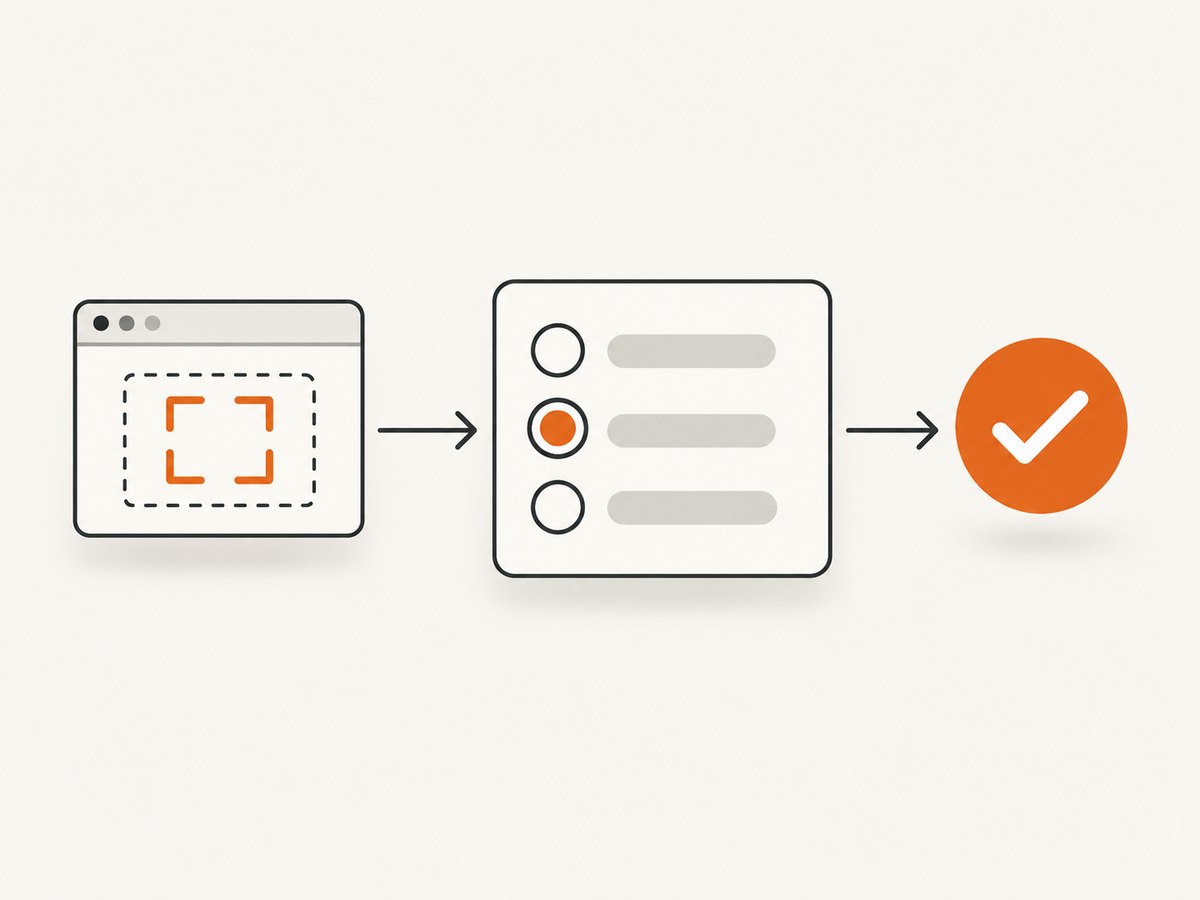
Native radio buttons are grouped by their name. Only one radio in a group can be checked at a time. The value identifies the option submitted with the form:
<input type="radio" name="contact" value="email">
<input type="radio" name="contact" value="phone">
<input type="radio" name="contact" value="sms">
Select the email option with:
await page.locator('input[name="contact"][value="email"]').click();Including type="radio" makes the intent explicit and avoids matching another control that happens to use the same name and value:
await page.locator(
  'input[type="radio"][name="contact"][value="email"]',
).click();
Escape CSS characters when an ID or value contains punctuation. For difficult identifiers, use CSS.escape in the page context or choose a stable parent and a simpler descendant selector.
3. Scope the selector to the correct form
Pages often contain several radio groups with similar names, such as shipping and billing forms. Scope the locator to the nearest stable container:
const billing = page.locator('form#billing');
await billing.locator(
  'input[type="radio"][name="method"][value="card"]',
).click();
You can scope to a dialog, table row, fieldset, or component root:
const paymentPanel = page.locator('[data-testid="payment-panel"]');
await paymentPanel.locator('input[name="method"][value="bank"]').click();
Avoid a bare selector such as input[type="radio"] when multiple matches are possible. A locator that resolves to the wrong group can still succeed while producing the wrong test result.
4. Select through a label
A label is often more stable for tests that should follow the user-visible form. With an explicit for attribute, clicking the label checks its associated input:
<input id="contact-email" type="radio" name="contact" value="email">
<label for="contact-email">Email</label>
await page.locator('label[for="contact-email"]').click();If the label text is unique and trustworthy, use a text or accessibility locator. Puppeteer supports CSS, text, XPath, accessibility, and shadow-root-combining selector forms; see the Locator API and querying guide.
await page.locator('::-p-text(Email)').click();Text selectors can become ambiguous when the same word appears in help text or multiple cards. In that case, use the input’s name/value pair or scope the text locator to a fieldset.
5. Use an accessibility selector
When the accessible name is reliable, select the radio as a user of assistive technology would:
await page.locator('::-p-aria(Email)').click();Confirm that the result is the intended radio. A custom component may expose a role of radio and an accessible name, while a native input may have a name derived from its label. If several controls are named “Email,” scope the locator first:
const preferences = page.locator('[aria-label="Contact preference"]');
await preferences.locator('::-p-aria(Email)').click();
6. Use fill(true) when you want input-specific behavior
Puppeteer documents boolean values for Locator fill() on input elements, including radio buttons and switches:
await page.locator('input[name="contact"][value="email"]').fill(true);Use click() when you want normal pointer-style interaction, including the page’s click handlers and pointer event sequence. Use fill(true) when you specifically want the Locator API’s input behavior. Verify the result either way.
7. Wait for dynamically rendered radios
React, Vue, and other applications may render the form after the initial navigation. Create the locator before the form is ready and let the action wait for it:
await page.goto('https://example.com/checkout', {
  waitUntil: 'domcontentloaded',
});

const express = page.locator(
  'input[type="radio"][name="shipping"][value="express"]',
);
await express.click();
For an application-specific readiness condition, wait for a parent or data attribute first:
await page.waitForSelector('[data-testid="shipping-options"]');
await page.locator('input[name="shipping"][value="express"]').click();
Do not add arbitrary sleeps unless the application has no observable readiness signal. Locator actions already check visibility, enabled state, viewport position, and layout stability across animation frames.
8. Verify that the radio is checked
The DOM property is the authoritative state for a native input:
const selector = 'input[name="contact"][value="email"]';
await page.locator(selector).click();

const checked = await page.$eval(selector, (element) => element.checked);
if (!checked) {
  throw new Error(`Expected ${selector} to be checked`);
}
For a reusable assertion, return the property from evaluate:
async function selectRadio(page, selector) {
  const radio = page.locator(selector);
  await radio.click();
  const checked = await radio.evaluate((element) => element.checked);
  if (!checked) throw new Error(`Radio was not checked: ${selector}`);
}

await selectRadio(
  page,
  'input[type="radio"][name="contact"][value="email"]',
);
$eval() and evaluate() run a function against an element or in page context, as described in the Puppeteer Page API. For a custom widget, verify its documented state attribute, such as aria-checked="true", instead of assuming a hidden input’s property reflects the visible control.
9. Lower-level page.click()
The Page API remains useful for a straightforward selector-based click:
await page.click('input[type="radio"][name="contact"][value="email"]');page.click(selector) finds a matching element, scrolls it into view when needed, and throws if no match exists. The Locator API is generally easier to compose and gives you a stable object for subsequent assertions, so use page.click() when maintaining existing code or when a simple one-off action is enough. See the Page.click documentation.
10. Iframes and shadow DOM
Radio inside an iframe
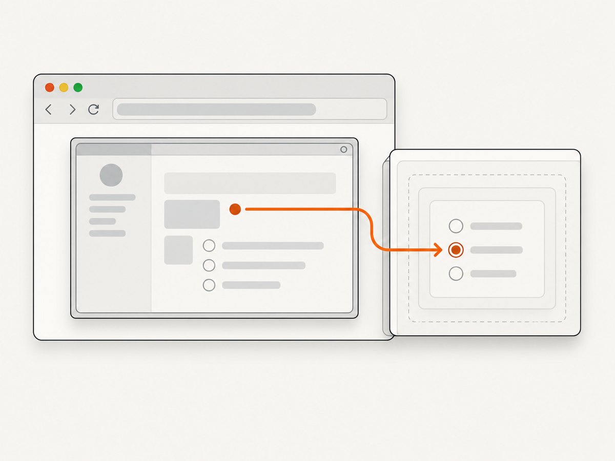
Page-level selectors do not cross iframe boundaries. Locate the frame, then create the locator from that frame:
await page.goto('https://example.com/checkout');
const frame = page.frames().find((item) => item.url().includes('/payment-frame'));
if (!frame) throw new Error('Payment iframe was not found');

await frame.locator(
  'input[type="radio"][name="method"][value="card"]',
).click();
For a frame selected by its element, wait for it first and use the frame returned by Puppeteer’s frame APIs. Keep frame discovery specific when several payment frames exist.
Radio inside a shadow root
Web components can hide controls inside an open shadow root. Puppeteer supports shadow-root-combining selectors:
await page.locator(
  'my-contact-form >>> input[type="radio"][value="email"]',
).click();
If the component exposes an accessible radio, an ARIA selector scoped to the host may be clearer. Closed shadow roots cannot be queried directly; use the component’s public interaction surface or click the host element that implements the behavior.
11. Custom radio widgets
Many design systems render a div or button and keep a hidden input for form submission. First inspect the DOM and accessibility tree. Typical patterns include:
<div role="radio" aria-checked="false" tabindex="0">Email</div>const email = page.locator('div[role="radio"][aria-label="Email"]');
await email.click();
await email.waitForFunction((element) =>
element.getAttribute('aria-checked') === 'true',
);If the control is keyboard-only, focus it and press the documented key:
await email.focus();
await page.keyboard.press('Space');
Do not force a click on a hidden input simply because it is easy to select. That can bypass event handlers used by the component and fail to update application state.
12. Choosing an implementation
| Approach | Best for | Main consideration |
|---|---|---|
locator(selector).click() |
Default native-radio selection | Stable selectors and built-in actionability checks |
locator(selector).fill(true) |
Locator input behavior | Use a boolean and still verify state |
| Label or ARIA selector | User-facing semantics | Names must be unique and stable |
page.click(selector) |
Simple legacy code | Less composable than a Locator |
evaluate() assignment |
Diagnostics only | Setting checked directly may skip events |
For production tests, combine a scoped stable selector with a post-click assertion. Add an accessibility selector when the test’s purpose is to model a user-visible choice.
13. Troubleshooting common failures
| Symptom | Likely cause | Fix |
|---|---|---|
| “No element found” | Wrong selector, delayed rendering, or wrong frame | Inspect the DOM, wait for a stable parent, and query the correct frame. |
| Click is intercepted | Cookie banner, modal, overlay, or animation covers the input | Dismiss the overlay, wait for it to disappear, or click the associated visible label. |
| Element is disabled | The form has not completed validation or loading | Wait for the enabling condition and inspect the disabled property. |
| Wrong option selected | Duplicate groups or a hidden duplicate matched | Scope by form/container and include name plus value. |
| Radio appears selected but app state is unchanged | Custom widget requires its own click target or keyboard event | Target the element with the radio role and verify aria-checked or application state. |
| Selection disappears after a render | React or another framework replaced the node | Reacquire the locator after the render and assert the final property. |
| Input is in an iframe | Selectors do not cross document boundaries | Find the frame and create the locator from that frame. |
| Shadow-root selector fails | Closed shadow root or unsupported component boundary | Use the component’s public API, accessible control, or host interaction. |
When diagnosing a failure, log the selector, current URL, matching element count, and relevant attributes. A short DOM snapshot around the form is usually more useful than increasing a timeout.
14. Performance and reliability
Prefer one precise locator action over repeated DOM polling. Avoid selecting every radio and filtering in Node.js when a CSS selector can identify the value directly. Reuse one browser process across tests, but create an isolated page or context for independent sessions.
Use a navigation wait condition that matches the application. networkidle2 can be slow on pages with long-lived connections; domcontentloaded plus a form-specific wait is often faster and more deterministic. Keep timeouts bounded so a broken page fails with a useful error.
page.setDefaultTimeout(10000);
page.setDefaultNavigationTimeout(30000);
For CI, capture a screenshot and HTML when selection fails:
try {
  await page.locator('input[name="contact"][value="email"]').click();
} catch (error) {
  await page.screenshot({ path: 'radio-failure.png', fullPage: true });
  require('fs').writeFileSync('radio-failure.html', await page.content());
  throw error;
}
Retries should be reserved for transient navigation or infrastructure errors. Retrying a genuinely wrong selector only makes failures slower and less clear.
15. Or skip the browser setup
If your goal is a clean image of a page after making a choice, ScreenshotNeo provides a website screenshot API. You can use Puppeteer for interactive form automation and then send the resulting page to an image pipeline, or capture pages directly when no custom browser script is needed. See the ScreenshotNeo API documentation.
curl -G "https://api.screenshotneo.com/v1/shot" -d access_key=YOUR_API_KEY --data-urlencode url=https://stripe.com -o shot.webpimport requests
r = requests.get("https://api.screenshotneo.com/v1/shot", params={"access_key": "YOUR_API_KEY", "url": "https://stripe.com"}, timeout=90)
open("shot.webp", "wb").write(r.content)const q = new URLSearchParams({ access_key: 'YOUR_API_KEY', url: 'https://stripe.com' });
const res = await fetch(`https://api.screenshotneo.com/v1/shot?${q}`);Cookie banners, newsletter popups, and chat widgets are removed before the shot. Bot checks, blank pages, timeouts, failed loads, and cache hits are never billed; response headers report the page verdict and whether it was billed. ScreenshotNeo also has an MCP server so Claude, Cursor, and other MCP clients can take screenshots, inspect pages, and capture PDFs. The free plan includes 1,000 screenshots per month with no card, and paid plans start at $5 for 3,000 shots. Start with 1,000 free screenshots.
16. Cost and operational notes
A local Puppeteer run consumes your own compute and browser maintenance time. In CI, account for Chromium downloads, startup latency, parallel worker limits, and storage for failure artifacts. Keep selectors and browser versions pinned enough to make failures reproducible, but update deliberately when the application or Puppeteer API changes.
For hosted captures, check the service’s billing semantics before adding retries. ScreenshotNeo bills only clean shots and exposes X-Page-Verdict and X-Billed headers, which lets a worker distinguish a usable image from a failed or unbillable response. Cache repeated captures when the page can tolerate a stale result.
17. FAQ
Should I click the input or its label?
Click the input when you have a stable selector and need direct control. Click the label when the label is the user-facing contract or the input is visually hidden.
Can I select two radios in one group?
No. Native radios sharing a name are mutually exclusive. Use separate names for independent choices.
Why does checked differ from the HTML attribute?
The checked attribute describes the initial markup. The checked property describes the current state after interaction.
Is a forced click a good fix?
Usually no. A forced click can hide an overlay, disabled state, or wrong selector. Fix the page state or selector, then verify the result.
How do I select a radio by value?
Use input[type="radio"][name="group"][value="option"], scope it to the relevant form, click it, and assert element.checked.


