How to Set the Background Image Size on a Website
Use CSS background-size to control cover, contain, fixed dimensions, cropping, responsive layouts, and reliable background image rendering.

Set the background-size property on the element that owns the background-image. For a full-width hero or panel, start with background-size: cover. It fills the element while preserving the image’s proportions, so part of the image can be cropped. Use contain when every part of the image must remain visible, accepting that empty space may appear.
.hero {
  background-image: url("hero.jpg");
  background-size: cover;
  background-position: center;
  background-repeat: no-repeat;
  background-color: #1f2937;
}
The MDN reference defines background-size as the property that sets the size of an element’s background image. The right value depends on whether your priority is filling the box, showing the complete image, or rendering at a deliberate dimension.
How background-size works
A background image is painted inside an element’s background positioning area. By default, that area is related to the padding box, and the initial value of background-size is auto auto. With auto, the image keeps its intrinsic dimensions unless another value determines one of its axes.
The property accepts:
covercontain- one length or percentage, such as
300pxor50% - two lengths or percentages, such as
300px 200px auto, which preserves the image’s intrinsic ratio when paired with a specified width or height
When one dimension is supplied, the other normally remains auto and is calculated from the image ratio. When both dimensions are supplied, the browser uses both values, which can distort the image if they do not match its natural proportions.
Choosing cover, contain, or explicit dimensions
| Goal | Value | Result |
|---|---|---|
| Fill the entire element | cover |
Preserves the ratio and crops one axis when the element and image ratios differ. |
| Show the whole image | contain |
Preserves the ratio and may leave uncovered bands. |
| Render a particular width | 300px or 50% |
Sets one dimension; the other usually remains proportional. |
| Set both dimensions | 300px 200px |
Uses both dimensions and may stretch or squash the image. |
Use cover for a full-bleed hero
.hero {
  min-height: 28rem;
  background-image: url("hero.jpg");
  background-size: cover;
  background-position: center;
  background-repeat: no-repeat;
}
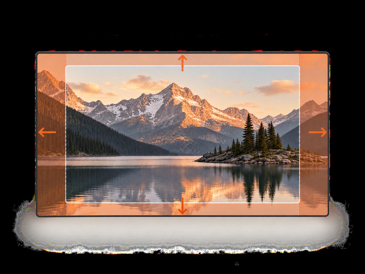
cover scales the image until both dimensions cover the element. If the image is wider than the element, its left and right edges can be cropped. If it is taller, its top and bottom can be cropped. background-position determines which part remains visible.
Use contain when no detail may be cropped
.product-board {
  min-height: 24rem;
  background-image: url("product-board.png");
  background-size: contain;
  background-position: center;
  background-repeat: no-repeat;
  background-color: #f3f4f6;
}
Contain fits the entire image inside the positioning area. The remaining space shows the element’s background color. Always add background-repeat: no-repeat when repetition would be undesirable; otherwise a smaller contained image can tile.
Use one or two lengths deliberately
.pattern {
  background-image: url("pattern.svg");
  background-size: 240px auto;
  background-repeat: repeat;
}

.badge {
  background-image: url("badge.png");
  background-size: 120px 80px;
  background-repeat: no-repeat;
}
240px auto fixes the rendered width while retaining the image’s ratio. 120px 80px fixes both axes and can distort the source. A percentage is measured against the background positioning area, not automatically against the viewport. With background-attachment: fixed, the reference area is the viewport.
A complete responsive example
This document creates a hero with readable foreground content, a fallback color, and responsive positioning. Save it as index.html and replace the image URL with an image you control.
<!doctype html>
<html lang="en">
<head>
  <meta charset="utf-8">
  <meta name="viewport" content="width=device-width, initial-scale=1">
  <title>Responsive background example</title>
  <style>
    :root { color-scheme: light; }
    * { box-sizing: border-box; }
    body {
      margin: 0;
      font-family: system-ui, sans-serif;
      color: white;
      background: #111827;
    }
    .hero {
      min-height: 70vh;
      display: grid;
      align-items: end;
      padding: clamp(1.5rem, 5vw, 5rem);
      background-color: #334155;
      background-image: linear-gradient(rgba(0,0,0,.15), rgba(0,0,0,.7)),
                        url("hero.jpg");
      background-size: cover;
      background-position: center 35%;
      background-repeat: no-repeat;
    }
    .hero__content { max-width: 42rem; }
    .hero h1 { font-size: clamp(2rem, 6vw, 4.5rem); margin: 0 0 1rem; }
    .hero p { font-size: clamp(1rem, 2vw, 1.25rem); margin: 0; }
    @media (max-width: 40rem) {
      .hero {
        min-height: 34rem;
        background-position: 62% center;
      }
    }
  </style>
</head>
<body>
  <main class="hero">
    <div class="hero__content">
      <h1>Readable content over a responsive background</h1>
      <p>The image fills the hero while the overlay and fallback color preserve contrast.</p>
    </div>
  </main>
</body>
</html>
The gradient is a second background layer. Background layers are listed from front to back, so the gradient appears above the photograph. Both layers use the same cover sizing in this example.
Control cropping with background-position
cover decides the scale; background-position decides which portion is visible after scaling.
.hero { background-position: center; }
.hero--top { background-position: center top; }
.hero--subject-right { background-position: 70% center; }
.hero--custom { background-position: 25% 40%; }
Use a percentage when the important subject is consistently off-center. On narrow screens, a separate media query often gives the subject more room. If the crop still removes essential information, use a different composition or switch to an inline <img> with an appropriate object-fit; backgrounds are decorative and do not provide an image alternative for assistive technology.
Multiple backgrounds and responsive values
Each background layer can have its own size. Keep the comma-separated order aligned across background-image, background-size, and background-position.
.banner {
  background-image: url("noise.svg"), url("landscape.jpg");
  background-size: 180px 180px, cover;
  background-position: top left, center;
  background-repeat: repeat, no-repeat;
}
For fluid layouts, CSS functions can adjust a fixed size without scripting:
.card {
  background-size: clamp(14rem, 45vw, 32rem) auto;
}
Use media queries when the image needs a different crop or when loading a smaller asset is more appropriate. CSS sizing alone does not reduce the downloaded file size.
Background color, transparency, and accessibility
A background color remains visible wherever the image does not cover the area and behind transparent pixels. Set one so slow loads, failed loads, and transparent PNG or SVG regions still have a deliberate appearance.
.logo-wall {
  background-color: #fff;
  background-image: url("marks.svg");
  background-size: contain;
  background-repeat: no-repeat;
}
Do not place essential text or meaning only in a background image. Provide that information as HTML, maintain sufficient text contrast, and respect reduced-motion preferences if a background is animated through other effects. A decorative background normally needs no alt text because it is not an inline image.
Common mistakes and fixes
| Symptom | Cause | Fix |
|---|---|---|
| The declaration has no effect | background-size is on a different element from background-image, or the selector is overridden. |
Put both declarations on the same element and inspect computed styles. |
| The image repeats with contain | The image is smaller than the positioning area and the default repeat behavior remains active. | Add background-repeat: no-repeat. |
| The subject is cut off with cover | The image and element have different aspect ratios. | Adjust background-position, change the source composition, or use contain. |
| A percentage looks wrong | The percentage uses the background positioning area, which may be the padding box rather than the viewport. | Check background-origin, element dimensions, and whether fixed attachment is involved. |
| The hero has no visible image | The element has no height, the URL is invalid, or another background layer covers it. | Give the element a height or content, verify the URL in the network panel, and inspect layer order. |
| The image looks stretched | Two explicit dimensions do not match the source ratio. | Use auto for one axis or choose cover/contain. |
Performance and reliability notes
- Choose an appropriately sized source.
background-sizechanges display dimensions, not the number of bytes downloaded. - Use modern formats such as WebP or AVIF where your delivery pipeline supports them, and compress photographs before publishing.
- Set a fallback
background-colorso the layout remains usable while the image loads. - Keep critical text in HTML. A background image can fail, be blocked, or load after the content.
- For content images that need intrinsic sizing, captions, or alternative text, prefer
<img>withobject-fit: coverorcontain. - Test representative aspect ratios: wide desktop, short laptop, tablet, and narrow mobile. Cropping is a layout result, not an image defect.
Verify the result with a rendered screenshot
Browser developer tools can show computed CSS, but a rendered capture is useful for checking the final crop at a known viewport. You can inspect a local or deployed page with your own browser automation, or use ScreenshotNeo when you need repeatable screenshots from a URL.
Or skip the browser setup
ScreenshotNeo provides a single GET request that returns a PNG, JPEG, WebP, or PDF. It can capture a full page or one element, set a viewport and device preset, use retina scale, wait for a selector or network idle, run custom CSS or JavaScript, and hide selectors. Cookie and consent banners, newsletter popups, and chat widgets are removed before the shot. Bot checks, blank pages, timeouts, failed loads, and cache hits are not billed, and the response identifies the result with X-Page-Verdict and X-Billed headers. An MCP server provides take_screenshot, get_page_info, and capture_pdf tools for Claude, Cursor, and other MCP clients.

See the ScreenshotNeo API documentation for all options. The basic request below captures a page that uses background-size:
cURL
curl -G "https://api.screenshotneo.com/v1/shot" \
  -d access_key=YOUR_API_KEY \
  --data-urlencode url=https://stripe.com \
  -o shot.webp
Python
import requests

r = requests.get(
    "https://api.screenshotneo.com/v1/shot",
    params={"access_key": "YOUR_API_KEY", "url": "https://stripe.com"},
    timeout=90,
)
r.raise_for_status()
open("shot.webp", "wb").write(r.content)
Node.js
const q = new URLSearchParams({
  access_key: 'YOUR_API_KEY',
  url: 'https://stripe.com'
});
const res = await fetch(`https://api.screenshotneo.com/v1/shot?${q}`);
if (!res.ok) throw new Error(`Screenshot failed: ${res.status}`);
const buffer = Buffer.from(await res.arrayBuffer());
require('fs').writeFileSync('shot.webp', buffer);
For a production capture, add the relevant documented options for viewport dimensions, device preset, full-page mode, delay or selector waits, custom CSS, cache TTL, output format, and signed links. If the page’s hero depends on JavaScript, wait for a stable selector or network idle before capturing. If an image is lazy-loaded, use full-page capture or an explicit wait so it enters the viewport and is rendered.
Free accounts include 1,000 screenshots per month with no card. Paid plans start at $5 for 3,000 shots; yearly billing provides two months free, and every feature is available on every plan. Create a free ScreenshotNeo account to capture your first page.
FAQ
Should I use cover or contain?
Use cover when the element must be fully filled. Use contain when the complete image must remain visible.
Why is my background image cropped?
Cropping is expected with cover when the image and element have different aspect ratios. Change background-position or choose a different source image.
Can I use background-size on an img element?
No. background-size sizes CSS background images. For an inline image, use CSS such as object-fit: cover or object-fit: contain.
What does 100% 100% mean?
It stretches the background to the full width and height of the positioning area. Use it only when distortion is acceptable; cover or contain usually preserves the source ratio.
Does changing background-size make the download smaller?
No. It changes how the downloaded image is painted. Use an appropriately sized, compressed source or responsive asset strategy to reduce transfer size.


