How to Set the Browser Screen Size in Cypress
Use cy.viewport() to size Cypress’s application viewport, or configure the headless browser screen separately for screenshots and video.

To change the size of the page Cypress is testing, call cy.viewport(width, height) inside a test, or set viewportWidth and viewportHeight in Cypress configuration. For example, cy.viewport(1280, 720) gives the application under test a 1280-by-720-pixel viewport.
That is different from changing the headless browser’s screen size, which affects screenshot and video rendering. Configure that separately with the before:browser:launch event. Choose the setting based on what you need to resize: the page viewport or the browser display.
1. Choose the right kind of size
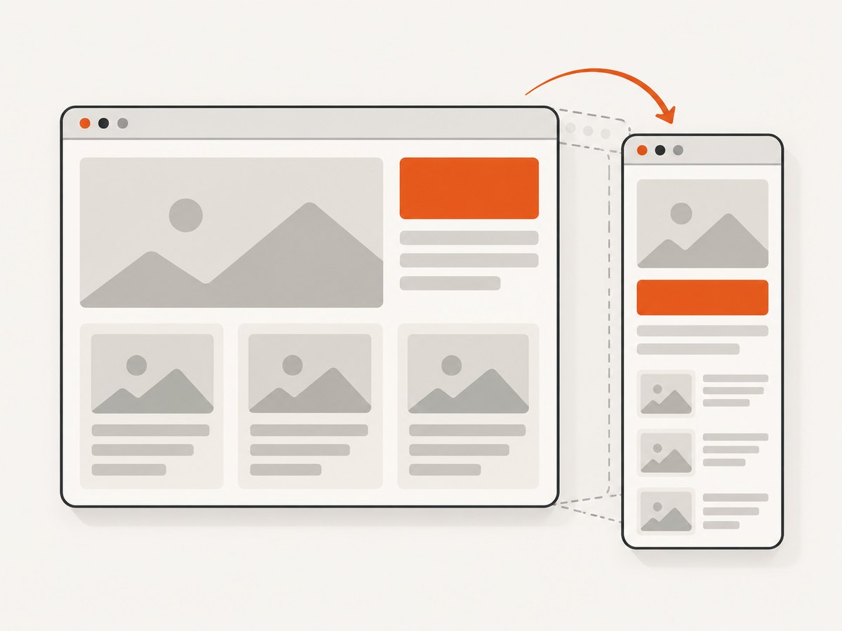
Cypress has two relevant dimensions, and confusing them is a common source of misleading responsive tests.
| What you want to control | Use | What it affects |
|---|---|---|
| Page dimensions for responsive behavior | cy.viewport() or viewport config |
The application under test’s viewport |
| Headless browser display dimensions | before:browser:launch |
Browser screen dimensions used for screenshots and video |
cy.viewport() does not resize a physical monitor, and it does not provide complete device emulation. In particular, Cypress says it does not simulate devicePixelRatio. A named preset supplies viewport dimensions and orientation; it is not equivalent to testing on a real phone.
In Cypress Open Mode, the preview may be scaled down to fit the runner pane. That visual scaling does not mean the application viewport changed. If the preview looks small, check the configured dimensions and the runner layout separately.
2. Resize the application in a test
Use the numeric form when your test needs a specific width and height. Set the viewport before checking responsive elements so the assertions run against the intended layout.
describe('responsive navigation', () => {
  it('shows the mobile menu at a narrow width', () => {
    cy.viewport(390, 844)
    cy.visit('/products')

    cy.get('[data-cy=mobile-menu-button]').should('be.visible')
    cy.get('[data-cy=desktop-navigation]').should('not.be.visible')
  })

  it('shows desktop navigation at a wide width', () => {
    cy.viewport(1280, 800)
    cy.visit('/products')

    cy.get('[data-cy=desktop-navigation]').should('be.visible')
    cy.get('[data-cy=mobile-menu-button]').should('not.be.visible')
  })
})
The dimensions are CSS pixels. Pick values around your app’s actual responsive breakpoints, rather than choosing sizes only because they correspond to a popular device. If a layout changes at 768 pixels, for example, test on both sides of that boundary to catch off-by-one errors.
Use a named preset
For a convenient device-shaped viewport, pass a documented preset name. You may also request landscape orientation:
it('shows the compact layout in portrait', () => {
  cy.viewport('iphone-6')
  cy.visit('/')
  cy.get('[data-cy=mobile-menu-button]').should('be.visible')
})

it('shows the compact layout in landscape', () => {
  cy.viewport('iphone-6', 'landscape')
  cy.visit('/')
  cy.get('[data-cy=content]').should('be.visible')
})
Cypress swaps the preset’s dimensions for landscape. Use numeric dimensions if you need an exact viewport that a preset does not express. Presets do not change pixel density or reproduce all browser and operating system behaviors.
Run a boundary test
A breakpoint test is most informative when it checks widths just below and above the breakpoint. Keep each viewport change explicit; it makes failures easier to interpret.
const widths = [767, 768]

widths.forEach((width) => {
  it(`checks navigation at ${width}px`, () => {
    cy.viewport(width, 900)
    cy.visit('/')

    if (width < 768) {
      cy.get('[data-cy=mobile-menu-button]').should('be.visible')
    } else {
      cy.get('[data-cy=desktop-navigation]').should('be.visible')
    }
  })
})
Adjust the expected behavior and breakpoint to match your CSS. If the app reads viewport dimensions during startup, visit after setting the viewport, as above, so the initial layout is created at the intended size.
3. Set default viewport dimensions
Set global defaults when most tests should use the same application size. Cypress documents a default of 1000 by 660 pixels, and resets the viewport to its default between tests. Add explicit values to cypress.config.js or cypress.config.ts to make your chosen baseline clear to the team.
const { defineConfig } = require('cypress')

module.exports = defineConfig({
  viewportWidth: 1280,
  viewportHeight: 800,
})
For TypeScript configuration, use the same properties in the object passed to defineConfig:
import { defineConfig } from 'cypress'

export default defineConfig({
  viewportWidth: 1280,
  viewportHeight: 800,
})
These are default application viewport dimensions. A cy.viewport() call in a test can select a different size for that test. Cypress restores the default between tests, so a size set in one test should not be relied on to carry into the next.
4. Scope dimensions to a test or suite
When only a group of tests needs a different viewport, use test-specific or suite-specific configuration. This keeps the special dimensions close to the tests that need them.
describe('tablet layout', { viewportWidth: 900, viewportHeight: 1100 }, () => {
  it('keeps the filters visible', () => {
    cy.visit('/catalog')
    cy.get('[data-cy=filters]').should('be.visible')
  })
})

describe('mobile checkout', { viewportWidth: 390, viewportHeight: 844 }, () => {
  it('shows the compact checkout layout', () => {
    cy.visit('/checkout')
    cy.get('[data-cy=checkout-form]').should('be.visible')
  })
})
Scoped configuration applies to the relevant test or suite and then returns to the prior default. This is useful for organizing a responsive suite by layout size without adding a viewport command to every test.
5. Override dimensions for a run
For a one-off run, pass the configuration values on the Cypress command line. This is handy when reproducing a CI issue or running the same tests at a different baseline without editing project files.
npx cypress run --config viewportWidth=1280,viewportHeight=720Cypress also documents environment overrides named CYPRESS_VIEWPORT_WIDTH and CYPRESS_VIEWPORT_HEIGHT. For example, a shell can set them for one run:
CYPRESS_VIEWPORT_WIDTH=1280 CYPRESS_VIEWPORT_HEIGHT=720 npx cypress runCommand-line configuration is explicit in build logs and scripts. Use the configuration file for a stable project default, and a run override when you intentionally need a different default for one execution.
6. Change the headless browser screen size
If you specifically need to change headless screenshot or video output dimensions, configure browser launch options through setupNodeEvents and the before:browser:launch event. This setting is separate from cy.viewport(); changing one does not replace the other.
const { defineConfig } = require('cypress')

module.exports = defineConfig({
  e2e: {
    setupNodeEvents(on, config) {
      on('before:browser:launch', (browser, launchOptions) => {
        if (browser.name === 'chrome' && browser.isHeadless) {
          launchOptions.args.push('--window-size=1600,1000')
        }

        return launchOptions
      })
    },
  },
})
Browser launch options are browser-specific. Cypress documents a headless screen default of 1280 by 720 and device pixel ratio 1 in its browser-launch guidance. For Electron, use the Electron preferences supported by Cypress rather than assuming Chrome command-line arguments apply. Consult the Cypress browser launch API for the options and browser details relevant to your installed version.
If your responsive assertions need a 390-pixel page viewport, still call cy.viewport(390, 844) or configure those application dimensions. A 1600-by-1000 headless screen setting does not itself make the page-under-test viewport 1600 by 1000.
7. Avoid runtime configuration changes for viewport sizing
In Cypress 16.0.0 and later, changing viewportWidth or viewportHeight with Cypress.config() while a test is executing throws an error. Use cy.viewport() to resize during a test, or use test-specific configuration for suite and test scopes.
// Use this during a running test:
cy.viewport(1024, 768)

// Set this in cypress.config.js for the run default:
module.exports = {
  viewportWidth: 1024,
  viewportHeight: 768,
}
The distinction is useful: Cypress configuration establishes the run or scope defaults; the viewport command changes the application dimensions as part of a running test.
8. Troubleshooting
| Symptom | Likely cause | Fix |
|---|---|---|
| Responsive elements do not change after setting window size | The browser screen was changed, but the app viewport was not | Call cy.viewport(width, height) before the assertions, or set viewport config. |
| Screenshot output has unexpected outer dimensions | The headless browser screen and page viewport are being treated as the same setting | Configure the screen in before:browser:launch and the app separately with cy.viewport(). |
Cypress.config() throws when changing dimensions |
Viewport dimensions are being changed at runtime in Cypress 16 or later | Use cy.viewport() in the test or scope the values through test/suite configuration. |
| Runner preview appears smaller than expected | Open Mode scaled the preview to fit its pane | Check the actual configured viewport; preview scaling is visual and does not change page dimensions. |
| A preset looks unlike a physical phone | A preset supplies dimensions and orientation but not full device simulation or pixel ratio | Test any required device-specific behaviors on the appropriate real browser or device setup. |
| Launch argument has no effect | The option is browser-specific or the wrong browser mode is being targeted | Check browser.name, headless state, and the browser-specific launch documentation; use Electron preferences for Electron. |
9. Performance, reliability, and cost
Viewport changes are lightweight compared with visiting a page and waiting for its application to render. Keep the test matrix focused on meaningful breakpoints and representative device dimensions; testing every pixel width usually adds execution time without making each case more informative.
For reliable responsive checks, set dimensions before visiting or before querying layout-dependent elements. Keep test data and assertions stable across sizes, and avoid relying on the runner preview’s displayed scale. If a test changes viewport partway through, assert the specific behavior expected after the resize rather than assuming every application recalculates layout in exactly the same way.
Cypress viewport configuration does not incur a separate service charge. The main cost is test runtime, especially when a larger viewport matrix repeats expensive setup or network-dependent page loads. Reuse setup where appropriate and reserve headless browser screen changes for cases that actually concern screenshot or video rendering.
10. Capture a page screenshot without maintaining browser setup
For Cypress responsive assertions, set the application viewport in Cypress. If your task is to produce a clean website screenshot or PDF, ScreenshotNeo is a separate option: its screenshot API takes a URL and returns an image or PDF. The ScreenshotNeo API has its own capture options and does not set Cypress’s test viewport.

Or skip the browser setup
ScreenshotNeo provides one-call URL capture in cURL, Python, and Node.js. See the ScreenshotNeo documentation for the API details.
curl -G "https://api.screenshotneo.com/v1/shot" -d access_key=YOUR_API_KEY --data-urlencode url=https://stripe.com -o shot.webpimport requests
r = requests.get(
"https://api.screenshotneo.com/v1/shot",
params={"access_key": "YOUR_API_KEY", "url": "https://stripe.com"},
timeout=90,
)
open("shot.webp", "wb").write(r.content)const q = new URLSearchParams({ access_key: 'YOUR_API_KEY', url: 'https://stripe.com' })
const res = await fetch(`https://api.screenshotneo.com/v1/shot?${q}`)
if (!res.ok) throw new Error(`Screenshot request failed: ${res.status}`)
const image = Buffer.from(await res.arrayBuffer())
await import('node:fs/promises').then(fs => fs.writeFile('shot.webp', image))- Cookie and consent banners are accepted like a visitor, and more than 60 known consent platforms, newsletter popups, and chat widgets are removed before the shot. Each step can be turned off.
- Bot checks, CAPTCHAs, blank pages, timeouts, failed loads, and cache hits are not billed. Responses identify the page verdict and billing status in headers.
- An MCP server gives AI agents, including Claude, Cursor, and other MCP clients, the
take_screenshot,get_page_info, andcapture_pdftools. - The Free plan includes 1,000 screenshots per month with no card. Paid plans start at $5 for 3,000 shots; every feature is available on every plan.
Create a free ScreenshotNeo account for 1,000 screenshots a month with no card.
11. Frequently asked questions
Does cy.viewport() change the Cypress runner window?
No. It changes the application-under-test viewport. The runner preview may scale to fit the available pane, and that display scaling does not alter the configured page dimensions.
Can I test portrait and landscape?
Yes. Use a preset with an orientation, such as cy.viewport('iphone-6', 'landscape'), or provide numeric width and height in the desired orientation.
Does a viewport preset emulate a device pixel ratio?
No. The preset supplies viewport dimensions and orientation. Cypress documents that cy.viewport() does not simulate devicePixelRatio.
Which setting should I use for a responsive assertion?
Use cy.viewport() in the test or viewport configuration. Use browser launch options only when you need to control the headless browser screen used for screenshot or video output.


