How to Set Image Dimensions in wkhtmltoimage
Set exact viewport and crop dimensions in wkhtmltoimage with practical commands, library settings, troubleshooting, and API alternatives.
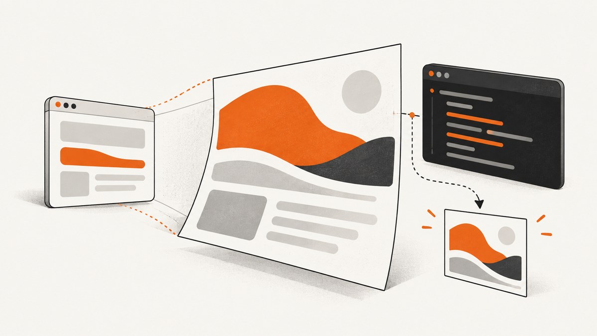
wkhtmltoimage lets you control the rendered screen size and the final image bounds separately. For a fixed 1,200 by 800 viewport, run:
wkhtmltoimage --width 1200 --height 800 input.html output.pngBy default, --width is a rendering guide because smart width can expand the layout for unbreakable content. To request a strict rendering width, add --disable-smart-width:
wkhtmltoimage --width 1200 --height 800 --disable-smart-width input.html output.pngIf the output itself must be exactly 1,200 by 800 pixels, also set the crop dimensions:
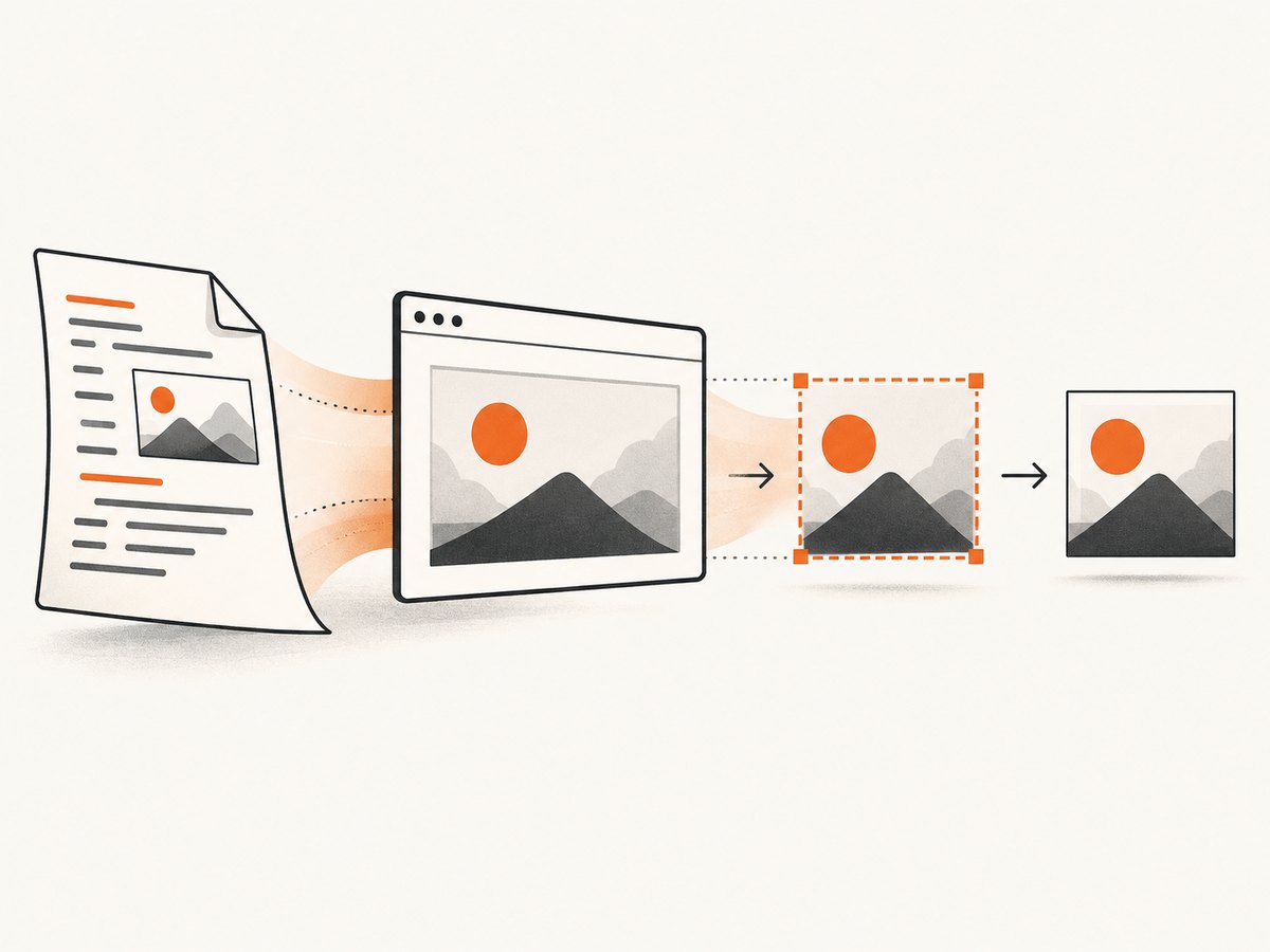
wkhtmltoimage --width 1200 --height 800 --disable-smart-width --crop-w 1200 --crop-h 800 input.html output.pngThese controls are independent: viewport flags affect HTML layout, while crop flags select the pixels written to the file.
How wkhtmltoimage dimensions work
wkhtmltoimage renders an HTML document using a screen viewport, then converts the rendered page into an image. The main settings are:
| Goal | Option | Effect |
|---|---|---|
| Set rendering width | --width <int> |
Sets the screen width used by the renderer. |
| Set rendering height | --height <int> |
Sets screen height. If omitted, height is calculated from page content. |
| Prevent width expansion | --disable-smart-width |
Makes the requested screen width strict instead of allowing smart-width expansion. |
| Allow smart width | --enable-smart-width |
Enables the default behavior that can expand width for content that cannot wrap. |
| Crop width | --crop-w <int> |
Sets the output crop width. |
| Crop height | --crop-h <int> |
Sets the output crop height. |
| Crop origin | --crop-x <int>, --crop-y <int> |
Moves the crop rectangle away from the top-left corner. |
| Wait for JavaScript | --javascript-delay <msec> |
Waits before capture so delayed content can render. |
The Debian wkhtmltoimage manpage documents the command synopsis and these options. Check your installed build before comparing results because packaged versions and patches can differ.
Set a fixed viewport size
1. Fixed width and height
Use this when you need a predictable browser-like viewport, such as a dashboard thumbnail or a visual regression fixture:
wkhtmltoimage --width 1440 --height 900 page.html dashboard.pngThe input and output paths come last. The input can be a local file or a URL supported by your build:
wkhtmltoimage --width 1024 --height 768 https://example.com example.pngA fixed height does not automatically crop overflow to that height. It defines the screen height used during layout. If the page extends below the viewport, the resulting image may still include more content depending on rendering behavior and other options. Use explicit crop settings when exact output bounds matter.
2. Make width strict
Smart width is the reason a command can produce an image wider than the number passed to --width. It can extend the layout to fit unbreakable content such as long URLs, preformatted text, or wide tables. Disable it when your output contract requires a strict viewport:
wkhtmltoimage --width 1200 --disable-smart-width page.html strict.pngStrict viewport width does not repair the HTML. An element wider than the viewport can still overflow or be clipped. Add responsive CSS, allow wrapping, or deliberately crop the overflow.
Crop the output to exact pixels
Use crop flags when you need the final file dimensions to be bounded independently of layout:
wkhtmltoimage --width 1200 --height 800 --crop-w 1200 --crop-h 800 page.html exact.pngTo capture a 600 by 400 rectangle beginning 100 pixels from the left and 200 pixels from the top:
wkhtmltoimage --width 1200 --height 800 --crop-x 100 --crop-y 200 --crop-w 600 --crop-h 400 page.html region.pngThink of the process as two rectangles:
- Viewport: the screen dimensions used to calculate CSS layout.
- Crop: the portion of the rendered surface written to the image.
A 1,200-pixel viewport can therefore produce a 600-pixel crop, and a strict viewport can still contain overflowing content outside the crop.
Capture the full page
Omit --height when you want the image height calculated from page content:
wkhtmltoimage --width 1200 --disable-smart-width page.html full-page.pngThis is useful for documentation pages and long receipts. The calculated height depends on the final layout, so content changes can change the output dimensions. If JavaScript inserts content after load, add a page-specific delay:
wkhtmltoimage --width 1200 --disable-smart-width --javascript-delay 1500 page.html full-page.pngThe correct delay depends on the page. Prefer a deterministic page state when you control the HTML, and keep the delay as short as the page allows.
Useful combinations
Exact social-card canvas
wkhtmltoimage --width 1200 --height 630 --disable-smart-width --crop-w 1200 --crop-h 630 card.html card.pngLetterboxed fixed viewport
wkhtmltoimage --width 1280 --height 720 --disable-smart-width page.html viewport.pngTop portion of a long page
wkhtmltoimage --width 1200 --disable-smart-width --crop-x 0 --crop-y 0 --crop-w 1200 --crop-h 900 page.html hero.pngJPEG output
wkhtmltoimage --width 1200 --height 800 --format jpg --quality 85 page.html output.jpgAvailable output settings depend on the build. PNG is generally preferable for text and UI screenshots; JPEG is smaller for photographic content.
Library configuration with libwkhtmltox
If you embed wkhtmltoimage instead of invoking the CLI, the image settings expose the same model. Set screenWidth for the viewport, choose smartWidth, and set crop fields for bounded output:
settings->setInt("screenWidth", 1200);
settings->setInt("screenHeight", 800);
settings->setBool("smartWidth", false);
settings->setInt("crop.left", 0);
settings->setInt("crop.top", 0);
settings->setInt("crop.width", 1200);
settings->setInt("crop.height", 800);
settings->setString("fmt", "png");
The library also exposes JPEG quality, PNG or SVG transparency, input, and output settings. Names and bindings vary by language wrapper, so map them to the image settings documented for your version.
HTML and CSS details that affect dimensions
- Box sizing: borders and padding can make an element larger than its declared width. Use
box-sizing: border-boxwhen a component must fit a known box. - Margins: body margins can create an apparent offset at the crop origin. Reset them when pixel alignment matters:
html, body { margin: 0; }. - Wide content: long words, preformatted blocks, and tables can trigger smart-width expansion or horizontal overflow.
- Fonts: a missing font changes line wrapping and therefore page height. Install the font in the capture environment or provide a reliable web font.
- Images: intrinsic image dimensions can expand layout before CSS constraints apply. Set explicit
widthandheightwhere stable geometry is required. - JavaScript: content added after the initial load may be absent unless you wait with
--javascript-delay.
Common errors and fixes
| Symptom | Likely cause | Fix |
|---|---|---|
Output is wider than --width |
Smart width expanded for unbreakable content. | Add --disable-smart-width; fix overflow in CSS if needed. |
| Output is not exactly the requested size | Viewport settings were mistaken for crop settings. | Add --crop-w and --crop-h. |
| Bottom content is missing | Fixed height or capture occurred before JavaScript finished. | Omit --height for full-page output and use a suitable JavaScript delay. |
| Right side of a table is clipped | Content exceeds the strict viewport. | Reduce table width, enable wrapping, increase viewport width, or choose a different crop. |
| Layout changes between machines | Different wkhtmltoimage builds, fonts, or graphics libraries. | Pin the executable version, install identical fonts, and record wkhtmltoimage --version. |
| Blank or partially loaded image | Network resource, certificate, script, or timing problem. | Open the URL in the same environment, inspect stderr, allow required resources, and increase the page-specific delay. |
| Crop starts at the wrong place | CSS margins or an incorrect crop origin. | Reset page margins and adjust --crop-x/--crop-y. |
Performance, reliability, and cost considerations
Rendering a full page costs more time and memory than rendering a small fixed viewport. Keep the viewport and crop no larger than required, block unnecessary assets when your integration permits it, and reuse a warmed worker process if your hosting model supports that safely. Large images, many web fonts, and long JavaScript delays are common sources of slow captures.
For reliable automation, log the command, executable version, input URL or file, viewport, crop rectangle, delay, exit status, and output dimensions. Treat a successful process exit as insufficient proof that the page is correct: validate that the output file exists, has nonzero bytes, and has the expected pixel dimensions.
wkhtmltoimage itself has no per-capture service fee, but you still pay for the machine time, bandwidth, storage, browser maintenance, and operational work required to run it. A hosted API can be simpler when you need retries, scaling, browser isolation, or consistent capture behavior.
Or skip the browser setup
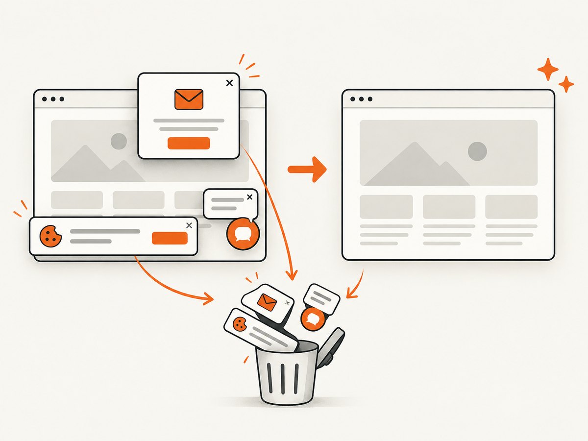
ScreenshotNeo provides a website screenshot API and MCP server. One GET request returns PNG, JPEG, WebP, or PDF. Cookie and consent banners, newsletter popups, and chat widgets are removed before the shot. Bot checks, blank pages, timeouts, failed loads, and cache hits are not billed, and response headers identify the page verdict and billing status.
See the ScreenshotNeo API documentation for all options. Basic call:
curl -G "https://api.screenshotneo.com/v1/shot" -d access_key=YOUR_API_KEY --data-urlencode url=https://stripe.com -o shot.webpimport requests
r = requests.get("https://api.screenshotneo.com/v1/shot", params={"access_key": "YOUR_API_KEY", "url": "https://stripe.com"}, timeout=90)
open("shot.webp", "wb").write(r.content)const q = new URLSearchParams({ access_key: 'YOUR_API_KEY', url: 'https://stripe.com' });
const res = await fetch(`https://api.screenshotneo.com/v1/shot?${q}`);You can set full-page capture, CSS element capture, dark mode, device presets or custom viewports, retina scale, PDF paper settings, custom CSS and JavaScript, clicks, waits, blocked requests, headers, cookies, user agents, authorization, timezone, geolocation, transparent backgrounds, resizing, cache TTLs, signed links, asynchronous jobs, webhooks, bulk capture, and usage reporting. An MCP server exposes take_screenshot, get_page_info, and capture_pdf to Claude, Cursor, and other MCP clients.
The Free plan includes 1,000 shots each month with no card. Paid plans start at $5 for 3,000 shots; yearly billing gives two months free. Create a free ScreenshotNeo account.
FAQ
Does --width guarantee the file width?
No. It controls the rendering screen width and is a guide while smart width is enabled. Use --disable-smart-width for a strict viewport and crop flags for exact output bounds.
What happens when I omit --height?
wkhtmltoimage calculates the height from page content, which is useful for full-page captures.
Can I crop without changing layout?
Yes. Set the viewport with --width and --height, then use --crop-x, --crop-y, --crop-w, and --crop-h to select the output rectangle.
Which version should I use?
Record and pin the version used by your automation. Debian and Ubuntu package documentation identify 0.12.6 builds, but other distributions may ship different patches.


