How to Set a JPG as a Website Background Image
Set a JPG as a CSS background, make it fill a section or page, and fix common sizing, path, contrast, and loading problems.

To set a JPG as a website background, apply background-image to the element that should display it, then choose how the image fits that element. For example:
.hero {
  background-image: url("/images/photo.jpg");
  background-size: cover;
  background-position: center;
  background-repeat: no-repeat;
  min-height: 24rem;
  background-color: #263238;
}
Replace /images/photo.jpg with the image’s actual URL or path. The element needs a visible box: a CSS background does not create content or give an otherwise empty element height. The minimum height above gives the example hero a box to paint into. The fallback color appears if the image cannot load.
Use cover when you want the box filled and can accept cropping. Use contain when the whole image must remain visible and empty space is acceptable. CSS backgrounds are best for decoration; if the image carries information, use an HTML image with meaningful alternative text. See MDN’s documentation for background images and background sizing.
1. Choose the right element and image path
Start by deciding what the JPG is for and which box should show it. A hero photograph that sits behind a heading can be a background. A product diagram, portrait, or other image visitors need to understand should normally be an HTML image instead. Browsers do not provide special background-image information to assistive technology; a CSS background is not a substitute for an accessible text alternative.
Paths in CSS are resolved relative to the stylesheet file, not necessarily relative to the HTML page. If your stylesheet is at assets/css/site.css and the file is at assets/images/hero.jpg, a relative path from the stylesheet could be:
.hero {
  background-image: url("../images/hero.jpg");
}
A root-relative path such as /images/hero.jpg starts at the website root. An absolute URL can point to an image hosted elsewhere. Use a quoted URL, check the exact filename and extension, and remember that file names can be case-sensitive on the server. A file named Hero.JPG may not be found by a request for hero.jpg.
You can also use the shorthand background property, but it sets multiple background-related values at once and can reset values you set elsewhere. For clarity while debugging, write the longhand properties separately. A layered background can combine a tint and an image:
.hero {
  background-image:
    linear-gradient(rgb(0 0 0 / 35%), rgb(0 0 0 / 35%)),
    url("/images/hero.jpg");
  background-size: cover;
  background-position: center;
  background-repeat: no-repeat;
}
The first listed layer is painted on top of the next one, so the translucent gradient darkens the photo beneath it. This can help text remain readable, but check the result at every relevant viewport and crop.
2. Make the JPG fill a section or the page
Fill a hero or content section
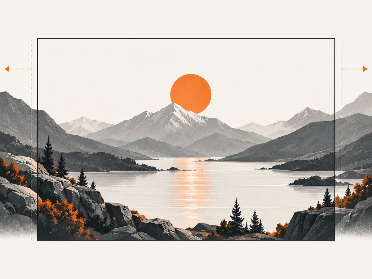
background-size: cover scales the image to cover the whole element while preserving its proportions. If the element and image have different aspect ratios, some of the image falls outside the box and is cropped. This is usually the right choice for a photo behind a hero heading.
.hero {
  min-height: 24rem;
  padding: 3rem 1.5rem;
  background-image: url("/images/hero.jpg");
  background-size: cover;
  background-position: center;
  background-repeat: no-repeat;
  background-color: #263238;
}
Here, min-height ensures the hero has room even if its content is short, while padding adds space around its content. If the section should grow with text, prefer a minimum height over a fixed height. A fixed height can clip or crowd content when text wraps or the page is viewed on a small screen.
Show the entire image
Use contain when cropping would hide important parts of the photograph or artwork. It scales the image until the whole image fits inside the box, which can leave uncovered space when the box has a different shape. Set a background color to make that space intentional.
.poster {
  min-height: 30rem;
  background-image: url("/images/poster.jpg");
  background-size: contain;
  background-position: center;
  background-repeat: no-repeat;
  background-color: #111;
}
You can also size a background explicitly, for example background-size: 20rem auto, or stretch it with 100% 100%. Stretching may distort the image, so use it only when distortion is acceptable. The main sizing choice is:
| Value | What it does | Use it when |
|---|---|---|
cover |
Fills the box; may crop the image. | The whole section should have a photo behind it. |
contain |
Shows the whole image; may leave blank space. | No part of the image can be cropped. |
| Explicit dimensions | Sets a chosen rendered size; proportions depend on the values. | You need a deliberate size and have checked distortion and clipping. |
Control which part stays visible
background-position controls alignment. Try center, center top, or percentage coordinates such as 60% 40%. With cover, positioning changes which part is cropped when the image overflows the box. It does not change the image’s intrinsic composition.
.hero {
  background-size: cover;
  background-position: 60% 35%;
}
Test the crop at both narrow and wide widths. A face or product placed near an edge may be visible on desktop and cropped away on mobile.
Apply a background to the page
For a page-wide decorative image, place the background on body:
body {
  background-image: url("/images/page-background.jpg");
  background-size: cover;
  background-position: center;
  background-repeat: no-repeat;
  background-color: #263238;
}
The body’s content determines its height. A short page and a long page may therefore have different amounts of background area. If you need a viewport-height section, give that section a suitable minimum height; do not assume the background itself will make the page taller.
3. Make the background responsive
A single large JPG can send more image data than a small screen needs, and a desktop composition may crop poorly on a phone. If the composition or file size should differ substantially by viewport, provide separate assets using a media query:
.hero {
  min-height: 24rem;
  background-image: url("/images/hero-small.jpg");
  background-size: cover;
  background-position: center;
  background-repeat: no-repeat;
  background-color: #263238;
}

@media (min-width: 50rem) {
  .hero {
    background-image: url("/images/hero-large.jpg");
    background-position: 60% center;
  }
}
Choose image dimensions appropriate to how they will be displayed. A file far larger than the rendered background can add unnecessary transfer and decoding work. Conversely, an undersized image can look soft on a large or high-density display. CSS image-set() can select candidates by pixel density; check its current syntax and browser support for your target audience before relying on it. For meaningful images, HTML’s <picture> and srcset provide responsive image selection together with image semantics.
Browsers may cache an image after it has been fetched. During development, a stale cached asset can make a replacement seem not to have loaded; use a hard refresh or inspect the request in developer tools. For production, use your normal asset versioning or cache-busting approach when replacing files at the same URL.
4. Keep text readable and the image accessible
Use a CSS background when the image is presentational. If understanding the page depends on the image, put it in the document as an <img> and provide alternative text that conveys its relevant information. Do not repeat nearby text in the alternative text when it adds nothing.
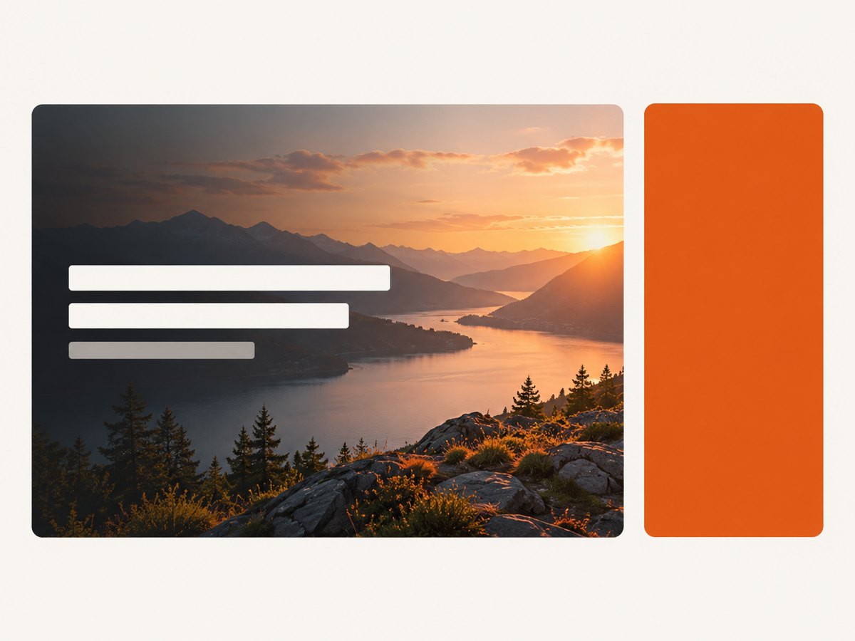
When text sits over a photograph, check contrast behind the actual letters, not just across the image as a whole. The crop changes with viewport size, so a bright patch may move behind a heading on mobile. MDN summarizes WCAG contrast targets as 4.5:1 for ordinary text and 3:1 for large text. A gradient overlay or a solid text panel can help; verify the final colors rather than assuming a particular overlay always passes. Keep a fallback background color for the period before the image loads and for failed requests.
5. Troubleshoot a background that is missing or wrong
Check these causes in order. This usually distinguishes a bad URL from a sizing or cascade issue quickly.
| Symptom | Likely cause | What to check or change |
|---|---|---|
| No image appears | Incorrect path, filename case, failed request, or CSS rule not applied. | Open the image URL directly; inspect the Network panel and the element’s computed styles. |
| Background area is tiny or absent | The element has no visible height or width. | Inspect its box; add content, padding, or an appropriate minimum height. |
| Image tiles | Background repetition is enabled. | Set background-repeat: no-repeat if one instance is intended. |
| Photo is cropped badly | cover is cropping to fill a differently shaped box. |
Adjust background-position, alter the box proportions, or use a better crop. |
| Blank bands surround image | contain preserves the full image but does not fill the box. |
Use a matching background color, or use cover if cropping is acceptable. |
| Change has no effect | Another rule overrides the declaration, or the browser has cached the old asset. | Check computed styles, selector specificity, stylesheet order, and the Network panel. |
| Text is difficult to read | Image contrast changes under the text, or a fallback is missing. | Add a tested overlay or solid panel and verify contrast at narrow and wide layouts. |
A practical debugging sequence
- Inspect the element and confirm it has nonzero dimensions.
- In developer tools, confirm the intended CSS rule is loaded and not crossed out by another rule.
- Open the exact image URL shown in the computed style. Confirm the response succeeds and the path’s case matches the deployed file.
- Temporarily set a bright
background-color. If the color does not appear, investigate the selector, cascade, or element box before the JPG. - Once the image loads, set
background-repeat, choosecoverorcontain, then tunebackground-position. - Check the result at the actual viewport sizes and ensure text remains readable.
6. Or skip the browser setup
If what you need is a screenshot of the finished page rather than a CSS background, ScreenshotNeo is a website screenshot API and MCP server. One GET request returns an image or PDF. Here is a runnable cURL example using its documented API; see the ScreenshotNeo API documentation for options and setup.
curl -G "https://api.screenshotneo.com/v1/shot" \
  -d access_key=YOUR_API_KEY \
  --data-urlencode url=https://stripe.com \
  -o shot.webp
Python equivalent:
import requests

r = requests.get(
    "https://api.screenshotneo.com/v1/shot",
    params={"access_key": "YOUR_API_KEY", "url": "https://stripe.com"},
    timeout=90,
)
open("shot.webp", "wb").write(r.content)
Node.js equivalent:
const q = new URLSearchParams({
  access_key: 'YOUR_API_KEY',
  url: 'https://stripe.com'
});
const res = await fetch(`https://api.screenshotneo.com/v1/shot?${q}`);
if (!res.ok) throw new Error(`Screenshot request failed: ${res.status}`);
const image = Buffer.from(await res.arrayBuffer());
await import('node:fs/promises').then(fs => fs.writeFile('shot.webp', image));
ScreenshotNeo removes cookie banners, newsletter popups, and chat widgets before capture. Bot checks, blank pages, and failed loads are never billed. Its MCP server lets AI agents take screenshots. The free plan includes 1,000 screenshots a month with no card; paid plans start at $5 for 3,000. Sign up free and get 1,000 screenshots a month with no card.
7. Common questions
Can I use a JPG from another website?
Yes, if the URL is publicly accessible and the host permits it to be used that way. A local or deployed asset is more predictable because you control its path and availability.
Will a CSS background be read by a screen reader?
Generally, no. Backgrounds are not announced as image content. Use an HTML image with suitable alternative text when the image conveys information.
Why does cover cut off part of my image?
It preserves the image proportions while filling the element. When the shapes differ, cropping is necessary. Reposition the image, change the box shape, or choose contain if the whole image must show.
Can I use more than one background image?
Yes. Separate layers with commas in background-image. The first layer is painted above later layers, which is useful for placing a gradient over a photo.


