How to Set the Size of Playwright Screenshots
Set Playwright screenshot dimensions correctly with viewport, full-page, clip, scale, and element capture examples.
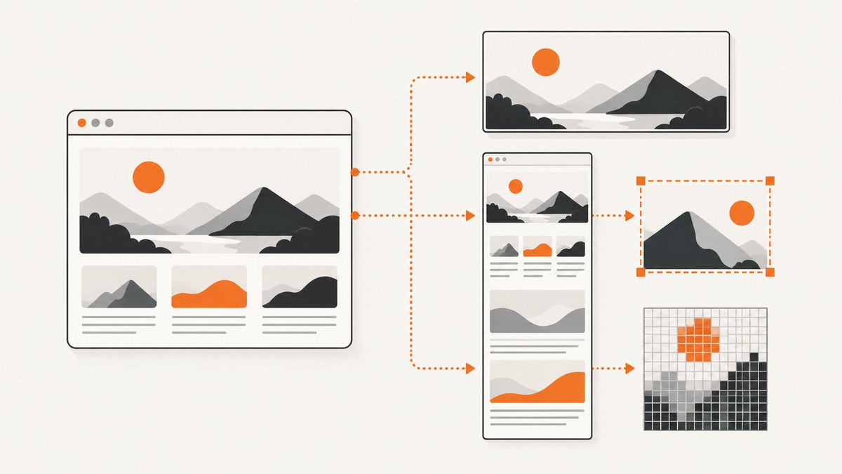
Playwright screenshot size depends on what you mean by “size.” You may want a fixed visible viewport, the entire document, a rectangular crop, a particular CSS-pixel density, or the dimensions of one element. Each goal uses a different option.
For a normal screenshot at a predictable resolution, set the viewport before navigation and then call page.screenshot():
import { chromium } from 'playwright';

const browser = await chromium.launch();
const page = await browser.newPage();

await page.setViewportSize({ width: 1280, height: 720 });
await page.goto('https://example.com');
await page.screenshot({ path: 'screenshot.png' });

await browser.close();
The official Playwright Page API recommends setting the viewport before navigation because responsive layouts can change when the viewport is resized after the page has loaded.
What “screenshot size” means in Playwright
Playwright exposes several independent controls. Choosing the correct one prevents most sizing surprises.
| Goal | Playwright control | What it changes |
|---|---|---|
| Fixed visible browser area | viewport or page.setViewportSize() |
CSS width and height used by the page layout |
| Entire scrollable page | fullPage: true |
Document extent captured below the fold |
| Exact rectangle | clip: { x, y, width, height } |
The region included in the output |
| One component | locator.screenshot() |
The matched element’s bounds |
| Output pixel density | scale: 'css' or 'device' |
Whether output pixels follow CSS pixels or device pixels |
A viewport of 1280 by 720 does not guarantee a 1280 by 720 file. fullPage, clip, and scale can all change the final bitmap dimensions.
Set a visible viewport size
Use page.setViewportSize() when you need to change a page’s dimensions during a script. Set it before goto whenever possible.
import { chromium } from 'playwright';

const browser = await chromium.launch();
const page = await browser.newPage();

await page.setViewportSize({ width: 1440, height: 900 });
await page.goto('https://example.com', { waitUntil: 'networkidle' });
await page.screenshot({ path: 'desktop-1440x900.png' });

await browser.close();
The values are CSS pixels. Width controls responsive breakpoints and horizontal layout; height controls the visible portion of the page. A page with a 1440-pixel viewport can still produce a taller image if you request a full-page capture.
Set the viewport when creating a browser context
Context-level configuration is useful when several pages share the same dimensions:
import { chromium } from 'playwright';

const browser = await chromium.launch();
const context = await browser.newContext({
  viewport: { width: 1280, height: 720 }
});

const page = await context.newPage();
await page.goto('https://example.com');
await page.screenshot({ path: 'context-size.png' });

await context.close();
await browser.close();
page.setViewportSize() also resets the screen size. If your test depends on both screen and viewport properties, configure the context’s screen and viewport together.
How do I take a full page screenshot in Playwright?
Pass fullPage: true to capture the complete scrollable document:
await page.setViewportSize({ width: 1280, height: 720 });
await page.goto('https://example.com');
await page.screenshot({
  path: 'full-page.png',
  fullPage: true
});
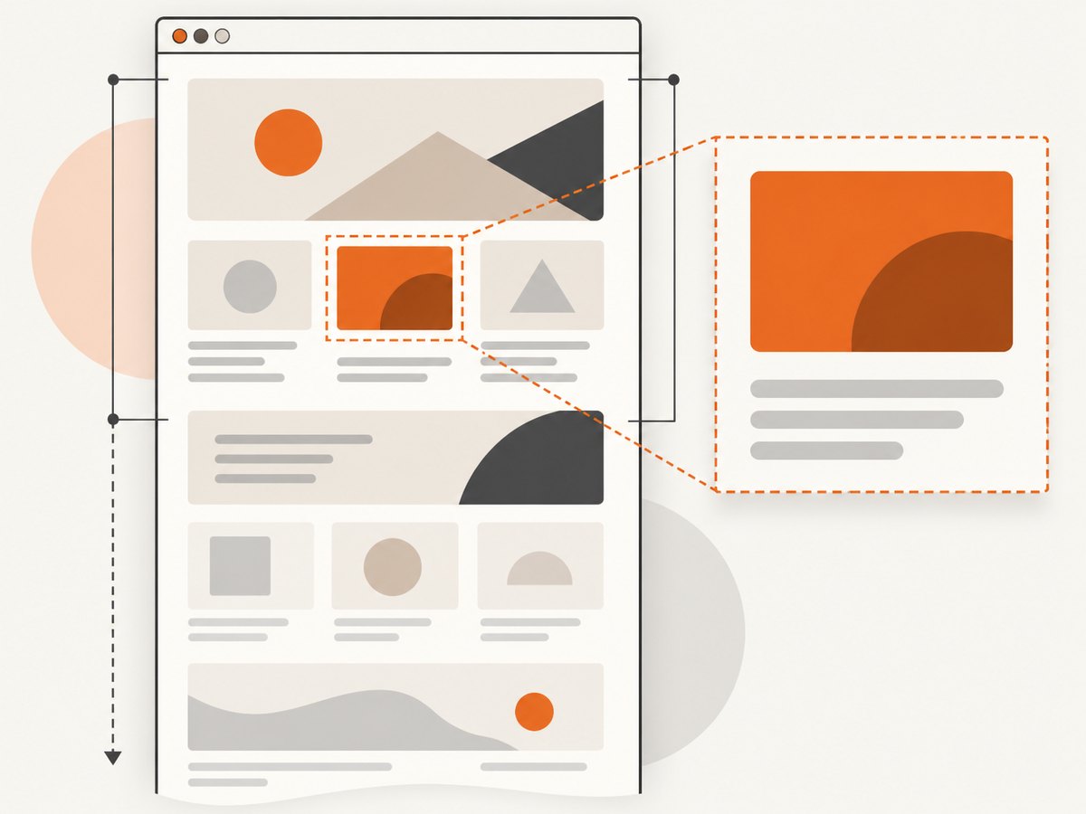
This behaves like a very tall capture of the document. It does not set the browser viewport height to the document height, and it does not change the responsive layout width. A page designed for a 1280-pixel viewport remains a 1280-pixel layout while the output extends vertically.
Lazy-loaded content can require an explicit scroll or application-specific wait before capture. Playwright’s screenshot API handles the document extent, but your application still needs to render content that only appears after interaction or scrolling.
Capture a precise rectangle with clip
Use clip when you know the coordinates and dimensions of the region to save:
await page.setViewportSize({ width: 1280, height: 720 });
await page.goto('https://example.com');
await page.screenshot({
  path: 'header-region.png',
  clip: { x: 0, y: 0, width: 1280, height: 180 }
});
The coordinates are measured from the page’s viewport. The rectangle must have positive width and height and must fit within the available capture area. Fixed headers, scrolling, and device scale can make coordinate-based crops fragile, so prefer a locator when the target is a semantic element.
How do I screenshot a specific element in Playwright?
Use a locator’s screenshot method for a component, card, chart, or other element:
const card = page.locator('[data-testid="pricing-card"]').first();
await card.waitFor({ state: 'visible' });
await card.screenshot({ path: 'pricing-card.png' });
Playwright clips the page to the matched element’s size and position. A scrollable element only includes the content currently visible inside that element; it does not automatically capture every pixel in an inner scroll area. If the locator matches multiple elements, choose one with first(), nth(), or a more specific selector.
Control CSS pixels versus device pixels with scale
The screenshot API’s scale option controls output density:
await page.screenshot({
  path: 'css-pixels.png',
  scale: 'css'
});

await page.screenshot({
  path: 'device-pixels.png',
  scale: 'device'
});
scale: 'css' produces one image pixel per CSS pixel. This is useful for stable visual regression files and predictable dimensions. scale: 'device' produces device pixels and is the default listed by the Page API. On a high-DPI device, the resulting bitmap can be larger than the viewport’s CSS dimensions.
Why is my Playwright screenshot twice as large as my viewport?
A common cause is device pixel ratio. For example, a 1280 by 720 CSS viewport on a device scale factor of 2 can produce roughly 2560 by 1440 output pixels when using device scaling. The layout is still 1280 by 720 CSS pixels; only the bitmap density changed. Use scale: 'css' when the file must match CSS dimensions.
Combine viewport, full page, clip, and scale
These options can be combined when each controls a different concern:
await page.setViewportSize({ width: 1366, height: 768 });
await page.goto('https://example.com');
await page.screenshot({
  path: 'stable-full-page.png',
  fullPage: true,
  scale: 'css'
});
fullPage determines document extent while scale determines pixel density. A clip capture instead limits the rectangle. Do not use fullPage when your goal is only the visible fold.
Device and responsive layout settings
Viewport dimensions are only one part of responsive rendering. Browser context settings can also affect media queries and page behavior:
const context = await browser.newContext({
  viewport: { width: 390, height: 844 },
  deviceScaleFactor: 1,
  isMobile: true,
  hasTouch: true
});
Use a consistent context for visual comparisons. Keep browser version, fonts, timezone, locale, color scheme, and device scale consistent as well; otherwise screenshots may differ even when width and height match.
Playwright Test automatic screenshots
Playwright Test has a separate screenshot configuration path. Automatic screenshots are off by default. Configure the test runner when you want screenshots attached to test results:
import { defineConfig } from '@playwright/test';

export default defineConfig({
  use: {
    screenshot: 'only-on-failure'
  }
});
The TestOptions API also accepts screenshot settings such as fullPage. This configuration is separate from calling page.screenshot() yourself. See the official TestOptions documentation for the current runner options.
Practical recipes
Fixed desktop screenshot
await page.setViewportSize({ width: 1920, height: 1080 });
await page.goto('https://example.com');
await page.screenshot({ path: 'desktop.png', scale: 'css' });
Mobile screenshot
await page.setViewportSize({ width: 390, height: 844 });
await page.goto('https://example.com');
await page.screenshot({ path: 'mobile.png', scale: 'css' });
Full page at a controlled width
await page.setViewportSize({ width: 1200, height: 800 });
await page.goto('https://example.com', { waitUntil: 'networkidle' });
await page.screenshot({ path: 'document.png', fullPage: true, scale: 'css' });
Element after a state change
const menu = page.locator('#menu');
await page.getByRole('button', { name: 'Open menu' }).click();
await menu.waitFor({ state: 'visible' });
await menu.screenshot({ path: 'open-menu.png' });
Troubleshooting Playwright screenshot dimensions
| Symptom | Likely cause | Fix |
|---|---|---|
| The image is taller than the viewport | fullPage: true or a tall element |
Remove fullPage for the visible viewport, or keep it when the document is intended. |
| The image is twice as wide and tall | Device-pixel scaling on a high-DPI context | Use scale: 'css' or set a consistent device scale factor. |
| Mobile layout did not activate | Viewport was changed after navigation, or width is above a breakpoint | Set the viewport before goto and verify the CSS breakpoint. |
| Only part of a scrollable widget appears | Element screenshots capture the element’s visible scroll area | Scroll the inner element yourself or capture the required region with a calculated clip. |
| Clip throws an error | Non-positive dimensions or coordinates outside the page | Use positive width and height, and calculate coordinates after layout is ready. |
| Screenshot shows an old responsive layout | Viewport changed after resources and media queries were evaluated | Create a correctly sized context or set the viewport before navigation. |
| Automatic test screenshots are missing | Playwright Test screenshot mode is disabled | Set use.screenshot to 'on', 'only-on-failure', or another supported mode. |
Performance, reliability, and cost considerations
Large full-page captures consume more memory and take longer to encode than a viewport-sized image. Keep the viewport width and full-page requirement as small as the use case allows. For visual regression, use a fixed browser version, context settings, fonts, and scale: 'css' so file dimensions remain stable.
Wait for the application state you actually need. networkidle can be useful for pages with a clear idle point, while a locator wait is more reliable for a specific component. A fixed timeout alone can be too short on a slow run or unnecessarily long on a fast one.
Element and clip screenshots are often cheaper to process than very tall documents because they include fewer pixels. If a page contains animations, disable or pause them before capture to reduce visual differences between runs. Make sure images and web fonts have loaded before taking a screenshot when those assets affect layout.
Or skip the browser setup
ScreenshotNeo provides a website screenshot API when you need a URL turned into an image or PDF without maintaining Playwright browser setup. Its API supports viewport and device presets, full-page capture with lazy images loaded, element capture by CSS selector, retina scale, image resizing, custom CSS and JavaScript, waits, headers, cookies, user agents, timezone, geolocation, blocking rules, caching, signed links, asynchronous jobs, bulk capture, and PDF options.
Use the same sizing concepts through one GET request. See the ScreenshotNeo documentation for the complete parameter list.
cURL
curl -G "https://api.screenshotneo.com/v1/shot" -d access_key=YOUR_API_KEY --data-urlencode url=https://stripe.com -o shot.webpPython
import requests
r = requests.get("https://api.screenshotneo.com/v1/shot", params={"access_key": "YOUR_API_KEY", "url": "https://stripe.com"}, timeout=90)
open("shot.webp", "wb").write(r.content)
Node.js
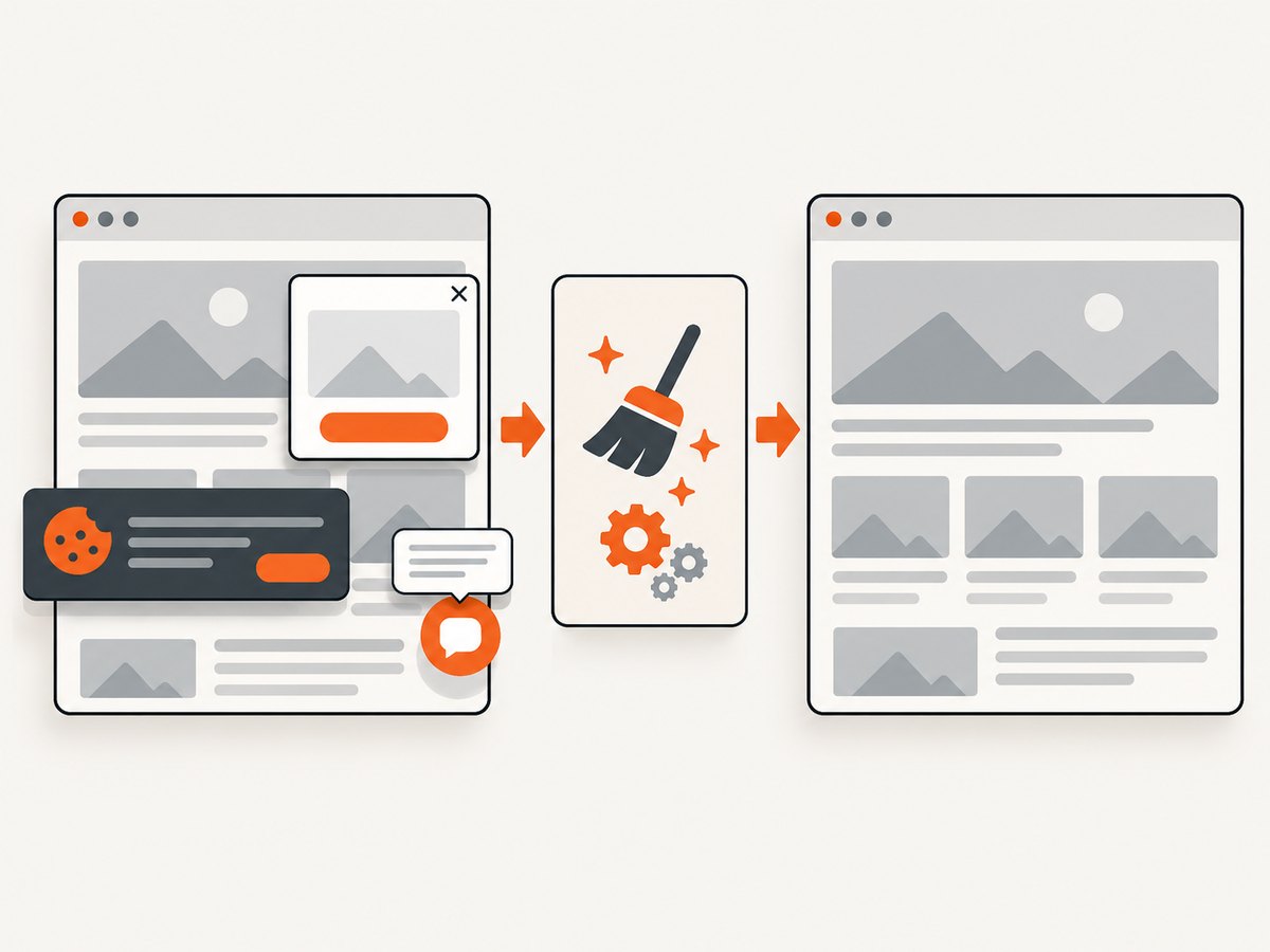
const q = new URLSearchParams({ access_key: 'YOUR_API_KEY', url: 'https://stripe.com' }); const res = await fetch(`https://api.screenshotneo.com/v1/shot?${q}`);ScreenshotNeo accepts cookie and consent banners before capture and removes more than 60 known consent platforms, newsletter popups, and chat widgets. Bot checks, CAPTCHAs, blank pages, timeouts, failed loads, and cache hits are not billed; response headers identify the page verdict and whether the request was billed. An MCP server provides take_screenshot, get_page_info, and capture_pdf tools for Claude, Cursor, and other MCP clients.
The Free plan includes 1,000 shots per month without a card. Paid plans start at $5 for 3,000 shots, and every feature is available on every plan. Create a free ScreenshotNeo account.
FAQ
Does viewport height control full-page output?
No. Viewport height controls the visible browser area. fullPage: true captures the scrollable document.
Should visual tests use CSS or device scale?
Use scale: 'css' when stable CSS-pixel dimensions matter. Use device scaling when you need device-pixel fidelity.
Can I resize after calling goto?
Yes, but responsive pages may have already evaluated layout. Set the viewport before navigation for predictable results.
What is the simplest way to capture one component?
Locate it and call locator.screenshot(). Use a clip only when coordinates are the actual requirement.
Why does a scrollable element screenshot look incomplete?
Element screenshots show the element’s currently visible scroll content. Scroll the element or capture a different region when you need more.
Where can I check current option names?
Refer to the current Page API, Screenshots guide, and TestOptions API.


