How to Set PNG Image Size in HTML
Set PNG dimensions with HTML attributes or CSS. Learn how to keep images responsive, avoid distortion, reserve layout space, and choose the right sizing method.
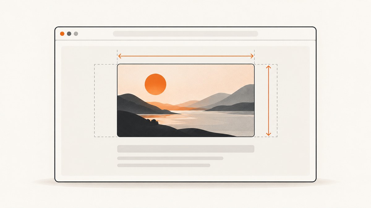
To set a PNG’s size in HTML, add integer width and height attributes to its <img> element. Use CSS to control how large it is rendered. For a responsive image that shrinks to fit its container without distortion, set max-width: 100% and height: auto.
<img src="picture.png" alt="Description" width="1200" height="800" class="responsive">.responsive {
max-width: 100%;
height: auto;
}Replace 1200 and 800 with the PNG’s actual intrinsic width and height in pixels. The attributes tell the browser the image’s proportions before the file loads, helping it reserve space. CSS can still set the rendered size.
1. How do I set PNG image size in HTML?
Use the width and height attributes on <img> to declare the image’s dimensions. Their values are unitless integers interpreted as pixels. Do not write width="1200px" or height="800px".
<img src="/images/chart.png" alt="Monthly sales chart" width="1200" height="800">Those values should describe the source image’s intrinsic dimensions, or at least its correct aspect ratio. If the source is 1200 × 800, its ratio is 3:2. The browser can use that ratio to reserve the right shape while downloading the image. See MDN’s <img> reference for the dimension attributes and their effect on layout.
HTML dimensions do not require the rendered image to occupy 1200 × 800 CSS pixels. CSS may scale it down or up. Keep the attributes in the markup even when CSS controls the display: they communicate the image’s ratio early, which can reduce layout movement as content loads.
2. Make a PNG responsive without stretching it
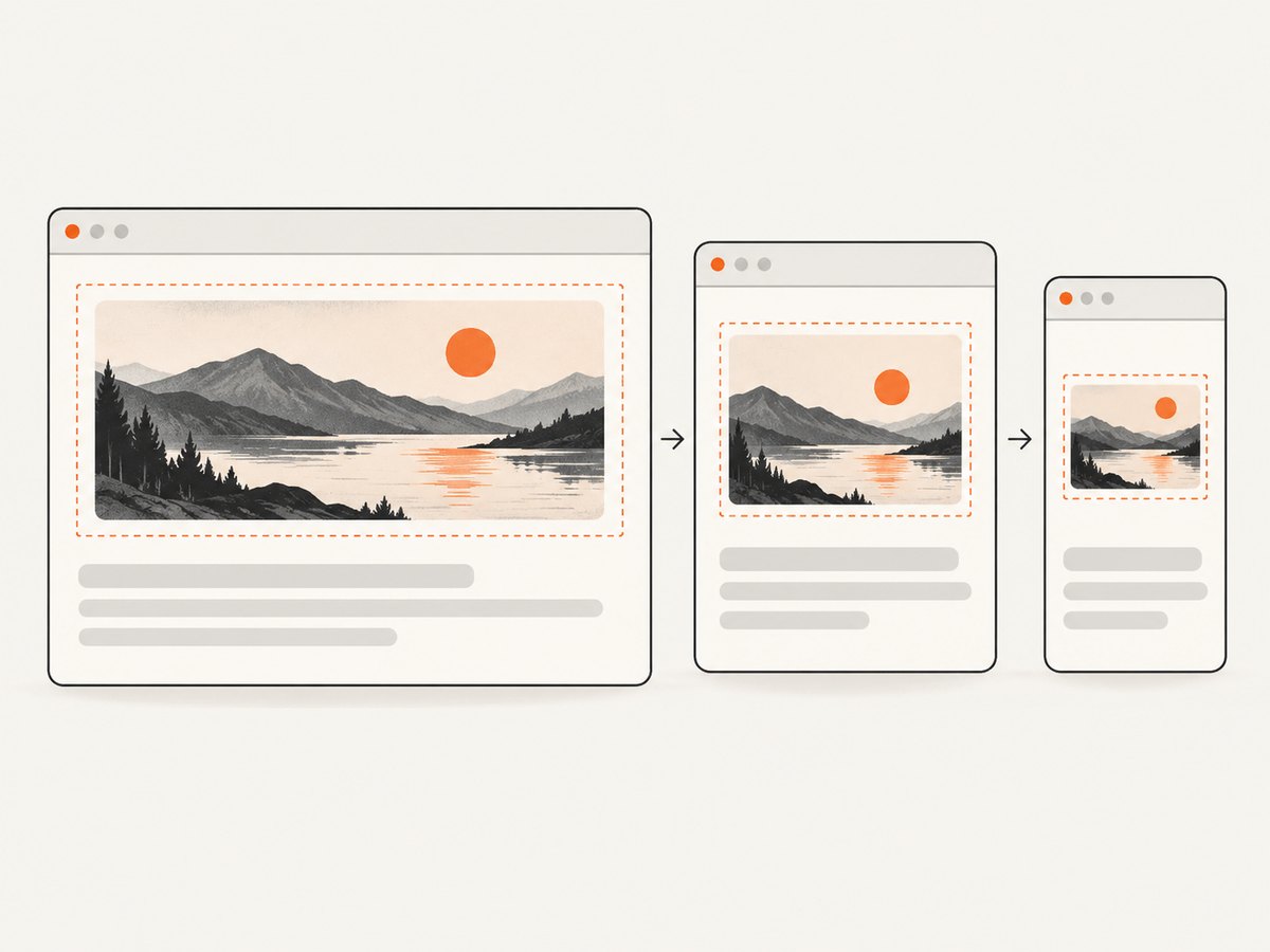
For a content image that should fit its parent and retain its proportions, use a maximum width and automatic height:
<figure class="article-image">
  <img
    src="/images/diagram.png"
    alt="A request passes through a capture service and returns an image"
    width="1200"
    height="800"
  >
  <figcaption>The capture flow from request to image.</figcaption>
</figure>
.article-image {
max-width: 100%;
margin: 0;
}
.article-image img {
display: block;
max-width: 100%;
height: auto;
}
.article-image figcaption {
margin-top: 0.5rem;
color: #555;
}With height: auto, the browser calculates height from the source aspect ratio as width changes. This is usually the right choice for photographs, charts, screenshots, and illustrations that must remain intact. If only the image itself needs to shrink, the figure rules are optional.
Should I use width or max-width?
Use width: 100% when the image should fill the available width of its containing block. Use max-width: 100% when it should shrink on narrow screens but remain at its natural size when there is more room. In both cases, pair the width rule with height: auto for natural proportions.
/* Fill the available container width */
img.fill-container {
  width: 100%;
  height: auto;
}

/* Shrink only when the container is narrower than the image */
img.shrink-to-fit {
  max-width: 100%;
  height: auto;
}
A very large image with width: 100% may be enlarged beyond its intrinsic width on a wide screen. Prefer max-width: 100% when upscaling is not desired.
3. Put an image in a fixed-size box
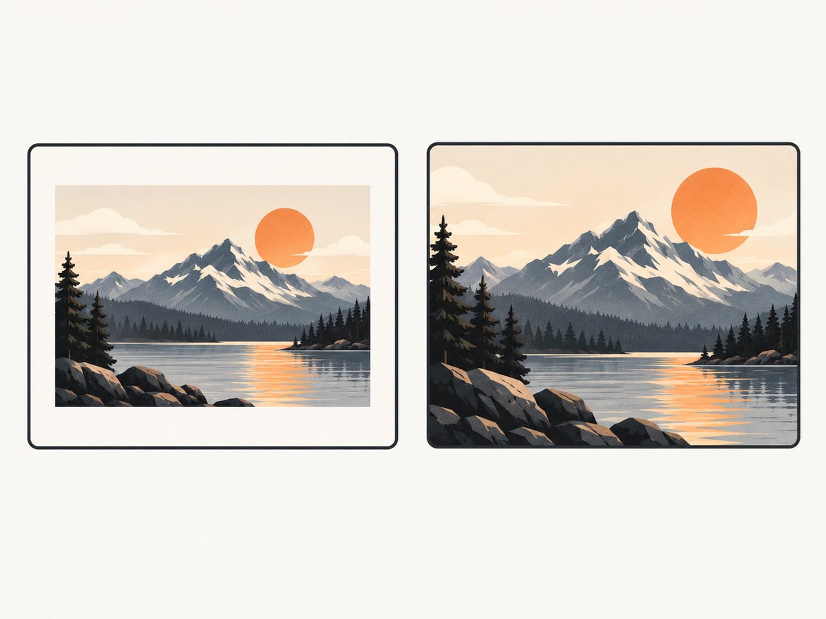
A thumbnail grid or card may need every image to occupy the same frame even when the source images have different proportions. Set both CSS dimensions and choose how the image fits with object-fit.
<img class="thumbnail" src="picture.png" alt="Mountain lake at dawn" width="320" height="200">.thumbnail {
width: 320px;
height: 200px;
object-fit: contain;
background: #eee;
}| Value | What happens | Choose it when |
|---|---|---|
contain |
Shows the entire image within the frame. Empty space may remain on one or more sides. | No image content may be cropped. |
cover |
Fills the frame while preserving proportions; part of the image may be cropped. | Consistent filled cards matter more than showing every edge. |
fill |
Fills the frame and may distort the image if its ratio differs. | Stretching is explicitly acceptable. |
none |
Displays the image at its natural size, which may overflow the frame. | The intrinsic size is desired. |
Use object-position to choose which part remains visible when cover crops an image. For example, object-position: center top keeps the top of a portrait or screenshot in view. MDN’s object-fit reference describes the fitting behavior.
.thumbnail {
  width: 320px;
  height: 200px;
  object-fit: cover;
  object-position: center top;
}
The CSS frame dimensions and HTML attributes serve different purposes. CSS sets the displayed box; the attributes provide the source’s dimensions and ratio to the browser. If these ratios differ, the selected object-fit value determines whether the result has empty space, cropping, or distortion.
4. Serve different PNG sizes for different screens
If the same image is available in multiple sizes, use srcset and sizes to let the browser select a suitable file. The following example offers three resolutions of the same image:
<img
  src="/images/map-800.png"
  srcset="/images/map-400.png 400w,
          /images/map-800.png 800w,
          /images/map-1600.png 1600w"
  sizes="(max-width: 600px) 100vw, 800px"
  width="1600"
  height="1000"
  alt="Map of the walking route"
  style="max-width: 100%; height: auto;"
>
The w descriptors state each file’s pixel width. The sizes attribute describes the image’s expected display width at different viewport sizes; the browser can combine that information with the device’s pixel density when choosing a candidate. Make sure the files share the intended composition and aspect ratio. The fallback src should be a valid image. For responsive image resources and art direction, see MDN’s guide to responsive images.
When should I use picture?
Use <picture> when the browser needs to choose between different formats or art-directed alternatives, such as a tighter crop for a narrow viewport. Keep an <img> inside as the fallback and provide its alternative text and dimensions there.
<picture>
  <source media="(max-width: 600px)" srcset="/images/scene-mobile.png">
  <source type="image/webp" srcset="/images/scene.webp">
  <img src="/images/scene.png" width="1200" height="800" alt="Hikers crossing a ridge">
</picture>
If alternatives have different aspect ratios, avoid assuming that one set of dimensions describes every selected resource’s shape. Ensure the layout behaves correctly for each source, and test the actual viewport and source selection.
5. Common mistakes and troubleshooting
| Symptom | Likely cause | Fix |
|---|---|---|
| The image looks stretched or squashed. | Both displayed dimensions are forced to a ratio that differs from the PNG, or CSS uses object-fit: fill. |
Use height: auto for natural scaling, or use contain/cover in a fixed frame. |
| The image overflows a phone screen. | Its intrinsic width or a fixed CSS width exceeds the container. | Apply max-width: 100%; height: auto; and check parent elements for overflow constraints. |
| A thumbnail has blank bars. | object-fit: contain preserves the complete image in a differently shaped frame. |
Keep the bars if all content matters; use cover if cropping is acceptable. |
| The wrong part of a cover thumbnail appears. | The default position centers the crop. | Set object-position, such as center top. |
| Page content jumps when the PNG loads. | The browser has no usable dimensions or ratio before loading, or the declared ratio does not match the source. | Provide correct width and height attributes and check CSS sizing. |
| A srcset image looks blurry or takes longer to load than expected. | Candidate widths may not suit the rendered size or the browser’s selection context; files may be mislabeled. | Verify each candidate’s actual pixel width, the sizes estimate, and the generated files. |
| The image does not appear. | The URL may be wrong, the file unavailable, or the selected source missing. | Inspect the request in browser developer tools and load the src URL directly. |
Debug checklist
- Check the source PNG’s actual pixel dimensions and ratio.
- Inspect computed CSS for width, height, min/max constraints, and
object-fit. - Check whether a parent container clips or constrains the image.
- For
srcset, verify candidate URLs, width descriptors, and the expected rendered width insizes. - Check the browser’s network panel for failed image requests and the selected source URL.
For additional sizing context, MDN explains intrinsic image ratios and fitting in Understanding aspect ratios.
6. Performance, layout stability, and practical limits
CSS resizing changes how large an image is displayed; it does not make the downloaded PNG file smaller. If transfer size matters, generate appropriately sized image files and offer them through srcset, or consider a more compact image format where it suits the page. A browser displaying a small version of a very large PNG may still need to download that large source.
Supplying dimensions gives the browser information to calculate the aspect ratio before the image arrives and reserve layout space. This helps content below the image avoid moving as it loads. The declared ratio should match the image; incorrect dimensions can reserve the wrong shape and cause a layout adjustment later.
Choose the method based on the design requirement:
- Content image, natural ratio: intrinsic HTML dimensions plus
max-width: 100%; height: auto. - Image must fill its parent:
width: 100%; height: auto. - Uniform cards or thumbnails: explicit CSS frame dimensions and
object-fit. - Different resolutions:
srcsetand a realisticsizesvalue. - Different crops or formats:
<picture>with an<img>fallback.
7. Or skip the browser setup
If you are generating a PNG by capturing a web page, ScreenshotNeo returns a screenshot image or PDF from one GET request. You can then set that image’s HTML display size using the techniques above. See the ScreenshotNeo documentation for API details.
curl -G "https://api.screenshotneo.com/v1/shot" -d access_key=YOUR_API_KEY --data-urlencode url=https://stripe.com -o shot.webpimport requests
r = requests.get(
"https://api.screenshotneo.com/v1/shot",
params={"access_key": "YOUR_API_KEY", "url": "https://stripe.com"},
timeout=90,
)
open("shot.webp", "wb").write(r.content)const q = new URLSearchParams({ access_key: 'YOUR_API_KEY', url: 'https://stripe.com' });
const res = await fetch(`https://api.screenshotneo.com/v1/shot?${q}`);ScreenshotNeo removes cookie banners, newsletter popups, and chat widgets before the shot. Bot checks, blank pages, and failed loads are never billed. Its MCP server lets AI agents take screenshots. The free plan includes 1,000 screenshots a month with no card; paid plans start at $5 for 3,000. Sign up for 1,000 free screenshots a month, with no card.
8. Frequently asked questions
Do width and height use pixels?
Yes. The HTML attributes are unitless integer values that describe dimensions in CSS pixels. Do not add px inside the attribute.
Does changing the HTML size resize the PNG file?
No. It changes the rendered dimensions in the page. To reduce the downloaded file’s pixel dimensions or byte size, create or serve a smaller image asset.
What values should I use for a transparent PNG?
Use its actual intrinsic pixel dimensions for the HTML attributes. Transparency does not change how image sizing works.
Can I size a PNG using only CSS?
Yes. CSS controls the rendered size. Include correct HTML dimensions as well when possible so the browser knows the aspect ratio before the image loads.


