How to Set Screen Size in Headless Playwright
Set a deterministic Playwright viewport in headless mode, understand viewport vs. screen, and configure sizes in tests, contexts, and individual pages.

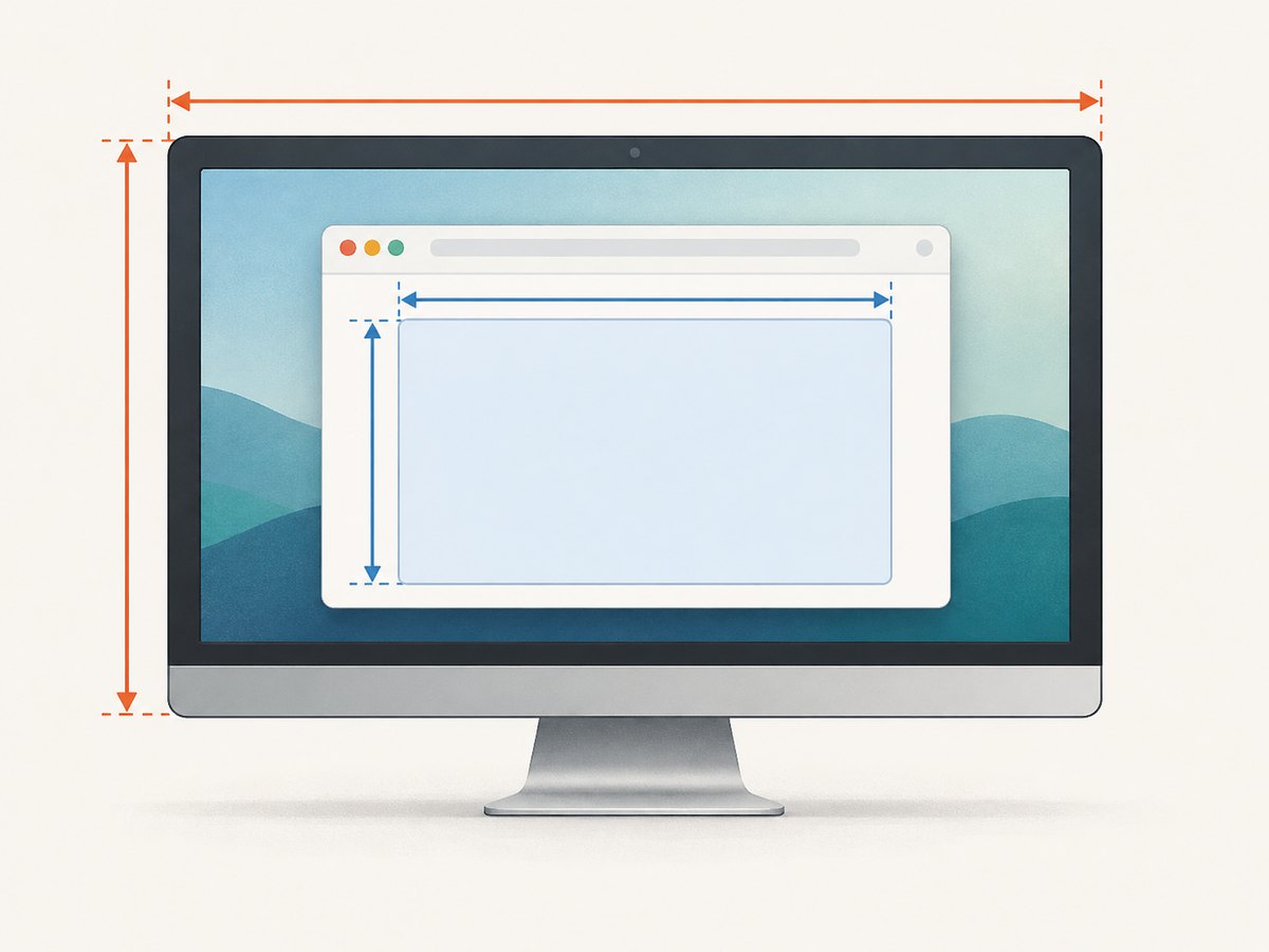
To set the page size in headless Playwright, configure a viewport. For a reusable browser context, pass viewport: { width, height } to browser.newContext(); for Playwright Test, set use.viewport; for a one-off page, call page.setViewportSize(). Playwright runs headless by default, so no special headless screen-size flag is needed.
Use screen alongside viewport only when the page also needs controlled values from window.screen. The viewport is the page’s layout area; it is not the operating system’s monitor resolution. The examples below use Playwright’s JavaScript API, with TypeScript-compatible test configuration.
1. Choose the right setting for your scope
| Goal | Use | When it applies |
|---|---|---|
| Set a size for a test project | use.viewport |
Playwright Test creates contexts using the runner configuration. |
| Set a size for pages in a context | browser.newContext({ viewport }) |
You manage the browser and context directly. |
| Resize one page | page.setViewportSize() |
You need a page-specific or mid-test size change. |
Control both layout and window.screen |
viewport and screen in context options |
The application reads screen dimensions as well as viewport dimensions. |
| Generate code at a chosen size | --viewport-size with codegen |
You are recording a script; set runtime configuration separately. |
| Emulate a known device | A Playwright device preset | You need its bundled device settings, with optional overrides. |
Playwright documents a default viewport of 1280×720. Setting viewport: null opts out of the consistent preset and makes dimensions depend on the host window, which can make runs non-deterministic. For repeatable tests and screenshots, specify explicit width and height.
2. Set a viewport on a browser context
Context configuration is a good default for scripts that create one or more pages. Set it before creating the page and navigating, so the first document layout uses the intended size.
import { chromium } from 'playwright';

const browser = await chromium.launch(); // headless is the default
const context = await browser.newContext({
  viewport: { width: 1440, height: 900 },
});
const page = await context.newPage();

await page.goto('https://example.com');
console.log(await page.evaluate(() => ({
  innerWidth: window.innerWidth,
  innerHeight: window.innerHeight,
})));

await browser.close();
This creates a 1440×900 page viewport. It does not resize a physical or virtual desktop. Use a fresh context when separate test cases need different starting sizes; context options make the initial conditions explicit and help avoid accidental state sharing.
Set both viewport and screen dimensions
The screen option emulates dimensions exposed through window.screen. It is used when a viewport is set. If your application branches on screen.width, configure both values at context creation:
const context = await browser.newContext({
  viewport: { width: 1440, height: 900 },
  screen: { width: 1440, height: 900 },
});
Viewport and screen are separate controls. A page can have a 1280-pixel viewport while reporting a larger screen. That may be useful for a specific emulation scenario, but for ordinary responsive layout testing the viewport is usually the dimension that matters.
3. Configure Playwright Test
For the Playwright Test runner, set the viewport in the project’s use options. This applies to contexts the runner creates for that configuration.

import { defineConfig } from '@playwright/test';

export default defineConfig({
  use: {
    viewport: { width: 1440, height: 900 },
  },
});
To test a responsive layout at several widths, define projects with different viewport values. Each project runs with its own configuration:
import { defineConfig } from '@playwright/test';

export default defineConfig({
  projects: [
    {
      name: 'desktop',
      use: { viewport: { width: 1440, height: 900 } },
    },
    {
      name: 'tablet',
      use: { viewport: { width: 768, height: 1024 } },
    },
    {
      name: 'mobile-layout',
      use: { viewport: { width: 390, height: 844 } },
    },
  ],
});
These are example dimensions, not universal definitions of desktop, tablet, or phone sizes. Choose widths that cover your application’s breakpoints and the devices your users support. A viewport alone does not provide every behavior of a physical device; use a device preset when you need a coordinated set of emulation options.
4. Resize an individual page
Call page.setViewportSize() when only one page needs a different size. Prefer doing this before navigation if the initial responsive layout matters. Some sites do not expect a phone-sized page to change size after loading.
import { chromium } from 'playwright';

const browser = await chromium.launch();
const page = await browser.newPage();

await page.setViewportSize({ width: 390, height: 844 });
await page.goto('https://example.com');

await browser.close();
browser.newPage() is a convenience method that creates a page with an isolated context. If you need several pages to share context settings, create a context explicitly and then call context.newPage().
Changing the viewport after navigation can trigger responsive reflow and resize events. It is useful for testing a resize interaction, but it is not identical to loading the site initially at the new dimensions. Also, page-level resizing resets the emulated screen dimensions. If you need independent control of viewport and screen values, set both when creating the context.
5. Use device presets and codegen when appropriate
Device presets
Playwright’s device registry contains descriptors with device-related emulation settings, including a viewport. Spread a preset into the context options, then put any override after it so your value wins:
import { chromium, devices } from 'playwright';

const browser = await chromium.launch();
const context = await browser.newContext({
  ...devices['Desktop Chrome'],
  viewport: { width: 1365, height: 900 },
});
const page = await context.newPage();
await page.goto('https://example.com');

await browser.close();
Use a preset when its bundled device behavior is relevant. If you only need a layout width and height, a plain viewport is simpler and makes the requested dimensions easier to see. Presets and available names are part of Playwright’s emulation API; consult the current documentation when selecting one.
Codegen viewport
To record a script using a particular viewport, pass codegen’s viewport-size option:
npx playwright codegen --viewport-size="800,600" https://example.comThis controls the code generation session. It does not replace viewport configuration in a reusable test configuration or in a script that you run separately.
6. Verify the dimensions your page sees
When a layout behaves unexpectedly, inspect both the layout viewport and screen values in the page context:
const dimensions = await page.evaluate(() => ({
  innerWidth: window.innerWidth,
  innerHeight: window.innerHeight,
  screenWidth: window.screen.width,
  screenHeight: window.screen.height,
}));

console.log(dimensions);
innerWidth and innerHeight help confirm the page’s viewport. The screen fields help confirm the emulated screen. Check the values after the page has loaded if application code changes its layout based on those dimensions.
7. Common problems and fixes
| Symptom | Likely cause | Fix |
|---|---|---|
| The page still looks like the old size on first render | The size was changed after navigation, or the application rendered before the resize. | Set viewport in the context or test configuration before navigating. |
window.screen does not match the desired dimensions |
Only the viewport was set, or page resizing reset screen emulation. | Set screen alongside viewport in newContext(). |
| Runs have inconsistent dimensions across machines | viewport: null leaves sizing dependent on the host window. |
Specify explicit dimensions for deterministic runs. |
| A phone layout does not look like a physical phone | A viewport only sets layout dimensions; other device properties may also matter. | Use an appropriate device descriptor when you need its combined emulation settings. |
| A CLI window argument has no effect on page layout | Window-management flags are not the normal Playwright viewport control. | Use context, test runner, or page viewport APIs. Avoid custom browser arguments unless necessary; Playwright warns they can break functionality. |
| TypeScript reports an invalid option | The option may be in the wrong configuration scope or misspelled. | Use use.viewport in Playwright Test, and viewport in browser context options. Check the installed Playwright version’s API documentation. |
8. Practical guidance for stable runs
- Choose a scope deliberately. Put shared dimensions in project configuration or context creation; reserve page resizing for a page-specific change.
- Set initial dimensions before navigation. This lets the first layout and scripts that inspect window dimensions see the target size.
- Use explicit numbers. Avoid host-dependent sizing when tests or screenshots must be reproducible.
- Cover breakpoints, not every possible width. Test widths around the CSS and application breakpoints that affect behavior.
- Measure the value the code actually uses. Layout decisions commonly depend on viewport values, while some scripts inspect
window.screen. - Keep browser launch options focused. A viewport is a context or page setting; custom browser arguments can interfere with Playwright’s expected behavior.
For performance and reliability, explicit viewport configuration adds no separate browser launch or display-management step. Reusing a context for pages that intentionally share its configuration can be convenient; create separate contexts when you need isolated settings. Keep dimensions and device options stable within a test case so failures are easier to reproduce. These are configuration practices, not claims about a specific runtime speed.
Or skip the browser setup
If your goal is to capture a website at a chosen size rather than run browser automation, ScreenshotNeo provides a screenshot API and MCP server. It accepts one GET request and returns an image or PDF. See the ScreenshotNeo API documentation for request options and configuration.
curl -G "https://api.screenshotneo.com/v1/shot" \
  -d access_key=YOUR_API_KEY \
  --data-urlencode url=https://stripe.com \
  -o shot.webp
Cookie banners, popups, and chat widgets are removed before the shot. Bot checks, blank pages, and failed loads are never billed. An MCP server lets AI agents take screenshots. The free plan includes 1,000 screenshots per month with no card; paid plans start at $5 for 3,000. Sign up for 1,000 free screenshots a month, with no card.
FAQ
Does headless Playwright need a special screen-size launch flag?
No. Headless is the default, and viewport sizing is configured through the context, test runner, or page API.
Should I set screen size or viewport size?
For page layout, set the viewport. Also set screen when the page reads window.screen and you need those values controlled.
Does setting a viewport change the operating system display resolution?
No. It emulates the page viewport inside the browser.
Can I use different sizes in the same test suite?
Yes. Configure separate Playwright Test projects, create contexts with different viewport options, or resize a page when the test specifically covers resizing.


