How to Set Screen Size in PhantomJS and CasperJS
Set predictable PhantomJS and CasperJS viewports, understand clipping and PDF sizes, handle responsive reflow, and troubleshoot screenshot dimensions.

In PhantomJS and CasperJS, “screen size” usually means the browser viewport: the width and height, in CSS pixels, that the page uses for layout. Set that viewport before navigation when the initial responsive layout matters. In PhantomJS, assign page.viewportSize. In CasperJS, pass viewportSize to casper.create(), or call casper.viewport(width, height) during a flow.
Quick answer
PhantomJS:
var page = require('webpage').create();

page.viewportSize = {
  width: 1024,
  height: 768
};

page.open('https://example.com/', function (status) {
  if (status !== 'success') {
    console.log('Could not load page');
    phantom.exit(1);
    return;
  }

  page.render('page.png');
  phantom.exit();
});
CasperJS at startup:
var casper = require('casper').create({
  viewportSize: {
    width: 1024,
    height: 768
  }
});

casper.start('https://example.com/');
casper.then(function () {
  this.capture('page.png');
});
casper.run();
CasperJS during a flow:
casper.viewport(1024, 768).then(function () {
  // Continue only after the page has had a chance to reflow.
  this.capture('resized.png');
});
CasperJS leaves PhantomJS’s documented default viewport of 400 by 300 pixels unchanged unless you configure it. Set an explicit size for repeatable screenshots and responsive tests. See the PhantomJS viewportSize API and CasperJS viewportSize option.
What viewport size controls
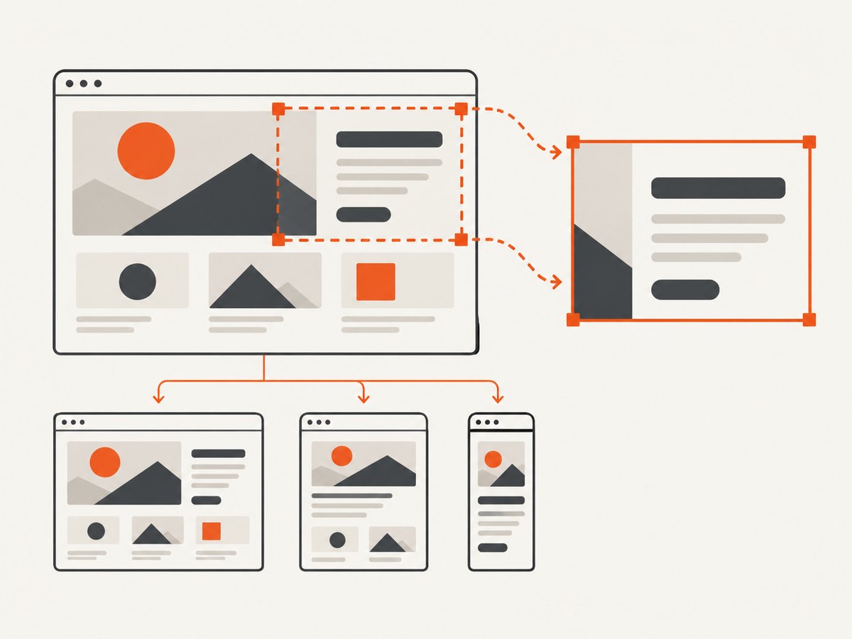
The viewport is the CSS pixel rectangle available to the page. Media queries such as @media (max-width: 768px), flexbox wrapping, navigation breakpoints and JavaScript layout calculations use this value. It is separate from several other dimensions:
| Setting | Controls | Typical use |
|---|---|---|
viewportSize |
Browser layout viewport in CSS pixels | Responsive layout and screenshot context |
clipRect |
Rectangle copied into an image | Crop a region of the rendered page |
paperSize |
PDF paper dimensions and margins | Print output, not responsive layout |
| Device scale | How CSS pixels map to output pixels | High-density or retina-like rendering |
Changing viewportSize does not crop an image. PhantomJS’s clipRect is a separate capture rectangle, as shown in its render documentation. Likewise, use paperSize when the requirement is PDF page geometry; it does not replace a viewport setting.
Set the PhantomJS viewport before opening a page
Assign the object before page.open(). This ensures the first layout, scripts that read window.innerWidth, and responsive components see the intended dimensions from navigation onward.
var page = require('webpage').create();

page.viewportSize = { width: 1440, height: 900 };
page.settings.userAgent = 'Mozilla/5.0 (compatible; PhantomJS screenshot)';

page.open('https://example.com/', function (status) {
  if (status !== 'success') {
    console.log('HTTP navigation failed: ' + status);
    phantom.exit(1);
    return;
  }

  // Verify the CSS viewport that the page sees.
  var dimensions = page.evaluate(function () {
    return {
      innerWidth: window.innerWidth,
      innerHeight: window.innerHeight,
      documentWidth: document.documentElement.scrollWidth,
      documentHeight: document.documentElement.scrollHeight
    };
  });
  console.log(JSON.stringify(dimensions));

  page.render('desktop.png');
  phantom.exit();
});
Use integer pixel values. A width of 375 and height of 812 exercises a common mobile breakpoint; 768 by 1024 represents a portrait tablet; 1366 by 768 is a common desktop test size. The correct values are the ones your application promises to support, so keep them in your test configuration rather than scattering magic numbers through scripts.
Capture a viewport-sized image versus the full page
A normal render captures the visible viewport. To capture a page taller than the viewport, PhantomJS can render the full document when page.clipRect is set to the document dimensions:
var page = require('webpage').create();
page.viewportSize = { width: 1280, height: 800 };

page.open('https://example.com/', function (status) {
  if (status !== 'success') {
    phantom.exit(1);
    return;
  }

  var size = page.evaluate(function () {
    var body = document.body;
    var root = document.documentElement;
    return {
      width: Math.max(body.scrollWidth, root.scrollWidth),
      height: Math.max(body.scrollHeight, root.scrollHeight)
    };
  });

  page.clipRect = {
    top: 0,
    left: 0,
    width: size.width,
    height: size.height
  };
  page.render('full-page.png');
  phantom.exit();
});
This changes the output rectangle, not the CSS viewport used to lay out the page. Fixed headers, lazy loading and scroll-triggered effects can therefore behave differently from a true scrolling capture. If you need a full-page image, test pages with sticky elements and lazy content explicitly.
Configure CasperJS at startup
Pass viewportSize to casper.create() so every step begins with the same dimensions:
var casper = require('casper').create({
  viewportSize: {
    width: 1280,
    height: 800
  },
  verbose: true,
  logLevel: 'warning'
});

casper.start('https://example.com/');
casper.then(function () {
  this.capture('casper-desktop.png');
});
casper.run(function () {
  this.echo('Done.').exit();
});
Do not assume CasperJS changes PhantomJS’s default automatically. The CasperJS API notes that PhantomJS starts at 400 by 300 and CasperJS does not override that default unless you provide a value. An explicit option also makes the script self-documenting when it is run in CI.
Change the viewport during a CasperJS flow
Use casper.viewport(width, height) when one scenario must exercise several responsive layouts. The method accepts an optional callback, and the asynchronous form is useful when subsequent actions depend on reflow:
var casper = require('casper').create();

casper.start('https://example.com/');

casper.viewport(375, 812).then(function () {
  this.waitForSelector('.mobile-menu', function () {
    this.capture('mobile.png');
  });
});

casper.viewport(1440, 900).then(function () {
  this.waitForSelector('.desktop-navigation', function () {
    this.capture('desktop.png');
  });
});

casper.run(function () {
  this.echo('Responsive captures complete.').exit();
});
Changing dimensions is not a substitute for waiting on application work. If the page rebuilds navigation asynchronously, wait for a selector or use a short, justified delay after the viewport continuation. CasperJS specifically recommends its asynchronous continuation when you need to be sure page reflow has occurred.
Responsive testing checklist
- Choose widths that match your supported breakpoints, including one pixel on each side of a breakpoint.
- Set the viewport before navigation for the first layout.
- Wait for a stable selector, fonts, images and application data before capture.
- Check both
window.innerWidthand document scroll dimensions in diagnostics. - Keep crop settings separate from viewport settings.
- Repeat with portrait and landscape dimensions where orientation changes behavior.
- Record the URL, viewport, user agent and script version beside each artifact.
Common problems and fixes
| Symptom | Cause | Fix |
|---|---|---|
| Screenshot is 400×300 | CasperJS retained PhantomJS’s default. | Set viewportSize in casper.create() or call viewport(). |
| Layout is mobile despite a wide image | The viewport was set after navigation, or a meta viewport tag and device emulation affect layout. | Set dimensions before open(); inspect innerWidth and page markup. |
| Image dimensions are unexpected | clipRect crops independently of the viewport. |
Remove or recalculate clipRect; print both values in diagnostics. |
| Capture occurs before reflow | A runtime resize was followed immediately by capture. | Chain viewport(...).then(...), then wait for a layout selector. |
| Full-page output cuts off content | Document height was measured before late content or lazy images loaded. | Wait for content, scroll if required by the page, then measure dimensions again. |
| Fonts or images differ between runs | Resources were still loading, blocked, or served differently. | Wait for a reliable readiness condition and log console/resource errors. |
| PDF has the wrong paper shape | Viewport dimensions were used for print geometry. | Configure PhantomJS paperSize for PDF output. |
| Script exits without an image | Navigation failed or phantom.exit() ran too early. |
Check the status, handle failure paths, and exit in the final callback. |
Timing, reliability and performance
Viewport assignment itself is inexpensive. Most runtime comes from navigation, JavaScript, fonts, images and third-party resources. For stable runs:
- Reuse one browser process for a batch of URLs when your harness permits it, but reset viewport, cookies and page state between cases.
- Wait for a meaningful application condition instead of an arbitrary long delay. A selector indicating that the main content is rendered is usually more reliable.
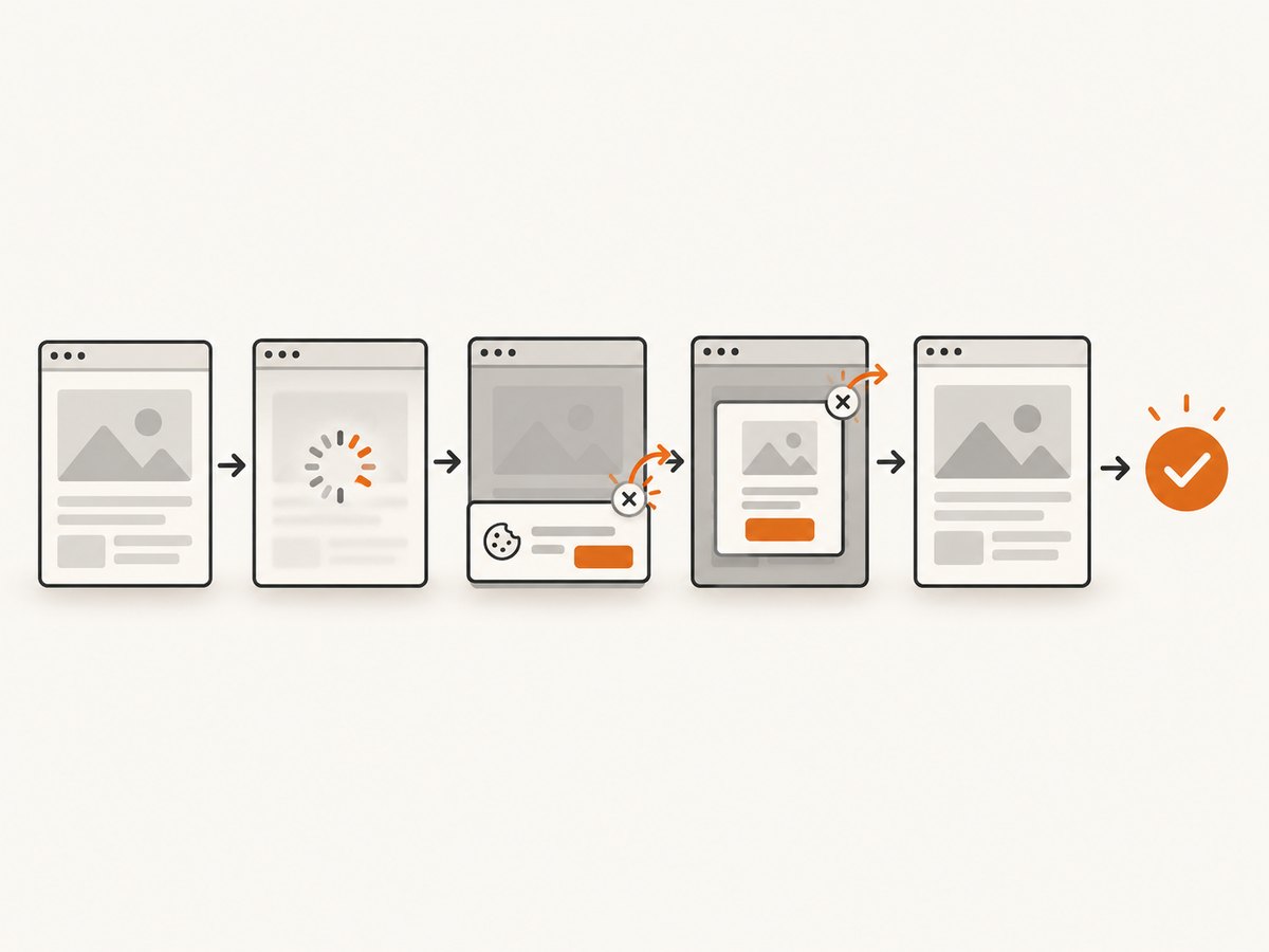
- Disable or stub analytics and chat during tests when they alter layout or keep network activity alive.
- Capture only the dimensions you need. Full-document measurement and very tall images consume more memory than viewport captures.
- Keep retries bounded. A retry can distinguish a transient network failure from a deterministic script or layout bug, but unlimited retries hide failures.
- Store failure screenshots and console output. The viewport value alone cannot explain a blank page, blocked request or JavaScript exception.
PhantomJS and CasperJS are legacy tools. Their documentation describes the APIs above, but the dossier does not establish current maintenance or compatibility with modern sites. Verify your runtime, TLS support, JavaScript features and CI image before selecting them for new automation.
Or skip the browser setup
For a hosted capture, ScreenshotNeo accepts one GET request and returns PNG, JPEG, WebP or PDF. Its options include any viewport, 12 device presets, retina scale, full-page capture, element capture by CSS selector, dark mode, custom CSS and JavaScript, waits, request blocking, headers, cookies, user agents, timezone and geolocation. The API uses familiar screenshot parameter names, which makes migration from a browser script straightforward. Read the ScreenshotNeo documentation for the complete option list.
curl -G "https://api.screenshotneo.com/v1/shot" \
  -d access_key=YOUR_API_KEY \
  --data-urlencode url=https://stripe.com \
  -o shot.webp
import requests
r = requests.get(
"https://api.screenshotneo.com/v1/shot",
params={"access_key": "YOUR_API_KEY", "url": "https://stripe.com"},
timeout=90,
)
r.raise_for_status()
open("shot.webp", "wb").write(r.content)const q = new URLSearchParams({
access_key: 'YOUR_API_KEY',
url: 'https://stripe.com'
});
const res = await fetch(`https://api.screenshotneo.com/v1/shot?${q}`);Cookie banners, newsletter popups and chat widgets are removed before the shot, with each cleanup step configurable. Bot checks and CAPTCHAs, blank pages, timeouts, failed loads and cache hits are not billed; response headers identify the page verdict and whether the request was billed. ScreenshotNeo also provides an MCP server with take_screenshot, get_page_info and capture_pdf tools for Claude, Cursor and other MCP clients. The Free plan includes 1,000 shots each month with no card; paid plans start at $5 for 3,000 shots. Create a free ScreenshotNeo account.
FAQ
Is screen size measured in physical pixels?
The PhantomJS and CasperJS settings described here are CSS pixel dimensions. Output bitmap dimensions can also be affected by device scale or image processing.
Should I set the viewport before or after open()?
Set it before open() when the initial responsive layout matters. Use CasperJS’s runtime method only when deliberately testing a resize.
Can clipRect make a page responsive?
No. It selects the captured rectangle. The page layout still uses the viewport.
How do I make a PDF match the viewport?
Use the viewport for on-screen layout and PhantomJS paperSize for PDF paper dimensions. They solve different problems.
Why does a runtime resize need a continuation?
Responsive CSS and JavaScript need time to reflow. CasperJS’s asynchronous viewport(width, height, then) form lets the next step run after the resize operation.
What should I log when a screenshot is wrong?
Log the requested viewport, window.innerWidth, window.innerHeight, document scroll dimensions, navigation status, console errors and the active crop rectangle.


