How to Set the Screen Size in Puppeteer
Set a Puppeteer page’s CSS viewport with page.setViewport(). Learn when to use device emulation, resize content or control headless screen geometry instead.
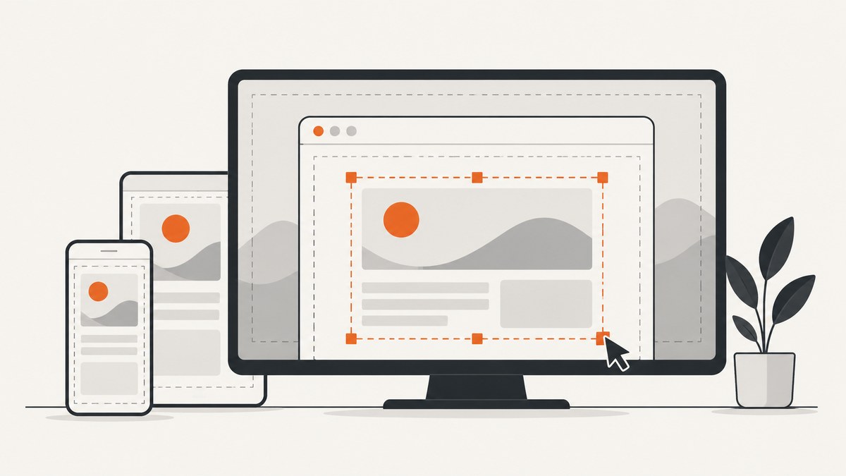
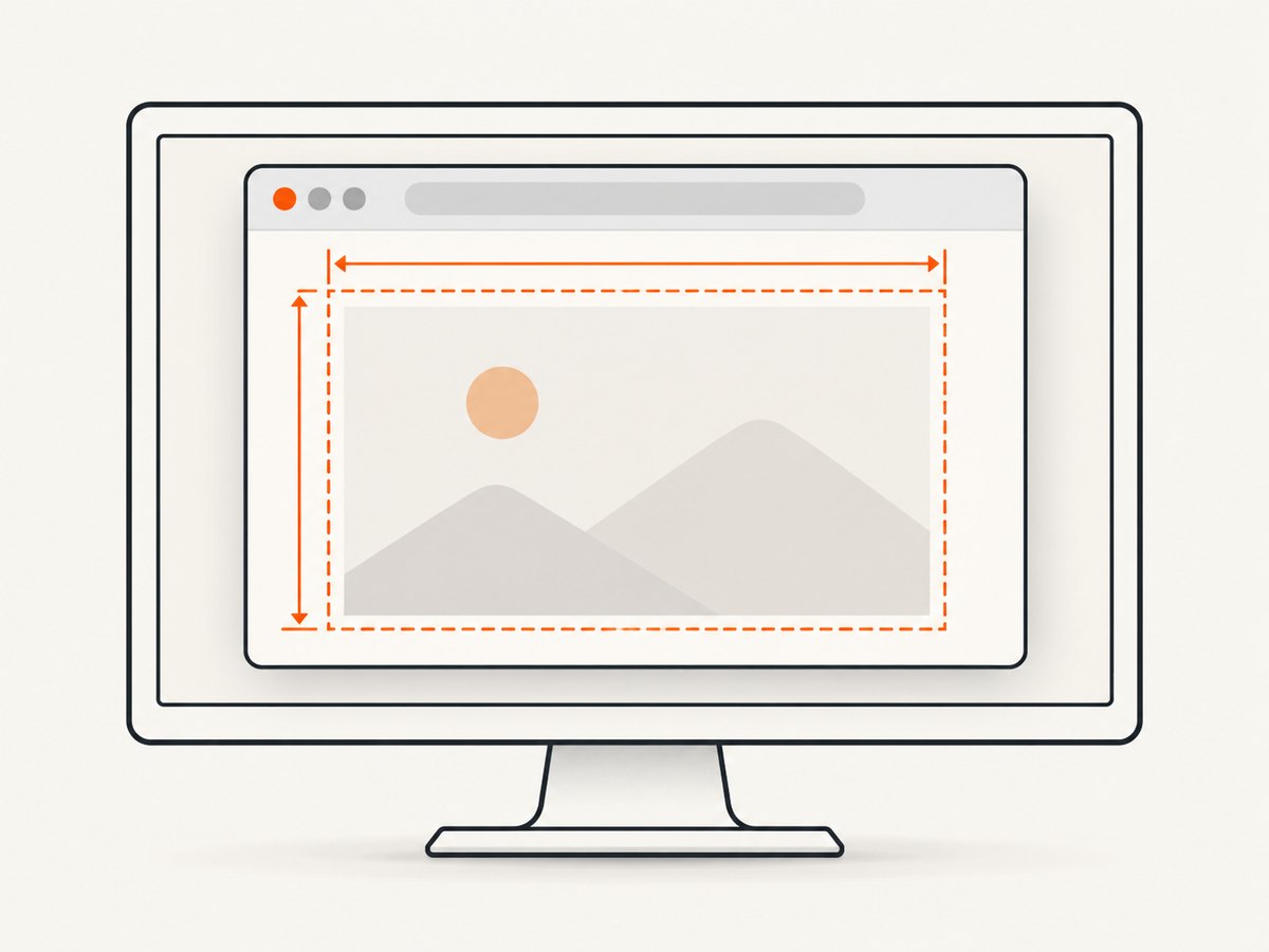
For most Puppeteer tasks, set the page’s CSS viewport with await page.setViewport({ width, height }). The numbers are CSS pixels. Set it before page.goto() so the site loads at the dimensions you intend to test.
“Screen size” can mean different things: the page’s layout viewport, mobile device metrics, the browser content area, the window bounds, or the simulated display used by headless Chrome. Those controls are separate. Pick the one that matches what you need to observe.
1. Set a page’s viewport
This complete Node.js example opens a page with a 1080-by-1024 CSS-pixel viewport and saves a screenshot. Replace the URL and dimensions with those for your test.
const puppeteer = require('puppeteer');

(async () => {
  const browser = await puppeteer.launch();
  try {
    const page = await browser.newPage();

    await page.setViewport({
      width: 1080,
      height: 1024,
      deviceScaleFactor: 1,
    });

    await page.goto('https://example.com', {
      waitUntil: 'networkidle2',
    });
    await page.screenshot({ path: 'page.png', fullPage: true });
  } finally {
    await browser.close();
  }
})();
Install Puppeteer in a Node project with npm install puppeteer if it is not already present. The package’s launch configuration and available browser options can depend on the installed Puppeteer version. For the viewport call, width and height are required. deviceScaleFactor, hasTouch, isLandscape and isMobile are optional; the documented defaults for the optional booleans are false, and the default scale factor is 1. See the Page.setViewport API.
Choose dimensions deliberately
Use the CSS-pixel width and height relevant to the layout or test case. The 1080-by-1024 size above appears in Puppeteer’s getting-started example; it is not a required breakpoint or universal recommended size. A page created with the default connection options has an 800-by-600 viewport unless that default is changed. That default describes the page viewport, not necessarily the browser window or simulated screen.
With fullPage: true, a screenshot can include content below the viewport. It does not mean the page was laid out at the document’s full height from the start: the viewport still controls the page layout, and full-page capture changes the captured area.
2. Choose the right kind of size
| What you need to change | Use | What it controls |
|---|---|---|
| Page layout dimensions | page.setViewport({ width, height }) |
The page’s CSS viewport, in CSS pixels. |
| Known mobile device behavior | page.emulate(device) |
A device’s viewport and user agent together; use before navigation. |
| Browser content area | page.resize({ contentWidth, contentHeight }) |
The content dimensions used by Puppeteer’s window-management guide. |
| Window size, position or state | Browser window-bound methods | The browser window itself, rather than just page layout. |
| Headless display geometry | --screen-info or screen APIs |
The simulated display or displays available to headless Chrome. |
Use setViewport for ordinary responsive layout checks. Use device emulation when the user agent and mobile metrics matter too. Use content resizing or window bounds when your automation needs to inspect the browser window itself. For display geometry in headless mode, configure the simulated screen.
3. Emulate a mobile device
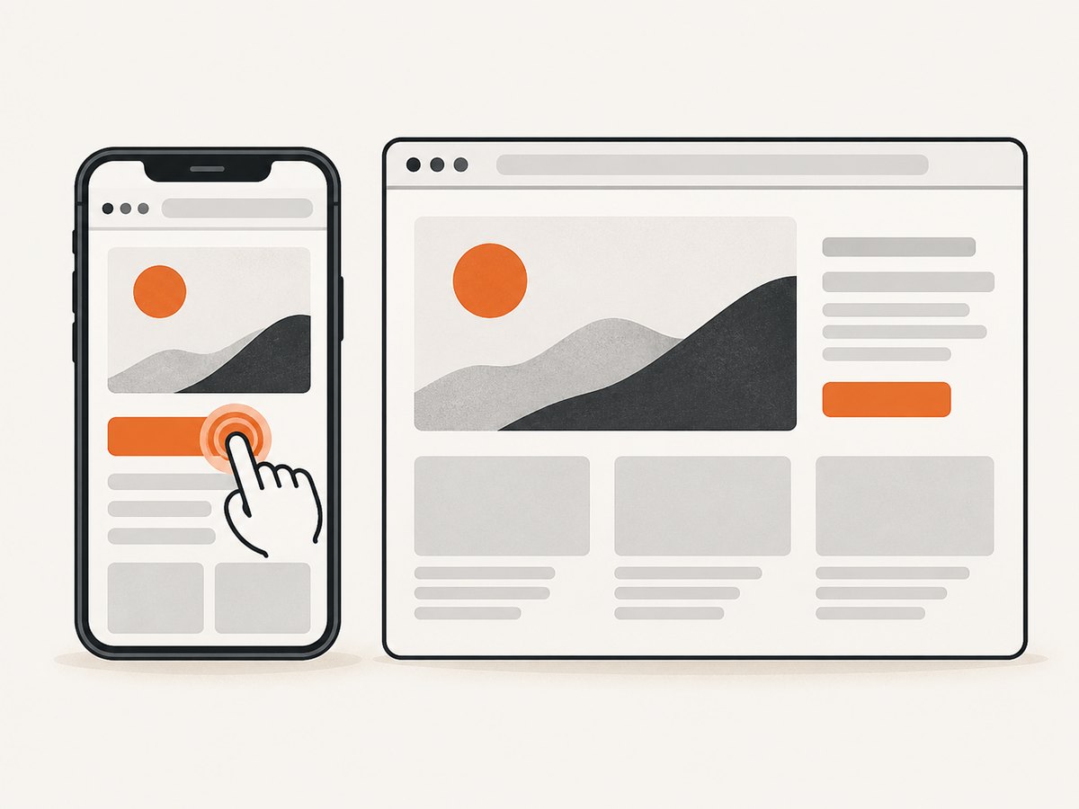
When a test needs a particular device profile, use Puppeteer’s device descriptors and page.emulate(). This applies the device viewport and user agent together. Emulate before navigation so the initial request sees the intended settings.
const puppeteer = require('puppeteer');
const { devices } = puppeteer;

(async () => {
  const browser = await puppeteer.launch();
  try {
    const page = await browser.newPage();
    const phone = devices['iPhone 13'];

    await page.emulate(phone);
    await page.goto('https://example.com', {
      waitUntil: 'networkidle2',
    });
    await page.screenshot({ path: 'phone.png', fullPage: true });
  } finally {
    await browser.close();
  }
})();
Use a device descriptor available in your installed version; descriptor names and APIs are version-sensitive. If you only need a narrow responsive layout and do not need that device’s user agent or other emulated metrics, set the viewport directly. Changing mobile or touch properties after navigation can cause a reload in some cases, so establish them first where possible. Consult the official device emulation guide.
4. Resize content, window bounds or the headless screen
Change content dimensions
Puppeteer’s window-management guide uses page.resize({ contentWidth, contentHeight }) to change the browser content area. Its example removes the default viewport constraint with page.setViewport(null) first, then waits for the resize to be reported because the update is asynchronous. Follow that pattern if the content area itself is what your test needs to control.
const puppeteer = require('puppeteer');

(async () => {
  const browser = await puppeteer.launch();
  try {
    const page = await browser.newPage();
    await page.setViewport(null);
    await page.goto('https://example.com');

    await page.resize({ contentWidth: 1200, contentHeight: 900 });
    await page.evaluate(() => new Promise(resolve => {
      requestAnimationFrame(() => requestAnimationFrame(resolve));
    }));

    console.log(await page.evaluate(() => ({
      width: document.documentElement.clientWidth,
      height: document.documentElement.clientHeight,
    })));
  } finally {
    await browser.close();
  }
})();
Check the window management guide for the current API and window identifier methods. Window operations are separate from page layout sizing, and support can vary with browser mode and Puppeteer version.
Set browser window bounds
Use the Browser window-bound methods when you need to move, resize or change the state of a browser window. The guide describes obtaining a window identifier and using browser.getWindowBounds() or browser.setWindowBounds(windowId, bounds). A window’s outer dimensions can differ from its content dimensions because the browser has its own frame. Do not assume a window size is the same as the page’s CSS viewport.
Configure a headless display
For headless Chrome screen geometry, launch Puppeteer with Chrome’s --screen-info setting. The screen configuration guide gives this example:
const browser = await puppeteer.launch({
  headless: true,
  args: ['--screen-info={800x600}'],
});
The guide describes an 800-by-600 headless screen by default when neither screen-info nor window-size switches are supplied. If --window-size is supplied, the described headless screen is as large as the requested window. In headless mode, Puppeteer also provides browser.addScreen() and browser.removeScreen() for dynamic screen changes. These switches and APIs are headless-only; headful Chrome uses the physical platform screens. See the screen configuration guide.
5. Viewport options and edge cases
widthandheight: Required page dimensions in CSS pixels. Set both to the layout you want to exercise.deviceScaleFactor: Controls device scale metrics, with a documented default of 1. It is useful when testing higher-density rendering; it does not turn the CSS viewport dimensions into physical screen dimensions.isMobileandhasTouch: Enable mobile and touch-related emulation. Set them before navigation when possible; changing them can reload a page in some circumstances.isLandscape: Sets the orientation metric. Choose viewport dimensions consistent with the orientation your test intends to represent.page.setViewport(null): Resets the page viewport to its default. This does not mean “use the physical monitor size.”- Per-page behavior: Each page can have its own viewport; setting one page’s dimensions does not resize every page in the browser.
- Timing: Set the viewport before
goto()when possible. If you resize an already loaded page, wait for the resize to settle before asserting layout or taking a screenshot.
To confirm the CSS viewport seen by the document, inspect window.innerWidth, window.innerHeight, or the document element’s client dimensions after the page has settled. These report page geometry, not the outer window bounds or the physical display.
6. Troubleshooting
| Symptom | Likely cause | Fix |
|---|---|---|
| The layout still looks like desktop after setting a narrow width. | The viewport was changed after navigation, or the site’s responsive behavior depends on mobile emulation or user agent. | Set the viewport before goto(). If the test targets a known phone, call page.emulate(device) before navigation. |
| The viewport reports the requested size, but the screenshot seems larger. | A full-page screenshot includes document content beyond the viewport, or device scale affects raster output. | Check whether fullPage is enabled and distinguish CSS pixels from output image pixels. Inspect the page’s client dimensions. |
| The browser window did not change size. | setViewport changes the page viewport, not necessarily the outer window. |
Use window-bound methods for window bounds, or page.resize() for content area dimensions, following the window-management guide. |
| A headless display setting has no effect in headful Chrome. | The screen configuration switches and dynamic screen APIs described are headless-only. | Run headless for simulated display configuration, or use the physical platform display in headful mode. |
| A resize assertion intermittently sees the old dimensions. | The resize update is asynchronous and the page has not finished reacting. | Wait for resize reporting or at least the next animation frames, then read the dimensions and assert. |
devices, page.resize() or screen APIs are unavailable. |
The installed Puppeteer version may not expose the API or descriptor used in an example. | Check the installed version and its matching official docs. The referenced documentation spans versions 25.10 through 25.12, so newer APIs can be version-sensitive. |
7. Performance, reliability and cost
Changing the viewport itself is a small configuration step, but navigation and page behavior usually dominate the time and reliability of a capture. Reuse one browser process for a batch of pages when appropriate, close pages when finished, and always close the browser in a finally block so failures do not leave a process running. Choose a wait condition that matches the site: waiting for full network quiet can take longer or time out on pages that keep requests open, while a weaker condition can capture before delayed content appears. For a specific element or app, an explicit selector wait can be more predictable than one fixed delay.
Viewport choice affects layout and screenshot dimensions. Larger full-page screenshots can include more document content and produce larger image files. A higher device scale factor can increase raster size and resource use. Keep test dimensions and emulation settings explicit so captures are repeatable. Puppeteer itself is a browser automation library; the research dossier supplies no price or benchmark claim for it, so cost depends on where and how you run Chrome.
Or skip the browser setup
If you only need a screenshot at a URL, ScreenshotNeo is a website screenshot API and MCP server. Its API accepts a URL in one GET request and returns PNG, JPEG, WebP or PDF. For the available capture options and API details, see the ScreenshotNeo documentation.
curl -G "https://api.screenshotneo.com/v1/shot" \
  -d access_key=YOUR_API_KEY \
  --data-urlencode url=https://example.com \
  -o shot.webp
Cookie banners are accepted and removed before the shot, along with known newsletter popups and chat widgets; each cleanup step can be turned off. Bot checks, blank pages, timeouts and failed loads are not billed, and cache hits cost nothing. Responses indicate the page verdict and billing state in headers. Its MCP server lets AI agents, including Claude and Cursor, take screenshots. The free plan includes 1,000 shots a month with no card; paid plans start at $5 for 3,000 shots.
Sign up for 1,000 free screenshots a month, with no card.
FAQ
Does page.setViewport() set my monitor size?
No. It resizes the page viewport. Browser window bounds and headless display geometry use separate controls.
Should I call setViewport() before or after goto()?
Before navigation is the safest general pattern. It ensures the page starts with the requested dimensions and avoids some reload behavior from changing mobile metrics later.
What size does Puppeteer use by default?
ConnectOptions documents an 800-by-600 page viewport by default. The screen configuration guide separately describes the default headless screen as 800 by 600 when relevant launch switches are absent.
How can I test responsive breakpoints?
Set a sequence of explicit CSS viewport widths, navigate or wait for layout to settle, and inspect the rendered behavior at each width. Use device emulation too if the test depends on mobile user agent, touch or device metrics.


