How to Set a Website Background Image with CSS
Set CSS background images correctly with cover, responsive sizing, overlays, accessibility guidance, troubleshooting, and complete examples.
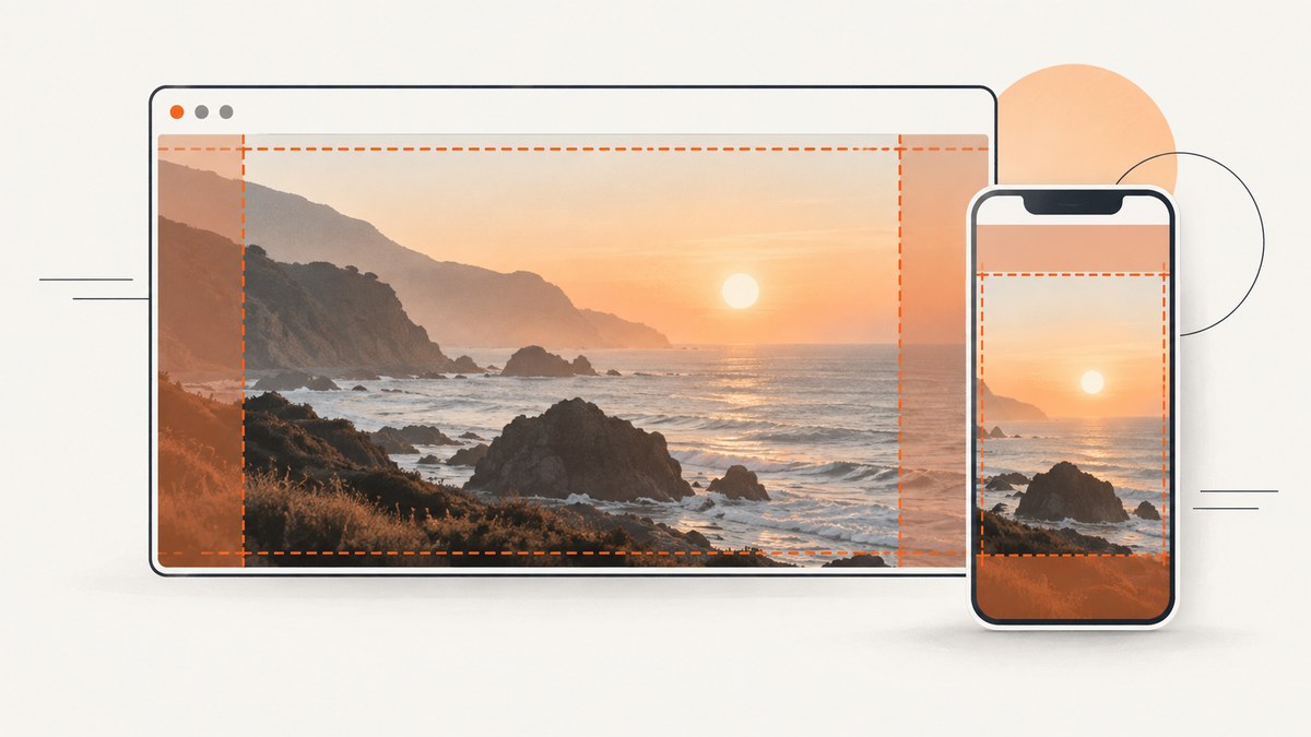
The basic CSS is:
.hero {
  min-height: 24rem;
  background-color: #243044;
  background-image: url("/images/hero.jpg");
  background-position: center;
  background-repeat: no-repeat;
  background-size: cover;
}
Apply the rule to the element that should display the image. The element must have visible dimensions through its content, padding, a minimum height, or an explicit height. background-image attaches an image to an element; it does not create height by itself. Use cover when the image should fill the box and cropping is acceptable, or contain when the complete image must remain visible.
This guide explains the complete decision process, responsive variants, layered backgrounds, accessibility, performance, debugging, and a hosted screenshot option when you do not want to maintain a browser capture setup.
1. Add a background image to a specific element
Start with semantic HTML and a class for the region you want to decorate:
<header class="hero">
  <div class="hero__content">
    <p class="eyebrow">Product launch</p>
    <h1>Build a faster documentation site</h1>
    <p>A background can provide atmosphere while your HTML remains readable and accessible.</p>
  </div>
</header>
.hero {
min-height: 24rem;
padding: 4rem 1.5rem;
background-color: #243044;
background-image: url("/images/hero.jpg");
background-position: center;
background-repeat: no-repeat;
background-size: cover;
}
.hero__content {
max-width: 42rem;
color: white;
}The URL is resolved relative to the CSS file, not necessarily the HTML file. A leading slash refers to the web site’s root. A relative URL such as ../images/hero.jpg is resolved from the stylesheet’s directory. Confirm the exact capitalization and extension on case-sensitive servers.
2. Choose the right sizing behavior
cover: fill the area
background-size: cover preserves the image’s aspect ratio and scales it until every part of the element is covered. If the element and image have different proportions, some edges are cropped. This is the usual choice for hero sections, banners, and cards where an edge-to-edge visual matters more than seeing every pixel.
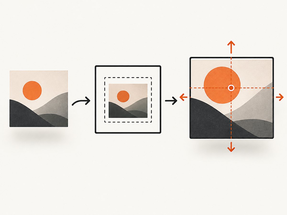
.hero {
  background-size: cover;
  background-position: center;
}contain: show the entire image
contain scales the image so the complete image fits inside the box while preserving its proportions. Empty space can remain on two sides. Unless you disable tiling, the image may repeat into that space:
.poster {
  background-color: #f3f4f6;
  background-image: url("/images/poster.png");
  background-size: contain;
  background-position: center;
  background-repeat: no-repeat;
}
Explicit lengths and percentages
You can specify one or two lengths, such as background-size: 30rem auto, or percentages such as 100% auto. The first value controls width and the second height. An auto value preserves the intrinsic ratio. Avoid assigning unrelated width and height values that distort the image.
3. Control repetition, position, and the fallback color
Backgrounds repeat by default. Set background-repeat: no-repeat for a single photograph. Other useful values are repeat-x, repeat-y, and space or round for patterns.
background-position chooses the point that stays aligned when cropping occurs. Common values include center, top, top right, and two-value coordinates such as 35% 20%. If a person’s face is near the top, use center top or a custom percentage so it remains visible on narrow screens.
.hero {
  background-position: 50% 25%;
  background-repeat: no-repeat;
  background-color: #243044;
}
Always provide a background-color. If the image is unavailable or still loading, the color supplies a readable fallback. MDN recommends specifying a color even when an opaque image normally hides it. See the MDN background-image reference.
4. Use the shorthand safely
The shorthand keeps a common background declaration compact:
.hero {
  background: #243044 url("/images/hero.jpg") center / cover no-repeat;
}
The slash separates background-position from background-size. A shorthand can set color, image, position, size, repeat, attachment, and origin together. Omitted subproperties reset to their initial values, so adding a later shorthand can unexpectedly undo an earlier background-repeat or position rule. The MDN background reference documents the grammar.
5. Add a readable overlay
White or dark text can become unreadable over parts of a photograph. A gradient layer can darken the image while preserving its detail:
.hero {
  background-color: #243044;
  background-image:
    linear-gradient(rgb(0 0 0 / 45%), rgb(0 0 0 / 45%)),
    url("/images/hero.jpg");
  background-position: center;
  background-size: cover;
  background-repeat: no-repeat;
}
In a comma-separated list, the first background is closest to the user, so the gradient is painted above the photo. You can use a directional gradient when the text occupies one side:
.hero {
  background-image:
    linear-gradient(90deg, rgb(0 0 0 / 70%), rgb(0 0 0 / 10%)),
    url("/images/hero.jpg");
}
Evaluate the actual rendered contrast rather than assuming a percentage is sufficient. The MDN guidance is 4.5:1 for normal body text and 3:1 for larger text. A solid panel behind text may be more reliable than an overlay when the photograph has strong highlights.
6. Make backgrounds responsive
A single crop rarely works perfectly at every aspect ratio. Use media queries to reposition the focal point or select a different asset:
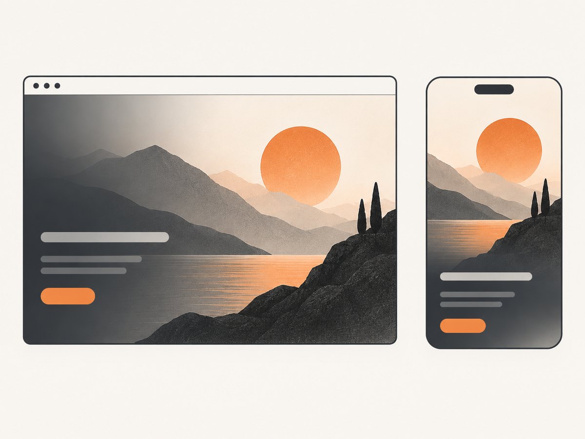
.hero {
  min-height: 28rem;
  background-image: url("/images/hero-wide.jpg");
  background-position: 55% center;
  background-size: cover;
}

@media (max-width:  fortyrem) {
  .hero {
    min-height: 32rem;
    background-image: url("/images/hero-tall.jpg");
    background-position: 50% top;
  }
}
Replace fortyrem with a valid CSS length such as 40rem; it is written out here only to make the unit easy to spot. A production rule is:
@media (max-width: 40rem) {
  .hero {
    min-height: 32rem;
    background-image: url("/images/hero-tall.jpg");
    background-position: 50% top;
  }
}
For decorative imagery that needs different pixel-density files, image-set() can provide alternatives:
.avatar-panel {
  background-image: image-set(
    url("/images/panel.jpg") 1x,
    url("/images/panel@2x.jpg") 2x
  );
  background-size: cover;
}
For meaningful content, prefer HTML <picture> and <img srcset>. Responsive HTML images can carry alternative text and let the browser select an appropriate source. See web.dev’s responsive images guidance.
7. Decide whether the image belongs in CSS or HTML
CSS backgrounds are suitable for decorative or presentational imagery. Assistive technologies do not receive special information about CSS background images, so a screen reader will not announce one as an image. If the image communicates information needed to understand the page, include it in the document with useful alternative text:
<figure>
  <img src="/images/architecture-diagram.png"
       alt="Diagram showing requests passing through the cache layer">
  <figcaption>Request flow through the cache layer.</figcaption>
</figure>
Do not duplicate a meaningful HTML image as a CSS background. Conversely, a purely atmospheric texture can remain in CSS without an empty or misleading alt value. The web.dev images guide covers content images and text alternatives.
8. Full-page backgrounds and attachment behavior
To decorate the page canvas, target body or a full-height wrapper, but remember that the background follows that element’s box:
html, body {
  min-height: 100%;
}

body {
  margin: 0;
  background-color: #111827;
  background-image: url("/images/site-background.jpg");
  background-position: center top;
  background-repeat: no-repeat;
  background-size: cover;
}
A fixed background can remain attached to the viewport while content scrolls:
body {
  background-attachment: fixed;
}
Use this intentionally. A fixed, full-page photograph can consume substantial memory on large screens and may behave differently across browsers and mobile devices. A normal scrolling background is easier to reason about. Do not treat a body background as a replacement for a content image.
9. Troubleshooting checklist
| Symptom | Likely cause | Fix |
|---|---|---|
| No image appears | The URL is wrong, the selector does not match, or the element has no visible area. | Open the image URL directly, inspect the element in developer tools, and add content, padding, min-height, or height. |
| 404 or failed request | The path is resolved from the CSS file, or filename capitalization differs. | Correct the relative path and check the Network panel for the requested URL. |
| The image tiles | background-repeat defaults to repeat. |
Set background-repeat: no-repeat, or choose a deliberate repeat mode for a pattern. |
| The subject is cropped | cover must crop when aspect ratios differ. |
Change background-position, use a focal-point percentage, select another asset, or use contain. |
| Empty bands appear | contain preserves the whole image. |
Keep the fallback color, accept the letterboxing, or use cover when filling the box matters more. |
| The image is stretched | Independent width and height values distort the ratio. | Use cover, contain, or one dimension plus auto. |
| Text is hard to read | Contrast changes across the photo. | Add a gradient or backing panel and check the rendered contrast at each responsive crop. |
| A later rule wins | A more specific selector, a shorthand, or source-order conflict overrides the declaration. | Inspect computed styles and move the intended rule later; avoid !important unless there is a clear reason. |
| CSS changes do not appear | A cached stylesheet or image is being served. | Check the response in developer tools, use a versioned asset URL, and hard-refresh during development. |
10. Performance and reliability considerations
- Use an appropriately sized, compressed image. A background that is several times wider than the largest display wastes transfer and decoding work.
- Prefer modern formats such as WebP or AVIF when your delivery pipeline supports them, with a fallback format where needed.
- Keep a solid color behind every image so the layout remains readable while the request is pending or fails.
- Do not put essential text inside the bitmap. Text in HTML remains searchable, selectable, translatable, and accessible.
- Lazy-loading is automatic only in some layout patterns and is not a property of
background-image. Avoid placing a huge background on every page if it is not needed. - Use media queries or
image-set()to avoid sending a desktop asset to a small viewport when a smaller crop is available. - Check the image’s license and keep stable URLs. A renamed or deleted asset is a production failure even when the CSS itself is valid.
11. Preview the result with ScreenshotNeo
When a background is responsive, layered, or dependent on a specific viewport, a screenshot makes visual review repeatable. ScreenshotNeo is a website screenshot API and MCP server. It can capture full pages, set a viewport or device preset, use dark mode, wait for a selector or network idle, and apply custom CSS or JavaScript.
Or skip the browser setup
One GET request returns an image or PDF. The following calls capture the rendered page; replace the URL with your page and keep the API key private.
curl -G "https://api.screenshotneo.com/v1/shot" -d access_key=YOUR_API_KEY --data-urlencode url=https://stripe.com -o shot.webpimport requests
r = requests.get("https://api.screenshotneo.com/v1/shot", params={"access_key": "YOUR_API_KEY", "url": "https://stripe.com"}, timeout=90)
open("shot.webp", "wb").write(r.content)const q = new URLSearchParams({ access_key: 'YOUR_API_KEY', url: 'https://stripe.com' });
const res = await fetch(`https://api.screenshotneo.com/v1/shot?${q}`);See the ScreenshotNeo API documentation for options and response details. Cookie banners, newsletter popups, and chat widgets are removed before the shot. Bot checks, blank pages, timeouts, failed loads, and cache hits are not billed, and response headers identify the page verdict and billing status. An MCP server provides take_screenshot, get_page_info, and capture_pdf tools to Claude, Cursor, and other MCP clients. The free plan includes 1,000 screenshots each month with no card; paid plans start at $5 for 3,000 shots. Create a free ScreenshotNeo account.
12. Frequently asked questions
Can I use a background image without a separate HTML element?
Yes. Apply it to an existing element such as body, a section, or a card. That element still needs a visible box.
Should I use cover or contain for a logo?
Usually neither as a substitute for an HTML image or inline SVG. A logo conveys identity and may need an accessible name. Use a semantic image or SVG with appropriate text alternatives.
How do I place the image at the bottom right?
Use background-position: right bottom. You can fine-tune it with percentages or lengths, such as 80% 70%.
Can one element have more than one background image?
Yes. Separate layers with commas. The first layer is closest to the user; list the fallback photo below an overlay or decorative texture.
Why does my background vanish when I add a shorthand?
A shorthand resets omitted subproperties. Include the image, position, size, and repeat in the shorthand, or place longhand declarations after it.
When should I use an image element instead?
Use <img> or <picture> when the image carries information, needs alternative text, or is part of the document’s content rather than decoration.


