How to Shrink wkhtmltopdf Content to Fit the Page Width
Fix wkhtmltopdf content that overflows PDF pages by checking page geometry, margins, HTML layout, viewport, and scaling controls in order.
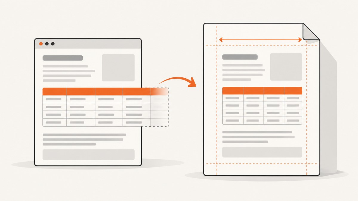
When wkhtmltopdf content is too wide, first confirm the PDF page size and horizontal margins, then inspect the HTML for elements that force a wide layout. Only after that, test the viewport, smart shrinking, or zoom—one control at a time. There is no universal zoom value that will fix every source page.
“Fit to page” can mean scaling the rendered page down, or changing the HTML so it wraps and reflows within the printable width. Scaling can make text smaller; correcting a fixed-width table or adding a print stylesheet may preserve readability. The right fix depends on the HTML and the target paper size.
1. Confirm the PDF page size and usable width
wkhtmltopdf documents A4 as its default paper size and 10 mm as the default left and right margins. The printable width is therefore narrower than the physical paper. Set the page size and margins explicitly so a change in defaults or invocation context does not make your output ambiguous. The official usage documentation describes --page-size, custom --page-width, --margin-left, and --margin-right. See the wkhtmltopdf usage documentation.
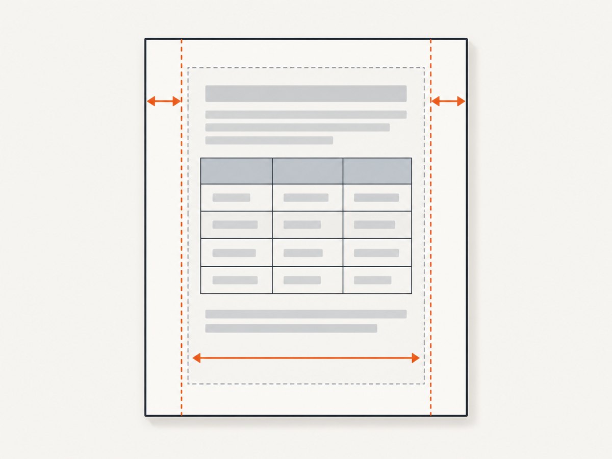
For a named paper size, start with:
wkhtmltopdf --page-size A4 --margin-left 10mm --margin-right 10mm input.html output.pdfReplace A4 and the margins with the document’s intended format. If the HTML is supposed to use nearly the full width, reduce margins deliberately; do not change them blindly if the document needs a binding, printer-safe, or design margin.
For a custom page width, use a width with units and set the other page dimensions and margins to match your output requirements:
wkhtmltopdf \
  --page-width 210mm \
  --page-height 297mm \
  --margin-left 10mm \
  --margin-right 10mm \
  input.html output.pdf
This example uses A4 dimensions as a custom geometry illustration. Prefer --page-size A4 when a named size is what you want. A custom width is useful when the document format itself requires one.
Calculate the available width
For a page whose width is measured in millimeters:
usable width = page width - left margin - right marginFor example, with a 210 mm page and 10 mm margins on each side, the content area is 190 mm wide. This is a geometry calculation, not a guarantee that every CSS element will fit inside it. A table with a fixed width, a non-wrapping heading, or an oversized image can still overflow.
2. Find what is forcing the HTML to stay wide
Before shrinking the rendered page, inspect the source layout. Look for fixed pixel widths, wide tables, long unbroken strings, large images, and nested containers whose minimum width exceeds the available page width. These are common web-layout causes to investigate; without the actual HTML, no one setting can establish which one applies.
- Fixed widths: Check elements with explicit
widthormin-widthvalues that exceed the intended print area. - Tables: Count columns and inspect long cell contents. A table may retain its intrinsic width even when its parent is narrower.
- Unbroken text: Long URLs, identifiers, and code tokens may resist wrapping. Decide whether they can break in print.
- Images: Check the intrinsic image dimensions and whether CSS constrains them to the printable area.
- Print-specific layout: Check whether screen styles, flex or grid rules, or viewport-relative dimensions produce an unsuitable print layout.
When reflow is the goal, use a print stylesheet to express the intended layout. For instance, a project might constrain images and allow long content to wrap in print:
@media print {
  img {
    max-width: 100%;
    height: auto;
  }

  pre, code {
    overflow-wrap: anywhere;
  }

  table {
    width: 100%;
    table-layout: fixed;
  }
}
Treat that CSS as a starting point, not a universal prescription. Fixed table layout can make dense tables harder to read, and breaking code or URLs can affect readability. Add only the rules that suit the content and check the resulting PDF.
3. Check the emulated viewport
Some pages choose layout based on the browser window. wkhtmltopdf documents --viewport-size as a way to set a viewport size to emulate a window. If your HTML uses viewport-dependent breakpoints or sizing, compare output with a deliberate viewport that matches the layout you expect.
wkhtmltopdf \
  --page-size A4 \
  --margin-left 10mm \
  --margin-right 10mm \
  --viewport-size 1280x900 \
  input.html output.pdf
The dimensions above are an example to illustrate where the option goes, not a recommended value for every page. Select a viewport based on the source page’s responsive layout and verify the PDF. Viewport size influences the page’s CSS layout; it does not alter the physical page width or automatically fix an oversized fixed-width element.
4. Test smart shrinking and zoom separately
The wkhtmltopdf usage documentation says smart shrinking is enabled by default. Its --disable-smart-shrinking option disables WebKit’s strategy that makes the pixel/DPI ratio non-constant. This is a scaling control, not a promise that arbitrary wide content will be repaired.
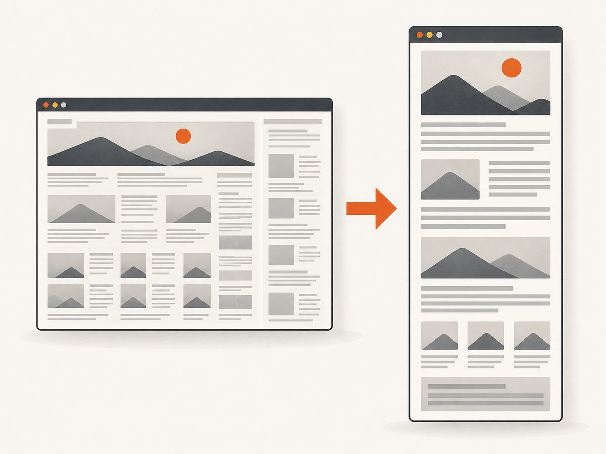
First render with your explicit page geometry and defaults. Then, if the scale behaves unexpectedly, compare a render with smart shrinking disabled:
wkhtmltopdf \
  --page-size A4 \
  --margin-left 10mm \
  --margin-right 10mm \
  --disable-smart-shrinking \
  input.html output-no-smart-shrinking.pdf
Compare legibility and clipping against the original. Disabling smart shrinking may change scale in a way that makes overflow more apparent, so it is a diagnostic comparison rather than a universal fix. An older project issue includes different user suggestions—one commenter recommends disabling smart shrinking in a particular case and another suggests changing zoom. Those reports are case-specific, not a general rule: wkhtmltopdf issue discussion.
Next, test --zoom independently. The documented default zoom factor is 1:
wkhtmltopdf \
  --page-size A4 \
  --margin-left 10mm \
  --margin-right 10mm \
  --zoom 0.9 \
  input.html output-zoom.pdf
The value here is an example of a controlled comparison, not a recommended setting. A zoom below 1 can make rendered content smaller, including its text. If content needs to wrap instead of becoming uniformly smaller, fix the layout instead. Avoid changing zoom and smart shrinking together on the first comparison; otherwise it is difficult to tell which change affected the result.
5. A repeatable diagnosis workflow
- Record the renderer build. Capture the output of
wkhtmltopdf --version, including any build details it prints. Reproducibility may depend on the installed build. - Set intended page geometry. Choose a named paper size or custom width and set left and right margins explicitly.
- Render a baseline. Keep other options unchanged and inspect the PDF for clipping, scaling, and text size.
- Inspect the source layout. Find fixed widths, minimum widths, tables, images, and long content that can force overflow.
- Decide whether to reflow or scale. Prefer a print layout change when the content should wrap; test zoom or smart shrinking when the rendered scale itself is the issue.
- Compare viewport behavior. If responsive CSS is involved, set a deliberate viewport and render again.
- Change one variable at a time. Keep each output so you can identify what improved or worsened the result.
For each render, note the command, page size, margins, viewport, zoom, smart shrinking state, and wkhtmltopdf version. That small record makes it easier to reproduce the result in another environment or wrapper.
6. Using wkhtmltopdf through a library or wrapper
If a program calls wkhtmltopdf through a library, do not assume command-line flag names map directly to its settings. The library settings reference lists related properties: web.enableIntelligentShrinking, load.zoomFactor, and output size width. Set the corresponding properties in the wrapper you actually use, then confirm how it passes them to the installed renderer.
Also check whether the wrapper supplies defaults or overrides command-line options. If a command works in a terminal but differs in an application, compare the effective page size, margins, viewport, scale settings, and binary version in both environments.
7. Troubleshooting common outcomes
| Symptom | Likely cause to check | Next step |
|---|---|---|
| Content is clipped at the right edge | Usable page width is too small, or a child element remains wider than its container | Confirm page size and both margins, then inspect fixed widths, tables, images, and minimum widths. |
| Everything fits, but text is too small | The rendered page is being scaled down to fit | Check smart shrinking and zoom separately. Prefer a reflowing print layout where possible. |
| One table causes the page to become wide | Column content or table layout sets a large intrinsic or fixed width | Inspect column widths and long cell values. Consider a print-specific table layout or a deliberate alternative such as landscape pages if that matches the document. |
| Output differs at different viewport sizes | Responsive or viewport-dependent CSS changes the source layout | Set a deliberate --viewport-size and compare. Keep physical PDF page geometry explicit too. |
| Disabling smart shrinking makes output worse | The automatic scale adjustment was helping this particular page | Restore the default and investigate HTML width or test zoom independently. The option is not a universal repair. |
| CLI result differs from application output | The wrapper may set different properties, use another binary, or apply different defaults | Compare versions and effective settings. Check the wrapper’s API for intelligent shrinking, zoom factor, and output width properties. |
| A zoom adjustment fixes width but harms readability | Uniform scaling shrinks text and other content together | Use print CSS to reflow content or reduce specific oversized elements, then retain a readable scale. |
8. Reliability, performance, and cost considerations
Keep page geometry explicit and preserve a known-good baseline. When a generated PDF is a deliverable, inspect representative pages after changing CSS or renderer settings, especially pages with wide tables, images, or long code. A setting that improves one page can alter another page’s scale or pagination.
There is no benchmark in the cited documentation that establishes a performance gain from a particular viewport, zoom, or smart-shrinking setting. Measure your own rendering workload if speed matters, and separate width diagnosis from performance tuning. Cost depends on how and where you run wkhtmltopdf; the research sources do not establish a general price. Account for your compute environment and any service you choose rather than inferring a cost from these flags.
Or skip the browser setup
If your goal is a screenshot of a web page rather than a PDF generated by wkhtmltopdf, ScreenshotNeo provides a one-request screenshot API. It returns a PNG, JPEG, WebP, or PDF, and its parameter names used by other screenshot APIs also work, which can make switching easier. This is a different workflow from tuning a local wkhtmltopdf document.
See the ScreenshotNeo API documentation for request options. For example, request a WebP capture with cURL:
curl -G "https://api.screenshotneo.com/v1/shot" -d access_key=YOUR_API_KEY --data-urlencode url=https://stripe.com -o shot.webpOr use Python:
import requests

r = requests.get(
    "https://api.screenshotneo.com/v1/shot",
    params={"access_key": "YOUR_API_KEY", "url": "https://stripe.com"},
    timeout=90,
)
open("shot.webp", "wb").write(r.content)
Or use Node.js:
const q = new URLSearchParams({ access_key: 'YOUR_API_KEY', url: 'https://stripe.com' });
const res = await fetch(`https://api.screenshotneo.com/v1/shot?${q}`);
if (!res.ok) throw new Error(`Screenshot request failed: ${res.status}`);
const bytes = new Uint8Array(await res.arrayBuffer());
await import('node:fs/promises').then(fs => fs.writeFile('shot.webp', bytes));
ScreenshotNeo accepts cookie and consent banners before capture and removes 60+ known consent platforms, newsletter popups, and chat widgets; each of those steps can be turned off. Bot checks, blank pages, timeouts, failed loads, and cache hits cost nothing, and the response reports the page verdict and billing status in headers. Its MCP server provides take_screenshot, get_page_info, and capture_pdf for Claude, Cursor, and other MCP clients.
The free plan includes 1,000 screenshots per month with no card. Paid plans start at $5 for 3,000 screenshots; every feature is on every plan. Sign up for ScreenshotNeo’s free plan.
FAQ
Is smart shrinking enabled by default?
Yes, according to the wkhtmltopdf usage documentation. Compare the disabled mode only when diagnosing unexpected scaling; the default may suit your page better.
Should I use a smaller zoom or change the CSS?
Use zoom when uniform scaling is acceptable. Change the CSS when elements should wrap or reflow while keeping text readable.
Will setting the viewport change the PDF page size?
No. The viewport emulates a window size for layout. Page size and margins define the PDF geometry.
Can I make every HTML page fit with one command?
No single setting is established as a universal fix. The source layout, intended paper, wrapper, and renderer build all affect the result.
Sources
- wkhtmltopdf usage documentation: paper size, margins, custom page width, viewport, zoom, and smart shrinking.
- wkhtmltopdf library settings reference: intelligent shrinking, zoom factor, and output width settings.
- wkhtmltopdf issue discussion: case-specific user troubleshooting suggestions.