How to Simulate Webpage Screen Resolutions
Learn how to simulate webpage screen resolutions with browser responsive modes, custom viewports, breakpoint testing, and automated screenshots.
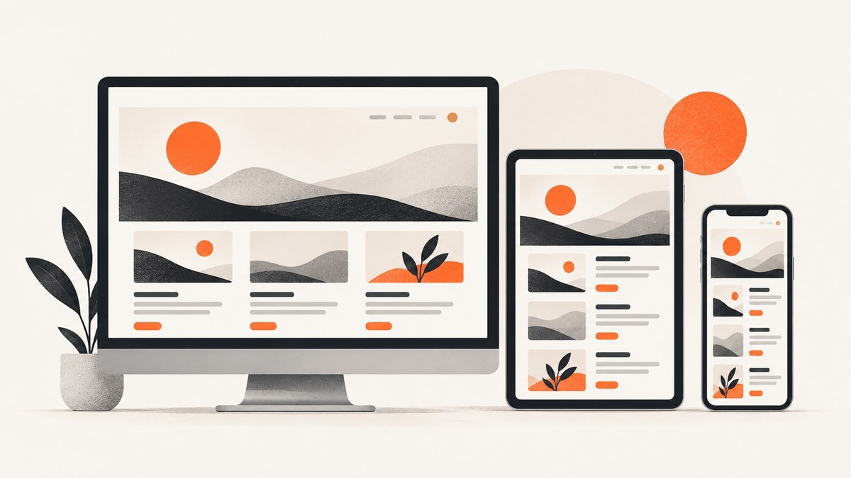
Short answer: use your browser’s responsive design tools to set a viewport width and height, then test the layout around its CSS breakpoints. A simulated viewport shows how the page layout responds to available space; it does not reproduce every property of a physical screen, operating system, browser interface, touch surface or mobile processor.
For a one-off investigation, browser DevTools is enough. For repeatable screenshots at many dimensions, automation is easier. This guide covers Chrome, Safari, Firefox and Edge, breakpoint testing, orientation, height-sensitive layouts, touch behavior, automation, troubleshooting and validation on real devices.
1. Screen resolution versus viewport size
“Screen resolution” commonly means the total pixel dimensions of a display, such as 1920 × 1080. Web layouts generally react to the browser viewport: the CSS width and height available to the document after browser chrome and other constraints. A device may have a high physical resolution but report a different CSS viewport because of device-pixel ratio and scaling.
When reproducing a responsive bug, record at least:
- Viewport width and height in CSS pixels.
- Browser and version.
- Operating system and zoom level.
- Orientation.
- Device-pixel ratio when a canvas, image or pixel-density issue is involved.
- Whether touch, a virtual keyboard or browser toolbars are present.
A viewport preview answers “what does this layout do at this available size?” It does not certify that the page behaves identically on the target phone. Chrome describes Device Mode as a “first-order approximation” of how a page looks and performs on a mobile device. For consequential device-specific behavior, confirm the result on real hardware or through remote debugging.
2. Simulate a resolution in Chrome DevTools
- Open the page in Chrome.
- Open DevTools with F12, Ctrl+Shift+I on Windows/Linux, or Cmd+Option+I on macOS.
- Click the Toggle device toolbar button, or press Ctrl+Shift+M / Cmd+Shift+M.
- Choose Responsive from the device selector.
- Enter the required width and height, or drag the viewport handles.
- Set the device scale factor only when you need to investigate pixel-density behavior. It does not replace changing the CSS viewport.
Chrome exposes convenient width presets including 320, 375, 425, 768, 1024, 1440 and 2560 pixels. Treat these as interface presets, not a universal list of correct breakpoints. A reported issue at 390 pixels should be reproduced at 390 pixels, even if no preset matches it.
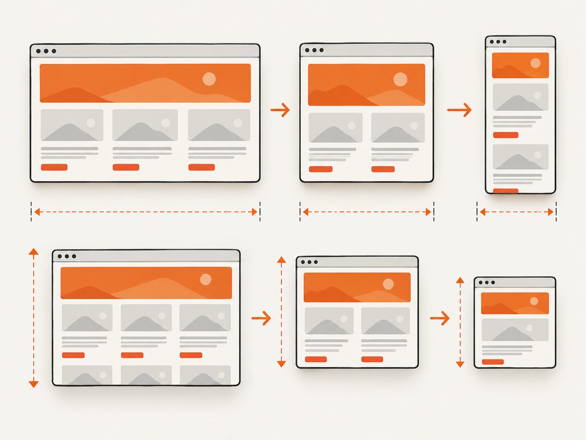
Find the breakpoint that changes the layout
Open the Device Toolbar’s More options menu and enable the media-query display. Chrome shows bars for min-width and max-width rules. Click a bar to move the viewport to that breakpoint, then test one or two pixels on each side. This catches navigation wrapping, cards changing columns, text overflow and controls that disappear abruptly.
For a breakpoint at 768 pixels, check at least 767, 768 and 769 pixels. Also test a realistic height at each width. A fixed bottom action may fit at 900 pixels high but cover content at 600 pixels.
3. Safari Responsive Design Mode
Safari’s responsive tools are available on macOS. First enable the Develop menu in Safari settings if it is hidden.
- Open the page in Safari.
- Choose Develop → Enter Responsive Design Mode.
- Choose a viewport preset or drag the viewport edges and corners.
- Rotate between portrait and landscape when orientation affects the layout.
- Reload after changing browser or device settings if the page only applies them during startup.
Safari documentation points out that browser interface elements, the address bar, the on-screen keyboard and device-specific form-field behavior can influence the visible area. A form that fits in a desktop-sized viewport may still be obscured when the iOS keyboard opens. Validate those flows on the actual target device.
4. Firefox Responsive Design Mode
- Open the page in Firefox.
- Open the menu and choose More tools → Responsive Design Mode, or use the Browser Tools shortcut.
- Enter a custom width and height or drag the bottom-right corner.
- Enable touch simulation for interactions that depend on touch events.
- Use the device-profile controls only when you need to preview a particular browser identity or user agent.
Firefox’s profile behavior can change the browser identity presented to the page. That is useful for a preview, but it is not proof that the real platform has identical APIs, fonts, input behavior or performance.
5. Microsoft Edge responsive mode
Edge uses the Chromium DevTools workflow. Open DevTools, toggle the device toolbar and select Responsive. Drag the viewport or type exact dimensions. When the page contains min-width or max-width media queries, Edge displays breakpoint bars above the viewport so you can jump to those thresholds and test both sides.
6. A repeatable resolution test plan
Do not test only the most popular phone and desktop sizes. Build a small matrix from the page’s actual CSS and the issue you need to reproduce.
| Test | Purpose |
|---|---|
| Exact reported width and height | Reproduce the bug before changing variables. |
| One or two pixels below each breakpoint | Find wrapping, overflow and visibility errors. |
| Breakpoint width | Check the exact rule transition. |
| One or two pixels above each breakpoint | Verify the new layout is stable. |
| Portrait and landscape | Catch orientation-specific changes. |
| Short and tall heights | Test sticky bars, dialogs and keyboard-sensitive content. |
| High and low device-pixel ratios | Find canvas, image and hairline rendering issues. |
Inspect the CSS instead of guessing device names
Search the stylesheet for media queries and container queries. A site may switch at 640 pixels, 720 pixels and 960 pixels rather than at a named phone or tablet width. If a component uses container queries, resizing the whole browser window may not reproduce the issue; resize the component’s containing block or use the layout tools to inspect it.
7. What viewport emulation does not reproduce
- Physical display characteristics: color gamut, brightness, refresh rate and viewing angle.
- Mobile performance: CPU, memory pressure, thermal throttling and network radio behavior.
- Browser chrome: dynamic address bars and safe-area insets can change the visible region.
- Input hardware: touch hit testing, gestures, hover availability and virtual keyboards.
- Platform rendering: fonts, form controls, text rasterization and GPU differences.
- Network conditions: latency, packet loss, captive portals and offline transitions.
Use emulation for layout feedback, then test important device-specific behavior on the target browser and hardware. Chrome, Safari, Firefox and Edge all document responsive modes as approximations rather than complete physical-device replacements.
8. Capture exact viewport sizes automatically
Automated browser tools are useful when you need a repeatable set of screenshots for pull requests or visual regression. The following Playwright example launches Chromium, sets a CSS viewport and saves a screenshot.
import { chromium } from 'playwright';

const browser = await chromium.launch();
const page = await browser.newPage({
  viewport: { width: 390, height: 844 },
  deviceScaleFactor: 1
});
await page.goto('https://example.com', { waitUntil: 'networkidle' });
await page.screenshot({ path: 'example-390x844.png', fullPage: true });
await browser.close();
Change width, height and deviceScaleFactor for each test case. Keep the browser version, fonts, locale, timezone and test data stable so image differences represent page changes rather than environment changes.
9. Or skip the browser setup
ScreenshotNeo accepts a URL and returns a PNG, JPEG, WebP or PDF with a chosen viewport and capture options. It supports full-page captures with lazy images loaded, element screenshots by CSS selector, dark mode, 12 device presets or any custom viewport, retina scale, custom CSS and JavaScript, click actions, selector or network-idle waits, request blocking, headers, cookies, user agents, timezone and geolocation.
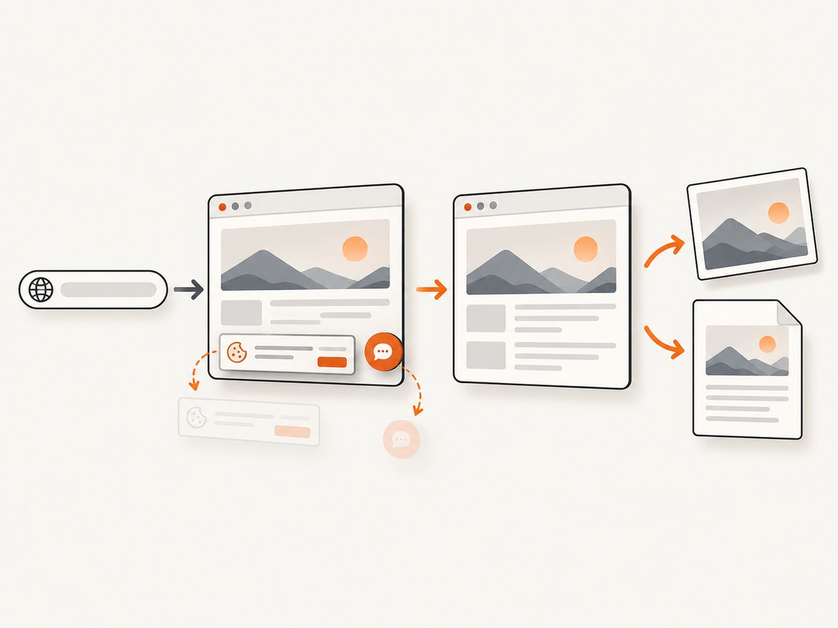
Cookie and consent banners are accepted before capture, and more than 60 known consent platforms, newsletter popups and chat widgets can be removed. Bot checks, blank pages, timeouts, failed loads and cache hits cost nothing; response headers identify the page verdict and whether it was billed. An MCP server provides take_screenshot, get_page_info and capture_pdf for Claude, Cursor and other MCP clients.
See the ScreenshotNeo API documentation for the complete parameter list. This is a minimal custom viewport request:
curl -G "https://api.screenshotneo.com/v1/shot" \
  -d access_key=YOUR_API_KEY \
  --data-urlencode url=https://stripe.com \
  -d width=390 \
  -d height=844 \
  -o shot.webp
import requests
r = requests.get(
"https://api.screenshotneo.com/v1/shot",
params={
"access_key": "YOUR_API_KEY",
"url": "https://stripe.com",
"width": 390,
"height": 844,
},
timeout=90,
)
r.raise_for_status()
open("shot.webp", "wb").write(r.content)const q = new URLSearchParams({
access_key: 'YOUR_API_KEY',
url: 'https://stripe.com',
width: '390',
height: '844'
});
const res = await fetch(`https://api.screenshotneo.com/v1/shot?${q}`);
if (!res.ok) throw new Error(`HTTP ${res.status}`);
await Bun.write('shot.webp', res);ScreenshotNeo bills only clean shots. Its free plan includes 1,000 screenshots per month with no card; paid plans start at $5 for 3,000 shots. Yearly billing provides two months free, and every feature is included on every plan. Create a free ScreenshotNeo account to capture your first viewport without installing a browser.
10. Troubleshooting
The page looks different from the real phone
Cause: emulation does not reproduce mobile browser chrome, fonts, touch behavior or performance. Fix: confirm the CSS viewport, zoom and device-pixel ratio, then test the flow on the actual browser and device.
The layout changes at an unexpected width
Cause: a media query, container query, scrollbar or browser zoom changes the available CSS width. Fix: inspect active rules in DevTools, test one pixel on each side of the breakpoint and check whether a vertical scrollbar reduces the layout width.
A screenshot cuts off content
Cause: the capture used the viewport rectangle instead of a full-page capture, or content loads after the screenshot. Fix: wait for a stable selector or network idle, scroll to trigger lazy loading, and enable full-page capture where appropriate.
Images or fonts are missing
Cause: blocked requests, cross-origin restrictions, slow resources or a font that has not finished loading. Fix: inspect the network panel, wait for the font and image selectors, and avoid taking the screenshot immediately after navigation.
The mobile menu cannot be opened
Cause: viewport emulation changed dimensions but did not perform the required click or touch action. Fix: click the menu in DevTools, enable touch simulation when relevant, or automate the click before capture.
A ScreenshotNeo request returns an error
Cause: missing or invalid API credentials, an inaccessible URL, or a timeout while the page loads. Fix: verify the access key, URL encoding and response status; increase the wait or timeout only when the page genuinely needs it. Check the X-Page-Verdict and X-Billed headers to distinguish a failed or blocked page from a clean billed shot.
11. Performance, reliability and cost
Local DevTools is fastest for interactive diagnosis because it avoids network capture infrastructure. Automated browsers add startup and page-load time, so reuse a browser process when generating many sizes and wait for a meaningful readiness condition instead of an arbitrary long delay. Keep screenshots deterministic by fixing locale, timezone, fonts, animations and test data.
For remote capture, reduce unnecessary work: use a selector capture when you do not need the whole document, block ads and analytics, cache stable pages with a TTL, and run bulk captures for up to 100 URLs per call. Async jobs with signed webhooks are useful for large batches. Treat cache hits, failed loads and bot checks according to the service’s verdict and billing headers rather than assuming every HTTP response is billable.
12. FAQ
What dimensions should I test?
Start with the exact dimensions from the bug report, then test immediately around every breakpoint found in the CSS. Add both orientations and a short height for overlays or sticky controls.
Is 1920 × 1080 a viewport size?
It can be, but it is usually a physical display resolution. Browser layout decisions use CSS viewport dimensions, which may be smaller because of browser chrome, scaling and device-pixel ratio.
Can DevTools prove that a page works on an iPhone?
No. It is a useful approximation for layout and many interaction checks. Confirm platform-specific behavior, keyboard handling, performance and rendering on the target device.
Should I use presets or custom dimensions?
Use presets for a quick survey and custom dimensions for a reported issue or a breakpoint test. The page’s own breakpoints are more useful than a generic device list.
When should I automate screenshots?
Automate when you need repeatable visual checks, many viewport sizes, pull-request comparisons or generated documentation. Keep a small manual pass for touch, keyboard and real-device behavior.


