How to Stack Growing Elements in Image Templates
Build image templates that expand cleanly as text and content grow with Figma Auto Layout, nested frames, wrapping, and grid guidance.

Direct answer: Put related layers in a vertical Auto Layout frame so each element follows the previous one as content grows. Set text width to Fill container when it should reflow within the parent and text height to Hug contents so additional lines increase the frame height. Use nested frames for components with their own internal arrangement. Choose wrap or grid only when the design should form multiple rows, columns, or cells.
Figma describes Auto Layout as a way for layouts to adjust when content changes or elements are added, removed, or resized, without manually repositioning every layer (Figma Auto Layout guide). This guide shows how to build that behavior into image templates, how to diagnose common failures, and when a vertical stack is the wrong model.
1. Start with the layout you actually need
Before applying Auto Layout, decide whether the content is a sequence, a row, or a two-dimensional arrangement.
| Layout need | Recommended flow | Typical example |
|---|---|---|
| Top-to-bottom content | Vertical Auto Layout | Title, description, metadata, actions |
| Side-by-side content | Horizontal Auto Layout | Icon beside a label, avatar beside a name |
| Items moving to new lines | Wrap | Tags or variable-length chips |
| Rows and columns with cell placement | Grid | Product tiles or a dashboard-like template |
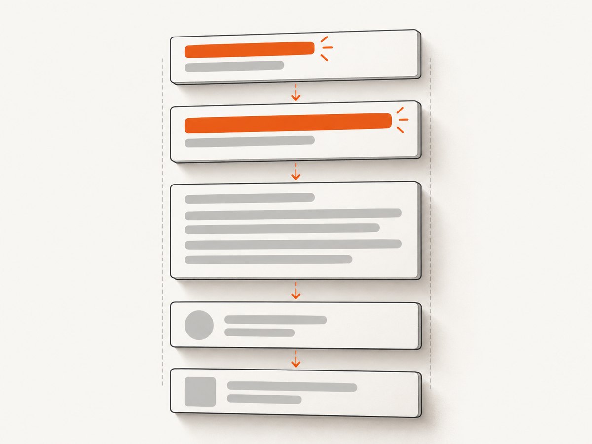
For a growing poster, social card, certificate, or report cover, the outer structure is usually vertical. That gives the parent a predictable y-axis and lets later elements move when an earlier text layer becomes taller.
2. Build a vertical stack in Figma
- Select the layers that belong together. Include the headline, supporting copy, image, metadata, and actions that should move as one unit.
- Apply Auto Layout. Use
Shift+Aor the Auto Layout control in the right panel. - Set the parent direction to Vertical. Figma’s vertical flow places children along the y-axis, so additions, removals, and reordering follow that axis (horizontal and vertical flows).
- Set a gap. Use the parent gap value for consistent spacing between children instead of adding independent spacer rectangles.
- Set padding. Add top, right, bottom, and left padding on the parent frame to control the content inset.
- Choose the parent width and height deliberately. A fixed width is useful for a standard export size. Let the height grow when the template must accommodate variable copy.
When you add a longer title, the title should become taller, the parent should expand, and every following child should move down. When you delete a child, the remaining gap and padding should remain governed by the parent.
3. Make text sizing intentional
Text sizing controls whether the stack can actually grow. Select a text layer inside the vertical frame and set its horizontal resizing to Fill container when lines should wrap to the parent width. Set vertical resizing to Hug contents so the text box grows with the number of lines.
- Fill container width: The text uses the available width inside its parent. A longer sentence wraps instead of extending outside the frame.
- Hug contents height: The text box increases in height as lines are added and decreases when copy is removed.
- Fixed width: Useful when the text column must remain a precise width, such as a two-column composition.
- Fixed height: Use only when clipping or a deliberate text window is part of the design.
Check line height, paragraph spacing, and font substitution as well. A font that is unavailable on another machine can change line breaks and therefore change the final height. Keep the text layer inside the Auto Layout frame; a text object positioned independently on the canvas will not participate in the stack.
4. Nest frames for mixed layouts
A real template often combines vertical and horizontal relationships. Keep each relationship in its own frame.
- Create an outer vertical frame for the full card.
- Create a horizontal inner frame for an icon and its copy.
- Put the icon and text inside that horizontal frame.
- Set the inner text width to Fill container and height to Hug contents.
- Place the inner frame in the outer vertical stack.
The outer frame controls the order and spacing of sections. The inner frame controls the icon-to-copy relationship. Figma’s documented combined-flow examples use this pattern for profile and social-post structures (combine vertical, horizontal, and grid flows).
For a card with a title, body, and buttons, use one vertical content frame. For a button row, use a horizontal frame inside it. If buttons should move to a new line when space runs out, enable wrapping on that button frame rather than changing the entire card to wrap.
5. Control alignment, padding, and flexible space
Alignment determines how children behave when their sizes differ. Use top alignment when variable-height text should share a common top edge. Use center alignment for a compact icon-and-label row. Use the parent gap for normal spacing and padding for the edge inset.
Use Space between only when the remaining space should be distributed between children, such as a header with a title on the left and an action on the right. It is usually a poor choice for a content stack whose height changes frequently because the apparent spacing changes with the frame size.
A flexible spacer can push a footer to the bottom of a fixed-height composition. Keep that spacer inside the parent and understand that it consumes leftover space; if the content becomes taller than the fixed height, the footer may be pushed out or clipped.
6. Use components and variables for repeatable templates
Turn the completed stack into a component when many templates share the same structure. Expose text, image, and visibility properties so each instance can change content without breaking the frame hierarchy.
Use variables for repeated values such as spacing, colors, or copy variants. Keep the Auto Layout rules in the component and vary only the content and supported properties. A variant with a longer headline should use the same Fill container and Hug contents rules as the short variant.
For responsive exports, define a small set of supported widths and inspect the longest expected copy at each width. A layout that works at one width can still fail when the text column becomes narrow enough to create an unexpected number of lines.
7. Wrap versus grid: choose based on overflow behavior
Wrap and grid solve different problems from a simple vertical stack.
Wrap
Wrap moves children to another row or column when the available space runs out. It is useful for tags, badges, and variable-length controls. Figma documents that vertical wrap preserves Auto Layout order and moves to another column only after the available height is reached; it is not masonry (Auto Layout guide).
Grid
Grid places children in cells and can support spans. Use it when each item belongs to a row-and-column coordinate, such as a gallery or product tile area. Do not switch a simple title-and-description stack to grid just because the content grows; grid introduces cell sizing and placement rules that are unnecessary for a one-dimensional sequence.
| Question | Vertical stack | Wrap | Grid |
|---|---|---|---|
| Does order follow one axis? | Yes | Yes, with new lines | Usually row and column positions |
| Does a taller text block push later content? | Yes | Within its line or column rules | According to cell sizing |
| Best for | Document-like sections | Tags and flowing controls | Two-dimensional collections |
8. Handle images, fixed regions, and optional content
Decide whether an image should have a fixed aspect ratio or a fixed height. A fixed aspect ratio lets its height change with width, which can increase the parent height. A fixed height preserves the composition but may crop or leave unused space.
Keep optional sections as children of the same parent and hide the section when it is not needed. The parent should close the resulting gap automatically. Avoid leaving invisible spacer layers that still consume layout space unless that blank region is intentional.
For badges or labels that must remain attached to an image corner, use an inner frame for the image and overlay. Keep that inner frame as one child of the vertical stack. This prevents the badge from becoming an unrelated item that shifts independently.
9. Validate with short and long content
- Use the shortest realistic headline and body copy.
- Replace them with the longest copy your product permits.
- Check that text wraps inside its width and grows in height.
- Confirm that following elements move without overlap.
- Toggle optional sections off and on.
- Try a missing image, a tall image, and a different language if localization is planned.
- Inspect the exported image at the final pixel dimensions.
This is a design validation procedure, not a claim about measured performance. The goal is to expose constraint mistakes before the template is used for many content variations.
10. Troubleshooting common failures
| Symptom | Likely cause | Fix |
|---|---|---|
| Long text overlaps the next element | Text height is fixed or the layer is outside Auto Layout | Set height to Hug contents and move the layer inside the stack. |
| Text runs outside the card | Text width is fixed or wider than the parent | Set width to Fill container or reduce the text column width. |
| Everything becomes the same width | Children are set to Fill container unintentionally | Set icons, badges, and buttons to Hug contents where appropriate. |
| Spacing changes unpredictably | Space between or manual spacer layers are being used | Use a fixed gap and parent padding for normal content spacing. |
| Footer disappears | Fixed parent height is smaller than the expanded content | Allow the parent to grow or define an intentional clipping region. |
| Wrap order looks wrong | Wrap direction or available height is different from the intended reading order | Verify the flow direction and remember that vertical wrap is not masonry. |
| Icon and text drift apart | They are separate children of the outer frame | Put them in a nested horizontal frame. |
| Export differs from the design file | Font substitution, image scaling, or a different frame size | Confirm fonts, image fit settings, and export dimensions. |
11. Performance, reliability, and cost considerations
For a Figma file, a shallow and predictable hierarchy is easier to maintain than many layers of independent positioning. Nest only where a component needs a different flow. Reuse components for repeated structures, and keep variable content within documented limits.
If you generate many final images automatically, rendering reliability becomes a separate concern from the layout rules. Verify the target URL, wait for the content that must appear, and record whether a capture succeeded. A failed render should be retried or flagged rather than silently published.
When choosing a screenshot service, compare how it treats failed pages and cache hits, whether it can wait for dynamic content, and whether it supports the output format you need. ScreenshotNeo reports page verdict and billing status in response headers; clean shots are billed, while bot checks or CAPTCHAs, blank pages, timeouts, failed loads, and cache hits cost nothing.
12. Or skip the browser setup
If your goal is to produce rendered images from a URL rather than maintain a browser automation stack, ScreenshotNeo provides a one-request website screenshot API and MCP server. It can capture PNG, JPEG, WebP, or PDF output. See the ScreenshotNeo documentation for the complete parameter reference.

curl -G "https://api.screenshotneo.com/v1/shot" -d access_key=YOUR_API_KEY --data-urlencode url=https://stripe.com -o shot.webpimport requests
r = requests.get("https://api.screenshotneo.com/v1/shot", params={"access_key": "YOUR_API_KEY", "url": "https://stripe.com"}, timeout=90)
open("shot.webp", "wb").write(r.content)const q = new URLSearchParams({ access_key: 'YOUR_API_KEY', url: 'https://stripe.com' });
const res = await fetch(`https://api.screenshotneo.com/v1/shot?${q}`);For growing image templates, relevant options include full-page capture with lazy images loaded, capturing one element by CSS selector, custom CSS and JavaScript, waiting for a selector, delay, or network idle, dark mode, device presets or any viewport, retina scale, transparent backgrounds, image resizing, custom headers and cookies, and hiding selectors. You can also block ads, trackers, requests, or resource types before capture.
Use caching with a TTL you choose when the same URL can be reused. Use signed links for public image tags, asynchronous jobs with signed webhooks for longer workflows, and bulk capture for up to 100 URLs per call. The usage API and OpenAPI specification help you monitor and integrate the service.
ScreenshotNeo removes cookie and consent banners, newsletter popups, and chat widgets before capture; each cleanup step can be turned off. Bot checks, blank pages, failed loads, timeouts, and cache hits are not billed, and the response identifies the page verdict and billing result with X-Page-Verdict and X-Billed headers. Its MCP server includes take_screenshot, get_page_info, and capture_pdf tools for Claude, Cursor, and other MCP clients.
The Free plan includes 1,000 shots per month with no card. Paid plans start at $5 for 3,000 shots; every feature is available on every plan, and yearly billing gives two months free. Create a free ScreenshotNeo account to start with the 1,000 monthly shots.
13. Short FAQ
Should the outer frame be fixed height?
Only when the exported composition must always have a fixed canvas. Otherwise let the vertical frame grow with its content and define the final export frame separately.
Why does Hug contents not make the whole card grow?
Every relevant parent must permit growth. Check the text height, the immediate nested frame height, and the outer frame height for fixed constraints or clipping.
Can I mix horizontal and vertical Auto Layout?
Yes. Put each direction in its own nested frame and make the outer frame responsible for the larger sequence.
Is wrap a replacement for masonry?
No. Figma documents that vertical wrap preserves Auto Layout order and changes columns after the available height is reached; it does not create masonry packing.
When should I use grid?
Use grid when items need row-and-column placement or cell spans. Use a vertical stack when one section should simply follow another.
Can ScreenshotNeo capture only the template element?
Yes. ScreenshotNeo supports capturing one element by CSS selector, along with full-page capture and other wait, styling, and output options.


