SVG vs. PNG in HTML: Which Should You Use?
Use SVG for scalable vector artwork and PNG for pixel-precise images or transparency. Compare rendering, accessibility, caching and responsive HTML before you choose.

Use SVG for vector artwork that must stay sharp at different sizes—such as icons, logos, interface elements, and diagrams. Use PNG when you need a specific pixel-level appearance or raster transparency. There is no universal winner for file size or speed: compare the actual assets. For photographs, consider WebP or AVIF too, subject to your browser support requirements.
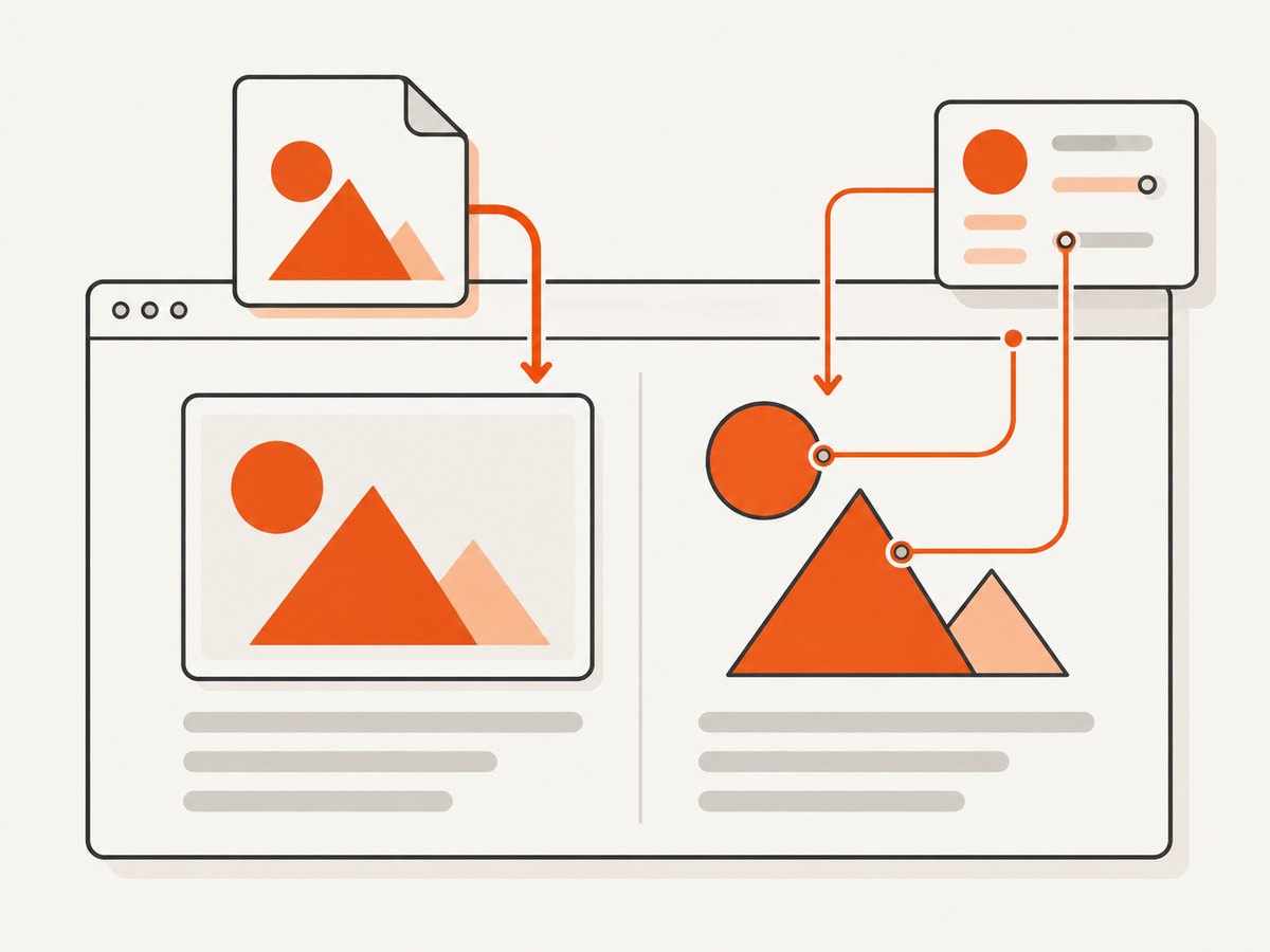
In HTML, both formats can be displayed with <img>. Choose an external SVG image when it is artwork to display; use inline SVG when you need to style or manipulate its shapes directly. Give informative images useful text alternatives, and reserve empty alternatives for images that add no information.
1. What SVG and PNG represent
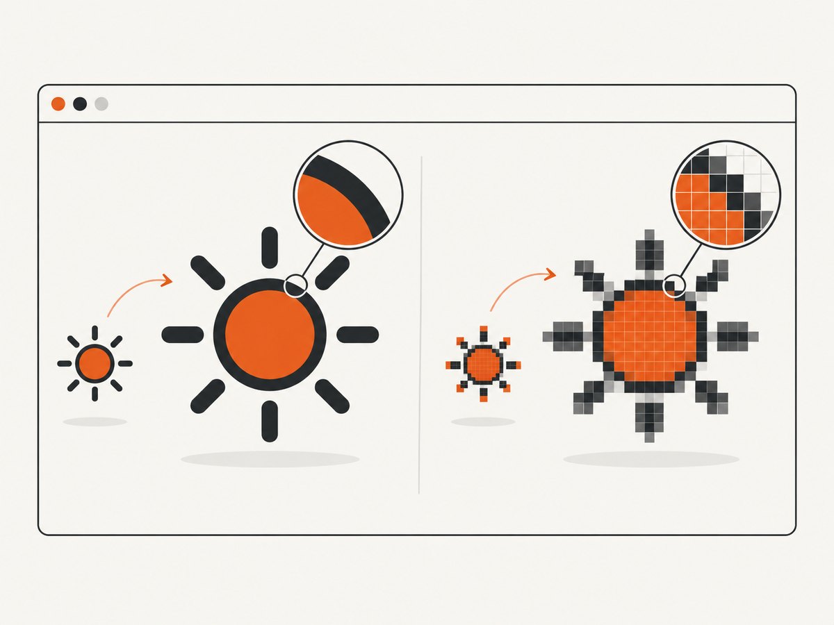
SVG describes shapes and paths using vector markup. The browser renders those instructions at the size needed, which makes SVG suitable for artwork that changes display size. PNG stores a grid of pixels. It can reproduce a raster image precisely, but enlarging it beyond its intended resolution can make the pixels visible.
| Question | SVG | PNG |
|---|---|---|
| How is the image represented? | Vector geometry and markup | Raster pixels |
| Typical fit | Icons, logos, diagrams, interface graphics | Pixel-precise artwork, screenshots, raster graphics |
| What happens when enlarged? | Vector art can be rendered at a new size | Pixels may become visible beyond the intended resolution |
| Can it be used in an img element? | Yes | Yes |
| Can the document directly style its parts? | Inline SVG exposes its markup | No; it is a raster image |
These are format characteristics, not a guarantee that any given SVG is smaller or faster than any given PNG. Complexity, encoding, dimensions, caching, and how an asset is embedded all matter. MDN’s image format guide discusses SVG and raster formats, including WebP and AVIF.
2. Which should you use? A practical decision
- Identify the artwork. Is it made of scalable shapes, paths, and labels, or is it fundamentally a grid of pixels? Start with SVG for the former and PNG for the latter.
- Check how it will be displayed. If an icon or diagram needs to render at several sizes, SVG is a natural fit. If you need to preserve exact raster pixels, use a raster source with enough resolution for the layout.
- Decide whether the graphic needs direct manipulation. An external SVG in an
imgis displayed as an image. Inline SVG lets the document reach its SVG elements for styling and interaction. PNG remains an image rather than editable vector markup. - Set accessibility and layout behavior. Add an appropriate text alternative and explicit dimensions; responsive raster images may need candidate sizes.
- Compare real outputs when size or speed matters. Inspect the actual encoded files and test them in the target layout and browsers. The format name alone does not determine which is faster.
Use SVG for scalable interface artwork
SVG is generally a good choice for icons, logos, and diagrams whose edges should remain clean at different display sizes. An external SVG file keeps the artwork as a separate resource. It can be reused in more than one place and cached independently of the HTML document.
SVG loaded in an image context has security restrictions: scripts do not run, and external resources such as stylesheets or images may not load. If the graphic only needs to be displayed, this image behavior is often appropriate. If you need interaction with SVG content, choose the embedding method deliberately. MDN explains the differences in its guide to SVG as an image.
Use PNG for pixel-level raster artwork
PNG is appropriate when you need to preserve raster details and transparency. Make sure the source has enough pixels for its displayed size, especially on high-density screens. A small PNG scaled up can look soft or visibly pixelated; exporting a larger source can help, at the cost of more image data.
For photographic images, also compare WebP or AVIF. MDN notes that newer formats can offer better compression, while browser support differs. Select based on your target browsers and the real image rather than assuming PNG is the best photographic format.
3. Display either format with an img element
For a standalone asset, <img> is the straightforward choice. It gives the browser a separate resource to load, works for both formats, and supports alternative text. Set dimensions to reserve layout space while the asset loads.
<!-- Informative SVG image -->
<img
  src="/assets/architecture.svg"
  alt="Diagram showing the web app, API, and database connections"
  width="640"
  height="360"
  role="img"
>

<!-- Decorative PNG beside equivalent text -->
<img
  src="/assets/section-flourish.png"
  alt=""
  width="96"
  height="24"
>
The SVG role="img" attribute addresses a VoiceOver announcement issue documented by MDN for SVG-source img elements. For the informative diagram, write an alt that communicates its purpose, not a filename or a list of visual details the surrounding content already explains. For a purely decorative asset whose meaning is redundant, alt="" avoids adding unnecessary spoken content. See MDN’s img reference.
Responsive PNG with srcset and sizes
If you provide multiple raster resolutions, srcset and sizes let the browser select an appropriate candidate for the layout. The width descriptors below correspond to the intrinsic widths of the image files.
<img
  src="/assets/chart-800.png"
  srcset="/assets/chart-400.png 400w,
          /assets/chart-800.png 800w,
          /assets/chart-1200.png 1200w"
  sizes="(max-width: 600px) 100vw, 800px"
  alt="Quarterly revenue by region"
  width="1200"
  height="675"
>
Adjust the candidate files and sizes expression to match the actual layout. A wrong declaration can prompt the browser to choose an unnecessarily large candidate or one that does not suit the rendered width. Responsive image selection is covered in MDN’s img documentation.
4. Use inline SVG when the document needs its shapes
Inline SVG becomes part of the HTML. This is useful when CSS or JavaScript needs to target its paths or other SVG elements directly. It also places the markup in the document, which can increase HTML size; unlike an external image resource, it does not have the same independent asset caching behavior.
<svg
  role="img"
  aria-labelledby="status-title"
  viewBox="0 0 160 40"
  width="160"
  height="40"
  xmlns="http://www.w3.org/2000/svg"
>
  <title id="status-title">Service status: operational</title>
  <circle class="status-dot" cx="20" cy="20" r="8" />
  <text x="38" y="25">Operational</text>
</svg>
For inline SVG, MDN describes labeling with role="img" and a <title>, or using aria-labelledby to connect the graphic to a title or visible text. A longer explanation can use <desc>. Choose the label to fit the graphic’s purpose and avoid reading out redundant detail. MDN’s SVG in HTML introduction describes these patterns.
Use an external SVG in <img> when you want a separately reusable image and do not need to target its internal shapes. Avoid switching to object, embed, or iframe just to display ordinary artwork: these embed SVG as a document and differ from image-mode security behavior. Use them only when document embedding is actually needed.
5. Avoid layout shifts and oversized assets
- Set width and height. Use the image’s intrinsic aspect ratio so the browser can allocate space before the resource finishes loading.
- Use appropriately sized sources. Do not rely on CSS to shrink an enormous PNG on every visit. Provide responsive candidates when layouts need different raster resolutions.
- Keep SVG geometry intentional. Check its view box and displayed dimensions; a malformed or unexpected aspect ratio can cause cropping or excess whitespace.
- Measure the encoded asset. SVG path complexity can make a file large, while a simple raster image may be compact. PNG dimensions and visual detail also affect its encoded size.
- Test the real context. Compare loading and rendering with the same layout, cache state, and target browsers. There is no general performance result that follows from SVG or PNG alone.
6. Troubleshooting common problems
| Symptom | Likely cause | Fix |
|---|---|---|
| PNG looks blocky when enlarged | The source pixel dimensions are too small for its rendered size. | Use a larger source or responsive candidates with srcset and sizes. |
| SVG looks fuzzy or has unexpected whitespace | The artwork, view box, or CSS sizing may not match the intended aspect ratio; the displayed content may also be a raster image inside the SVG. | Inspect the SVG view box and contained artwork, then set deliberate dimensions and fit behavior. |
| SVG styles or external images do not appear in an img element | SVG image mode restricts scripts and loading of external resources. | Make the SVG self-contained, or select document embedding only when its behavior is required. |
| Inline SVG title is not announced as expected | The SVG lacks an accessible role or programmatic relationship to its label. | Apply an appropriate role="img" and <title>, or use aria-labelledby; verify the result with the assistive technology relevant to your audience. |
| Page content jumps when an image loads | The browser did not have dimensions with which to reserve space. | Set width and height that preserve the asset’s aspect ratio. |
| Browser downloads an unexpectedly large responsive image | The sizes expression, candidate widths, or descriptors do not reflect the rendered layout. |
Update the candidates and declared slot sizes, then inspect the chosen resource at representative viewport widths. |
| PNG is larger than expected | The image dimensions or pixel detail require more encoded data. | Export only the necessary dimensions; for photographs, compare WebP or AVIF where supported. |
7. Inspect the rendered result with a screenshot
A screenshot can help review whether SVG edges stay clear at intended viewport sizes, whether a PNG is visibly pixelated, and whether dimensions or cropping create layout surprises. Capture representative desktop and narrow layouts, then compare the rendered page rather than judging only the source file.
Capture a page locally with a browser
A browser automation tool can render a page and save a screenshot. For example, with Playwright installed in a project, this Node.js script navigates to a page, waits for images to load, and captures the viewport:
// npm install playwright
const { chromium } = require('playwright');

(async () => {
  const browser = await chromium.launch({ headless: true });
  const page = await browser.newPage({
    viewport: { width: 1440, height: 1000 },
    deviceScaleFactor: 1,
  });
  await page.goto('https://example.com', { waitUntil: 'networkidle' });
  await page.locator('img').evaluateAll(images =>
    Promise.all(images.map(img => img.decode().catch(() => {})))
  );
  await page.screenshot({ path: 'page.png', fullPage: true });
  await browser.close();
})();
For a visual check, you can also render a test page containing the asset and inspect its screenshot at the target viewport. This helps catch CSS sizing, unexpected whitespace, and cropping. A screenshot does not replace checking keyboard use, accessible names, or actual assistive technology behavior.
Or skip the browser setup
ScreenshotNeo is a website screenshot API and MCP server. One GET request returns an image or PDF, and the response reports whether a page was billed. Cookie banners, popups, and chat widgets are removed before the shot; bot checks, blank pages, timeouts, and failed loads are never billed. An MCP server lets AI agents use screenshot tools. The free plan includes 1,000 screenshots a month with no card; paid plans start at $5 for 3,000. See the API documentation.
curl -G "https://api.screenshotneo.com/v1/shot" \
  -d access_key=YOUR_API_KEY \
  --data-urlencode url=https://example.com \
  -o shot.webp
Sign up for 1,000 free screenshots a month, with no card.
8. Frequently asked questions
Can I use SVG and PNG on the same page?
Yes. Choose a format for each asset based on whether it is vector artwork or raster imagery, and use whichever embedding method fits that asset.
Should every logo be SVG?
SVG is a natural fit for a logo drawn as vector shapes and displayed at multiple sizes. If the supplied artwork is raster, use a sufficiently large raster source or obtain a vector version when scaling quality matters.
Does inline SVG always load faster?
No. Inline markup can avoid a separate asset request, but it adds to the document and does not have the same independent caching behavior as an external SVG. Compare the actual page and reuse pattern.
Is PNG the right format for every transparent image?
No. PNG supports transparency, but the appropriate format depends on the artwork, browser requirements, and available alternatives. Compare the actual file and supported formats for the page.


