How to Test Responsive Design
A practical responsive-testing workflow covering viewports, browsers, accessibility, real devices, automation, and repeatable screenshots.

Short answer: Test responsive design at viewport widths and device conditions that reflect your real audience, then verify layout, interaction, accessibility, performance, and content reflow. Use Chrome DevTools for fast coverage, Lighthouse for automated audits, and representative physical iOS and Android devices for release-critical flows. Record the exact viewport, browser, orientation, network, steps, and evidence for every defect.
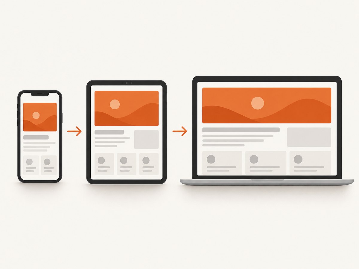
Responsive design is more than making a desktop page narrower. A responsive page uses flexible layouts, media queries, responsive images and media, readable typography, and the viewport meta tag so content adapts to available space. MDN describes responsive web design as an approach that adapts a page across device sizes, from phones and tablets to televisions and watches. MDN responsive design
1. Define what “responsive” must mean for your site
Before opening a browser tool, list the experiences that must work. A useful test covers five dimensions:
- Layout: columns, navigation, cards, tables, images, and spacing reflow without clipping or horizontal scrolling.
- Content: headings, labels, prices, error messages, and long words remain visible and understandable.
- Interaction: menus, dialogs, forms, carousels, sticky controls, checkout, and sign-in flows work with touch and keyboard input.
- Accessibility: zoom, keyboard focus, screen-reader structure, target size, contrast, and reflow preserve information and functionality.
- Performance: the page remains usable on slower networks and hardware, including when images, fonts, and scripts load progressively.
Do not choose breakpoints from a universal device list. Start with analytics and support data: identify the browsers, operating systems, screen sizes, and orientations your users actually have. MDN recommends prioritizing common combinations because testing every possible combination is impractical. MDN testing guidance
2. Check the document and CSS foundation
Many apparent responsive bugs begin with a missing viewport declaration or inflexible content. Confirm these basics before investigating a particular breakpoint.
<!doctype html>
<html lang="en">
<head>
  <meta name="viewport" content="width=device-width" />
  <title>Responsive page</title>
  <style>
    *, *::before, *::after { box-sizing: border-box; }
    body { margin: 0; font: 1rem/1.5 system-ui, sans-serif; }
    .wrapper { width: min(100% - 2rem, 72rem); margin-inline: auto; }
    .grid { display: grid; grid-template-columns: repeat(3, 1fr); gap: 1rem; }
    img, video { display: block; max-width: 100%; height: auto; }
    @media (max-width: 48rem) {
      .grid { grid-template-columns: 1fr 1fr; }
    }
    @media (max-width: 32rem) {
      .grid { grid-template-columns: 1fr; }
    }
  </style>
</head>
<body>…</body>
</html>
The width=device-width viewport tag tells mobile browsers to use the device width. Without it, a phone can render a desktop-width layout and prevent narrow-screen media queries from behaving as intended. Prefer fluid grids, flexbox, intrinsic sizing, and content-driven breakpoints. Use max-width: 100% where images should shrink with their container, and check that long URLs, code samples, tables, and translated strings cannot force overflow.
3. Build a realistic browser and device matrix
Create a small, explicit matrix instead of claiming coverage for every device. Include the combinations that represent your audience and the flows that carry the most risk.
| Axis | What to include | Why it matters |
|---|---|---|
| Width | Narrow phone, intermediate width, common laptop, wide desktop | Find wrapping and breakpoint defects between presets |
| Orientation | Portrait and landscape on phones and tablets | Landscape often exposes navigation and height problems |
| Browser | Representative current desktop browsers plus current iOS and Android browsers | Rendering and input behavior differ by engine and platform |
| Pixel density | Standard and high-density screens | Reveals blurry assets and density-related sizing mistakes |
| Network | Fast connection and throttled mobile conditions | Shows layout shifts, slow media, and timeout behavior |
| Input | Mouse, touch, keyboard, and zoom | Responsive behavior includes interaction, not only pixels |
Choose boundary widths around actual layout changes. If a card row changes from three columns to two at 48rem, test just below, exactly at, and just above that value. Also test intermediate widths that are not device presets; these are where fixed assumptions commonly fail.
4. Use Chrome DevTools for fast viewport coverage
Chrome Device Mode is the fastest way to explore many widths and diagnose media-query behavior. Chrome documents emulation for screen size and resolution, network conditions, media queries, touch, geolocation, and orientation. Chrome Device Mode documentation
- Open the page in Chrome and choose More tools → Developer tools.
- Toggle the device toolbar, then choose a preset or select Responsive.
- Drag the viewport through narrow, intermediate, and wide widths. Pause at every breakpoint and at awkward in-between widths.
- Rotate the emulated device and inspect both portrait and landscape layouts.
- Turn on the media-query inspector to see which rules are active.
- Enable touch emulation and use the page as a finger user: tap menus, controls, and carousel gestures.
- Throttle the network, reload, and watch for missing content, layout shifts, and controls that become unusable while loading.
- Use the sensors or location controls when the page changes by geolocation or orientation.
Inspect the page at the moment a problem appears. Look for a fixed-width child, an unbreakable string, a transformed element extending beyond the viewport, or a positioned control that is anchored to the wrong container. The Elements panel and computed styles usually reveal the cause faster than repeatedly resizing.
5. Exercise behavior at every important width
A screenshot can look correct while the flow is broken. At each matrix point, run a short interaction script:
- Open and close the main navigation, nested menus, dialogs, and cookie controls.
- Submit valid and invalid forms. Confirm labels, helper text, validation errors, and focus remain visible.
- Scroll through sticky headers, footers, tables, and long cards. Check that fixed elements do not cover content.
- Use carousels with touch and keyboard input. Ensure controls are reachable and the active item is obvious.
- Zoom the page and increase text size where supported. Content should reflow instead of being clipped.
- Try long names, translated strings, large prices, empty states, and server errors.
- Test sign-in, checkout, search, and other revenue or support-critical paths on slow loading conditions.
Record horizontal overflow explicitly. A page can have a deliberate full-bleed element, so inspect the overflowing node rather than hiding the issue globally with overflow-x: hidden. That declaration can conceal broken content and make keyboard users lose access to controls.
6. Test accessibility and reflow manually
Responsive testing must include people who zoom, use a keyboard, or rely on assistive technology. Chrome notes that automated checks cannot determine whether a person can navigate a page with a keyboard or screen reader, so perform those interactions manually. Chrome accessibility reference
- Tab through the page at narrow and wide widths. Focus indicators must stay visible and move in a logical order.
- Use a screen reader to verify headings, landmarks, labels, dialog announcements, and error messages.
- Zoom to 200% and inspect whether content remains available without two-dimensional scrolling where reflow is expected.
- Check touch targets, contrast, text spacing, and motion-sensitive interactions.
- Open the on-screen keyboard on a phone and confirm that focused fields and submit buttons remain visible.
Reflow is a functional requirement: preserving information and controls matters more than preserving a particular visual arrangement. Test dynamically while resizing, not only after a fresh load, because scripts that measure the viewport can fail during a resize.
7. Add automated audits with Lighthouse
Lighthouse runs in Chrome DevTools, from the command line, or as a Node module. It audits performance, accessibility, SEO, and other quality areas; Lighthouse CI can detect regressions over time. Lighthouse documentation
Run it at representative mobile and desktop settings, authenticated and unauthenticated states where applicable, and on pages with real content. Treat a score or failed audit as an investigation lead. A passing audit does not prove that a keyboard user can complete checkout, that a dialog is understandable, or that every breakpoint is correct.
npx lighthouse https://example.com \
  --preset=desktop \
  --output=html \
  --output-path=./lighthouse-desktop.html

npx lighthouse https://example.com \
  --form-factor=mobile \
  --screenEmulation.mobile=true \
  --output=html \
  --output-path=./lighthouse-mobile.html
For CI, save the configuration and compare the same URL, viewport, throttling profile, and authentication setup on every run. Investigate changes in cumulative layout shift, image sizing, render-blocking resources, and accessibility violations alongside visual diffs.
8. Confirm release-critical flows on physical devices
Emulation provides breadth and quick feedback, but simulation does not reproduce every hardware, browser-rendering, CPU, GPU, battery, touch, or viewport-chrome condition. BrowserStack makes this distinction for its real-device testing guidance, and MDN recommends physical devices for the greatest accuracy. MDN device-testing guidance BrowserStack responsive-testing guidance
Use at least one representative iOS phone and one Android phone when those platforms matter. Add a tablet when tablet traffic or a tablet-specific layout is significant. Check:
- Browser address-bar expansion and collapse changing the visual viewport.
- On-screen keyboard behavior and focus visibility.
- Touch scrolling, momentum, pinch zoom, and gesture conflicts.
- Performance on slower CPUs and when the device is low on battery.
- Orientation changes during a form or media flow.
- Camera, file upload, payment, and authentication flows that emulators may not reproduce accurately.
If you lack a device lab, a real-device cloud can extend coverage. Verify the provider’s current device list, pricing, browser versions, and program terms before selecting one.
9. Capture reproducible defects
A responsive bug is only useful when another person can reproduce it. For every defect, save:
- URL, build identifier, and authentication state.
- Device or viewport width and height, pixel density, and orientation.
- Browser name and version, operating system, and input method.
- Network condition, geolocation, and any custom headers or feature flags.
- Exact steps, expected behavior, actual behavior, and whether a refresh changes it.
- A screenshot or video, plus console errors and a performance trace when relevant.
Keep a small regression set of pages and widths. Run it after changes to navigation, typography, shared components, breakpoints, or image handling. A stable set of captures makes visual changes reviewable and prevents fixes for one width from breaking another.
10. Or skip the browser setup
ScreenshotNeo provides a website screenshot API and MCP server. It accepts one GET request and returns PNG, JPEG, WebP, or PDF output. Its capture options include full-page screenshots with lazy images loaded, CSS-selector element capture, dark mode, 12 device presets or any viewport, retina scale, custom CSS and JavaScript, click and wait actions, hidden selectors, blocked ads and trackers, custom headers, cookies, user agents, authorization, timezone, geolocation, transparent backgrounds, resizing, caching, signed links, asynchronous jobs, webhooks, bulk capture for up to 100 URLs, a usage API, and an OpenAPI specification. Parameter names used by other screenshot APIs also work, which can simplify migration. See the ScreenshotNeo documentation.

For a responsive test, capture the same URL at each matrix width and compare the returned files. A clean capture accepts cookie or consent banners before the shot and removes more than 60 known consent platforms, newsletter popups, and chat widgets. Each step can be disabled when you need to test that UI itself.
curl -G "https://api.screenshotneo.com/v1/shot" -d access_key=YOUR_API_KEY --data-urlencode url=https://stripe.com -o shot.webpimport requests
r = requests.get(
"https://api.screenshotneo.com/v1/shot",
params={"access_key": "YOUR_API_KEY", "url": "https://stripe.com"},
timeout=90,
)
r.raise_for_status()
open("shot.webp", "wb").write(r.content)const q = new URLSearchParams({ access_key: 'YOUR_API_KEY', url: 'https://stripe.com' });
const res = await fetch(`https://api.screenshotneo.com/v1/shot?${q}`);
if (!res.ok) throw new Error(`Screenshot failed: ${res.status}`);
const data = new Uint8Array(await res.arrayBuffer());
await Bun.write('shot.webp', data);For each viewport, add the relevant API parameters from the documentation for width, height, device preset, full-page mode, format, scale, wait condition, custom CSS, or selector capture. Inspect X-Page-Verdict and X-Billed in the response: bot checks or CAPTCHAs, blank pages, timeouts, failed loads, and cache hits are not billed, and the headers identify the result. ScreenshotNeo also provides an MCP server with take_screenshot, get_page_info, and capture_pdf tools for Claude, Cursor, and other MCP clients.
Why use it for a test matrix: cookie banners, popups, and chat widgets are removed before the shot; bot checks, blank pages, and failed loads are never billed; an MCP server lets AI agents take screenshots; 1,000 screenshots a month are free with no card, and paid plans start at $5 for 3,000. Create a free ScreenshotNeo account.
11. Troubleshooting common responsive-testing failures
| Symptom | Likely cause | Fix |
|---|---|---|
| Phone shows a desktop layout | Missing or malformed viewport meta tag | Add <meta name="viewport" content="width=device-width" /> and reload without a cached document. |
| Horizontal scrollbar appears | Fixed-width child, long token, oversized media, or negative margin | Inspect the overflowing element; use intrinsic sizing, wrapping, and responsive media. |
| Menu opens off-screen | Absolute positioning is anchored to the wrong ancestor | Set the intended positioning context and test both orientations. |
| Text is clipped after zoom | Fixed height, hidden overflow, or absolute positioning | Allow content-driven height and reflow; retest at 200% zoom. |
| Screenshot is blank | Page timed out, failed to load, or is blocked by a bot check | Check the URL, authentication, wait condition, and response verdict; inspect server and browser logs. |
| Capture includes a consent banner | Consent handling was disabled or the platform is not recognized | Enable consent handling, or hide the banner with a documented selector/custom script when appropriate. |
| Visual diff changes every run | Animations, rotating content, ads, fonts, or time-dependent data | Freeze animation, block unstable resources, wait for a stable selector, and control timezone/data. |
| DevTools looks correct but the phone fails | Hardware, browser chrome, touch, keyboard, or performance difference | Reproduce on a physical device and reduce the case to a release-critical flow. |
12. Performance, reliability, and cost notes
Responsive tests become expensive and noisy when every commit launches every environment. Run a fast local smoke set on pull requests, then run the broader browser and device matrix on scheduled builds or release candidates. Cache deterministic assets, disable animations in visual tests, and wait for a meaningful readiness signal rather than an arbitrary long delay.
Network throttling is useful for finding problems but is not a substitute for measuring real devices. Keep the same throttling profile when comparing runs. For hosted screenshots, reuse cache where the page is unchanged and choose a TTL that matches how often content updates. Use asynchronous jobs and signed webhooks for large batches, and bulk capture when checking many URLs. Keep credentials in environment variables, not source code, and use custom headers or cookies only for the account and environment being tested.
ScreenshotNeo’s pricing is Free for 1,000 shots per month with no card, Starter $5 for 3,000, Growth $15 for 15,000, Pro $39 for 60,000, Scale $99 for 250,000, and Business $249 for 1,000,000; yearly billing gives two months free. Every feature is available on every plan. Because only clean shots are billed, check the verdict and billed headers when reconciling usage.
13. Responsive-design testing checklist
- Viewport meta tag is present and correct.
- Matrix is based on audience analytics and critical flows.
- Boundary and intermediate widths have been tested.
- Portrait, landscape, touch, keyboard, zoom, and slow network were exercised.
- Menus, forms, dialogs, tables, sticky elements, and errors work at every important width.
- Images, video, fonts, long words, translations, and empty states reflow.
- Lighthouse findings were investigated rather than treated as a complete verdict.
- At least one representative physical iOS and Android device was used when relevant.
- Defects include environment details and reproducible steps.
- Visual captures are stable, labeled, and stored with the build.
14. FAQ
Is Chrome DevTools enough?
It is enough for fast viewport and breakpoint exploration, but not for final confidence. Physical devices expose hardware, browser-chrome, touch, keyboard, and performance behavior that emulation can miss.
How many screen sizes should I test?
There is no universal number. Test the widths used by your audience, every content-driven breakpoint, and intermediate boundary widths where layout changes.
Should I test every browser?
No. Prioritize representative browsers and operating systems from analytics and support data, then add browsers required by your customers or business commitments.
Do screenshots prove a page is responsive?
No. Screenshots reveal visual layout defects, but keyboard navigation, screen readers, touch, zoom, loading states, and form behavior require interaction tests.
When should I use a hosted screenshot API?
Use one when you need repeatable captures across many URLs or viewports, CI evidence, scheduled checks, or agent-driven workflows without maintaining browser infrastructure.


