How to Test a Web App at Different Screen Resolutions
A complete workflow for responsive testing with viewport matrices, breakpoints, DevTools, real devices, automation, evidence, and screenshots.

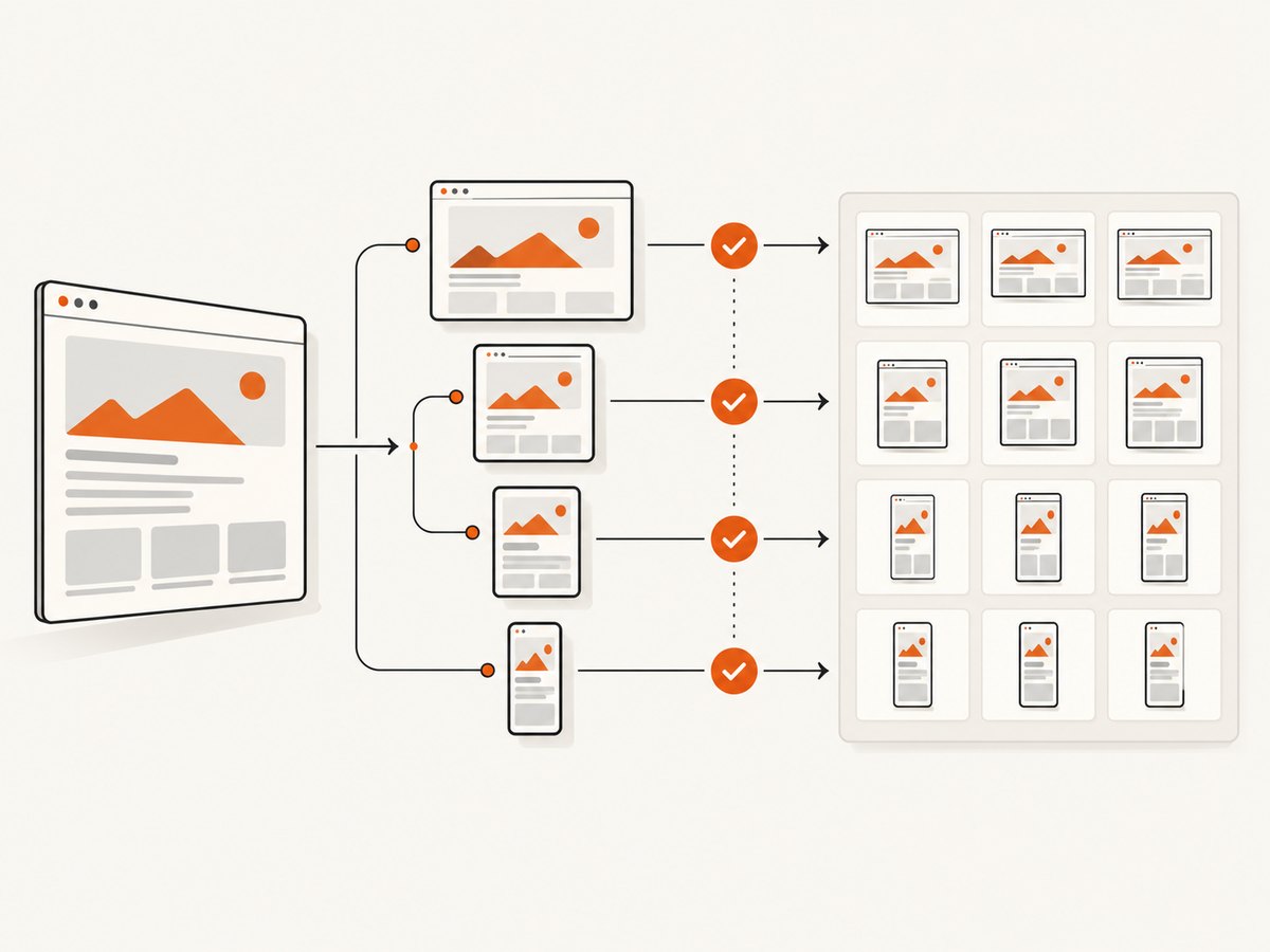
Testing a web app at different screen resolutions means testing its CSS viewport, not just the physical pixel count printed on a device box. Build a viewport matrix, exercise each breakpoint and the widths immediately around it, vary device pixel ratio (DPR) when density matters, and verify reflow, interaction, accessibility, and performance. Browser emulation gives you broad coverage quickly; real devices confirm behavior that emulators cannot reproduce.
This guide shows a repeatable workflow using Chrome DevTools, an automated Playwright script, real-device checks, and screenshot evidence. It also explains how to choose sizes, test orientation and zoom, handle edge cases, and diagnose common responsive failures.
1. Define the resolution test matrix
Write down the combinations your product promises to support before opening DevTools. A useful row records:
- Viewport width and height in CSS pixels
- Portrait or landscape orientation
- Browser and operating system
- Device pixel ratio (DPR)
- Browser zoom level
- Mouse, keyboard, touch, or pen input
- Network and CPU conditions
- Color scheme, reduced motion, contrast, and text-size preferences
A physical display resolution and a CSS viewport are different. A high-density phone may have many physical pixels while exposing a much smaller CSS width. DPR is the ratio between those physical pixels and CSS pixels. Include DPR cases when your app uses resolution media queries, srcset, image-set(), canvas scaling, or pixel-sensitive charts.
Start with the responsive viewport widths documented for Chrome DevTools: 320, 375, 425, 768, 1024, 1440, and 2560px. Add your own product breakpoints and the widths just below and just above each one. The boundary checks matter because a one-pixel change can switch navigation, grid columns, or typography.
| Class | Example viewport | What to inspect |
|---|---|---|
| Small phone | 320×568 | Wrapping, minimum touch targets, horizontal overflow |
| Typical phone | 375×812 | Navigation, forms, sticky controls, dialogs |
| Large phone | 425×900 | Intermediate layout transitions |
| Tablet portrait | 768×1024 | Two-column layouts, tables, sidebars |
| Small desktop | 1024×768 | Collapsed desktop navigation and dense grids |
| Desktop | 1440×900 | Readable line length, max-width containers |
| Wide desktop | 2560×1440 | Empty space, stretching, oversized media |
2. Use Chrome DevTools responsive emulation
- Open the page in Chrome and choose More tools → Developer tools.
- Toggle the device toolbar with the phone-and-tablet icon or
Ctrl/Cmd+Shift+M. - Choose Responsive, then enter an exact width and height. Dragging the handles is useful for exploration; exact values are better for repeatable tests.
- Open the device-toolbar menu and enable Show media queries. Click a breakpoint marker to jump to that width.
- Resize slowly through each transition and then test one pixel below and above every breakpoint.
- Use the rotate control to repeat the important cases in landscape.
Chrome’s accessibility guidance recommends dynamically resizing the viewport to test how content reflows. Look for clipped content, overlapping controls, unexpected horizontal scrolling, and information that becomes unreachable. A layout can look correct at a named device width while failing at an intermediate width.
In the Elements panel, inspect the matched CSS rules at each transition. This reveals which declaration changed and whether a later selector, fixed width, or minimum size is preventing the intended behavior. Check computed widths for containers, images, inputs, and dialogs rather than relying only on appearance.
3. Test reflow, interaction, and accessibility
At every width class, run a short functional checklist:
- Open and close the primary navigation, menus, dialogs, and drawers.
- Complete the key forms, including validation errors, long labels, and autofill.
- Move through controls with the keyboard. The focus indicator must remain visible and inside the viewport.
- Use touch emulation to check target spacing, swipe areas, and accidental activation.
- Scroll long pages. Verify sticky headers, fixed action bars, anchored links, and focus scrolling.
- Try long words, translated strings, large numbers, empty states, and server error messages.
- Check tables, code blocks, charts, and media for a usable overflow strategy.
- Enable dark mode, reduced motion, increased contrast, and browser text zoom when they are supported.
Responsive behavior is more than visual similarity. Content, controls, and validation messages must remain visible and usable without loss of information or functionality. WCAG’s reflow guidance is a useful reference for this review. Avoid tests that assume one absolute dimension; W3C’s device-independent testing guidance recommends several versions for different screen resolutions.
4. Automate a resolution matrix with Playwright
Automation is useful for catching regressions after CSS or component changes. The following Node.js script visits a URL at the documented width classes, waits for the page to settle, captures a full-page screenshot, and records horizontal overflow. It is intentionally small enough to run in a project or CI job.
import { chromium } from 'playwright';
import fs from 'node:fs/promises';

const target = process.argv[2] || 'http://localhost:3000';
const viewports = [
  { name: 'phone-320', width: 320, height: 568 },
  { name: 'phone-375', width: 375, height: 812 },
  { name: 'phone-425', width: 425, height: 900 },
  { name: 'tablet-768', width: 768, height: 1024 },
  { name: 'desktop-1024', width: 1024, height: 768 },
  { name: 'desktop-1440', width: 1440, height: 900 },
  { name: 'wide-2560', width: 2560, height: 1440 }
];

await fs.mkdir('artifacts/responsive', { recursive: true });
const browser = await chromium.launch();
const page = await browser.newPage({ deviceScaleFactor: 1 });

for (const viewport of viewports) {
  await page.setViewportSize({ width: viewport.width, height: viewport.height });
  await page.goto(target, { waitUntil: 'networkidle' });
  await page.screenshot({
    path: `artifacts/responsive/${viewport.name}.png`,
    fullPage: true
  });
  const metrics = await page.evaluate(() => ({
    scrollWidth: document.documentElement.scrollWidth,
    clientWidth: document.documentElement.clientWidth,
    title: document.title
  }));
  const overflow = metrics.scrollWidth > metrics.clientWidth;
  console.log(JSON.stringify({ ...viewport, ...metrics, overflow }));
}

await browser.close();
Install and run it with:
npm install -D playwright
npx playwright install chromium
node responsive-matrix.mjs https://example.com
Do not treat a screenshot diff as the only assertion. Pair it with checks for overflow, missing text, focus order, and critical actions. If your application needs a specific browser or DPR, create separate projects with those settings. For density-sensitive rendering, repeat selected rows with deviceScaleFactor: 2 and compare image loading and canvas output.
5. Verify breakpoints and CSS assumptions
For each media query, write a boundary test. If a rule begins at 768px, capture at 767, 768, and 769px. Confirm that the intended component changes exactly once and that no intermediate width produces a broken hybrid state.
@media (max-width: 767px) {
  .layout { display: block; }
}

@media (min-width: 768px) {
  .layout { display: grid; grid-template-columns: 16rem 1fr; }
}
Prefer fluid constraints such as max-width, flexible grid tracks, and wrapping over fixed pixel assumptions. Check whether images have intrinsic dimensions that force overflow, whether flex items need min-width: 0, and whether absolutely positioned children escape a narrow container. Long unbroken strings, localized text, and browser zoom expose these problems quickly.
6. Include zoom, DPR, orientation, and preferences
Browser zoom changes the effective CSS viewport even when the window size is unchanged. Test 100% and at least one larger zoom level required by your accessibility policy. A page that works at 1440px can behave like a much narrower page at 200% zoom.
Repeat critical checks in portrait and landscape. Landscape often exposes assumptions about viewport height: dialogs may extend below the fold, mobile keyboards may cover inputs, and sticky elements may consume most of the available space.
Use a high-DPR case when selecting responsive images or rendering canvas content. Verify that the chosen asset is sharp without loading an unnecessarily large file. Also test prefers-reduced-motion, prefers-color-scheme, and contrast settings if your interface responds to them.
7. Confirm critical behavior on real hardware
Emulation is efficient for breadth, but it cannot reproduce every mobile CPU, memory limit, sensor, browser implementation, input latency, or virtual keyboard. Chrome’s own guidance says that, when in doubt, the best option is to run the page on a mobile device.
Choose real devices from your supported-browser policy and audience data. On each one, repeat the highest-risk flows: sign-in, checkout, file upload, scrolling lists, fixed-position controls, text entry, orientation changes, and offline or slow-network behavior. Record the browser version, OS, viewport, DPR, zoom, and result so another person can reproduce the issue.
8. Capture evidence for every viewport
A useful evidence record contains:
- Build, commit, or deployment URL
- Viewport CSS width and height
- Browser and operating-system version
- DPR, zoom, and orientation
- Network and CPU profile
- Expected behavior and observed behavior
- Screenshot or screen recording
- Defect severity and reproduction steps
Keep the same matrix after each layout change. Store screenshots with stable names and compare only equivalent states. Disable timestamps, random content, rotating ads, and animation where possible; otherwise visual diffs produce noise instead of useful evidence.
9. Or skip the browser setup
ScreenshotNeo provides a website screenshot API when you need repeatable captures without maintaining a browser runner. One GET request returns a PNG, JPEG, WebP, or PDF. You can pass any target URL and add viewport, device preset, full-page, element selector, DPR, dark-mode, wait, custom CSS, JavaScript, cookies, headers, geolocation, and other capture options. See the ScreenshotNeo documentation for the complete parameter list.

curl -G "https://api.screenshotneo.com/v1/shot" \
  -d access_key=YOUR_API_KEY \
  --data-urlencode url=https://stripe.com \
  -d width=320 \
  -d height=568 \
  -d full_page=true \
  -o shot.webp
import requests
r = requests.get(
"https://api.screenshotneo.com/v1/shot",
params={
"access_key": "YOUR_API_KEY",
"url": "https://stripe.com",
"width": 375,
"height": 812,
"full_page": "true"
},
timeout=90
)
r.raise_for_status()
open("shot.webp", "wb").write(r.content)const q = new URLSearchParams({
access_key: 'YOUR_API_KEY',
url: 'https://stripe.com',
width: '768',
height: '1024',
full_page: 'true'
});
const res = await fetch(`https://api.screenshotneo.com/v1/shot?${q}`);
if (!res.ok) throw new Error(`Screenshot failed: ${res.status}`);
const buffer = Buffer.from(await res.arrayBuffer());
await import('node:fs/promises').then(fs => fs.writeFile('shot.webp', buffer));Cookie banners, newsletter popups, and chat widgets are removed before the shot. Bot checks, blank pages, timeouts, failed loads, and cache hits are never billed, and response headers identify the page verdict and whether it was billed. An MCP server lets Claude, Cursor, and other AI agents call take_screenshot, get_page_info, and capture_pdf. The free plan includes 1,000 screenshots each month with no card; paid plans start at $5 for 3,000 shots. Create a free ScreenshotNeo account.
10. Troubleshooting responsive test failures
| Symptom | Likely cause | Fix |
|---|---|---|
| Horizontal scrollbar appears | Fixed-width child, long word, or overflowing flex item | Inspect the widest element; use flexible sizing, wrapping, or min-width: 0. |
| Layout changes at the wrong width | Overlapping media queries or unexpected zoom | Test the boundary pixels, inspect matched rules, and confirm browser zoom is 100%. |
| Screenshot is shorter than expected | Lazy content has not loaded or capture occurred before layout settled | Scroll through the page, wait for a selector or network idle, and capture again. |
| Text is clipped in a dialog | Fixed height, viewport-height calculation, or keyboard overlap | Allow scrolling inside the dialog and retest landscape and text zoom. |
| Images look blurry | Wrong DPR asset or missing responsive source | Inspect srcset selection and repeat with DPR 1 and 2. |
| Visual diff changes every run | Animation, ads, timestamps, or nondeterministic data | Freeze time and animation, block unstable resources, and use deterministic fixtures. |
| Emulation passes but a phone fails | Real browser, CPU, keyboard, sensor, or touch behavior differs | Reproduce on hardware and add that device/browser to the supported matrix. |
11. Performance, reliability, and cost notes
Keep the matrix focused on risk. Test every breakpoint, then select representative widths within each stable range. Run expensive full-page captures after fast smoke checks. Parallel browser workers can reduce elapsed time, but cap concurrency so your test server and third-party dependencies do not become the bottleneck.
For reliable comparisons, wait for a defined application-ready signal rather than an arbitrary delay. Use stable test data, disable transitions, and record the exact build. Separate layout defects from performance defects: a page may reflow correctly while a slow device makes the interaction unusable.
Screenshot services charge differently, so check their billing rules before scaling a visual matrix. ScreenshotNeo bills only clean shots; bot checks, blank pages, timeouts, failed loads, and cache hits cost nothing. Its cache TTL, bulk capture, asynchronous jobs, signed webhooks, and usage API can help with repeated matrices. Choose a cache TTL that matches how often the page changes, and use bulk capture for up to 100 URLs per call when the same viewport set applies to many pages.
12. A practical release checklist
- Supported viewport, browser, and OS matrix is written down.
- Widths immediately below and above every breakpoint pass.
- Portrait, landscape, zoom, and relevant DPR cases pass.
- Navigation, forms, dialogs, focus, touch targets, and scrolling work.
- No unintended horizontal overflow exists.
- Long content, localization, errors, empty states, and large text are usable.
- Critical flows pass on selected real devices.
- Screenshots and metadata are stored for the tested build.
- Failures have a reproducible viewport and severity.
FAQ
Is screen resolution the same as viewport size?
No. Resolution describes physical pixels; the browser viewport is the CSS-pixel area available to layout. DPR and zoom connect the two.
How many resolutions should a project test?
There is no universal number. Cover every supported breakpoint, its neighboring pixels, and representative widths from your audience and risk profile.
Can DevTools replace real devices?
It is excellent for broad layout coverage, but real hardware is needed for device-specific CPU, memory, keyboard, sensor, touch, and browser behavior.
Should screenshots be full page?
Use full-page captures for layout and content evidence. Also capture the viewport-only state for fixed headers, dialogs, and interaction issues.
When should DPR be part of a test?
Include it whenever image selection, canvas rendering, resolution media queries, or pixel density affects behavior or visual quality.


