How to Test Website Thumbnails Across Browsers and Devices
Build a repeatable Playwright matrix for thumbnail testing across Chromium, Firefox, WebKit, mobile profiles, and real responsive breakpoints.
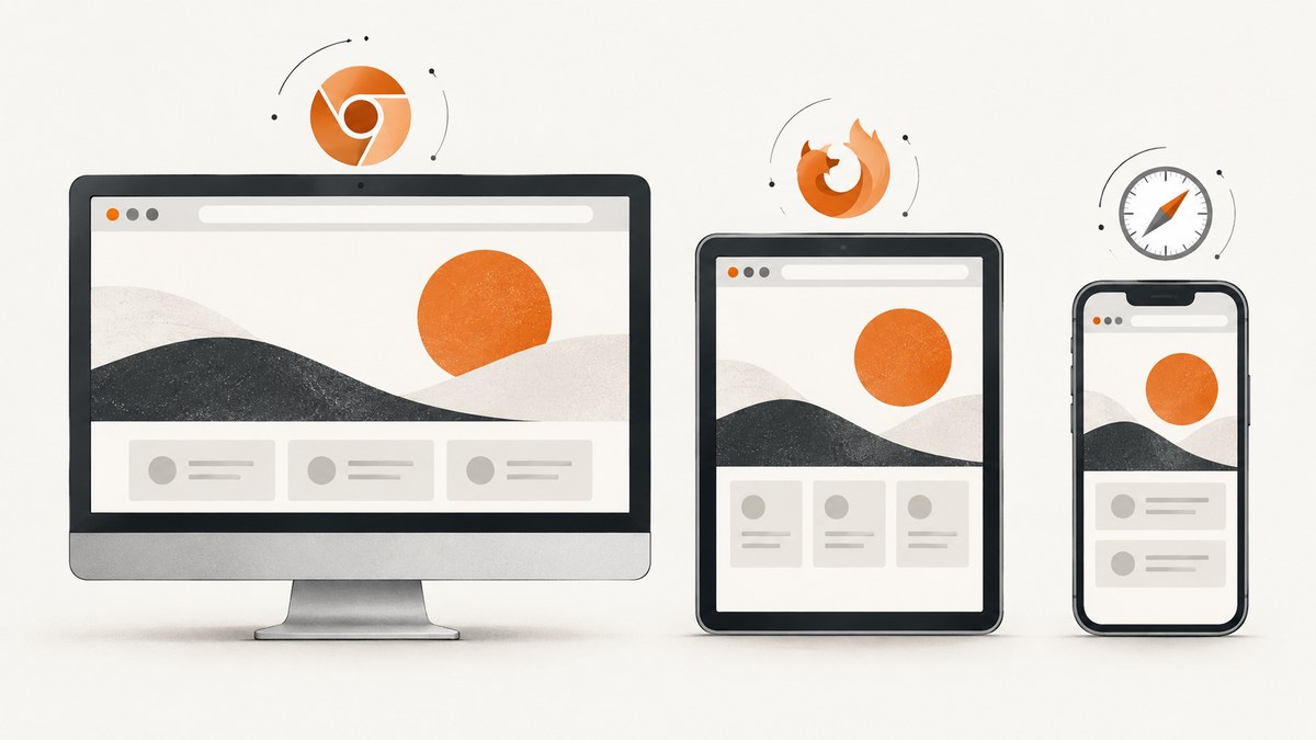
Direct answer: Test thumbnails with a small, intentional Playwright matrix that covers the browser engines, device profiles, and viewport breakpoints your audience actually uses. Capture stable screenshots, compare them with Playwright Test visual assertions, and keep the browser binaries, operating system, rendering settings, and baseline environment consistent. Treat emulated devices as simulations, then add selected physical-device checks when a release or support requirement justifies them.
This guide shows how to build that workflow, choose coverage without creating an unmaintainable test grid, diagnose visual differences, and automate screenshot capture. It also shows how to use ScreenshotNeo when you need clean, repeatable captures without maintaining browser infrastructure.
1. Define the browser and device matrix
Begin with the browsers and form factors your product promises to support. A practical automation baseline is Chromium, Firefox, and WebKit. Add branded Chrome or Edge channels if those brands are part of your support policy. Add mobile Chrome and mobile Safari profiles when mobile traffic matters. Playwright calls each configured combination a project. Its browser documentation covers these engines, channels, installation, and version updates: Playwright Browsers.
Do not multiply every browser by every device by every viewport without a reason. Use analytics, support tickets, conversion paths, and recent release risk to select representative combinations. There is no universal device ranking: the right matrix depends on your audience.
| Dimension | What to choose | Why it matters for thumbnails |
|---|---|---|
| Engine or brand | Chromium, Firefox, WebKit; Chrome or Edge channels when required | Image decoding, CSS, font metrics, and layout can differ |
| Form factor | Desktop, tablet, mobile | Grid columns, card width, and crop rules change |
| Viewport | Exact breakpoint widths plus one or two normal widths | Exposes reflow, clipping, and incorrect media queries |
| Pixel scale | Consistent device scale factor for baselines | Changes screenshot pixel dimensions and diff sensitivity |
| Interaction | Touch and mouse profiles as appropriate | Hover states and touch-specific controls can alter cards |
Recommended starting projects
- Chromium desktop at 1440×900.
- Firefox desktop at 1440×900.
- WebKit desktop at 1440×900.
- Mobile Chrome profile at its default viewport.
- Mobile Safari profile at its default viewport.
- One tablet profile if your analytics show tablet usage or your layout has a tablet-specific breakpoint.
Profiles include user agent, screen size, viewport, and touch capability. You can override the viewport for a project. Read the details in Playwright Emulation. These settings model browser parameters; they do not prove that every physical device behaves identically.
2. Install Playwright and create a test page
The following example uses Playwright Test with JavaScript. It checks a gallery page containing elements with the thumbnail-card class. Replace the URL and selectors with your application’s route.
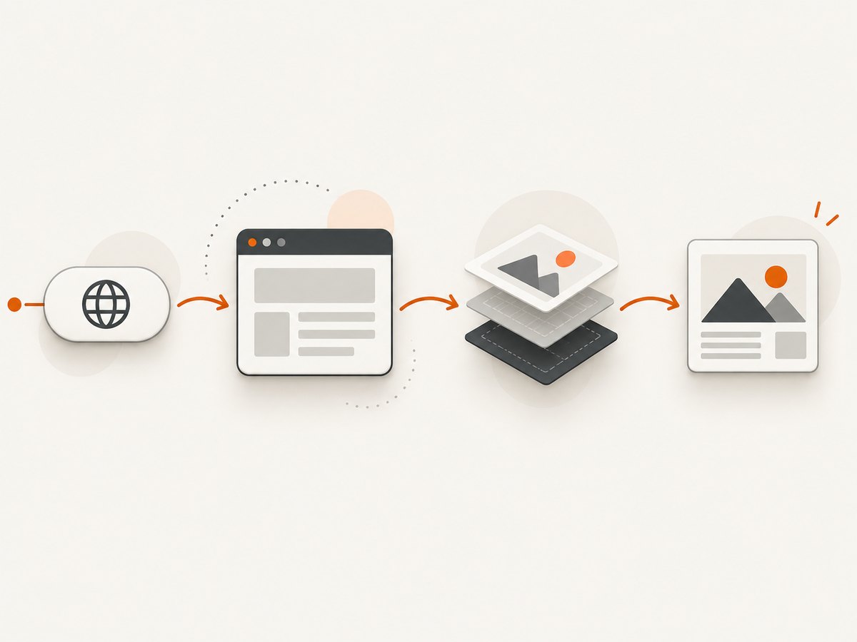
npm init playwright@latest
# Choose JavaScript and Playwright Test when prompted
npx playwright install chromium firefox webkit
Playwright versions are paired with specific browser binaries. Install the browsers supported by the version in your lockfile and update deliberately rather than changing the framework and binaries independently.
// tests/thumbnails.spec.js
import { test, expect } from '@playwright/test';

test.describe('thumbnail rendering', () => {
  test('gallery thumbnails are visible and stable', async ({ page }) => {
    await page.goto('https://example.com/gallery', { waitUntil: 'domcontentloaded' });

    // Wait for the component, then ensure images have decoded.
    await page.locator('.thumbnail-card').first().waitFor();
    await page.waitForFunction(() => {
      return [...document.images].every((img) => img.complete && img.naturalWidth > 0);
    });

    const cards = page.locator('.thumbnail-card');
    await expect(cards).toHaveCount(12);
    await expect(page).toHaveScreenshot('gallery.png', {
      fullPage: true,
      animations: 'disabled',
      caret: 'hide',
      scale: 'css',
      maxDiffPixelRatio: 0.01
    });
  });
});
The first run creates a reference image. Later runs compare the new screenshot with that reference. Review every diff before accepting it. The visual comparison guide explains baseline generation and environmental variation: Playwright Visual comparisons.
3. Configure projects for browsers and devices
Create a configuration that makes the matrix explicit. The device registry supplies profiles for mobile Chrome, mobile Safari, and tablets. You can combine a device profile with a custom viewport when you need to target a breakpoint exactly.
// playwright.config.js
import { defineConfig, devices } from '@playwright/test';

export default defineConfig({
  testDir: './tests',
  timeout: 30_000,
  expect: { timeout: 5_000 },
  retries: process.env.CI ? 2 : 0,
  workers: process.env.CI ? 2 : undefined,
  use: {
    baseURL: 'https://example.com',
    actionTimeout: 10_000,
    navigationTimeout: 30_000,
    locale: 'en-US',
    timezoneId: 'America/New_York',
    colorScheme: 'light',
    screenshot: 'only-on-failure',
    trace: 'retain-on-failure'
  },
  projects: [
    { name: 'chromium-desktop', use: { ...devices['Desktop Chrome'], viewport: { width: 1440, height: 900 } } },
    { name: 'firefox-desktop', use: { ...devices['Desktop Firefox'], viewport: { width: 1440, height: 900 } } },
    { name: 'webkit-desktop', use: { ...devices['Desktop Safari'], viewport: { width: 1440, height: 900 } } },
    { name: 'mobile-chrome', use: { ...devices['Pixel 5'] } },
    { name: 'mobile-safari', use: { ...devices['iPhone 13'] } },
    { name: 'tablet-breakpoint', use: { ...devices['iPad (gen 7)'], viewport: { width: 1024, height: 768 } } }
  ]
});
Run one project while developing, then run the complete matrix in CI:
npx playwright test --project=chromium-desktop
npx playwright test
npx playwright show-report
4. Test thumbnail behavior, not only page pixels
A full-page screenshot catches layout regressions, but targeted assertions explain what failed. Add checks for:
- Loading: every expected image has a nonzero natural width.
- Aspect ratio: cards preserve the intended ratio at each breakpoint.
- Crop:
object-fit: coverdoes not remove the subject or create unexpected letterboxing. - Dimensions: the rendered image width and height stay within the component contract.
- Alt text: meaningful thumbnails have useful alternative text; decorative images are marked appropriately.
- Layout stability: image dimensions are reserved before loading so cards do not jump.
- Responsive reflow: grid columns and gaps change at the intended breakpoints.
- States: missing, slow, blocked, and error images show a deliberate fallback.
test('thumbnail contract', async ({ page }) => {
  await page.goto('/gallery', { waitUntil: 'networkidle' });
  const image = page.locator('.thumbnail-card img').first();
  await expect(image).toBeVisible();
  await expect(image).toHaveAttribute('alt', /.+/);

  const box = await image.boundingBox();
  if (!box) throw new Error('Thumbnail has no layout box');
  const ratio = box.width / box.height;
  expect(ratio).toBeGreaterThan(1.4);
  expect(ratio).toBeLessThan(1.9);

  const decoded = await image.evaluate((img) => ({
    complete: img.complete,
    naturalWidth: img.naturalWidth,
    naturalHeight: img.naturalHeight
  }));
  expect(decoded.complete).toBe(true);
  expect(decoded.naturalWidth).toBeGreaterThan(0);
});
5. Make screenshots reproducible
Visual tests are useful only when noise is controlled. Keep the following stable:
- Content: use fixtures or pinned image URLs where possible. Rotating headlines, timestamps, ads, and personalized recommendations create unrelated diffs.
- Fonts: wait for
document.fonts.readyif custom fonts affect card dimensions. - Images: wait for image decoding, not merely the
loadevent of the document. - Animations: disable transitions and carousels during capture.
- Network: stub unstable APIs or use a deterministic test environment.
- Environment: use the same operating system, browser versions, settings, hardware class, power state, and headed or headless mode for baseline and comparison when feasible.
Playwright documents that rendering can vary with the host OS, browser version, settings, hardware, power source, headless mode, and other factors. A difference is not automatically a product regression. First identify whether the environment changed, then decide whether the baseline should be updated.
await page.addStyleTag({ content: `
  *, *::before, *::after {
    animation-duration: 0s !important;
    animation-iteration-count: 1 !important;
    transition-duration: 0s !important;
    caret-color: transparent !important;
  }
` });
await page.evaluate(() => document.fonts.ready);
6. Choose screenshot comparison settings
toHaveScreenshot supports thresholds for perceived color differences and a scale option. scale: 'css' keeps output closer to CSS-pixel dimensions; scale: 'device' captures device pixels and can produce larger images on high-DPI profiles. Pick one scale for your baselines and keep it consistent. Use a small tolerance for true regressions, but do not raise it merely to silence failures. See the PageAssertions API for threshold and scale options.
await expect(page).toHaveScreenshot('mobile-gallery.png', {
  fullPage: true,
  scale: 'css',
  threshold: 0.2,
  maxDiffPixels: 100,
  animations: 'disabled'
});
Use a pixel limit when a small, known area can vary. Use a ratio when screenshot dimensions vary by project. Keep separate baselines per browser project; comparing a WebKit image with a Chromium baseline produces noise rather than useful evidence.
7. Cover dark mode, touch, and edge cases
Thumbnail bugs often appear outside the default light desktop path. Add projects or test parameters for:
- Dark color scheme and light color scheme.
- Right-to-left language if captions or overlays support it.
- Long titles, missing captions, and very short titles.
- Portrait images, animated GIFs, transparent PNGs, and modern formats such as WebP or AVIF.
- Broken URLs, 404 responses, slow responses, and an image that never completes.
- Lazy-loaded images below the initial viewport.
- High-DPI scale and browser zoom settings used by your support policy.
- Touch interactions where a hover overlay must also be reachable by tap.
test('lazy thumbnails load after scrolling', async ({ page }) => {
  await page.goto('/gallery', { waitUntil: 'domcontentloaded' });
  await page.locator('.thumbnail-card').last().scrollIntoViewIfNeeded();
  await page.waitForFunction(() => {
    const img = document.querySelector('.thumbnail-card:last-child img');
    return img && img.complete && img.naturalWidth > 0;
  });
  await expect(page.locator('.thumbnail-card').last()).toHaveScreenshot('last-card.png');
});
8. Troubleshooting common failures
| Symptom | Likely cause | Fix |
|---|---|---|
| “Executable doesn’t exist” | Playwright browser binaries are missing or belong to another version | Run npx playwright install for the locked Playwright version and cache the result in CI. |
| Images are blank in screenshots | Capture occurs before lazy loading or decoding finishes | Scroll the target into view and wait for complete plus naturalWidth > 0. |
| Only CI differs | Different OS, fonts, browser build, headless mode, or hardware | Pin the environment and browser versions; regenerate baselines there. |
| Every browser has large diffs | One baseline is shared across engines | Keep snapshots in per-project directories and compare each engine with its own baseline. |
| Flaky diffs on the same runner | Animation, rotating content, ads, time, or network responses | Freeze data, disable animation, mock unstable requests, and wait for fonts and images. |
| Mobile layout never appears | Viewport override or CSS breakpoint mismatch | Log innerWidth, verify the project viewport, and test exact breakpoint widths. |
| Text wraps differently | Font not loaded or fallback font differs | Wait for document.fonts.ready and install the same fonts in baseline and CI environments. |
| Screenshot timeout | Page or image request never reaches a stable state | Use a bounded wait, inspect the trace, and provide an explicit fallback for failed images. |
9. Performance, reliability, and cost planning
Browser matrices multiply execution time. Keep pull-request checks focused on one or two high-value projects, then run the full matrix on merges or a scheduled job. Parallel workers reduce wall-clock time but increase CPU and memory demand. Cache browser binaries and npm dependencies in CI. Reuse a stable test fixture instead of downloading large originals for every case.
Retries can separate transient infrastructure failures from deterministic visual regressions, but they should not hide flaky tests. Store traces and diffs for failed runs. When a browser release changes rendering, review the diff set as a batch and update baselines only after confirming the new output is correct.
Physical-device testing adds fidelity for hardware-specific issues, but it costs more coordination and is not replaced completely by emulation. Use it for a small set of critical devices or release gates. Emulation is excellent for repeatable coverage of viewport, user agent, and touch behavior; it is not evidence that every physical model renders identically.
10. Or skip the browser setup
If your goal is a clean reference image rather than browser automation itself, ScreenshotNeo’s API documentation shows a one-request workflow. The API accepts a URL and returns PNG, JPEG, WebP, or PDF. You can still request full-page captures, device presets, custom viewports, retina scale, dark mode, CSS selectors, custom CSS and JavaScript, waits, blocked resource types, headers, cookies, user agents, timezone, geolocation, caching, signed links, asynchronous jobs, webhooks, and bulk capture.

cURL
curl -G "https://api.screenshotneo.com/v1/shot" -d access_key=YOUR_API_KEY --data-urlencode url=https://stripe.com -o shot.webpPython
import requests
r = requests.get("https://api.screenshotneo.com/v1/shot", params={"access_key": "YOUR_API_KEY", "url": "https://stripe.com"}, timeout=90)
r.raise_for_status()
open("shot.webp", "wb").write(r.content)
Node.js
const q = new URLSearchParams({ access_key: 'YOUR_API_KEY', url: 'https://stripe.com' });
const res = await fetch(`https://api.screenshotneo.com/v1/shot?${q}`);
if (!res.ok) throw new Error(`Screenshot failed: ${res.status}`);
const fs = await import('node:fs/promises');
await fs.writeFile('shot.webp', Buffer.from(await res.arrayBuffer()));
ScreenshotNeo accepts cookie and consent banners before capture and removes more than 60 known consent platforms, newsletter popups, and chat widgets; each step can be turned off. Bot checks or CAPTCHAs, blank pages, timeouts, failed loads, and cache hits cost nothing, and response headers identify the page verdict and whether the request was billed. Its MCP server provides take_screenshot, get_page_info, and capture_pdf tools for Claude, Cursor, and other MCP clients. The Free plan includes 1,000 shots each month with no card; paid plans start at $5 for 3,000 shots. Create a free ScreenshotNeo account.
11. ScreenshotNeo options for thumbnail workflows
- Responsive coverage: choose one of 12 device presets or provide any viewport.
- Component checks: capture one element by CSS selector instead of the entire page.
- Stable states: wait for a selector, a delay, or network idle; click an element before capture; hide selectors; inject custom CSS or JavaScript.
- Visual variants: select dark mode, retina scale, transparent backgrounds, or image resizing.
- Restricted pages: send custom headers, cookies, user agent, Authorization, timezone, or geolocation.
- Throughput: use caching with a chosen TTL, asynchronous jobs with signed webhooks, bulk capture for up to 100 URLs per call, and the usage API.
For a test suite, save the returned image with a deterministic filename that includes browser or viewport metadata, inspect X-Page-Verdict and X-Billed, and compare only successful clean captures. This keeps failed navigation from becoming a misleading visual baseline.
12. A practical release checklist
- Matrix is based on supported browsers, analytics, and known support issues.
- Chromium, Firefox, and WebKit coverage is intentional rather than accidental.
- Mobile and tablet projects use explicit profiles and breakpoint widths.
- Image decoding, fonts, lazy loading, and animations are controlled.
- Baselines are separated by project and generated in a pinned environment.
- Tests cover crop, aspect ratio, dimensions, alt text, fallback states, and layout shifts.
- Visual thresholds and screenshot scale are documented.
- CI caches browsers, stores traces, and runs the broad matrix at an appropriate cadence.
- Physical-device checks exist for hardware-specific risks that emulation cannot answer.
- Baseline updates are reviewed as code changes.
FAQ
How many browsers should run on every pull request?
Use the smallest set that catches likely regressions, often one Chromium project plus a mobile profile. Run Firefox, WebKit, branded channels, and wider viewport coverage on merges or scheduled jobs when they are part of your support promise.
Is a Playwright device profile the same as testing a real phone?
No. It simulates browser parameters such as user agent, viewport, screen size, and touch. Add physical-device testing when hardware, operating-system behavior, camera constraints, or browser integration matters.
Should thumbnails be compared with pixel-perfect equality?
Use a consistent scale and a small documented tolerance. Pixel-perfect comparison is appropriate for tightly controlled environments; a limited threshold can accommodate harmless antialiasing while still detecting crop and layout regressions.
Can I test pages that require authentication?
In Playwright, use a saved authenticated browser state or log in during setup. With ScreenshotNeo, provide the required headers, cookies, user agent, or Authorization values through the API options.
How do I avoid paying for failed captures with ScreenshotNeo?
ScreenshotNeo does not bill bot checks or CAPTCHAs, blank pages, timeouts, failed loads, or cache hits. Check the X-Page-Verdict and X-Billed response headers before storing a baseline.


