How to Turn an Image Into HTML With CSS
Learn when to embed an image, when to rebuild it with HTML and CSS, and how to use OCR and screenshot tools for an accurate result.
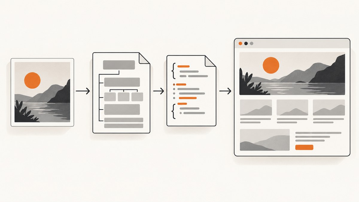
Turning an image into HTML can mean two different things:
- Display the image: embed the bitmap with an HTML image element and style it with CSS.
- Recreate the image as a web page: inspect the reference, transcribe its content, build semantic HTML, and use CSS to reproduce the layout.
An <img> element displays pixels; it does not convert the pixels into editable text, buttons, headings, or layout. If you need selectable text, responsive regions, accessibility, search visibility, or editable content, rebuild the important parts as HTML and CSS.
Choose the right approach
| Goal | Best approach | Why |
|---|---|---|
| Show a photo, diagram, or screenshot as-is | <img> |
Preserves the source pixels with minimal work. |
| Use a decorative hero or texture | CSS background-image |
Lets the image sit behind content and adapt with cover. |
| Make text selectable, searchable, and editable | Semantic HTML plus CSS | Text remains document content instead of pixels. |
| Reproduce a screenshot as a responsive page | HTML structure, CSS layout, and separate assets | Supports breakpoints, accessibility, and interaction. |
Meaningful images belong in document markup with useful alternative text. CSS backgrounds are not announced as equivalent content by screen readers. MDN documents the img element and the background-image property.
Method 1: Display the image with HTML and CSS
Use this when you do not need to reconstruct the image’s internal text or layout.
<figure class="reference-image">
  <img
    src="images/example.png"
    alt="A dashboard showing monthly revenue by region"
    width="1200"
    height="800"
  >
  <figcaption>Monthly revenue by region.</figcaption>
</figure>
.reference-image {
max-width: 75rem;
margin: 2rem auto;
padding: 0 1rem;
}
.reference-image img {
display: block;
width: 100%;
height: auto;
}
.reference-image figcaption {
margin-top: .5rem;
color: #555;
font: .9rem/1.4 system-ui, sans-serif;
}Set width and height attributes when the intrinsic dimensions are known. Browsers can reserve the correct space before the file finishes loading, reducing layout shifts. Keep max-width: 100% or a fluid width for narrow screens.
Fit an image into a fixed box
.thumbnail {
  width: 320px;
  height: 200px;
  object-fit: cover;
  object-position: center;
  display: block;
}

.contain-thumbnail {
  object-fit: contain;
  background: #f3f4f6;
}
cover fills the box and may crop edges. contain shows the whole image and may leave empty space. Use object-position to keep a face, logo, or focal area visible.
Serve alternate images responsively
<picture>
  <source media="(max-width: 700px)" srcset="images/card-small.webp">
  <source type="image/avif" srcset="images/card.avif">
  <img src="images/card.webp" alt="Product card with a blue jacket" width="1200" height="800">
</picture>
The picture element lets the browser select an appropriate source for viewport or format. Keep the fallback <img> for compatibility and accessibility.
Method 2: Use an image as a decorative background
Use a background when the image is decoration and the information is already represented by live HTML.
<section class="hero">
  <h1>Live text remains available to assistive technology</h1>
  <p>The background supplies visual atmosphere only.</p>
</section>
.hero {
min-height: 28rem;
display: grid;
align-content: center;
padding: 4rem 2rem;
color: white;
background-color: #283044;
background-image: url("images/hero.jpg");
background-position: center;
background-size: cover;
background-repeat: no-repeat;
}Do not put essential instructions, prices, headings, or searchable product information only in a background. Google Search Central recommends HTML image elements for images you want discovered, and notes that Google does not index CSS images in the same way as HTML image content. See Google’s image SEO guidance.
Method 3: Rebuild a screenshot as HTML and CSS
A faithful reconstruction is an implementation task, not a file conversion. Follow this workflow.
- Define the target. Decide whether you need a visual mockup, a responsive production page, or a pixel-close static reproduction.
- Inventory the reference. List regions such as navigation, hero, cards, forms, footer, images, icons, borders, shadows, and repeated spacing.
- Transcribe content. Put headings, labels, prices, and instructions in HTML. Do not flatten all content into one new screenshot.
- Choose semantic elements. Use
header,nav,main,section,article,button, lists, and headings according to meaning. - Build the layout. Start with CSS Grid or Flexbox for large regions, then add spacing, typography, color, borders, and image fitting.
- Make assets separate. Crop or export photographs, illustrations, and icons as individual files when they need independent sizing or alt text.
- Render and compare. Capture your page at the reference viewport, compare alignment and cropping, then adjust one variable at a time.
- Check responsive behavior. Test a narrow viewport and decide which columns stack, which text wraps, and which images crop.
A complete reconstruction starter
<!doctype html>
<html lang="en">
<head>
  <meta charset="utf-8">
  <meta name="viewport" content="width=device-width, initial-scale=1">
  <title>Product landing page</title>
  <style>
    :root { --ink: #172033; --muted: #667085; --accent: #315efb; --panel: #f5f7fb; }
    * { box-sizing: border-box; }
    body { margin: 0; color: var(--ink); font: 16px/1.5 system-ui, sans-serif; }
    .shell { max-width: 1120px; margin: auto; padding: 0 24px; }
    header { display: flex; align-items: center; justify-content: space-between; padding: 24px 0; }
    nav { display: flex; gap: 20px; }
    nav a { color: inherit; text-decoration: none; }
    .hero { display: grid; grid-template-columns: 1fr 1fr; gap: 48px; align-items: center; padding: 72px 0; }
    h1 { max-width: 11ch; margin: 0 0 20px; font-size: clamp(2.5rem, 6vw, 5rem); line-height: .98; }
    .lede { color: var(--muted); font-size: 1.15rem; }
    .hero-art { width: 100%; border-radius: 20px; display: block; object-fit: cover; }
    .cards { display: grid; grid-template-columns: repeat(3, 1fr); gap: 20px; padding: 32px 0 72px; }
    .card { padding: 24px; border: 1px solid #e4e7ec; border-radius: 16px; }
    @media (max-width: 760px) {
      .hero, .cards { grid-template-columns: 1fr; }
      nav { display: none; }
      .hero { padding: 40px 0; }
    }
  </style>
</head>
<body>
  <div class="shell">
    <header><strong>Northstar</strong><nav><a href="#features">Features</a><a href="#contact">Contact</a></nav></header>
    <main>
      <section class="hero">
        <div><p>A practical headline</p><h1>Rebuild the reference as real content</h1><p class="lede">This text can be selected, translated, indexed, and adapted to smaller screens.</p></div>
        <img class="hero-art" src="images/hero.webp" alt="Abstract blue and purple product illustration" width="900" height="700">
      </section>
      <section id="features" class="cards" aria-label="Features">
        <article class="card"><h2>Semantic</h2><p>Structure follows meaning instead of pixel coordinates.</p></article>
        <article class="card"><h2>Responsive</h2><p>The layout can change at a breakpoint.</p></article>
        <article class="card"><h2>Editable</h2><p>Content and styles can be changed independently.</p></article>
      </section>
    </main>
  </div>
</body>
</html>
Extract text with OCR, then proofread it
OCR is useful when a reference contains dense text, but its output is a draft. Google Cloud Vision distinguishes general TEXT_DETECTION from DOCUMENT_TEXT_DETECTION, which is designed for dense documents and returns text structure and bounding information. Review punctuation, numbers, line breaks, and reading order before putting the result into HTML. See Google Cloud’s text detection documentation.
For a quick local experiment with an OCR library, keep the original image and record corrections:
from PIL import Image
import pytesseract

image = Image.open("reference.png")
raw_text = pytesseract.image_to_string(image)
print(raw_text)
# Manually verify every heading, number, and label before publishing.
OCR does not infer the correct semantic hierarchy. You still need to decide which text is a heading, label, button, caption, or decorative mark.
Use screenshots to compare your reconstruction
Render the rebuilt page at the same viewport as the reference. Compare major geometry first: container width, columns, header height, and image crop. Then refine typography, spacing, borders, and shadows. A fixed viewport makes differences measurable; a narrow viewport reveals whether the design adapts rather than merely matching one desktop frame.
Or skip the browser setup
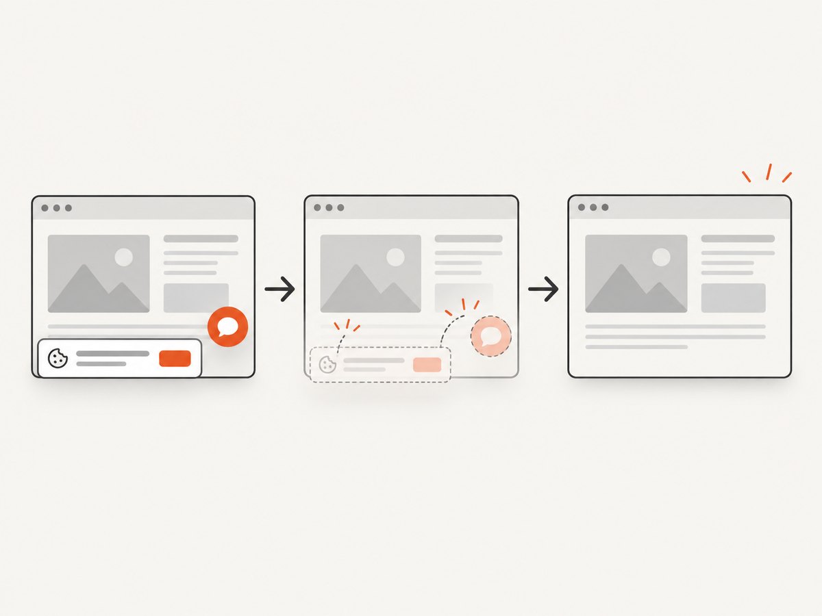
If you need a screenshot of an existing URL instead of rebuilding it, ScreenshotNeo returns a PNG, JPEG, WebP, or PDF from one GET request. Its capture flow accepts cookie and consent banners before removing more than 60 known consent platforms, newsletter popups, and chat widgets. Bot checks, blank pages, timeouts, failed loads, and cache hits are not billed; response headers identify the page verdict and billing status.
See the ScreenshotNeo API documentation for all options. This is a complete cURL example:
curl -G "https://api.screenshotneo.com/v1/shot" \
  -d access_key=YOUR_API_KEY \
  --data-urlencode url=https://stripe.com \
  -o shot.webp
import requests
r = requests.get(
"https://api.screenshotneo.com/v1/shot",
params={"access_key": "YOUR_API_KEY", "url": "https://stripe.com"},
timeout=90,
)
r.raise_for_status()
open("shot.webp", "wb").write(r.content)const q = new URLSearchParams({ access_key: 'YOUR_API_KEY', url: 'https://stripe.com' });
const res = await fetch(`https://api.screenshotneo.com/v1/shot?${q}`);
if (!res.ok) throw new Error(`HTTP ${res.status}`);
const fs = await import('node:fs/promises');
await fs.writeFile('shot.webp', Buffer.from(await res.arrayBuffer()));For AI workflows, its MCP server exposes take_screenshot, get_page_info, and capture_pdf to Claude, Cursor, and other MCP clients. You can also use full-page capture, CSS element capture, device presets, custom viewports, retina scale, custom CSS and JavaScript, waits, request blocking, headers, cookies, geolocation, caching, signed links, asynchronous jobs, bulk capture, and the usage API.
The Free plan includes 1,000 screenshots each month without a card. Paid plans start at $5 for 3,000 screenshots; every feature is available on every plan. Create a free ScreenshotNeo account.
Common errors and fixes
The image is stretched
Give the image a known aspect ratio and use object-fit. Use height: auto for natural proportions or cover when cropping is intentional.
The layout shifts while the image loads
Add accurate width and height attributes or reserve space with aspect-ratio. Avoid changing dimensions after load.
Text in the screenshot is not selectable
That is expected: pixels contain no DOM text. Transcribe the text into headings, paragraphs, links, and controls, using OCR only to accelerate the first draft.
The background image is invisible
Check the URL, make sure the element has a height, and confirm that another background shorthand is not overwriting background-image. Set a fallback background-color.
The page looks right only at one width
Replace absolute pixel positioning with Grid or Flexbox for major regions, add a breakpoint, and test content wrapping at intermediate widths.
Important content is missing from search
Move meaningful imagery and its description into an HTML image element, and keep important words as live text. CSS-only backgrounds are a poor representation for discoverable content.
OCR produced wrong words or order
Use a higher-resolution source, crop unrelated regions, select document text detection for dense pages, and proofread every value. Preserve the source image so corrections can be audited.
Performance, reliability, and cost notes
- Prefer modern compressed formats such as WebP or AVIF when they meet your quality requirements.
- Set intrinsic dimensions, use responsive sources, and lazy-load below-the-fold images where appropriate.
- Keep critical text in HTML so it renders without waiting for an image or OCR service.
- For repeated screenshot comparisons, cache captures with a deliberate TTL and record the viewport, URL, and revision.
- When using ScreenshotNeo, inspect
X-Page-VerdictandX-Billedto distinguish clean captures, failures, and cache hits. - For large sets of URLs, ScreenshotNeo supports bulk capture of up to 100 URLs per call and asynchronous jobs with signed webhooks.
Checklist
- Decide whether you are displaying pixels or rebuilding content.
- Use semantic HTML for meaningful text and regions.
- Choose
<img>for meaningful images and CSS backgrounds for decoration. - Add useful alt text, intrinsic dimensions, and responsive sizing.
- Use OCR as an aid and proofread its output.
- Compare renders at the target and narrow viewports.
- Check keyboard access, contrast, focus states, and mobile wrapping.
- Capture the final page and inspect billing and verdict headers when using an API.
FAQ
Can CSS convert a JPEG into editable HTML?
No. CSS styles elements; it cannot recover a document tree from bitmap pixels. Recreate the structure and transcribe the content.
Should a screenshot be an image or a page?
Use an image for a reference, archive, or decorative visual. Build a page when users must read, search, interact with, or adapt the content.
Is a CSS background accessible?
It is not announced as equivalent meaningful image content. Put important visuals in document markup with an appropriate alternative.
What is the fastest way to capture an existing web page?
Use a screenshot API such as ScreenshotNeo when you need a rendered capture and do not want to maintain browser automation, consent handling, and failure classification yourself.


