How to Use Custom Fonts in Generated Images
Learn a reliable two-stage workflow for keeping your own font in AI-generated images, from prompting and references to exact post-generation typesetting.

Short answer: use a two-stage workflow. First generate the visual with a short, explicit text prompt that puts the wording in quotes and specifies font style, size, color and placement. Then create the exact lettering in your licensed font as a reference image or typeset it after generation in a design editor. Prompt-only generation can suggest a type style, but it is not dependable for exact brand typography.
This approach answers the questions developers and designers usually have: how to keep a brand font, whether an image generator can accept a font file, why generated words contain errors, and how to automate repeatable production. The right method depends on four things: lettering accuracy, layout and style control, font licensing and access, and repeatability.
1. Choose the workflow that matches your accuracy requirement
| Workflow | Lettering accuracy | Layout and style control | Font access | Repeatability |
|---|---|---|---|---|
| Prompt-only generation | Variable; best for short text | Fast, limited | No direct font-file evidence in the cited OpenAI guidance | Low to medium |
| Structure-reference generation | Better preservation of prepared lettering layout | Strong composition control; style can be layered | Requires a reference image and rights | Medium |
| Post-generation typesetting | Highest exact-font control | Background is generated separately | Font must be installed and licensed in the editor | High for templates |
| Adobe API or PSD rendering | High when the PostScript name and resource resolve | Editable production files | Adobe Fonts entitlement or a hosted custom font | High |
Use prompt-only generation for concepts, mood boards and very short labels. Use a structure reference when the lettering must occupy a particular shape or position. Use post-generation typesetting for a final marketing asset, product card or social graphic where every character must be correct. Choose an API or PSD workflow when many files must be rendered consistently.
2. Prepare the font and the exact text
- Confirm the license. Make sure your team and the rendering service are allowed to use the font. A font file you can install locally is not automatically licensed for every hosted service or redistribution scenario.
- Write the final wording first. Keep it short. Long paragraphs and unusual words increase the chance of malformed lettering.
- Create a clean reference. Typeset the headline, label or logo in the licensed font on a plain background. Export a sharp image with enough padding around the lettering.
- Record font metadata. For production APIs, note the exact family, weight, style and, where required, the PostScript name. “Bold” in a design application may map to a different internal name than the file name.
- Decide what must be editable. If copy changes often, keep text as a live layer and generate only the background. If the wording is fixed, a flattened reference can be sufficient.
Prepare several versions when the design has multiple lockups: a single line, a stacked title and a logo-only mark. Each reference should contain only the lettering needed for that composition. This gives a structure-reference system less unrelated detail to interpret.
3. Prompt an image generator for exploratory results
Prompting can influence typography, but it cannot guarantee that a generator will reproduce a font file exactly. OpenAI Academy recommends putting the text in quotation marks or ALL CAPS, specifying font style, size, color and placement, keeping wording short, and spelling uncommon words letter by letter. For dense layouts, ask for sharp text rendering and plan to polish the result in a design tool.
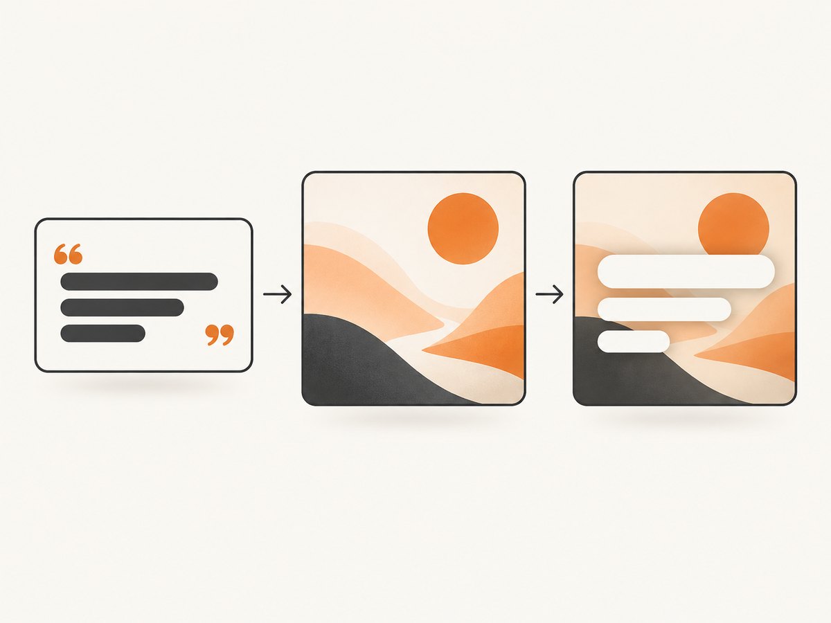
Editorial product poster, warm studio lighting, cobalt paper texture, centered headline reading "NORTH STAR", set in a geometric sans-serif style, large uppercase letters, white lettering, positioned in the upper third, generous tracking, sharp text rendering, minimal background details.Use one text instruction per important element. State whether the text is centered, left aligned or placed along an edge. Describe contrast explicitly, such as “black lettering on a pale cream panel.” If a word is uncommon, spell it letter by letter in the prompt. Generate several variations and select the one with the best composition; treat the lettering as a draft until it is checked character by character.
Prompt checklist
- Put the exact wording in quotes.
- Use ALL CAPS when that matches the design and reduces ambiguity.
- Specify family style, weight, approximate size, color and alignment.
- Describe the location relative to the canvas: top third, lower left, centered, and so on.
- Keep the copy short; move body text to a finishing step.
- Request sharp text rendering for a dense composition.
- Inspect every character before publishing.
4. Use a structure reference for stronger font and layout control
Create a reference image containing the exact headline or logo in your licensed font. Upload it as a Structure reference where the generator supports that feature. Increase Strength when the generated layout drifts away from the reference. A structure reference controls the arrangement and shape of the prepared lettering; a Style reference controls visual treatment such as color, texture or rendering style. Combining both gives more control than a text prompt alone.
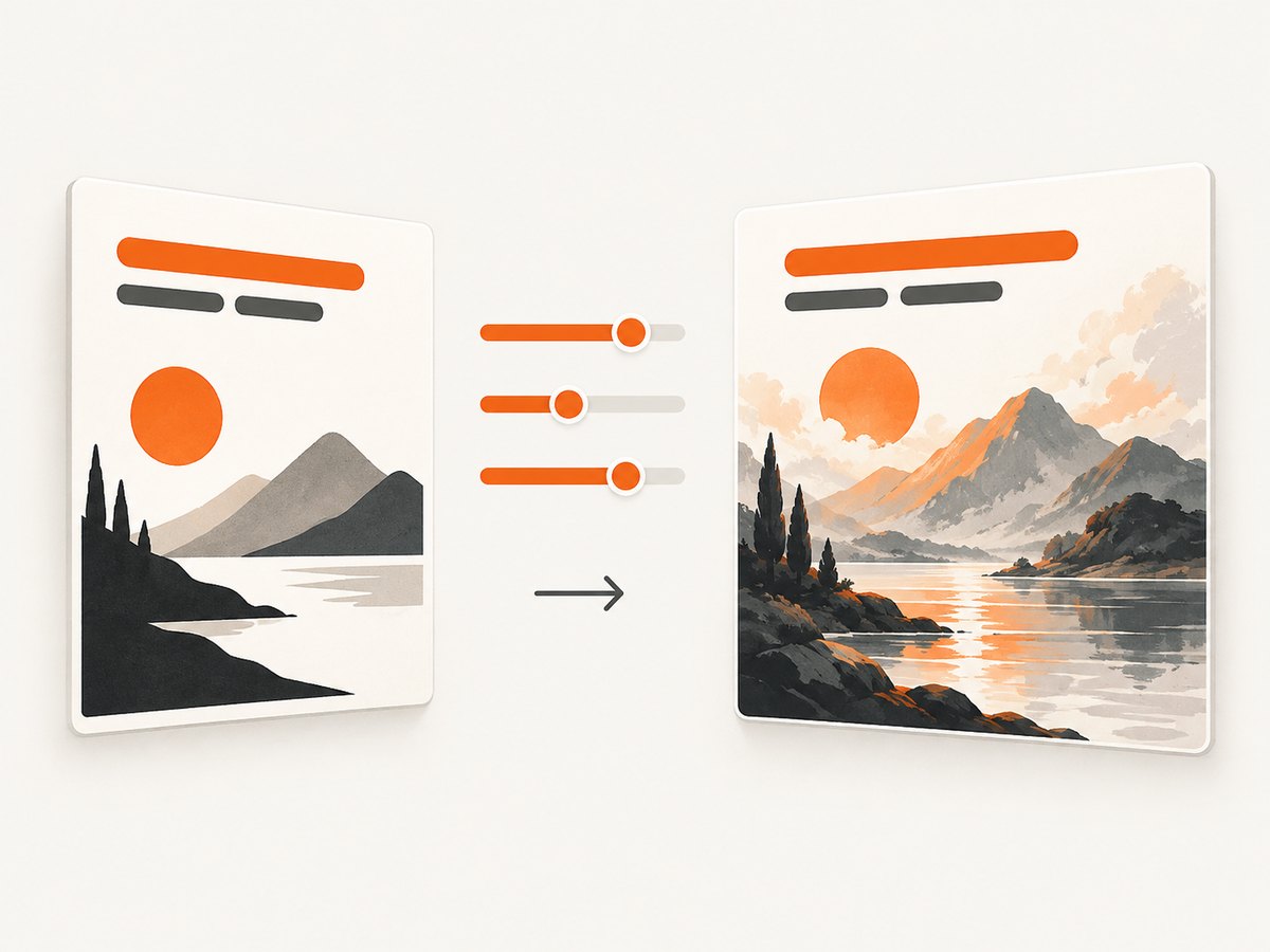
- Typeset the final phrase in the correct font on a simple background.
- Upload that image as the structure or composition reference.
- Start with moderate strength and generate several options.
- Increase strength if the letter positions or proportions change too much.
- Add a separate style reference if you need a particular material, lighting or illustration treatment.
- Compare the result with the reference at 100% zoom.
Do not assume a structure reference transfers the font file into the model. It supplies visual evidence of the lettering. If exact glyph geometry matters, preserve the original text as live type and composite it after the background is generated.
5. Typeset the final text after generation
Post-generation typesetting gives the highest exact-font control. Generate a clean background with empty space where the words belong, then add the text in Photoshop, another design editor or your own rendering pipeline. This is the safest option for legal names, prices, instructions, accessibility copy and brand marks.
Recommended finishing sequence
- Generate the background without critical text, or with a temporary placeholder.
- Open the background in an editor that has the licensed font installed.
- Set the exact font family, weight, size, tracking, line height and color.
- Align the live text to the planned safe area and check contrast.
- Export a master file with editable text and a delivery image such as PNG or JPEG.
- Proofread the exported file, not only the editor canvas.
This separation also makes localization easier. You can swap translated strings while keeping the generated art unchanged. It reduces reruns, preserves accessibility metadata in systems that support it, and makes future revisions deterministic.
6. Automate exact fonts with Adobe Photoshop APIs
Adobe’s Photoshop API v2 can resolve Adobe Fonts by PostScript name at render time when the account has the required Fonts entitlement and product profile. Adobe marks this capability beta. For a custom font file, the text API expects the correct PostScript name and an href to a supported cloud-storage resource. Configure missing-font behavior explicitly: fail makes a job stop when the font cannot be resolved, while useDefault allows substitution. The documented default is ArialMT.
{
  "text": "NORTH STAR",
  "font": {
    "postScriptName": "YourFontPostScriptName",
    "href": "https://storage.example/your-font-resource"
  },
  "missingFontHandling": "fail"
}
The object above illustrates the fields you must provide; use the exact request envelope and authentication documented by Adobe for your endpoint. The important production rules are stable: use the internal PostScript name rather than guessing from the display name, ensure the resource is reachable by the service, and fail safely when substitution would damage the design.
Production safeguards
- Store the PostScript name alongside the template version.
- Validate that the hosted resource is available before starting a batch.
- Keep missing-font handling set to
failfor brand-critical assets. - Log the resolved font and template identifier with each output.
- Render a small proof sheet containing unusual glyphs, numerals and punctuation.
7. Canva and editor-based workflows
Canva can be used to add or generate images and edit them in designs, which makes it useful for the finishing stage. Its app documentation says apps cannot upload or define custom fonts, use Canva Pro fonts, or download underlying font files. Availability therefore depends on the account and editor context. If your required font is not available in that context, generate the background elsewhere and typeset in an editor that can legally access the font.
8. Code patterns for a repeatable pipeline
A simple pipeline has four stages: prepare the text reference, generate the background, apply live text, and validate the export. Keep the source text and font metadata in a manifest so a rerun does not depend on memory or a screenshot of settings.
const job = {
  copy: "NORTH STAR",
  fontPostScriptName: "YourFontPostScriptName",
  placement: { x: 120, y: 96, width: 840 },
  color: "#FFFFFF",
  backgroundPrompt: "Abstract cobalt paper texture with a calm studio light and empty space in the upper third"
};

// 1. Send backgroundPrompt to your image generator.
// 2. Load the returned background into your compositor.
// 3. Draw job.copy with the licensed font resolved by job.fontPostScriptName.
// 4. Export PNG and retain the editable source plus this manifest.
The example intentionally leaves the image-generation endpoint unspecified because the research sources establish workflow principles rather than a universal API. In your implementation, add retries around transient requests, preserve the original background, and make the final text render a deterministic step.
9. Troubleshooting custom-font image generation
| Symptom | Likely cause | Fix |
|---|---|---|
| Letters are misspelled | The generator is synthesizing glyphs instead of laying out live text | Shorten the copy, quote it, request sharp text rendering, then typeset the final wording afterward |
| The font looks similar but not exact | A prompt describes a style rather than supplying font geometry | Use a structure reference or apply the licensed font in a finishing editor |
| Layout ignores the reference | Structure strength is too low or the reference contains too much detail | Increase strength and upload a simpler lettering-only reference |
| Font is substituted in an API job | Wrong PostScript name, inaccessible resource or missing entitlement | Verify the internal name, check the hosted href, confirm entitlement and set missing-font handling to fail |
| Weight or italics are wrong | The selected style maps to a different face | Use the exact family and style metadata; test a proof sheet with numerals and punctuation |
| Text becomes unreadable at delivery size | Generated lettering is too small or background contrast is low | Generate a larger clean area, increase contrast and typeset at the final output resolution |
| Localized copy breaks the composition | Translated text has different length or glyph coverage | Keep the background separate and reflow live text per language |
10. Performance, reliability and cost considerations
Performance
Prompt-only exploration is quick because it uses one generation pass, but revisions can multiply when lettering is wrong. A background-first pipeline spends one generation on the visual and uses fast deterministic text rendering for every copy variation. For batches, cache the generated background and render text locally or through a controlled API.
Reliability
Make font resolution a preflight check. Fail before rendering when the font file, PostScript name, entitlement or hosted resource is missing. Keep a fallback only for non-brand prototypes. Save the prompt, reference image, font metadata and output checksum with each production asset so another operator can reproduce the result.
Cost
Prompt-only workflows may look cheaper until repeated generations are required to correct words. Separating background generation from typography reduces those reruns. For automated services, account for image-generation calls, storage for references and outputs, editor or API licensing, and the cost of failed jobs. The most economical approach is usually the one that makes final text deterministic.
11. Or skip the browser setup
If your workflow starts with a web page, ScreenshotNeo can capture the finished design or reference page through one request instead of maintaining browser automation. It is a website screenshot API and MCP server from Yorker Media. Before capture, it accepts cookie and consent banners like a visitor and removes more than 60 known consent platforms, newsletter popups and chat widgets; each step can be turned off. Only clean shots are billed: bot checks, CAPTCHAs, blank pages, timeouts, failed loads and cache hits cost nothing, and the response reports the result with X-Page-Verdict and X-Billed headers.
See the ScreenshotNeo API documentation for all options. A direct call looks like this:
curl -G "https://api.screenshotneo.com/v1/shot" -d access_key=YOUR_API_KEY --data-urlencode url=https://stripe.com -o shot.webpimport requests
r = requests.get("https://api.screenshotneo.com/v1/shot", params={"access_key": "YOUR_API_KEY", "url": "https://stripe.com"}, timeout=90)
open("shot.webp", "wb").write(r.content)const q = new URLSearchParams({ access_key: 'YOUR_API_KEY', url: 'https://stripe.com' });
const res = await fetch(`https://api.screenshotneo.com/v1/shot?${q}`);ScreenshotNeo also supports full-page capture with lazy images loaded, element selection by CSS selector, dark mode, device presets and custom viewports, retina scale, PDF output, HTML/CSS rendering, custom JavaScript and CSS, clicks, selector or network-idle waits, request blocking, headers, cookies, user agents, authorization, timezone, geolocation, transparent backgrounds, resizing, caching with a chosen TTL, signed links, asynchronous jobs with signed webhooks, bulk capture for up to 100 URLs per call, a usage API and an OpenAPI specification. Its MCP server exposes take_screenshot, get_page_info and capture_pdf to Claude, Cursor and other MCP clients.
The Free plan includes 1,000 screenshots per month with no card. Paid plans start at $5 for 3,000 shots; yearly billing provides two months free, and every feature is available on every plan. Sign up free for ScreenshotNeo.
12. FAQ
Can I upload a font file directly to any image generator?
Do not assume so. The documented reliable choices are a prepared structure reference, post-generation typesetting, or a production API that explicitly accepts a font resource and resolves its PostScript name.
Why does AI change the text in my image?
Many image generators render letters as visual shapes rather than laying out a real text layer. Short quoted copy improves results, but exact wording is safest when added after generation.
Should I use a structure reference or a style reference?
Use a structure reference to preserve the arrangement and shape of prepared lettering. Use a style reference to influence visual treatment. Combining them gives stronger control over both.
What should happen when a production font is missing?
Set missing-font behavior to fail for brand-critical work. Silent substitution can create an asset that looks valid but violates the intended typography.
How do I keep typography consistent across many images?
Generate backgrounds separately, store the exact copy and font metadata in a manifest, and render live text through the same editor or API template for every output.