How to Vertically Center CSS Containers Across Printed Page Breaks
CSS cannot reliably center one container across printed pages. Center bounded content inside a page-sized wrapper and let oversized content flow.
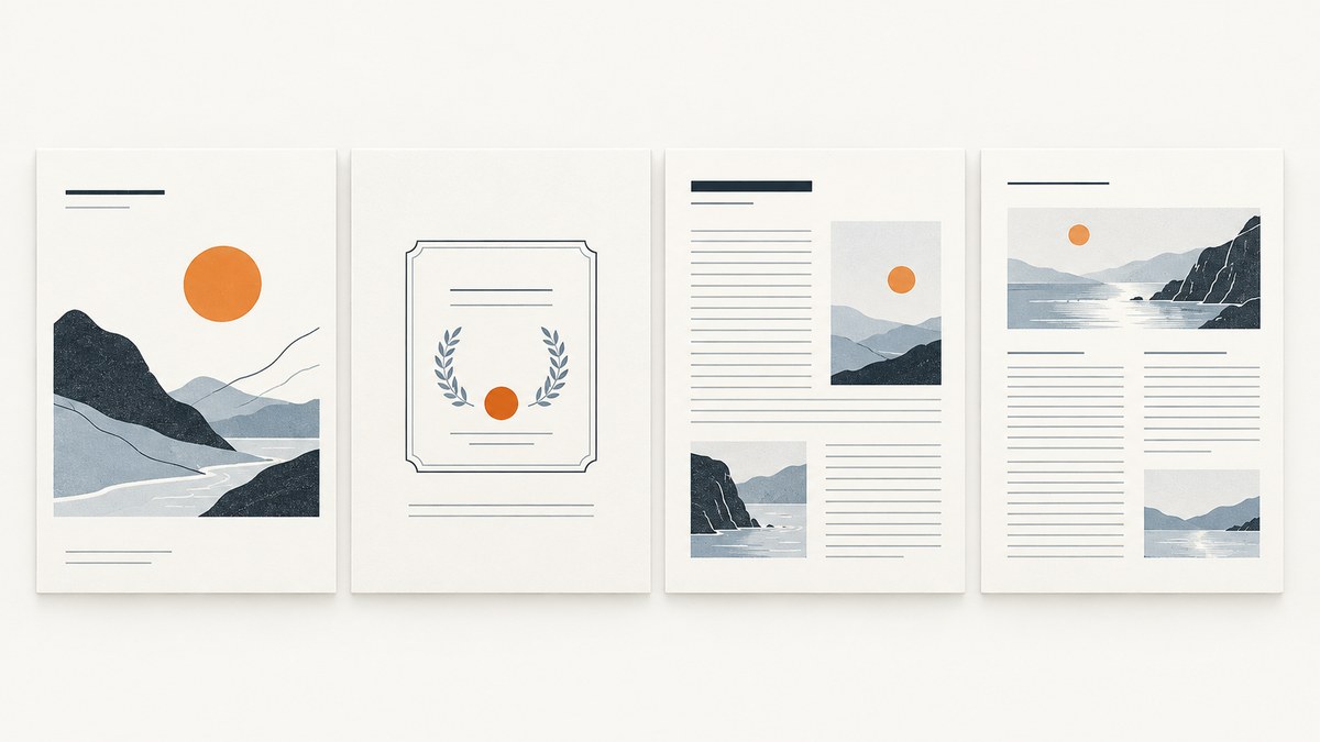
CSS does not define a reliable way to vertically center one container across multiple printed pages. The W3C CSS Print Profile says, “Vertical alignment is undefined across page boundaries.” The practical solution is to center each bounded unit inside its own page-sized wrapper. A long container that fragments across pages is not one object that can be centered as a whole.
This distinction matters when printing a certificate, cover, title page, or other one-page section alongside content that can span several pages. Set the page geometry explicitly, center the bounded section within that geometry, and let long content paginate naturally. W3C CSS Print Profile describes the limitation; CSS paged media and fragmentation rules explain how document boxes are laid out and split.
1. Why cross-page vertical centering is undefined
Print layout is not simply a tall web page sent to a printer. A paged-media renderer creates discrete page boxes and fragments document content to fit them. CSS defines controls for forcing, allowing, or avoiding page breaks, including the legacy page-break-* properties and the modern break-* properties. It does not define a single total-height box spanning several pages and then specify how to vertically align that box across its fragments.
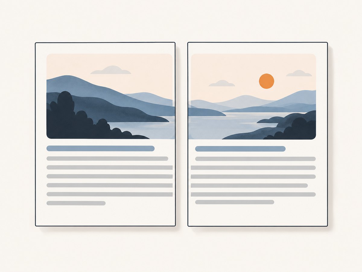
That is why a container that begins near the top of page one and continues onto page two cannot be meaningfully centered as a whole on both pages: the fragments are governed by pagination, and their available space is different. CSS Paged Media discusses alignment in page-margin boxes, but those are page furniture such as headers and footers, not a general alignment rule for arbitrary content. See the CSS Paged Media Level 3 specification.
The reliable design question is therefore: what is the unit that should be centered? If it is a bounded, one-page unit, give it a page-sized wrapper and center inside that wrapper. If it can exceed a page, let it flow and center only the short sections that have a known height.
2. Center a one-page unit with a page-sized wrapper
For a title sheet, certificate, or cover, define the printed page size and margins, then make the wrapper fill the usable page area. The following example targets A4 paper with 18 mm margins. Since A4 is 297 mm tall, the content area is 261 mm; derive the wrapper height from that geometry rather than guessing.
<!doctype html>
<html lang="en">
<head>
  <meta charset="utf-8">
  <title>Centered print section</title>
  <style>
    @page {
      size: A4;
      margin: 18mm;
    }

    .centered-page {
      min-height: 261mm; /* 297mm page minus 18mm top and bottom margins */
      display: flex;
      flex-direction: column;
      justify-content: center;
      align-items: center;
      text-align: center;
      break-before: page;
      break-inside: avoid;
    }

    .centered-page h1,
    .centered-page p {
      max-width: 150mm;
    }

    @media screen {
      .centered-page {
        min-height: 70vh;
        border: 1px dashed #999;
      }
    }
  </style>
</head>
<body>
  <section class="centered-page">
    <h1>Completion Certificate</h1>
    <p>Awarded to Alex Morgan</p>
  </section>
  <article>
    <h2>Details</h2>
    <p>This article is allowed to continue naturally across pages.</p>
  </article>
</body>
</html>
In this example, justify-content: center centers the children along the wrapper’s vertical main axis, and align-items: center centers them horizontally. The wrapper has a minimum height matching the printable content box, so short content sits in the middle while the page still has room for the section.
The sample uses break-before: page to start the centered section on a fresh page. Remove that declaration when the section should begin wherever normal flow places it. Use a forced break sparingly: it is appropriate for a cover or certificate, but can create an unwanted blank or underfilled page when combined with other forced breaks.
3. Match the wrapper to page geometry
The wrapper’s height must reflect the page size and the margins that the print renderer actually uses. With A4 portrait (297 mm tall) and 18 mm top and bottom margins, the available height is 261 mm. With US Letter portrait (279.4 mm tall) and 12.7 mm margins, the available height is 254 mm. Landscape changes which dimension is vertical.
| Paper and orientation | Page height | Margins | Usable height |
|---|---|---|---|
| A4 portrait | 297 mm | 18 mm top and bottom | 261 mm |
| US Letter portrait | 279.4 mm | 12.7 mm top and bottom | 254 mm |
| A4 landscape | 210 mm | 18 mm top and bottom | 174 mm |
@page establishes page-level context such as size and margins and can target all pages or selected page types. It cannot declare that an arbitrary multi-page container should be vertically centered across its fragments. See MDN’s reference for @page and the paged-media specification.
Browsers may also let users select a different paper size, scale, or printer margin in the print dialog. If the user can override your geometry, a hard-coded wrapper height might no longer match the printable area. For predictable output, control the print settings in the PDF generation workflow when possible, and verify the result in the renderer that will be used in production.
4. Decide whether the unit may split
break-inside: avoid asks the pagination engine to avoid breaking a generated box internally. It is a request about fragmentation, not a way to make content smaller or guarantee that an arbitrarily tall element fits on one sheet. MDN documents it for page, column, and region breaks in its break-inside reference.

Apply it to a section that normally fits on one page, such as a compact card or signature block. Do not apply it indiscriminately to a long article, report, or table. If the box exceeds a page, the renderer must still preserve and print the content, continuing onto subsequent pages as needed. The CSS Print Profile describes this overflow behavior: content too long for a page continues rather than disappearing.
@media print {
  .certificate,
  .summary-card {
    break-inside: avoid;
  }

  .long-report,
  .long-table {
    break-inside: auto;
  }

  .new-chapter {
    break-before: page;
  }
}
Use break-before when a section must begin on a new page. Use break-after when the following section must start on a new page. Use break-inside: avoid for a bounded unit that should remain intact when it fits. The older page-break-before, page-break-after, and page-break-inside names remain common in existing stylesheets, but new rules should use the fragmentation properties where supported.
5. Handle oversized content without losing it
A common mistake is applying min-height: 261mm and break-inside: avoid to a wrapper that can contain several pages of text, then expecting the renderer to center the full article. The minimum height only establishes a lower bound. The article can become taller, and pagination will fragment it; the top fragment cannot be centered based on the total height of all later fragments.
For long content, separate the document into meaningful units. A one-page cover can use the centered wrapper. The body can use normal flow. Individual short callouts may avoid splitting, while paragraphs and tables that do not fit should be allowed to continue. This keeps the title page visually centered without sacrificing the readability or completeness of the document.
If a centered section has a variable but bounded amount of content, consider a conservative maximum height or a layout with calculated top and bottom space. A block-based fallback can be more predictable than flex fragmentation in some rendering engines:
@media print {
  .centered-page--block {
    min-height: 261mm;
    box-sizing: border-box;
    padding-top: 90mm;
    padding-bottom: 90mm;
    text-align: center;
  }
}
This is not automatic centering: the spacing must be tuned for the expected content and page geometry. It can be useful when the target engine’s flex behavior during printing is inconsistent. Neither method changes the rule for a container that spans pages: cross-page vertical alignment remains undefined.
6. Test in the actual print or PDF renderer
- Choose the output geometry. Decide the paper size, orientation, and margins. Record whether printer settings can override them.
- Print a short sample. Check that a bounded section is centered vertically and horizontally in the printable area.
- Print a boundary sample. Add enough content to nearly fill the wrapper. Confirm the last line, footer, and any following section do not collide.
- Print an overflow sample. Make the content taller than one page and verify that it continues onto later pages instead of being clipped or omitted.
- Repeat in the production engine. Browser print preview, browser-generated PDF, and dedicated PDF engines can differ in paged-media feature support and fragmentation behavior.
Check page breaks visually as well as in the resulting PDF. A layout that looks correct on screen can paginate differently when fonts, paper size, margins, or print scaling change. Avoid promising pixel-identical output across browsers or PDF engines; support for individual paged-media features varies.
7. Troubleshooting
| Symptom | Likely cause | Fix |
|---|---|---|
| Content centers on screen but not on paper | The screen rule is active, or the print area differs from the assumed page geometry. | Put print-specific sizing in @media print, define @page, and check the print dialog’s paper, scale, and margins. |
| The section starts too low or too high | The wrapper height does not match the usable page height, or the renderer adds different margins. | Recalculate page height minus top and bottom margins. Verify orientation and user-selected settings. |
| A large blank gap appears before the section | break-before: page combines with a preceding forced break, or the section already starts on a new page. |
Inspect both adjacent elements’ break rules and remove the redundant forced break. |
A card still splits despite break-inside: avoid |
The card is taller than the available page area, or the renderer cannot honor the request in that context. | Shorten or split the card into meaningful pieces; keep the avoid rule for units that fit and test the target engine. |
| Text is clipped at the bottom | The wrapper or a fixed-height ancestor constrains overflow, or the content was treated as a one-page unit even though it is too tall. | Remove fixed-height clipping, allow the long section to fragment, and reserve centering for bounded sections. |
| Flex centering behaves differently in PDF output | Flex fragmentation support varies among print renderers. | Use the block spacing fallback for predictable bounded content, or choose a renderer with the needed paged-media behavior. |
| Extra pages appear after changing content | Small changes in font metrics, margins, or available height pushed content across a page boundary. | Recheck geometry and content height; avoid relying on a section that barely fits. |
8. Performance, reliability, and cost considerations
CSS centering itself is inexpensive; pagination and PDF rendering dominate the work. The largest reliability concern is not the centering declaration but changing layout inputs: fonts, images, paper settings, margins, and renderer versions can move a line onto another page. Keep page geometry explicit, avoid unnecessary fixed heights on flowing content, and leave a little room around the content that must fit on one page.
For automated document generation, use a stable rendering environment and treat the generated PDF as the output to inspect. If end users choose printer settings, communicate which paper size and scale the layout expects. A page-sized wrapper is a layout technique, not a guarantee that each printer has the same physical printable region.
9. Or skip the browser setup
If you need a screenshot or PDF of a web page rather than a hand-built print stylesheet, ScreenshotNeo provides a website screenshot API and MCP server for developers. Its API accepts one GET request with a URL and can return PNG, JPEG, WebP, or PDF. See the ScreenshotNeo API documentation for the request options.
curl -G "https://api.screenshotneo.com/v1/shot" \
  -d access_key=YOUR_API_KEY \
  --data-urlencode url=https://stripe.com \
  -o shot.webp
ScreenshotNeo accepts cookie and consent banners and removes more than 60 known consent platforms, newsletter popups, and chat widgets before the capture; each step can be turned off. Bot checks, blank pages, timeouts, failed loads, and cache hits cost nothing, and response headers report the page verdict and billing status. Its MCP server gives AI agents tools for screenshots, page information, and PDF capture. The free plan includes 1,000 screenshots a month with no card; paid plans start at $5 for 3,000 screenshots.
Sign up free for 1,000 screenshots a month, with no card required.
10. FAQ
Can I center a container across two printed pages with CSS?
There is no reliable CSS-defined cross-page vertical alignment behavior. Center each page-sized unit independently, or allow the content to flow across pages.
Does align-items: center vertically center content?
In a flex container, align-items aligns along the cross axis. With a column direction, the vertical main axis is controlled by justify-content; align-items handles horizontal alignment.
Will break-inside: avoid keep any element on one page?
No. It requests that a break be avoided inside the box. Oversized content still has to continue onto later pages to preserve it.
Can @page center the document?
@page controls page context such as size and margins. Alignment available in page-margin boxes is for those boxes, not arbitrary fragmented document content.
Should I use flexbox or fixed spacing?
Use flexbox when the target renderer centers the bounded section consistently. Use calculated spacing when the content dimensions are predictable and flex fragmentation is unreliable in that renderer.


