Web Thumbnail Design: Sizes, Formats, and Best Practices
Choose thumbnail dimensions and formats for each destination, keep designs legible at small sizes, and implement responsive, accessible web images.

A web thumbnail has no universal best size. Start with the surface where it will appear, then create and deliver a version suited to that surface’s aspect ratio, file limits, and rendered size. For YouTube standard video thumbnails, the recommended image is 3840 × 2160 pixels (16:9); for Shorts it is 2160 × 3840 (9:16). Both have a 640-pixel minimum width or height, respectively. Keep the composition simple, make the subject and any type readable when small, and check how the crop looks on phones as well as desktop.
For a web page, use a relevant, crawlable social preview image, descriptive alternative text for meaningful images, and responsive markup such as srcset or <picture>. Choose the format based on the destination and the artwork: JPG and PNG are safe YouTube choices; WebP or AVIF can be useful for web delivery when your publishing pipeline and target browsers support them.
1. Pick the destination before the dimensions
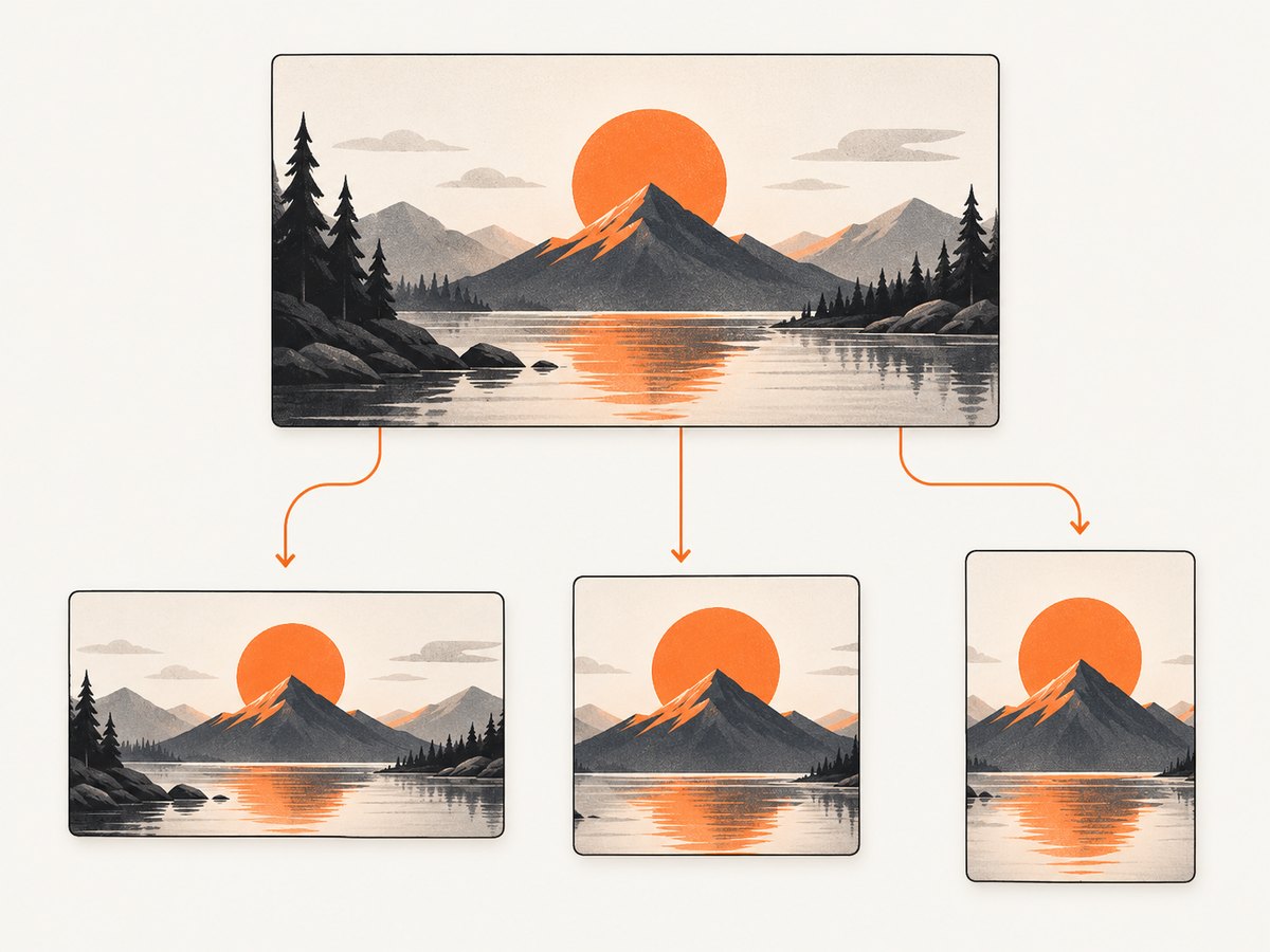
“Thumbnail” describes a role, not one fixed canvas. A video card, vertical short, podcast playlist, search result, and social share may all display related artwork with different shapes. A single master image can be a useful starting point, but cropping one file everywhere risks cutting off a face, product, logo, or essential words.
| Destination | Useful starting dimensions or shape | Notes |
|---|---|---|
| YouTube standard video | 3840 × 2160, 16:9 recommended | Minimum width 640 px. JPG or PNG. Mobile upload limit 2 MB; desktop limit 50 MB. |
| YouTube Shorts | 2160 × 3840, 9:16 recommended | Minimum height 640 px. Mobile upload limit 2 MB; desktop limit 50 MB. |
| YouTube podcast playlist | 1:1 | YouTube recommends square artwork for podcast playlists rather than 16:9. |
| Google video search thumbnail | At least 60 × 30 px; larger is preferred | Google lists BMP, GIF, JPEG, PNG, WebP, SVG, and AVIF. The image must be reachable by Googlebot. |
| Your site’s card or social preview | Use the ratio of the actual component or sharing surface | There is no single ratio that fits every site. Provide suitable derivatives and verify the rendered crop. |
These are destination-specific recommendations, not a universal standard. YouTube’s upload dimensions and limits come from [YouTube Help](https://support.google.com/youtube/answer/72431). The supported Google video thumbnail formats and crawlability guidance are in [Google’s video SEO documentation](https://developers.google.com/search/docs/appearance/video).
2. Make a master and crop-safe derivatives
- List the surfaces. Record each destination’s ratio, minimum dimensions, upload limit, and where the image will be cropped. Check current platform requirements before a production upload because platform rules can change.
- Create the largest required canvas. For a YouTube standard video master, use 3840 × 2160. Create independent crops for vertical or square placements rather than stretching the landscape art.
- Keep key content inside a safe area. Faces, logos, and important words should not sit against the edges. A card can crop to a different ratio, and thumbnails may be rendered at many sizes.
- Inspect the smallest likely rendering. Scale the thumbnail down to the approximate on-page display size. Check whether the subject remains obvious and text can still be read. Remove detail that becomes visual noise.
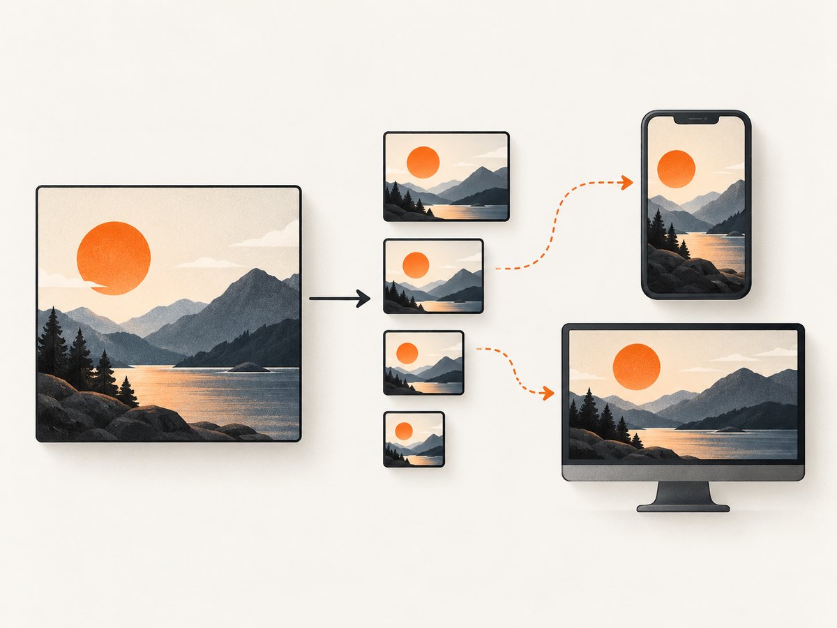
- Export for the destination. Respect the platform’s byte limit. For responsive sites, generate a small set of widths instead of sending the largest master to every visitor.
- Check the real placement. Preview the thumbnail in the card, feed, or video listing. Verify the crop, contrast, and loading behavior on a narrow viewport as well as a wide one.
YouTube recommends keeping thumbnails simple, using readable fonts, and making images as large as possible because they appear differently across devices. It also advises that the title accurately represent the video and that title and thumbnail tell a consistent story. See [YouTube’s thumbnail guidance](https://support.google.com/youtube/answer/72431).
3. Choose an image format
| Format | Good fit | Trade-offs |
|---|---|---|
| JPG / JPEG | Photographs and complex scenes; accepted for YouTube uploads | Lossy compression can reduce file size, but aggressive compression can create visible artifacts around edges and text. |
| PNG | Artwork with sharp edges, flat colors, or transparency; accepted for YouTube | Can be larger than a compressed photograph. Check the destination’s file limit. |
| WebP | Web delivery where your image pipeline and browser support suit the audience | Google lists it for video thumbnails. Confirm support on the destination that receives the upload. |
| AVIF | Web delivery when your tooling and audience support it | Google lists AVIF for video thumbnails. Test encoding and fallback behavior in your publishing stack. |
| GIF, SVG, BMP | Use only where the destination specifically supports the format and its behavior meets the need | Google lists these formats for its video thumbnails; that does not mean every upload service accepts them. |
For YouTube uploads, JPG and PNG are the conservative choices documented by YouTube. Google’s video documentation lists a broader set of formats for its video thumbnails; support on one Google surface does not guarantee support on YouTube or a third-party CMS. Do not rename a file extension to pretend one format is another.
4. Keep the design readable when small
Use one focal point
Give the viewer one obvious subject or action. A clean silhouette and a clear separation between the subject and background tend to survive downscaling better than a busy collage. Use contrast to distinguish the focal area, but keep the palette and visual treatment consistent with the video or page.
Limit text and make it meaningful
If words add useful context, keep them short and large enough to read at the smallest expected size. Avoid repeating the entire title in the artwork. Do not place essential meaning only inside the image: adjacent HTML text preserves accessibility and searchability.
Match the promise
The image should accurately represent what the page or video contains. A striking crop that misleads the viewer can undermine trust, even if it earns a click. Make the headline and thumbnail tell the same story.
Choose imagery for the audience
For an established audience, familiar people or recurring visual elements can provide context. For casual discovery, a clear action or emotion may be easier to understand without prior knowledge. Treat that as a creative choice to evaluate with your audience and analytics, not a guaranteed performance rule.
5. Implement thumbnails on a web page
Use semantic HTML, descriptive alternative text when the image conveys information, and responsive sources when you have multiple derivatives. The following example assumes you have created 480, 960, and 1440 pixel wide versions with the same crop.
<!-- In the page head: use an absolute, stable URL for the share image. -->
<meta property="og:image" content="https://example.com/images/release-preview-1200.jpg">

<!-- In the page body: provide responsive candidates. -->
<figure>
  <img
    src="/images/release-preview-960.jpg"
    srcset="/images/release-preview-480.jpg 480w,
            /images/release-preview-960.jpg 960w,
            /images/release-preview-1440.jpg 1440w"
    sizes="(max-width: 600px) 100vw, 600px"
    width="960"
    height="540"
    alt="A developer reviewing a website preview on a laptop"
    loading="lazy"
    decoding="async"
  >
  <figcaption>Review the preview at its intended size before publishing.</figcaption>
</figure>
Replace the example URLs and alt text with your own assets and an accurate description. If an image is purely decorative or duplicates nearby text, use an empty alt="" so assistive technology can skip it. For a complex graphic, give its essential explanation in nearby text rather than trying to put every detail in the alt attribute.
The sizes value should reflect the rendered layout, and each srcset candidate should depict the same content and crop at a different width. If mobile needs a different composition, use <picture> with a media-specific source. Provide explicit width and height to help reserve layout space. Avoid lazy-loading the page’s main above-the-fold thumbnail when that would delay its display; lazy loading is most appropriate for images farther down the page.
For link previews, use a relevant, representative og:image, keep its URL stable and crawlable, and use a high-resolution image with a reasonable aspect ratio. Google’s guidance covers image accessibility and responsive delivery in [its image SEO documentation](https://developers.google.com/search/docs/appearance/google-images). W3C explains purpose-appropriate alternatives in [Images Tutorial](https://www.w3.org/WAI/tutorials/images/).
6. Capture source material for a thumbnail
If a thumbnail starts as a frame from a live web page, capture the page at the intended viewport and then design or crop the artwork for its destination. A screenshot is source material: it does not replace checking the final platform dimensions, compression, crop, or upload limit. For repeatable captures, note the page URL, viewport, device scale, wait condition, and capture time so a later image can be reproduced.
A browser automation script gives you control over capture, but it also means maintaining a browser runtime, waiting for dynamic content, and handling consent overlays or failed page loads. Screenshot tools can differ in their available controls, so confirm the options supported by the tool you choose.
Or skip the browser setup
ScreenshotNeo is a website screenshot API and MCP server from Yorker Media. Its API accepts one GET request with a URL and can return PNG, JPEG, WebP, or PDF; see the ScreenshotNeo API docs. For example, this cURL call saves a WebP screenshot:
curl -G "https://api.screenshotneo.com/v1/shot" \
  -d access_key=YOUR_API_KEY \
  --data-urlencode url=https://stripe.com \
  -o shot.webp
Cookie banners are accepted and removed before the shot, along with known newsletter popups and chat widgets. Bot checks, blank pages, and failed loads are never billed, and response headers report the page verdict and billing status. Its MCP server lets AI agents use take_screenshot, get_page_info, and capture_pdf. The free plan includes 1,000 screenshots a month with no card; paid plans start at $5 for 3,000. Sign up for free and get 1,000 screenshots a month with no card.
7. Troubleshooting thumbnail problems
| Symptom | Likely cause | Fix |
|---|---|---|
| Upload is rejected | The dimensions, format, or file size do not meet that destination’s current requirements. | Check the destination’s current guidance; export at its recommended ratio and dimensions, use a supported format, and compress below the relevant limit. |
| Text is unreadable on phones | The design was judged only at full resolution, or has too much copy. | Preview at the smallest expected rendered size, simplify the words, increase type size and contrast, or remove text. |
| A face or logo is cut off | The image was reused across incompatible ratios or the important subject sits at an edge. | Create a destination-specific crop and move key content toward the center safe area. |
| Thumbnail looks soft | A small source was enlarged, or the upload was compressed too strongly. | Start from a larger master, export at the intended dimensions, and compare quality at the rendered size. |
| Share card shows an old image | The preview may be cached, or the metadata still references an earlier URL. | Check the page’s current og:image URL and ensure the file is reachable. Use a versioned asset URL when replacing content and validate the share surface again. |
| Responsive image looks stretched or wrong | Candidate files have different crops, or dimensions and layout rules conflict. | Use same-crop candidates in srcset; use <picture> for art direction. Check CSS sizing and the actual displayed dimensions. |
| Google cannot use the image | The file may not be crawlable, may be blocked, or may not meet the relevant video thumbnail requirements. | Make the URL reachable to Googlebot, use a documented format, and follow [Google’s video guidance](https://developers.google.com/search/docs/appearance/video). |
8. Performance, reliability, and cost
For page speed, deliver a file close to the size the layout needs, rather than sending a 4K master to a small card. Responsive candidates let the browser choose an appropriate source for viewport and pixel density. Compression reduces transfer size but can damage fine details and text; inspect the actual output at display size. Reserve image dimensions to reduce layout shifts, and avoid lazy-loading a key image that appears immediately at the top of the page.
For reliability, keep the source master and repeatable export settings, make image URLs stable, and verify that published assets return successfully. For automated screenshot capture, a stable URL, a deliberate wait condition, and consistent viewport settings make results easier to reproduce. Dynamic pages may need a selector wait or delay; excessive waiting adds latency, while capturing too early can miss images that load later.
Costs depend on the workflow: design labor, image storage and transfer, and any screenshot service or browser infrastructure. The research sources do not establish a universal cost or performance benchmark for image formats or capture methods. Measure your own page weight and capture time, and compare thumbnail experiments on comparable traffic. If using ScreenshotNeo, its supplied plans are Free (1,000 shots/month, no card), Starter $5 for 3,000, Growth $15 for 15,000, Pro $39 for 60,000, Scale $99 for 250,000, and Business $249 for 1,000,000; yearly billing gives two months free. All features are on every plan.
9. Measure changes without misleading yourself
Change one meaningful design element at a time when possible, record what changed and when, and compare audiences and surfaces separately. YouTube recommends using Analytics to review thumbnail performance. For broad discovery, it points to Home and Suggested click-through rate during the first 24 hours on videos with above-average impressions; for subscribers, review Subscriptions Feed CTR. These are experiment metrics, not universal benchmarks. Traffic mix, topic, title, and timing can all affect results, so a CTR difference alone does not prove that a particular design caused an outcome.
YouTube Help also makes the undated statement: “Fun fact: 90% of the best-performing videos have custom thumbnails.” Treat it as YouTube’s statement, not a promise that a custom image will improve every video. Accurate imagery and a consistent title remain essential.
10. Thumbnail publishing checklist
- Destination, aspect ratio, dimensions, accepted format, and byte limit are confirmed.
- Each incompatible surface has its own crop; key content is away from crop-prone edges.
- The focal subject and any words remain clear at the smallest expected rendering.
- The thumbnail accurately represents the page or video and agrees with its title.
- Web pages have useful alt text (or empty alt for decorative imagery), responsive sources, and relevant share metadata.
- Image URLs are stable and accessible to intended crawlers and visitors.
- The uploaded or deployed asset has been inspected in its real placement on desktop and mobile.
- Analytics comparisons use a defined surface, audience, and time window.
FAQ
What size should a web thumbnail be?
Use the dimensions required by its destination and the rendered size in your own layout. There is no single web-wide thumbnail size.
What is the YouTube thumbnail size?
YouTube recommends 3840 × 2160 (16:9) for standard video and 2160 × 3840 (9:16) for Shorts, with a minimum width or height of 640 pixels.
Should a thumbnail be JPG or PNG?
For YouTube, JPG and PNG are the documented safe upload choices. For web pages, choose based on image content, delivery support, and file size.
Should I put words on a thumbnail?
Only if they add context and remain readable at the smallest display size. Keep essential page meaning in HTML as well.
How do I make one thumbnail work on mobile and desktop?
Keep the subject crop-safe and test both placements. If their aspect ratios or composition needs differ, publish separate crops and select them responsively.


