Website Article Thumbnail Sizes and Best Practices
There is no universal thumbnail size. Match each image to its display slot, preserve proportions, and serve responsive variants.

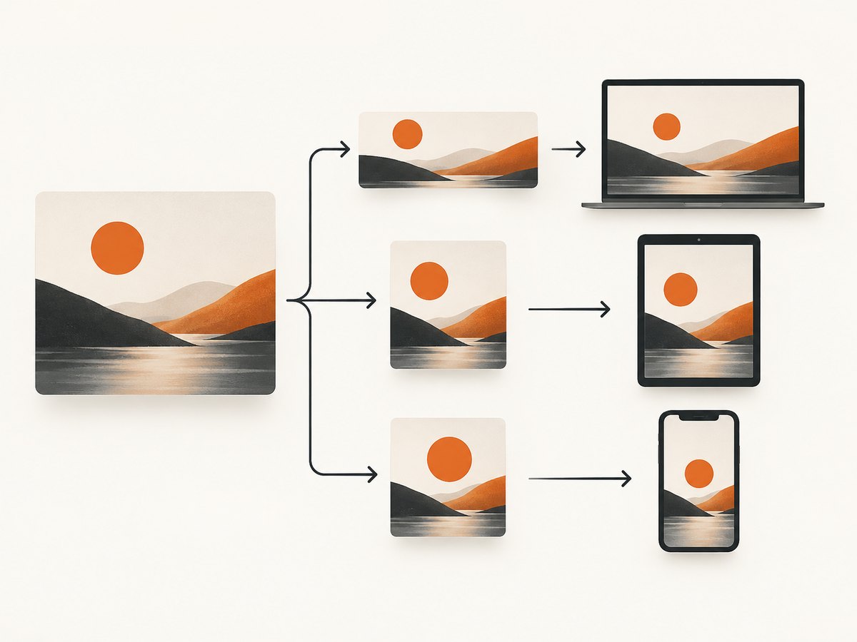
Direct answer: There is no universal best size for a website article thumbnail. Measure the actual display slot, choose an image large enough for its largest intended rendering, preserve the aspect ratio, and generate responsive variants. An article hero, archive card, search preview, and social image may each need a different crop and delivery size.
WordPress’s documented 150 × 150 pixel thumbnail is a platform default, not a recommendation for every website. Themes can register custom sizes, crop images differently, and request a particular variant. Your correct dimensions come from the layout and destinations where the image appears.
1. Start with the display slot
Before exporting an image, inspect every important placement:
- Article hero: the large image above or beside the post title.
- Archive card: a smaller image on a blog, category, or search listing.
- Related-post card: often a different ratio from the archive card.
- Social and search metadata: an image selected through
og:imageor structured data. - Email or feed: a constrained width that may use a separate crop.
Record the rendered width, rendered height, aspect ratio, and crop for each placement. A two-column desktop hero may be wide and shallow, while a mobile card may be closer to square. If the subject must remain visible in both, plan deliberate crops instead of letting CSS cut off the focal point unpredictably.
2. What dimensions should you use?
Use the largest physical size at which the image will actually be displayed, then create smaller responsive candidates. For example, if your hero never exceeds 1,200 CSS pixels but may appear on a high-density screen, a source around 2,400 pixels wide can provide room for a 2× candidate. Do not upload an enormous original simply because a larger number sounds safer; physical display size and file weight are separate concerns.
| Placement | How to choose dimensions | Crop guidance |
|---|---|---|
| Article hero | Match the widest rendered content column, with a 2× variant when needed. | Use the article’s established ratio and keep the focal subject away from edges. |
| Archive card | Measure the card at its widest breakpoint and generate a matching variant. | Use a consistent ratio so cards align in a grid. |
| Mobile card | Measure the narrow layout independently; do not assume the desktop crop works. | Use a tighter crop only when it keeps the subject understandable. |
| Social preview | Follow the destination’s current requirements and validate the rendered preview. | Choose a page-relevant image; avoid generic logos and text-heavy artwork. |
Google’s guidance for structured-data and social images emphasizes relevance and avoiding generic images such as a site logo. It does not define one universal pixel dimension for every destination. Check the current specification for the destination that matters to your distribution.
3. WordPress image sizes and what they mean
The WordPress Theme Handbook lists standard generated sizes:
| WordPress name | Documented maximum | What it means |
|---|---|---|
thumbnail |
150 × 150 pixels | A platform default, commonly cropped square. |
medium |
300 × 300 pixels | Maximum dimensions; the original ratio can remain. |
medium_large |
768 pixels wide | No fixed height limit. |
large |
1024 × 1024 pixels | Maximum dimensions; ratio can remain. |
full |
Original available size | Use only when the original is appropriate for the slot. |
These values come from WordPress documentation and can be changed by site settings, theme support, registered custom sizes, and the requested template size. WordPress media settings also let administrators set thumbnail width and height, choose exact cropping, and set maximum medium and large dimensions.
4. Preserve proportions and control cropping
Resize while maintaining the source height-to-width ratio unless the design intentionally requires a fixed crop. Distorting an image to force dimensions makes circles appear oval and people appear unnaturally wide or narrow. For fixed-ratio cards, crop rather than stretch.
In CSS, object-fit: cover fills a fixed box while preserving the ratio. Use object-position to keep the focal area visible:
.post-card__image {
  width: 100%;
  aspect-ratio: 16 / 9;
  object-fit: cover;
  object-position: 50% 40%;
  display: block;
}
Preview every crop at desktop and mobile breakpoints. WordPress themes can register custom crops with add_image_size() and request them in featured-image functions. A registered size does not help unless the template actually requests it.
5. Serve responsive image variants
WordPress has native responsive-image support. Since WordPress 4.4, generated markup can include srcset and sizes, allowing the browser to select an available file for the viewport and device resolution. Make the sizes hint describe the real layout.
<img
  src='https://example.com/uploads/article-768.webp'
  srcset='https://example.com/uploads/article-480.webp 480w,
          https://example.com/uploads/article-768.webp 768w,
          https://example.com/uploads/article-1200.webp 1200w'
  sizes='(max-width: 700px) 100vw, (max-width: 1100px) 80vw, 900px'
  width='1200'
  height='675'
  alt='A dashboard displayed on a laptop'
  loading='lazy'
  decoding='async'>
The intrinsic width and height reserve space before the file loads, helping prevent layout shift. Use loading='lazy' for below-the-fold cards. The primary hero may deserve eager loading when it is visible immediately.
Register a custom WordPress size
add_action('after_setup_theme', function () {
    add_theme_support('post-thumbnails');
    add_image_size('article-card', 640, 360, true);
    add_image_size('article-hero', 1280, 720, true);
});

// In a template:
the_post_thumbnail('article-card', [
    'alt' => get_the_title(),
    'loading' => 'lazy',
]);
After adding a new size, existing uploads may need thumbnail regeneration through your normal WordPress maintenance process. Confirm that the generated files exist and that the template requests the intended name.
6. Choose formats and quality by use case
Use an image format supported by your delivery stack and audience. WebP can reduce file weight for many photographic images; JPEG remains broadly compatible; PNG is useful when lossless detail or transparency is required. Compare visual quality at the actual rendered size. A smaller file with visible ringing or blurred text is not a successful optimization.
Keep source files large enough for the largest placement, but avoid sending the original to every card. Responsive candidates reduce bandwidth, improve loading time, and let browsers choose an appropriate file.
7. Metadata and social previews
Screen display and metadata previews are separate decisions. A page can use a 16:9 hero while its social metadata uses a crop selected for the destination. Set a relevant og:image, include usable intrinsic dimensions where supported, and inspect the final preview with the destination’s current debugging tool.
<meta property='og:image' content='https://example.com/images/article-social.jpg'>
<meta property='og:image:width' content='1200'>
<meta property='og:image:height' content='630'>
<meta name='twitter:card' content='summary_large_image'>
Do not treat the WordPress 150 × 150 default as a social requirement. Select an image that represents the page and keep important subjects inside the safe area of the crop.
8. A practical sizing workflow
- Inventory placements. Open the article, archive, category, related-post, and mobile layouts.
- Measure slots. Record rendered width, height, ratio, and whether the crop is fixed.
- Choose source dimensions. Size the source for the largest intended rendering, allowing for high-density screens.
- Define crops. Register WordPress sizes or create deliberate server-side crops.
- Generate variants. Provide candidates for narrow, medium, and wide layouts.
- Write responsive markup. Use
srcset, an accuratesizesvalue, intrinsic dimensions, and appropriate loading behavior. - Inspect quality and weight. Check the real page on mobile and desktop, then compare file sizes.
- Validate metadata. Confirm that social and structured-data images are relevant and render with the intended crop.
- Recheck after theme changes. A new sidebar or grid breakpoint can change the correct dimensions.
9. Capture exact article thumbnails with ScreenshotNeo
If you need repeatable screenshots of article pages, cards, or a specific element for editorial workflows, ScreenshotNeo can capture a URL or CSS-selected element. Its options include full-page capture with lazy images loaded, element capture by selector, any viewport or one of 12 device presets, retina scale, image resizing, transparent backgrounds, custom CSS and JavaScript, click actions, selector waits, delays, network-idle waits, blocked ads and trackers, custom headers, cookies, user agents, authorization, timezone, geolocation, caching with a chosen TTL, signed links, asynchronous jobs, bulk capture of up to 100 URLs, and PDF output.
Use the API base endpoint shown in the ScreenshotNeo documentation. The following examples save the response as an image.
cURL
curl -G 'https://api.screenshotneo.com/v1/shot' \
  -d access_key=YOUR_API_KEY \
  --data-urlencode url=https://stripe.com \
  -o shot.webp
Python
import requests

r = requests.get(
    'https://api.screenshotneo.com/v1/shot',
    params={'access_key': 'YOUR_API_KEY', 'url': 'https://stripe.com'},
    timeout=90,
)
r.raise_for_status()
open('shot.webp', 'wb').write(r.content)
Node.js
const q = new URLSearchParams({
  access_key: 'YOUR_API_KEY',
  url: 'https://stripe.com'
});
const res = await fetch(`https://api.screenshotneo.com/v1/shot?${q}`);
if (!res.ok) throw new Error(`HTTP ${res.status}`);
const data = Buffer.from(await res.arrayBuffer());
await import('node:fs/promises').then(fs => fs.writeFile('shot.webp', data));
For a card or thumbnail, add the relevant viewport, format, resize, or CSS options described in the documentation. Capture an element when the page contains unrelated navigation; use full-page mode when the image must include content below the fold.
10. Or skip the browser setup
ScreenshotNeo accepts and removes cookie-consent banners, newsletter popups, and chat widgets before the shot. Bot checks, blank pages, timeouts, failed loads, and cache hits are not billed, and response headers identify the page verdict and whether the request was billed. An MCP server provides take_screenshot, get_page_info, and capture_pdf tools for Claude, Cursor, and other MCP clients. The Free plan includes 1,000 screenshots per month with no card; paid plans start at $5 for 3,000 shots.

Create a free ScreenshotNeo account and start with 1,000 screenshots per month at no charge.
11. Troubleshooting common thumbnail problems
| Symptom | Likely cause | Fix |
|---|---|---|
| Image looks stretched | Width and height were forced independently. | Preserve the ratio or use an intentional crop with object-fit: cover. |
| Cards have different heights | Images use mixed ratios or uncropped originals. | Set one card ratio and request one matching generated size. |
| Mobile downloads the desktop file | sizes is missing or inaccurate. |
Describe the real mobile slot and verify the emitted srcset. |
| New custom size is absent | Existing uploads were never regenerated. | Regenerate thumbnails and confirm the template requests the size. |
| Subject is cut off | Automatic center cropping ignores the focal point. | Adjust the crop or use object-position and a focal-point workflow. |
| Layout jumps while loading | Intrinsic dimensions are missing. | Include accurate width and height attributes or reserve aspect-ratio space. |
| Screenshot shows a popup | The page was captured before consent or widget cleanup. | Use ScreenshotNeo cleanup options, selector waits, delays, or custom CSS to hide the element. |
| Screenshot is blank or incomplete | The page timed out, blocked automation, or lazy content had not loaded. | Increase the wait strategy, capture after a selector appears, or inspect the page verdict headers. |
12. Performance, reliability, and cost notes
Responsive variants reduce transfer size, but every extra generated file increases storage and processing work. Create variants for actual breakpoints rather than every possible width. Cache stable article thumbnails and set long cache lifetimes when the source image does not change. Invalidate the cache when an article image is replaced.
For automated captures, wait for the content that determines the thumbnail. A fixed delay can be wasteful or insufficient; a selector wait or network-idle condition is usually easier to reason about. Block advertisements and trackers when they are irrelevant to the editorial image. Use retries for transient network failures, but log response status, verdict, billing headers, target URL, and capture options so a failed image can be reproduced.
ScreenshotNeo’s billing model charges only clean shots. Bot checks, blank pages, timeouts, failed loads, and cache hits cost nothing, while the response identifies the verdict and billing status. Caching can reduce repeated work, and bulk capture supports up to 100 URLs per call when generating a batch of article assets.
FAQ
Is 150 × 150 the best article thumbnail size?
No. It is WordPress’s documented thumbnail maximum and often a square crop. Use the dimensions and ratio of your actual placement.
Should every article use the same ratio?
Consistent ratios make grids cleaner, but a hero and a social preview can legitimately use different crops. Keep each placement consistent within its own design.
Do larger images always look better?
No. Larger sources help only when the image is rendered large or on a high-density display. They also increase transfer and storage costs.
Can I use one image for the page and social metadata?
Yes, when the crop works in both places. Otherwise, provide a separate metadata image selected for the destination’s preview.
When should I capture an element instead of the full page?
Capture an element when the thumbnail represents a card, chart, or hero region and surrounding navigation should be excluded. Use full-page capture when below-the-fold content is part of the intended image.


