Website Blog Post Featured Image Size: A Practical Guide
Use your theme’s image rules first, then target 1200px-wide 16:9 images for Google Discover and responsive WordPress delivery.
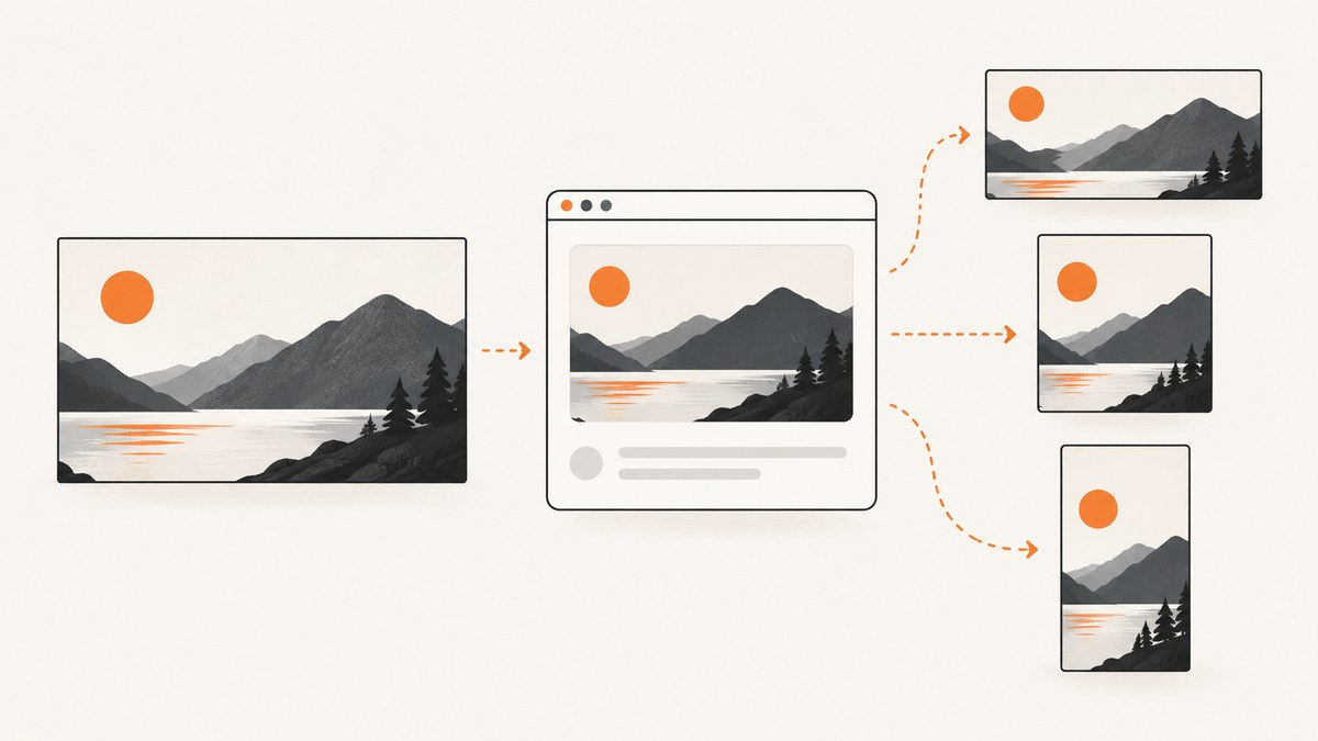
Short answer: there is no single featured-image size that works for every website. Start with the dimensions and crop used by your theme or page template. If Google Discover matters, prepare a relevant landscape image at least 1200 pixels wide, with more than 300,000 total pixels and a 16:9 composition. Google gives 1280×720 as an example. That Discover target is separate from WordPress theme defaults and from the image size your visitors ultimately download.
What “featured image size” means
A featured image is the CMS image assigned to represent a post, page or custom post type. Your theme may show it in archives, cards, search results, a page header, or above the article. Each location can use a different crop or registered image size.
Separate these three decisions:
- Source image: the original file you upload.
- Rendered crop: the dimensions and aspect ratio your theme displays.
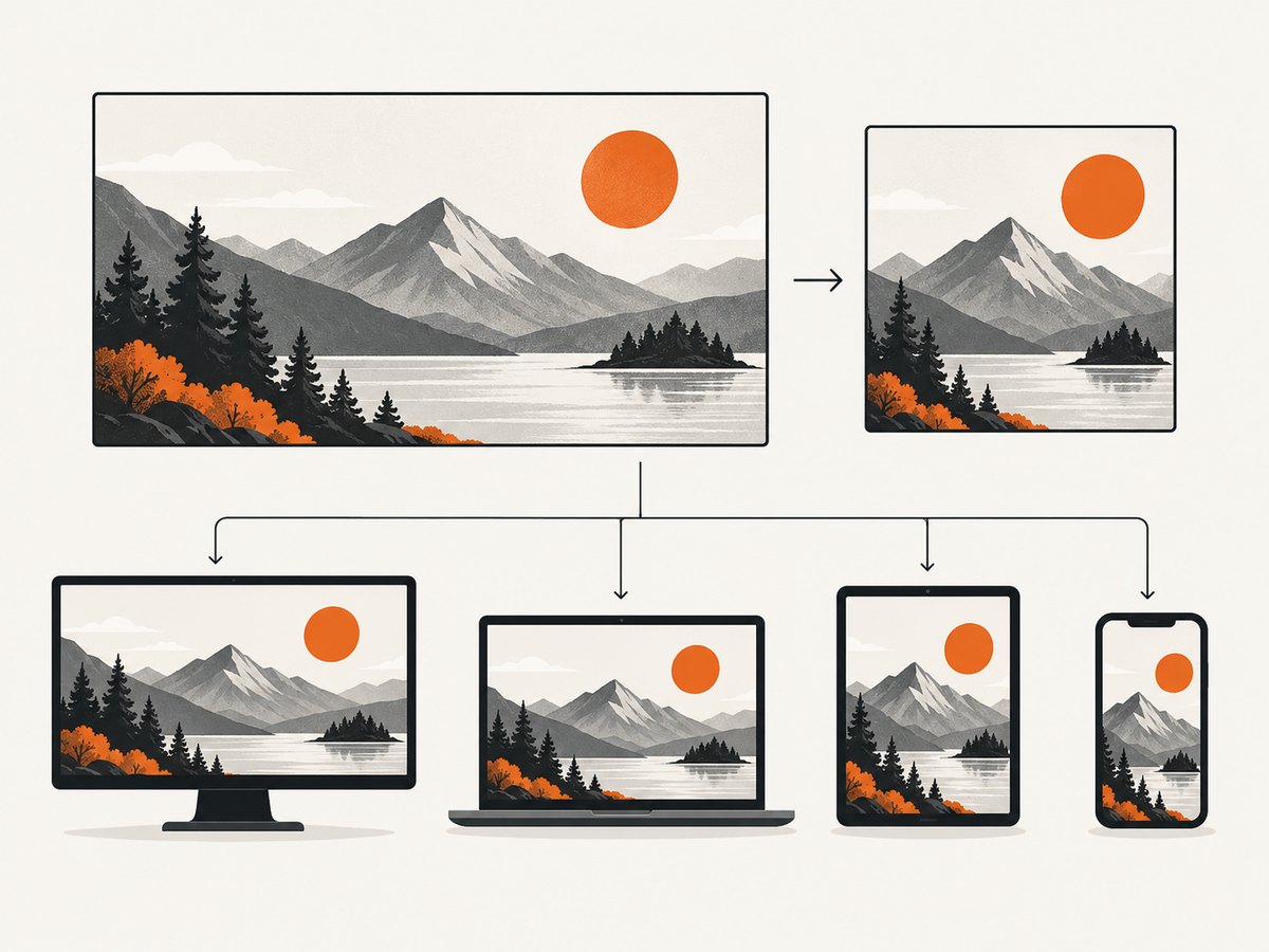
- Delivered file: the responsive image selected for a visitor’s screen through
srcsetandsizes.
Recommended dimensions by goal
| Goal | Practical starting point | Why |
|---|---|---|
| Theme-specific blog card or header | Use the theme documentation or template crop | The theme controls display and cropping. |
| Google Discover eligibility | At least 1200 px wide, more than 300,000 total pixels, 16:9 | These are Google’s current Discover image recommendations. |
| General editorial source | 1280×720 or larger 16:9 source | Provides room for responsive derivatives and cropping. |
| Square archive thumbnail | Let WordPress generate the theme’s square size | A 16:9 source may be center-cropped. |
A 1280×720 image contains 921,600 pixels, so it exceeds Discover’s 300,000-pixel threshold. A 1200×675 image also meets the threshold. Do not treat either dimension as a universal requirement for every theme or social platform.
Google Discover requirements
Google recommends a relevant 16:9 image that is at least 1200 pixels wide and exceeds 300,000 total pixels for Discover. It may crop the image automatically, so keep the subject and other important details inside the central landscape area. Enable max-image-preview:large or use AMP when following Google’s Discover guidance. Eligibility does not guarantee that Discover will distribute the page.
Read the Google Search Central Discover documentation for the current guidance.
WordPress image sizes and responsive delivery
WordPress defaults are implementation defaults, not universal recommendations. The documented defaults are:
- Thumbnail: 150×150 maximum.
- Medium: 300×300 maximum.
- Medium large: 768 pixels wide, with no height limit.
- Large: 1024×1024 maximum.
- Full: the uploaded original.
WordPress can expose multiple generated files through srcset. Its documented default maximum width for responsive sources is 2048 pixels. The browser then chooses an available file based on viewport and screen conditions.
See the WordPress Theme Handbook and WordPress responsive-images documentation.
How to choose the right source image
- Inspect the theme documentation for the post header, archive card and search-result crops.
- Choose a relevant image that represents the article. Avoid using a site logo as the representative image.
- Use a landscape source when the article may appear in Discover. Keep faces, products and key objects away from the edges.
- Export at least the largest width your theme needs. A 1280×720 source is a useful baseline for a 16:9 layout; use a larger source when the design displays wider images.
- Upload the source through WordPress and confirm which generated size appears in the page HTML.
- Check the page at mobile and desktop widths. Look for subject loss, excessive file size and blurry upscaling.
Set representative-image metadata
Google can use schema.org image markup or an og:image tag as signals when selecting a preview. This does not force Google to choose that image. Keep the image relevant, avoid text-heavy graphics and avoid extreme aspect ratios.
<meta property="og:image" content="https://example.com/uploads/post-featured-1280x720.jpg">
<meta name="twitter:card" content="summary_large_image">
<meta name="robots" content="max-image-preview:large">
Your SEO or social-sharing plugin may generate these tags automatically. Do not add duplicate tags from multiple plugins.
Inspect the actual image delivered
Use browser developer tools to inspect the rendered <img> element. Check srcset, sizes, intrinsic dimensions and the Network panel’s requested file. A large source file does not mean every visitor downloads that file.
const image = document.querySelector('article img');
console.log({
  src: image?.currentSrc,
  width: image?.naturalWidth,
  height: image?.naturalHeight,
  srcset: image?.srcset,
  sizes: image?.sizes
});
Generate a consistent featured image with a browser
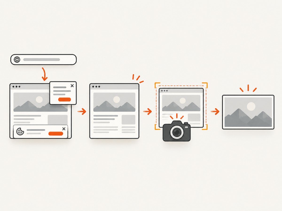
If you need screenshots or rendered previews of a page, a headless browser can capture the page at a fixed viewport and device scale. The following example uses Playwright, then resizes the result to a 16:9 output.
import { chromium } from 'playwright';

const browser = await chromium.launch();
const page = await browser.newPage({
  viewport: { width: 1280, height: 720 },
  deviceScaleFactor: 1
});
await page.goto('https://example.com/blog/post', { waitUntil: 'networkidle' });
await page.screenshot({ path: 'featured.png', fullPage: false });
await browser.close();
For a production pipeline, wait for the specific hero selector, hide cookie dialogs, and verify that fonts and lazy-loaded images have finished loading before capture.
Or skip the browser setup
ScreenshotNeo captures a URL through one API request. It removes cookie and consent banners, newsletter popups and chat widgets before the shot; bot checks, blank pages, failed loads and cache hits are not billed; and each response reports the result with X-Page-Verdict and X-Billed headers. Its MCP server provides take_screenshot, get_page_info and capture_pdf tools for Claude, Cursor and other MCP clients. Every plan includes the features, with 1,000 screenshots per month free without a card and paid plans starting at $5 for 3,000 shots.
See the ScreenshotNeo API documentation for all options.
curl -G "https://api.screenshotneo.com/v1/shot" \
  -d access_key=YOUR_API_KEY \
  --data-urlencode url=https://screenshotneo.com/blog/ \
  -o shot.webp
import requests
r = requests.get(
"https://api.screenshotneo.com/v1/shot",
params={"access_key": "YOUR_API_KEY", "url": "https://screenshotneo.com/blog/"},
timeout=90,
)
r.raise_for_status()
open("shot.webp", "wb").write(r.content)const q = new URLSearchParams({
access_key: 'YOUR_API_KEY',
url: 'https://screenshotneo.com/blog/'
});
const res = await fetch(`https://api.screenshotneo.com/v1/shot?${q}`);
if (!res.ok) throw new Error(`HTTP ${res.status}`);
const image = Buffer.from(await res.arrayBuffer());
await import('node:fs/promises').then(fs => fs.writeFile('shot.webp', image));Use the API’s viewport, device preset, retina scale, full-page, CSS, JavaScript, wait, hide-selector and image-resizing options to produce a stable editorial asset. Caching with a chosen TTL can avoid repeat captures. For many URLs, bulk capture supports up to 100 URLs per call; asynchronous jobs and signed webhooks help longer workflows.
Create a free ScreenshotNeo account with 1,000 screenshots each month and no card.
Troubleshooting
| Problem | Likely cause | Fix |
|---|---|---|
| Image looks stretched | Displayed ratio differs from source ratio. | Match the theme crop or use object-fit: cover with a deliberate focal point. |
| Subject is cut off | Theme or Discover applied an automatic crop. | Keep important content inside the central 16:9 safe area and inspect each template. |
| Discover preview is small | Image is under 1200 px wide or preview metadata is missing. | Publish a relevant 16:9 image at least 1200 px wide and enable large image previews. |
| Page loads a blurry image | No suitable responsive source exists or an image is being upscaled. | Upload a larger source and verify srcset candidates. |
| Page is slow | Original image is delivered to every viewport. | Use responsive sizes, compression and lazy loading below the fold. |
| Automated screenshot contains a popup | Capture occurred before dismissal or the popup is unknown. | Wait for the page, click or hide the selector, or use ScreenshotNeo’s consent and popup removal. |
| Screenshot is blank | Page failed, timed out or requires authentication. | Increase the wait, provide headers or cookies, and inspect the page verdict before using the file. |
Performance, reliability and cost
- Resize and compress derivatives while preserving the original source for future crops.
- Serve only the width the visitor needs; oversized hero files waste bandwidth.
- Use stable selectors and explicit waits in browser automation so font and lazy-image timing does not change the result.
- Cache unchanged captures. ScreenshotNeo lets you choose a cache TTL; cache hits are not billed.
- For unreliable pages, inspect response verdict headers and retry only transient failures. ScreenshotNeo does not bill bot checks, blank pages, timeouts or failed loads.
- For batch publishing, use bulk capture or asynchronous jobs instead of holding one request open per URL.
Checklist before publishing
- Theme crop and archive dimensions are confirmed.
- Source is relevant, landscape and large enough for the widest display.
- Discover target is met when applicable: 16:9, at least 1200 px wide and over 300,000 pixels.
- Important content survives likely crops.
og:image, schema image markup or both identify the representative image.max-image-preview:largeis enabled when following Discover guidance.srcsetandsizesdeliver an appropriate responsive file.- Mobile and desktop rendering have been checked.
FAQ
Is 1200×630 the required featured-image size?
No. That ratio is common in social tooling, but your theme controls its own crop. For Discover, Google recommends 16:9 and at least 1200 pixels wide.
Can a square image be a featured image?
Yes, if the theme supports it. It may be cropped or letterboxed in landscape layouts and is not the recommended composition for Discover.
Should I upload exactly 1280×720?
It is a useful 16:9 baseline and meets the cited pixel threshold, but upload a larger source when your theme displays wider images.
Does adding og:image guarantee Google will use it?
No. Google selects previews automatically, using available page and image signals.
What is the best way to create repeatable page screenshots?
Use a fixed viewport, explicit waits and controlled CSS in a browser pipeline, or use ScreenshotNeo when you want a single API call with consent and popup cleanup.


