Website Hero Image: A Complete Guide to Size, Responsive Crops, Performance, and Accessibility
Choose, build, and optimize a website hero image with responsive sizing, stable layouts, fast loading, and accessible alt text.
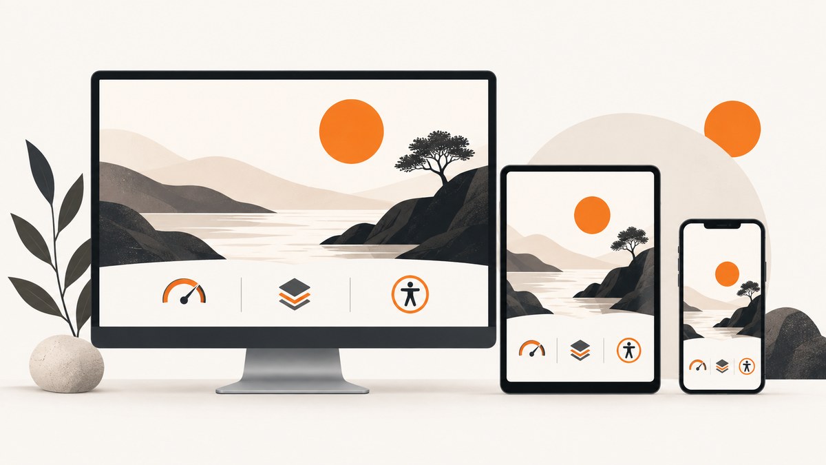
Direct answer: A website hero image is the prominent visual in the opening section of a page. The right implementation depends on the image’s rendered size, focal point, purpose, audience, and loading conditions. Use responsive image candidates with srcset and sizes, set explicit width and height, keep an above-the-fold hero out of lazy loading, choose a format that delivers the required quality at a reasonable transfer size, and write alt text based on whether the image is informative, decorative, or functional.
There is no universal “hero image size.” A two-column hero may render at 640 pixels wide on a laptop, while a full-bleed banner may render at 1,440 pixels. Build several source widths, let the browser select the closest candidate, and review the crop at every breakpoint. Google’s recommended good Largest Contentful Paint (LCP) threshold is 2.5 seconds or less at the 75th percentile, measured separately for mobile and desktop. LCP can be a visible image or a text block, so the hero is part of a page-level performance target, not the only factor.
What a website hero image does
A hero image establishes context in the first viewport. It can show a product, illustrate a concept, establish a mood, or support a call to action. Before exporting anything, decide which job it performs:
- Informative: the image communicates information that users need. Describe that information in the alt text.
- Decorative: the image adds visual atmosphere but does not add meaning. Use an empty alt attribute,
alt=''. - Functional: the image is a link or button. Describe the destination or action, not just what the image depicts.
Keep essential words in HTML rather than baking them into the image. W3C’s guidance states: “Images must have text alternatives that describe the information or function represented by them.” The W3C Images Tutorial explains how to apply this distinction.
How to choose the hero image dimensions
Start with the largest rendered slot, then work down to smaller slots. The browser should download an image close to the displayed width multiplied by the device pixel ratio, rather than always receiving the largest original.
| Hero layout | What to measure | Implementation choice |
|---|---|---|
| Full-bleed banner | Viewport width minus any fixed gutters | Wide srcset candidates and a crop-safe focal point |
| Two-column hero | Image column width at each breakpoint | A sizes value that describes the column, not the viewport |
| Contained card or product shot | Actual content-box width | Smaller candidates and object-fit: contain when the whole object matters |
Provide intrinsic dimensions even when CSS makes the image fluid. The browser uses them to reserve the aspect ratio before bytes arrive, reducing cumulative layout shift (CLS).
Responsive hero image markup
The following example uses width descriptors. The sizes attribute tells the browser how wide the image will be in the layout. Adjust the breakpoints to match your CSS.
<picture>
  <source
    type='image/avif'
    srcset='/images/hero-640.avif 640w,
            /images/hero-960.avif 960w,
            /images/hero-1440.avif 1440w,
            /images/hero-1920.avif 1920w'
    sizes='(min-width: 1200px) 50vw, (min-width: 768px) 55vw, 100vw'>
  <source
    type='image/webp'
    srcset='/images/hero-640.webp 640w,
            /images/hero-960.webp 960w,
            /images/hero-1440.webp 1440w,
            /images/hero-1920.webp 1920w'
    sizes='(min-width: 1200px) 50vw, (min-width: 768px) 55vw, 100vw'>
  <img
    src='/images/hero-960.jpg'
    srcset='/images/hero-640.jpg 640w,
            /images/hero-960.jpg 960w,
            /images/hero-1440.jpg 1440w,
            /images/hero-1920.jpg 1920w'
    sizes='(min-width: 1200px) 50vw, (min-width: 768px) 55vw, 100vw'
    width='1920'
    height='1080'
    alt='Team reviewing a dashboard on a large monitor'
    decoding='async'>
</picture>
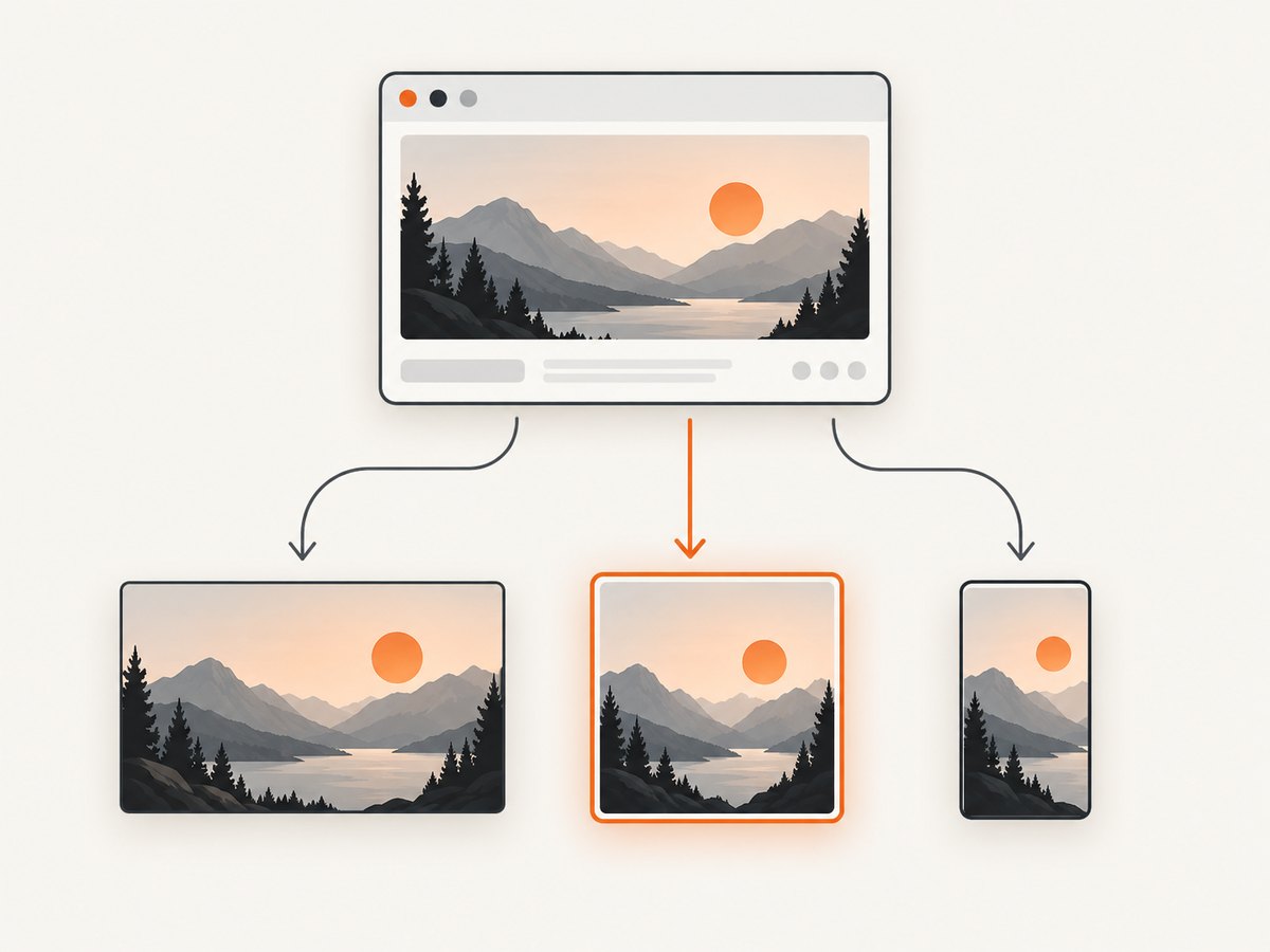
Use <picture> when you need format selection or art direction. Use srcset and sizes alone when the same crop works everywhere. The web.dev responsive images guide explains how candidate selection works.
Crop and focal-point control
A single source crop rarely works perfectly on every aspect ratio. A wide desktop hero may show a person’s full body, while a narrow mobile crop may cut off the face. Choose a focal point and test the actual rendered result.
.hero {
  aspect-ratio: 16 / 9;
  overflow: hidden;
}

.hero img {
  width: 100%;
  height: 100%;
  object-fit: cover;
  object-position: 65% 35%;
}

@media (max-width: 767px) {
  .hero {
    aspect-ratio: 4 / 5;
  }

  .hero img {
    object-position: 55% 30%;
  }
}
Use object-fit: contain when cutting off any part of the subject would misrepresent it. For genuinely different compositions, use art-directed sources with media queries:
<picture>
  <source media='(max-width: 767px)' srcset='/images/hero-mobile.webp'>
  <source media='(min-width: 768px)' srcset='/images/hero-desktop.webp'>
  <img src='/images/hero-desktop.jpg' width='1920' height='1080' alt='...'>
</picture>
Loading priority and layout stability
Do not add loading='lazy' to an above-the-fold hero. Lazy loading can delay a resource that is needed for the first view. If the hero is a genuine LCP candidate, fetchpriority='high' may help, but reserve high priority for genuinely vital resources because it can delay other important requests.
<img
  src='/images/hero-960.webp'
  srcset='/images/hero-640.webp 640w, /images/hero-960.webp 960w, /images/hero-1440.webp 1440w'
  sizes='100vw'
  width='1440'
  height='810'
  fetchpriority='high'
  decoding='async'
  alt='...'>
Preload selectively. When the image is discoverable in the initial HTML, the browser can usually find it without a preload. A preload can be useful when the hero is inserted by JavaScript or supplied as a CSS background.
<link
  rel='preload'
  as='image'
  href='/images/hero-960.webp'
  imagesrcset='/images/hero-640.webp 640w, /images/hero-960.webp 960w, /images/hero-1440.webp 1440w'
  imagesizes='100vw'>
Explicit dimensions prevent content from jumping as the image loads. The Chrome performance guidance covers priority and layout considerations.
Format, compression, and delivery
Choose a format based on the image content and your browser support requirements. Modern formats such as AVIF or WebP can reduce transfer size; keep a JPEG fallback when compatibility or your image pipeline requires it. Format choice is only one part of the result: dimensions, quality settings, metadata, CDN caching, and the rendered slot matter too.
- Photographic heroes usually benefit from lossy compression with a quality setting chosen by visual inspection.
- Illustrations with flat colors may compress well in a modern image format or PNG when transparency and sharp edges are essential.
- Do not ship a 4,000-pixel source when the largest rendered slot is 1,440 pixels unless you need extra density for a specific display.
- Strip unnecessary metadata and serve long-lived cache headers for immutable, fingerprinted files.
Measure the transferred bytes and the rendered dimensions on representative mobile and desktop connections. A “small” file can still be too large if it is requested before the page’s critical CSS, while a larger file may be justified for a large, high-density display.
Hero image accessibility and SEO
Write alt text in context. For an informative hero, state the essential subject or message in a concise phrase. For decoration, use alt='' so assistive technology can skip it. For a linked image, describe the destination or action.
Use a descriptive filename such as analytics-team-dashboard.webp instead of a camera-generated name. Google Search Central recommends useful filenames and contextual alt text, and warns against keyword stuffing. Read the Google Image SEO best practices for the relationship between alt text, page context, and image discovery.
A complete HTML and CSS hero example
<section class='hero' aria-labelledby='hero-title'>
  <div class='hero__copy'>
    <p class='eyebrow'>Weekly reporting</p>
    <h1 id='hero-title'>See the work behind every release</h1>
    <p>A concise sentence explains the product while the image supplies context.</p>
    <a class='button' href='/signup'>Start free</a>
  </div>
  <div class='hero__media'>
    <picture>
      <source media='(max-width: 767px)' srcset='/images/release-mobile.webp'>
      <source type='image/avif' srcset='/images/release-960.avif 960w, /images/release-1440.avif 1440w' sizes='50vw'>
      <img src='/images/release-960.jpg' srcset='/images/release-960.jpg 960w, /images/release-1440.jpg 1440w' sizes='(min-width: 768px) 50vw, 100vw' width='1440' height='960' fetchpriority='high' alt='Engineer reviewing a release timeline with teammates'>
    </picture>
  </div>
</section>

<style>
.hero { display: grid; grid-template-columns: 1fr 1fr; align-items: center; gap: 3rem; }
.hero__media { aspect-ratio: 3 / 2; overflow: hidden; }
.hero__media img { display: block; width: 100%; height: 100%; object-fit: cover; object-position: 60% 40%; }
@media (max-width: 767px) {
  .hero { grid-template-columns: 1fr; gap: 1.5rem; }
  .hero__media { order: -1; aspect-ratio: 4 / 3; }
}
</style>
Testing checklist
- Inspect the hero at the smallest supported phone width, a tablet width, and a large desktop width.
- Confirm the subject remains visible and the text has sufficient contrast over or beside the image.
- Check that the image has explicit dimensions and that no content moves when it loads.
- Verify that the browser selects an appropriate
srcsetcandidate and thatsizesmatches the real layout. - Confirm the hero is not lazy-loaded when it is above the fold.
- Run a keyboard and screen-reader pass. Ensure the alt text matches the image’s purpose.
- Review mobile and desktop LCP separately. A slow result may come from server response time, CSS, fonts, or other render-blocking work rather than the image alone.
Or skip the browser setup
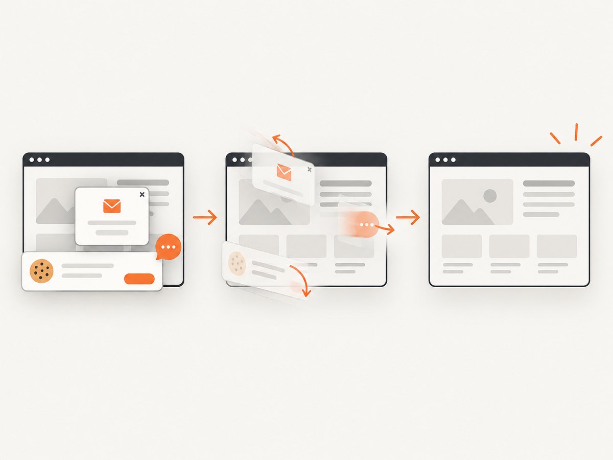
If you need rendered screenshots of hero variations, responsive states, or production pages, ScreenshotNeo returns a clean screenshot from one GET request. It accepts cookie and consent banners like a visitor, then removes more than 60 known consent platforms, newsletter popups, and chat widgets before capture. Bot checks, blank pages, timeouts, failed loads, and cache hits are not billed; response headers identify the page verdict and whether the shot was billed.
Use the API directly (see the ScreenshotNeo documentation):
curl -G 'https://api.screenshotneo.com/v1/shot' -d access_key=YOUR_API_KEY --data-urlencode url=https://stripe.com -o shot.webpimport requests
r = requests.get('https://api.screenshotneo.com/v1/shot', params={'access_key': 'YOUR_API_KEY', 'url': 'https://stripe.com'}, timeout=90)
open('shot.webp', 'wb').write(r.content)const q = new URLSearchParams({ access_key: 'YOUR_API_KEY', url: 'https://stripe.com' });
const res = await fetch(`https://api.screenshotneo.com/v1/shot?${q}`);You can also capture a full page with lazy images loaded, target one CSS selector, emulate dark mode or a device preset, set a viewport and retina scale, inject CSS or JavaScript, click before capture, wait for a selector, delay, or network idle, block ads and resource types, provide headers and cookies, set timezone or geolocation, resize the output, cache with a chosen TTL, create signed links, submit asynchronous jobs with signed webhooks, capture up to 100 URLs per bulk call, and query usage. An MCP server provides take_screenshot, get_page_info, and capture_pdf for Claude, Cursor, and other MCP clients.
The Free plan includes 1,000 screenshots each month with no card. Paid plans start at $5 for 3,000 shots; every feature is available on every plan. Create a free ScreenshotNeo account.
Troubleshooting common hero problems
| Symptom | Likely cause | Fix |
|---|---|---|
| Hero appears blurry | The selected candidate is narrower than the rendered slot, or compression is too aggressive. | Add an appropriate width candidate, correct sizes, and raise quality only after checking transfer cost. |
| Page jumps when the image loads | No intrinsic dimensions or aspect ratio is reserved. | Set width and height or an equivalent CSS aspect-ratio. |
| Mobile crop cuts off the subject | The desktop focal point was reused at a different aspect ratio. | Adjust object-position or provide an art-directed mobile source. |
| LCP is slow | Lazy loading, low request priority, a late JavaScript insertion, or render-blocking resources. | Remove lazy loading, consider fetchpriority='high', keep the image discoverable in HTML, and profile the complete page. |
| Text is unreadable over the image | The crop or image contrast changes behind the copy. | Move copy beside the image, adjust the focal point, or add a tested overlay with sufficient contrast. |
| Screen reader announces noise | Decorative art has descriptive alt text. | Use alt='' for decoration and reserve descriptions for informative or functional images. |
| API capture shows a popup | The page was captured before consent or widget cleanup completed. | With ScreenshotNeo, use its consent and cleanup behavior; otherwise wait for the relevant selector or state in your browser automation. |
Performance, reliability, and cost notes
Optimize for the rendered slot and your real audience. Test on mobile connections, cache immutable assets at the edge, and avoid requesting multiple hero formats that the browser will not use. Treat LCP as a page-level metric and inspect the waterfall before changing image quality.
For automated screenshot pipelines, reliability improves when captures wait for a meaningful condition such as a selector, network idle, or a controlled delay. Authenticated or personalized pages may require custom headers, cookies, or an authorization value. Caching can reduce repeated work when a chosen TTL matches how often the page changes. ScreenshotNeo reports whether a response was billed, so failed loads and cache hits do not consume paid shots.
FAQ
What size should a website hero image be?
There is no fixed size. Measure the largest rendered slot, provide several responsive candidates, and reserve enough resolution for the device pixel ratio.
Should a hero image be lazy loaded?
Do not lazy-load an above-the-fold hero. It is often an LCP candidate and should be discoverable early.
Should the hero be a CSS background?
Use an HTML image when the visual conveys content or needs meaningful alt text. A CSS background is appropriate for decoration, but it can be harder for the browser to discover early and may require selective preloading.
What should I put in the alt text?
Describe the essential information or function in context. Use an empty alt attribute for purely decorative imagery and avoid keyword stuffing.
How do I preserve a focal point across breakpoints?
Test the actual crops, adjust object-position, or provide separate desktop and mobile sources when the composition needs to change.


